Blog Update #7

Conclusions and Recommendations

We conclude that some of the features evaluated worked well, though concerns exist regarding inter-user trust and community navigation.

While there was no significant difference between the level of details in food and profile posts, participants were slightly more inclined to trust another user based on profile rather than food post. In other words, the evidence shows that a user puts higher emphasis on a profile than a food post, which is something we did not anticipate.

In the apartment layout, participants took more time to scan for targets and perform scrolling gestures both vertically and horizontally, as indicated by the significant effect the layout had on time. Interestingly, we found an interaction effect when analyzing layout and task, indicating that tasks which include explicit spatial (apartment floor) information might not be hindered as much.

In regards to our interface design, we acknowledge that there are some factors that could have affected the results in our experiments. One major factor could have been that the contrast between low and high levels of information was not high enough. As such, participants may have been unable to indicate a clear preference and chose arbitrarily which one they trusted more. In the second experiment, it is unclear whether the difficulty in performing the task was a scrolling problem, or a visual issue (e.g pictures were too small).

The concept presented here is still worth exploring given these conclusions, though future designs would have to address several serious issues.

In terms of promoting trust, it might make sense to make interface adjustments that emphasize the seller and their history. One specific recommendation might be to make certain (or all) fields in profiles required. Another might be to set a standard to check a user’s history, such as a background check or a food safety inspection. It might also be worthwhile to consider these in context with features that promote user trust, such as their effect on our messaging system.

With regards to main page layout, future design steps would have to address the issues reported with gestures and overload of information on screen. Specifically, this might involve considering pinch gestures for navigation and collapsible map “pins”. Alternatively, we might recommend the use of a hybrid interface. This would combine the map with the simplicity of a list, which might be sorted (e.g. using a recommendation system) to complement the spatial info.

Reflection

Prior to creating the interactive system, the field study was beneficial in identifying issues with some assumptions that we had. Initially, we felt that our system would be used by anybody within a close-knit community. To our surprise, the young adults in our study were pretty vocal about how they didn’t enjoy or cared little about interacting with their neighbors. After realizing this, we shifted our user group to an older age group that were more open to sharing and interacting with their neighbors. In addition, we realized that we had to put a higher importance on trust as multiple participants expressed their concerns for trusting food made by others. Use of an affinity diagram allowed us to easily identify rich patterns in this data.

Using different levels of prototypes greatly helped us in designing and shaping our experiments. With the low fidelity prototype that we created, we were able to quickly evaluate our conceptual ideas and see if it worked with minimal effort. Additionally, after getting feedback, we were able to quickly make changes and adjust features to test. After the low fidelity prototype, we were able to pinpoint areas of our overall prototype to test, such as creating timed trials in our medium fidelity prototype to test searching and browsing tasks to collect quantitative data.

Pilot testing was another great method that we learned through class, and after performing our study, we realized the significance of conducting such tests. Not only did pilot testing allow us to reveal functional issues of our prototype, it also allowed us to figure out a better way to gather qualitative data. To elaborate, we found some frames in our prototype that did not transition appropriately given the user’s input, and this would have affected our first participant’s results. Furthermore, we discovered that using a semi-structured interview style to gather qualitative data was better than giving the participant a survey to fill out.

In terms of analysis, we felt that using ANOVA testing in R studio allowed us to clearly see the differences in our findings and helped us visualize our collected data.

However, like most things in life, there were aspects in our study that did not go as we planned. When we designed our medium fidelity prototype, we had planned to use a touchscreen device to conduct the experiments, however, with the COVID-19 pandemic, we had to hastily adjust our experiments to make everything virtual. Given that we could not control the environment of our experiment, many factors could have affected our results, such as the different devices that the participants used, the internet speeds, etc.

Additionally, if we had more time to run our experiment with a larger group, we may have been able to collect more substantial data that could possibly change our results  and have more accurate conclusions.

Blog Update #6

Experiment Abstract and Materials

Pilot Test

We ran two sets of pilot tests, in which the full experiment was run on two participants. Both participants were immediate family members within the same household. Through the pilot testing, we were able to reveal the functional issues of our prototype in regards to completing test trials. Namely, we discovered that some frames did not transition appropriately based on the user’s input, affecting the response times and general feedback with the prototype. 

After conducting the surveys of each section in the experiment, we also found that it was easier to conduct a semi-structured interview using the questions from the survey rather than have the participants directly write their answers down. Two issues we found were that some questions required further explanations and that some questions relied on a specific response from the participant. One example of the latter issue was that one question asked “What factors made you think one page was more trustworthy than the other?”, but one participant rated both pages equally. As a result, we shifted to using the coding sheet as a ground for a semi-structured interview to allow for more adaptable questions.

Experiment Abstract

We introduce MealUp, a mobile app for food sharing and community building within apartments and similar building complexes. MealUp is designed to facilitate easy sharing for those providing and receiving food and encourage a better sense of community. 

In our experiment, we hope to discover:

  1. The level of information in postings to maximize trust between users
  2. Whether a close mapping between building layout and interface layout supports stereotypical search tasks

After conducting our experiment, we found no significant results between high and low level of information for both food posts and profile posts. Although, the level of information is more important to users in profile posts than food posts.

Additionally, we found that the list layout shows to be significantly faster for both visual search tasks. Participants also preferred the list layout in regards to enjoyment and satisfaction, but the apartment layout has a more community aspect to it.

Revised Supplementary Experiment Materials

None of the materials we used in our experiment has changed from MS III, such as consent forms or evaluation instruments. However, due to COVID-19 Pandemic and self-isolation rules, all the material was delivered online to participants.

Blog Update #5

Rationale of Medium Fidelity Prototyping Approach

Our prototype consists of three parts: a showcase of screens and interactions (mostly horizontal in scope), prepared trials in which users choose amongst trustworthy food postings, and prepared trials in which users search amongst active postings/people. The horizontal implementation serves to motivate why users might accomplish the latter two tasks, but the bulk of the prototyping effort was to support evaluating design alternatives for these tasks.

We chose this approach in order to validate certain ideas we proposed in our low-fi prototype. We wanted to test (1) what form the information on a food listing or profile should take in order to maximize a user’s trust and (2) whether making the physical layout of the building salient in the app is a good practice in terms of both efficiency and preference. As such, we decided to forego prototyping features such as text field entry or realistic progression through order creation (which would involve taking pictures of food).

To address (1), we decided to allow users to cycle through scrollable profiles and food listings in order to make more direct comparisons. As this task is largely one of visual appraisal, it was important that the features of these screens (e.g. user pictures, bios, food pictures) appeared to be realistic and differed only in information we intended to manipulate. To address (2), we fleshed out two different versions of a home screen. The ‘list layout’ was created to condense info as much as possible for efficiency’s sake, whereas the ‘apartment layout’ was made to reflect the spatial layout of the apartment. We would like to advance the latter as a way to better support thinking of the building in terms of floors, doors, and neighbours inside them. We imagine stereotypical ‘apartment life’ tasks (e.g. grabbing food from the first floor on the way out) might be best supported in this layout. With that being said, it introduces a lot of clutter. To this end, we prototyped multiple trials for two different search tasks within each layout. As we also aim to ask about preference, we decided both layouts would have realistic food and profile pictures. The apartment layout would also be displayed over a small building to better communicate what exactly users were scrolling through.

We chose to prototype in an iPad frame in Figma in order to best reflect the sort of touchscreen interaction we expect of the final interface (ideal for timing tasks) without significant effort programming for iOS or Android. This tool best supported mocking up screens and overlays for the horizontal prototype, generating believable pictures using plug-ins, displaying profiles in a slideshow-y manner for experiment 1, and mocking up rearranged test trials with time delays for experiment 2.

Prototype Demonstrations

The following is a video demo showcasing features implemented:

To serve our experimental goals, we have separate playable pages in the Figma prototype consisting of sequences of trials. These can all be played in different orders to easily implement counterbalancing. In experiment 1, users tap through a food post with a description and list of tags (left) into one with a longer description and comprehensive list of ingredients (right).

Users also tap through profiles with notable differences in bio length, app experience, profile picture, mutual friends list, and trophies.

In experiment 2, users are asked to find and tap a specific food or browse for and tap a hungry person on a given floor. We prototyped a progression through trials on each layout for each task. New targets are provided in each task in order to factor out memorization, and rearranged in order to cover a reasonable horizontal span of the lists (left) and horizontal and vertical span of the building (right).

The practice trial for each interface begins with a blinking overlay indicating scrolling directions (visible in video). Trials are separated by a timed instance of the following screen:

Blog Update #4

Revised goals of experiment

  • Evaluate what features of a posting can help increase trust for a potential consumer
  • Evaluate whether users prefer having an interface that allows them to scroll through a list of available items or an interface that shows all the users registered for the apartment with their current status
  • Evaluate which of the above interfaces performs more efficiently at browsing both specific food postings and neighbors

One takeaway from our field study was that participants who have little interaction with their neighbors generally have a low level of trust with one another. Our first goal is to help us understand what kind of information should be shared to increase trust between users. We will be evaluating this goal through analyzing multiple features such as, attaching pictures of the food in the posting versus not attaching a picture, viewing an user with a completed profile versus a partially completed profile. 

Our second goal is to help us better understand how to design our main page in order to display important visual information. A simple design option we have is to list only items and persons that are active. Although this option considerably cuts down on info onscreen, we feel that this layout hinders the ability to visualize their community in a salient way. As such, we aim to evaluate the subjective preference of the list interface against an interface that maps more closely to the building. 

Our third goal will look at whether there is a difference in efficiency between a layout that organizes building community by room versus one that displays just active listings and active persons. This will help to inform us about any possible tradeoff in efficiency brought on by emphasizing community in a way that does admittedly introduce more clutter.

Experiment method

Participants

We aim to recruit 12 participants overall, taking a purposive sampling approach to recruitment. A representative sample of the population living in apartment buildings (or similar co-living complexes such as condos or townhouses) will be chosen. Those living in student dorms will be excluded, as findings from our field study mostly indicate either a lack of interest or lack of capacity for this kind of food sharing in temporary residences such as dorms.

Conditions

Our study will consist of two experiments, each with two tasks. All 12 participants will complete all four tasks. 


Experiment 1 will be comparing two different components of our interface: food posts and user profiles. For each component, we will be assessing the level of trust the participant perceives given the amount of information (Low, High) contained in each. 

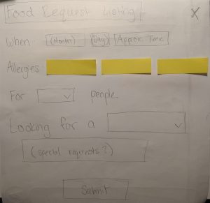
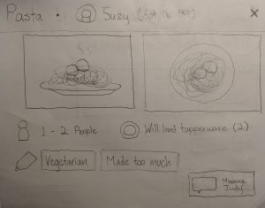
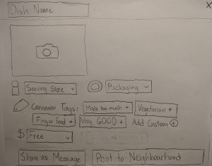
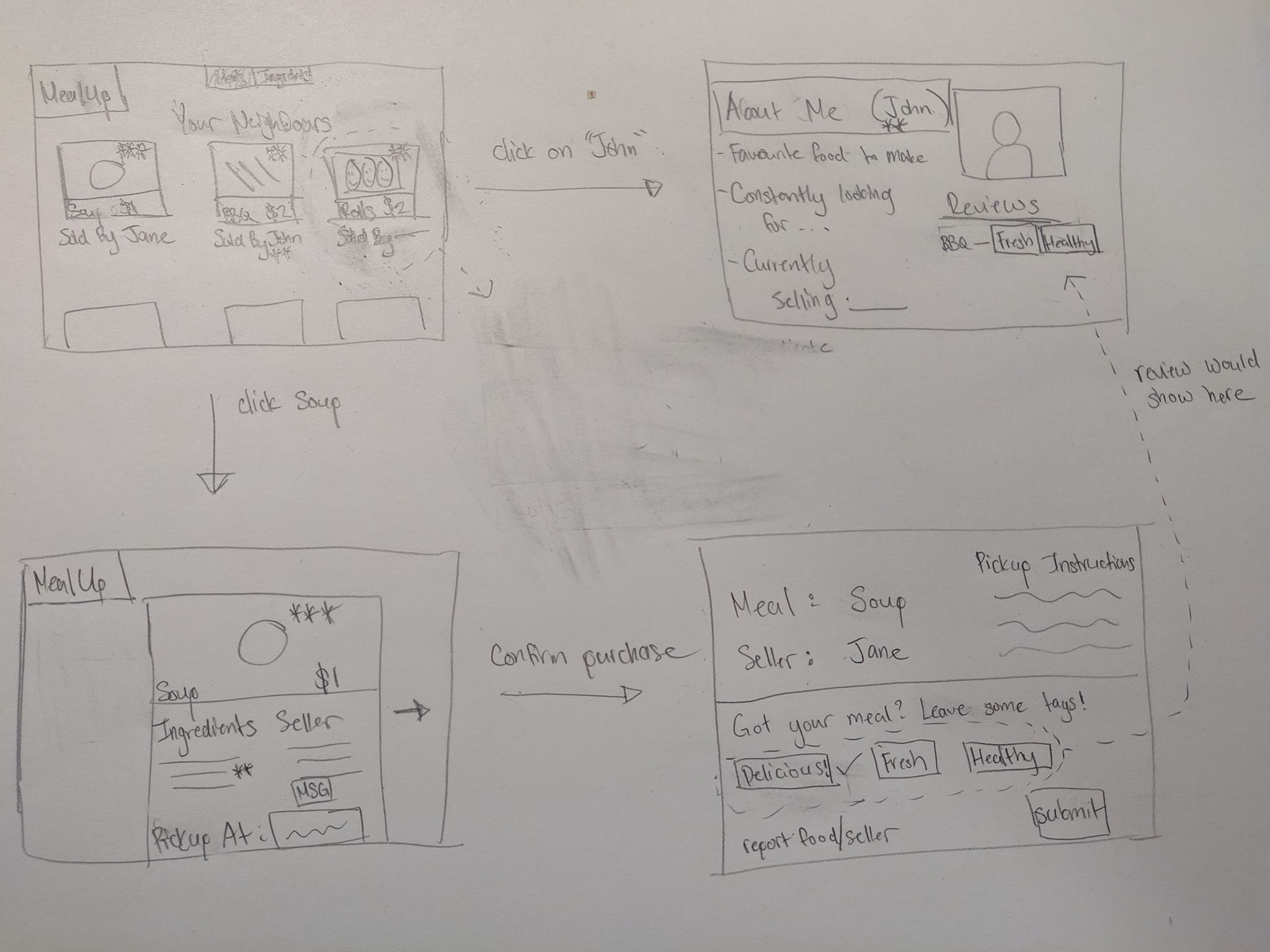
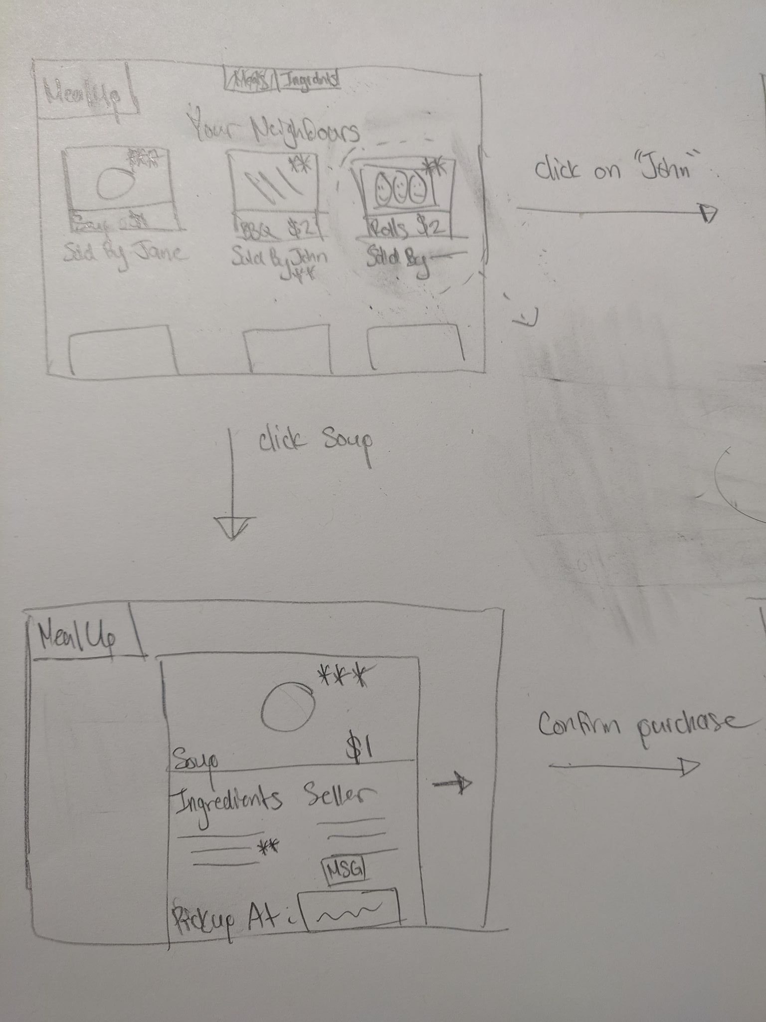
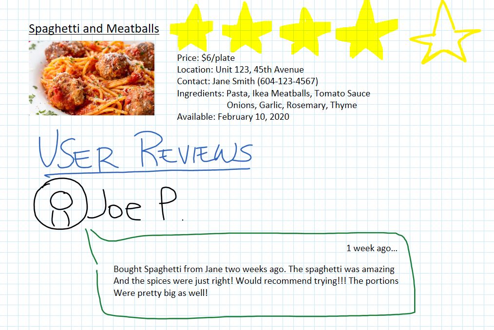
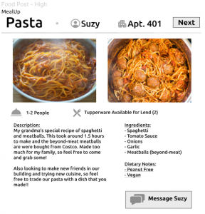
The main difference between the low and high level of information category of the food posts is that the high food post contains a longer description, an ingredients list, and a separate dietary notes section. Additionally, the description also mentions that the user is looking to make friends and willing to share or trade food. For the low food profile, the dietary notes section is mixed in with other hashtag labels.


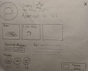
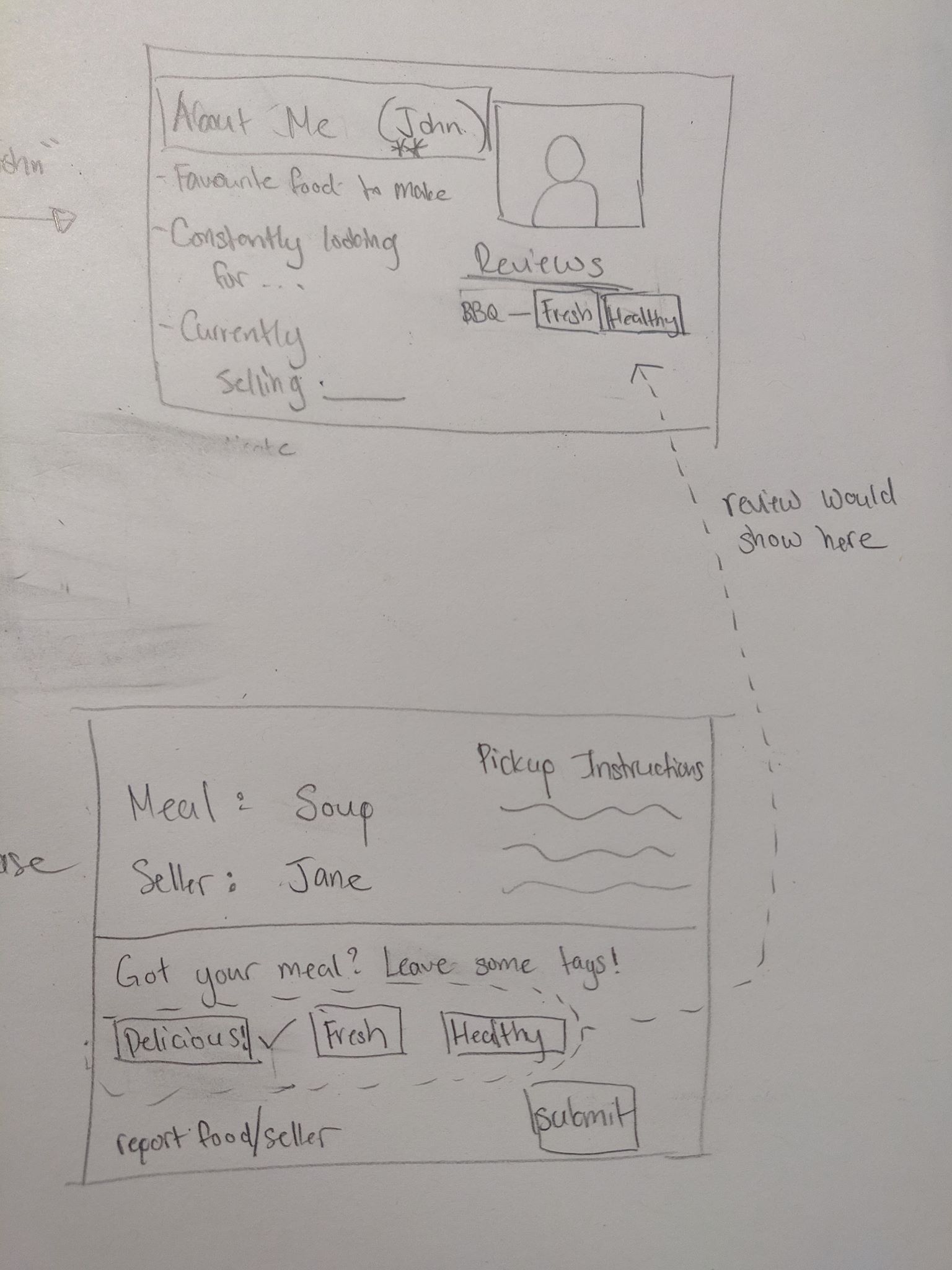
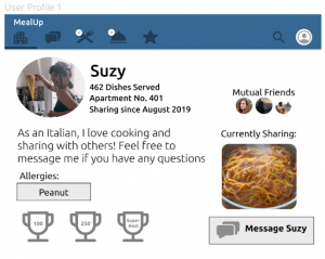
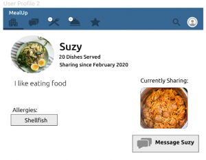
As for the profiles, the main difference between the low and high level of information profiles is that for the high profile, the user uses a real picture, contains the user address, has an awards/trophy section and shows mutual friends.

Experiment 2 will compare the efficiency and overall satisfaction between two distinct layouts for the main page of our interface. The two layouts that we will be evaluating are the apartment view and the list-view layouts. 


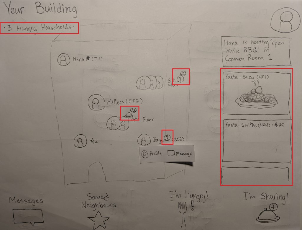
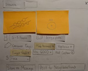
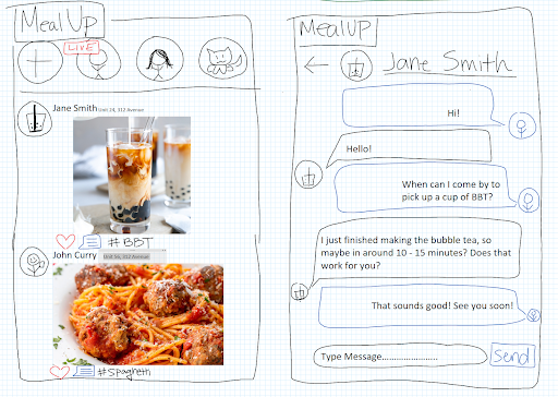
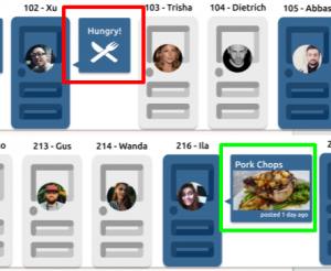
For the apartment view, the layout will be designed to mimic the layout of an apartment, specifically being organized in floors and enabling the user to browse other users on a specific floor. Additionally, each user may visually indicate that they are looking for food, marked with a “hungry!” (red box in picture below) indicator next to their profile, or post a food dish that is available that is indicated with a picture of their food (green box in picture below).

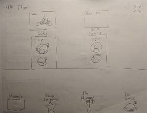
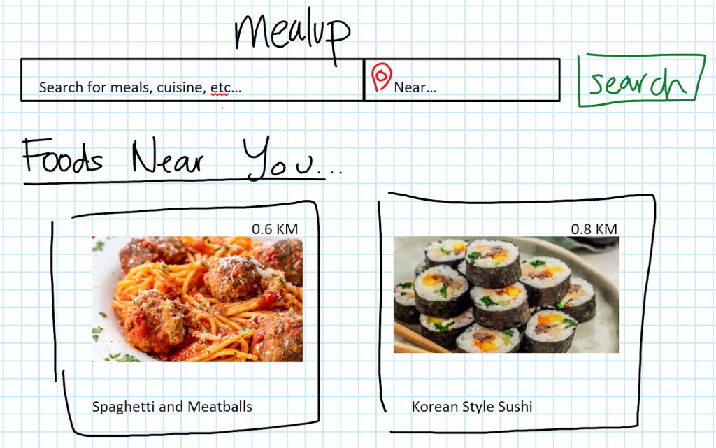
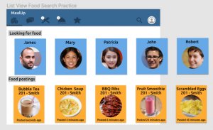
The list view will be simpler and straightforward, featuring two headings that indicate both users who are looking for food and food postings that are currently available.

Experimental Tasks

Experiment 1:

Meal Selection Process Task – this task consists of two parts: comparing between a high/low level of information for food posts, and comparing between a high/low level of information for user profiles. After each part, the participant will be asked to respond to a survey after each comparison.

Experiment 2:

Person-targeted task – For each of the two main page layouts, the participant will be prompted to find a person on a specific floor that is looking for food. For each trial, the screen will feature different people and food listings that the participant will have to search for. Once each trial is completed, an intermediate screen will show for 3 seconds that will prompt the participant for the next trial. An example prompt would say “Find any person living on the 3rd floor who is looking for food”.

Food-targeted task – For each of the two main page layouts, the participant will be prompted to locate a specific food listing. Each listing will be specified only by their name. Like with the person-targeted task, the screen will feature different people and food listings that the participant will have to search for. This task will also utilize an intermediate screen. An example prompt will say “Find the food listing for tomato soup”.

The ordering between these two tasks will also be counterbalanced between participants, but the participant will always complete the food listing task and user profile task before starting the person-targeted task and the food-targeted task. 

Design

Our study consists of two 2×2 within-subjects factorial designs. The first experiment consists of two levels of food postings (Low, High) and two levels of profiles (Low, High). The second consists of two levels of apartment layout (spatial vs list) and two different tasks (person-targeted search vs food-targeted search).

Procedure

Actual procedure may vary in order due to counterbalancing of conditions. The following is one example: 

Experiment 1

  1. Participant will have 2 minutes to to read through a basic user profile and task description.
  2. Participant will perform the meal selection process task.
  3. Participant will complete a survey.

Experiment 2

  1. Participant will have 3 minutes to familiarize themselves to both the spatial-view and list-view layouts of the application.
  2. Participant will perform the person-targeted task after one practice trial.
  3. Participant will perform the food-targeted task after one practice trial.
  4. Participant will complete a survey regarding their experience with both layouts. The survey will help to gather information about which interface was more desirable. 

Apparatus

The experiment will be conducted in different project rooms around the UBC campus. The basic profiles and task description will be printed and given to the participants, and the actual tasks will be conducted on a provided tablet.

Variables

Independent variables
Experiment 1
  • Profile (Levels: Low, High – within-subjects)
  • Food Posts (Levels: Low, High – within-subjects)
Experiment 2
  • Layout (Levels: Spatial, List – within subjects)
  • Search Task (Levels: Person-centered, food-centered – within-subjects)
Dependent variables
Experiment 1

User Trust Level – using a Likert scale to record data and determine the level of trust the participant has with different food posts and user profiles (with different levels of information). The participant will fill out their preferences after the completion of the first task.

Experiment 2

Average time to complete – for each task, the average amount of time between trials will be calculated. The time for each trial will be recorded in a spreadsheet and verified by reviewing the video recording session.

User satisfaction – after completing both tasks, the participant will report their satisfaction with a brief survey that includes six Likert scale questions, and a question asking about which layout they overall prefer.

Control Variables
Experiment 1

Order of interfaces – will be counterbalanced

Order of information level – will be counterbalanced

Experiment 2

Order of layout – will be counterbalanced

Order of search task – will be counterbalanced

Hypotheses

Participant Trust Level

H1: Higher levels of trust for user profiles with higher levels of detail will be reported than those with lower levels of detail.
Null: There will be no difference in the reported values for trust between the two user profiles.

H2: Higher levels of trust for food posts with higher levels of detail will be reported than those with lower levels of detail.
Null: There will be no difference in the reported values for trust between the two food posts.


Layout

H3: There is a difference in the time spent in performing (search tasks) between the two layouts.
Null: There will be no difference in the time spent in performing (visual search tasks) between the two layouts

H4: There will be a difference in the reported desirability between the two layouts.
Null: There will be no difference in the reported desirability between the two layouts.

Planned statistical analyses

For experiment 1, we will be using ANOVA (Analysis of Variance) to test the difference of means between ratings, information level, and profile vs food post. 

For experiment 2, we will use analysis of variance (ANOVA) to test the difference in means between search time and the overall satisfaction between the two layouts. We will mainly be looking at whether the layout has a main effect, but we will also determine if there is an interaction effect between layouts and tasks. The ordering of the tasks and of the layouts will also be considered.

Expected limitations of the planned experiment

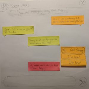
For experiment 1, our task would not be a realistic situation since the participant will not be going through the normal flow of the interface to get to these pages. Additionally, the participant will not be able to message the other party to develop trust between each other, which may affect the findings of our analysis, since actual users of our interface can develop trust in other ways than just the amount of information given.

In regards to experiment 2, while it is reasonable to assume that a user will want to search for both food and other users who are looking for food, we did not provide a way to filter information or perform the task based on a criteria. For example, it is likely a user would want to find meals that are suitable for a vegetarian diet. Another way to filter through postings could be to provide times in which a person will specifically be looking for food, allowing a user to plan ahead on when they will desire food. However, since a visual search forms the basis of these activities, it will still provide useful evidence for which layout is most efficient and desirable. Future research should be conducted on how to best implement some of the features listed above.

Supplementary experiment materials

Experiment 1 – Profile and Task Description

Experiment 1 – Survey

Experiment 2 – Survey

Consent Form

Call For Participation Form

Blog Update #3

Further Updated Task Examples

1. Tony – the time-constrained salaryman

Tony is living in a studio apartment with his girlfriend. Both he and his girlfriend work full-time and often work overtime as well. This leaves him with minimal time to buy groceries and prepare food for him and his girlfriend. Tony doesn’t want to keep ordering food delivery from restaurants as the delivery fees and bills are stacking up, and the restaurant foods are too salty and greasy for his liking. However, food delivery is the most convenient and time saving compared with his other options of buying groceries and cooking or eating out at restaurants.

2. Adam – the new cook in town

Adam recently moved from Port Moody to Vancouver to be closer to his new workplace. One of Adam’s hobbies is cooking as it allows him to try food from various cuisines. Living with his family allowed him to cook multiple dishes at a time since he would always have people to share his food with him. This is now an issue for Adam since he lives alone, he finds it hard to adjust his cooking style to cook just one portion. He is constantly finding himself with too many leftovers and feels that the leftovers are preventing him from cooking and trying new dishes. Unfortunately, since Adam is new to his condo, he hasn’t found anyone to share his food with yet.

3. John & Mary – the generous neighbours

John and Mary have been living in the neighbourhood for over 20 years with their 3 children. They own a 5 bedroom house and they are also renting out their basement suite. Currently, Mary prepares meals for her family as well as the tenant. To do this, she has to go grocery shopping twice a week. Mary loves to cook and experiment with cooking new recipes, however, she often makes too much and her fridge is filled with leftovers. Her family is sick of eating the same foods for days until they finish the leftovers, otherwise the extra food will go in the trash. Mary wishes she knew more neighbours that she could share her food with.

Low-Fidelity Prototype Demonstration

Our lo-fi prototype design centers around supporting the user’s ability to act as both a food provider (Adam & some of the John/Mary task example) and receiver (Tony task example) in their neighbourhood groups (in this case, an apartment-specific group). As such, our prototype maintains a mostly horizontal scope in order to reflect a breadth of features. It was also decided that the interface will be a mobile app in order to leverage certain hardware features (assume the following images are on a tablet).

The sign-up process for a group includes both profile creation and a verification or invitation process. Household allergens are also specified here. There is a balance to strike between in-group intimacy and privacy of user information that might look like what we would expect of a private Facebook group dedicated to the apartment, so in this specific example, the group would require some Location ID (given by an admin or creator) to verify you live at a given apartment number.

The main screen, from which users are able to take any number of actions, is a spatial layout of the whole neighbourhood at a glance. Neighbours that have marked themselves as hungry and neighbours that have posted food listings are both indicated in multiple ways.

Sufficiently crowded floors might warrant zooming into a hallway view.

A hungry user such as Tony might select “I’m Hungry!” from the main page to indicate he is looking for food. This can be a simple toggle, or it can involve visiting this page and scheduling a future time Tony knows he won’t be able to cook for himself.

A hungry user such as Tony might also just select the Pasta he sees on the main page, bringing up this box. A name, a price (if not free), pictures, serving size, kitchenware requirements, and tags all provide some insight into the dish.

The requesting process takes place in messages, with links to the relevant food item. This process is very importantly conversational. It allows flexible conversation about things such as allergies or pickup times, but differentiates itself from something like Facebook Messenger with important guidance prompts at different food-sharing steps. These include the ability to call food providers without needing to share phone numbers and bookkeeping of things on loan (such as Tupperware).

Profiles might also be accessed from either messages, listings, or the main screen. Neighbors can be “starred” to save for quick access in other contexts. Some additional incentive to share food, and, on a related note, some additional incentive to choose trusted cooks (as opposed to our previous review/rating system ideas) might arise from the use of a medal system and count of dishes shared.

Sharing food, like in the Adam or John/Mary task examples, is initiated from the neighbourhood page. This opens up a box designed with efficient entry in mind–listing food should not be another chore on top of making it. This is supported by features such as tapping common/suggested tags and taking pictures from the device camera.

Once completed, a food posting can be shared in one of two ways: 1. As a message to a specific person. This is something John & Mary might like to do, having established themselves in their community and having starred a certain person they know likes their leftovers. 2. As a posting to the neighbourhood group. This better supports Adam’s task example, where it would really just be nice if he met anyone who wanted some food.

The messaging function, now initiated by Jorge (who would like some skewers), has guidance prompts for the food provider role as well. It prompts the cook to mark dishes as safe for household-specified allergens allergens (and possibly communicate back and forth if there is any confusion).

And ultimately let the recipient know they can come over and receive food!

Additional Information about Prototype

All three of our task examples were supported to some extent. In support of Tony, we had to evaluate the task of seeking food from users who had already posted up available dishes. Conversely, we had to evaluate the ability to list available food to everyone else in the area. To further support both Adam and John and Mary, we wanted to demonstrate how a food listing can be efficiently communicated to existing friends.

For this prototype, we made sure to focus on a horizontal scope in order to gain insight into which tasks might be the hardest for users. We aimed to reflect a breadth of buying/selling behaviours without focusing on details such as how the main page is updated with new users or detailed walkthrough of a payment system.

One major design decision we had to make was how we wanted to display other users, how much info should be visible at first glance, and the layout of users. Two of our ideas aimed to have our main page focus on showing a portion of all neighbors at a time and a status of whether they are looking or giving out food. To simplify this prototype, we assumed that this instance was used in an apartment, as it showed the best alignment with our ideas and that if it worked well it can easily be tweaked to include houses on a map. Our first idea was to have the main screen mimic a scrollable hallway that would extend to include all users, and our second idea was to provide a spatial layout of all users that represented the floors each user was on.We ended up utilizing both layouts based on whether the user wanted a wider view or narrower view of other users.  

While we hope to explore and evaluate more methods to establish trust between users and create connections in our experimental methods, we chose to display the amount of meals a user has given out as an indication for trust and safety. We also allow for food listings to include information that might be relevant to whether recipients are comfortable requesting a dish (e.g. pictures of the final product, tagging dish as leftovers).

For a form of communication, we chose a simple messenger application akin to Facebook Messenger or WhatsApp because it has shown to be the most common interface for text communication. However, we decided to embed it with prompts and allergy acknowledgements in hopes of creating a streamlined but communicative buying and selling process that is safe.

Walkthrough Report

For our cognitive walkthrough, we asked the user to perform a series of tasks, playing as both a provider and a recipient. These tasks included: signing up, listing food available for sharing, messaging potential buyers or sellers, and browsing and scheduling for a pickup. The overall process was quite smooth however, there were a few areas where the user was confused about. 

The first main area of confusion was in the signup page where the user had to enter a location ID and an occupancy amount. For location ID, the user did not know what to enter and needed an explanation as to what it was. This confusion could be because of the naming convention or the lack of information or “help guide” as to what the location ID was and how the user could get it. After entering an ID, there was a pop up that said “verification” and the user was confused as to whether it was a button they needed to click for additional verification or if it was a message. This confusion could be reduced by perhaps changing the lettering to “verified” with a check mark in the front. Additionally, the user was confused about the “occupancy” field and needed further explanation as well.

Another point of confusion was during the task of browsing for food to purchase. The spatial layout on the homepage with the layout of the apartment building with floors was confusing for the user as they did not know where to press or how to browse. They skipped using the spatial layout and browsed for food using the image layout on the side as it was more familiar for them. We had to explain the spatial layout to them before they understood what it was and how they could browse with it. This may be a problem area that we need to focus on and figure out which layout would be better to perform the browsing task.

The task of listing available food to share, messaging potential buyers or sellers, and browsing/scheduling for pickup went smoothly. This is possibly because we used very standard layouts for these tasks and mimicked existing applications. For the listing food to share and scheduling for pickup screen layouts, we mimicked current food delivery applications. For the messaging task, we mimicked the social media app, Facebook Messenger. Since the user was familiar with the layouts already, they were able to successfully complete these tasks without issue.

The walkthrough covered all three of our task examples. For Tony, we incorporated the browsing and pickup of food, for both Adam and John/Mary, we incorporated listing available food for pickup as well as contacting potential buyers through messaging.

Proposed Goal(s) of Experiment

  • Evaluate what features of a posting can help increase trust for a potential consumer
  • Evaluate whether users prefer having an interface that allows them to scroll through a list of available items or an interface that shows all the users registered for the apartment with their current status
  • Evaluate the best way to facilitate conversation between the two parties

One takeaway we gathered from our field study was that participants who have little interaction with their neighbors generally have a lower level of trust with one another. Our first goal is to help us understand what kind of information should be shared to increase trust between users. We will be evaluating this goal through analyzing multiple features such as, attaching pictures of the food in the posting versus not attaching a picture, viewing an user with a completed profile versus a partially completed profile. 

Our second goal is to help us better understand how to design our main page in order to maximize the user experience and better display information to the user. A design option we have is to list the items that are available on the main page. Although this option helps users to efficiently see what items are offered at that moment, we feel that this layout hinders the ability to include a community aspect to the application which was one of our original intentions. Our solution to implement this aspect is to create an interface that shows which users are registered in their building alongside their current status. 

Our third goal is to better evaluate how users want to communicate with one another. Since we want to increase trust between parties, we plan on including a feature that allows users to easily converse with one another either through call or text.

Blog Update #2

Next Steps

Moving into prototyping, our biggest focus will be figuring out how to develop and maintain a level of trust between strangers who live in the same building or area. Without this, users may be reluctant to share to begin with. By exploring different design alternatives, we hope to find a method of communicating trust that is effective and safe, meaning concerns about consuming food produced by neighbors will be alleviated as much as possible. We also wish to create a prototype with building a rapport between users in mind. 

We aim to accommodate needs unique to both providers and receivers (respecting that some users may fill either role in our design). A buyer should feel safe acquiring and consuming food, efficiently find food that fits their needs, and provide feedback to a seller that other potential buyers can utilize. A seller should be able to advertise their food accurately and efficiently, and feel the same sense of satisfaction that comes with sharing practices as they exist now.

Additional recommendations might be to consider the timing of food availability and the ability to support sharing ingredients (possibly regarding this as a special, simple version of the process for sharing meals).

Revised Task Examples

1. Tony – the time-constrained student.

Tony is a UBC student who lives in dorms on campus with his girlfriend. He is currently taking 5 courses and is swamped with homework and weekly assignments. This leaves him with minimal time to buy groceries and prepare food for him and his girlfriend. Tony doesn’t want to keep ordering food delivery from restaurants as the delivery fees and bills are stacking up, and the restaurant foods are too salty and greasy for his liking. However, food delivery is the most convenient and time saving compared with his other options of buying groceries and cooking or eating out at restaurants.

2. Adam – the cook for numerous people.

Adam recently moved from Port Moody to Vancouver to be closer to his new workplace. One of Adam’s hobbies is cooking as it allows him to try food from various cuisines. Living with his family allowed him to cook multiple dishes at a time since he would always have people to share his food with him. This is now an issue for Adam since he lives alone, he finds it hard to adjust his cooking style to cook just one portion. He is constantly finding himself with too many leftovers and feels that the leftovers are preventing him from cooking and trying new dishes. Unfortunately, since Adam is new to his neighborhood, he hasn’t found anyone to share his food with yet.

3. John & Mary – the generous neighbour.

John and Mary have been living in the neighbourhood for over 20 years with their 3 children. They own a 5 bedroom house and they are also renting out their basement suite. Currently, Mary prepares meals for her family as well as the tenant. To do this, she has to go grocery shopping twice a week. Additionally, as the couple are very close with their neighbours, they often will babysit each other’s children as well as share food with each other. During holidays, their tradition is to bake cookies and other appetizers to share with extended family and neighbours.


Prioritized List of Requirements

Absolutely must include:

The requirements in this category mainly include basic abilities for users to interact with listed items. From our field study, we found that not everyone is comfortable and trusting of their neighbors, so we strongly believe that creating a system to build trust between one another will be crucial in supporting the application.

  • Users must have the ability to:
    • Browse accurate depictions of food and see food items that are available
    • Post food for sale or give away for free
    • Purchase (claim if free) food for a clear cost in relation to the proportion and quality of food they are getting
  • A system that can help build trust between users so that they feel safe using the application and interacting with one another
    • At the moment, we have a couple of ideas on how we can increase trust (for example, writing reviews for the food vs writing reviews for the user who posted) which will need to be explored further.
    • A level of trust should communicate with users that a seller is legitimate in what they sell, and that they do not need to have any health concerns consuming their food

Should include:

This category includes features that helps to create trust between users and the system. To build trust, we want users to be able to learn more about each other, so they don’t feel like they are strangers. Additionally, we found that knowing the process of how a food is prepared is valuable to know as well.

  • A system to facilitate messaging between users
  • Allow users to communicate the allergens in the household of the receiver
  • Ability for users to edit their own profiles and view the profiles of other users
  • The ability for users to communicate the process of how food is prepared when listing an item up for sale

Could include:

The features in this category are non-critical and provide users with an easier way to search for food and learn more about a dish.

  • Tags so that users can filter through all the available options
  • Ability for users to post a complete ingredient list in food
  • Ability to put up ingredients that have not been cooked yet

Could exclude:

We believe that this feature would be nice to have for those who have established themselves within a neighbourhood and regularly interact within one, but we want to maintain a focus on building food sharing rapport where it does not exist and leveraging computing to make it more efficient where it does. Swapping is relevant to the latter case, but it is not critical we explicitly afford swapping.

  • Ability for users to swap/trade foods explicitly

Design Alternatives

Alternative #1: Card System (UberEats-esque)

With this design, users are able to scroll through previews of dishes that are available near them. On each preview, it could display a picture taken of the dish, name, price, and a rating that shows how popular the dish or seller has been recently. Clicking on the preview would bring up more details of the dish, such as ingredients (with allergens being highlighted), a high-level description of how it was prepared, special notes by the seller, a way to contact the seller, and a way to indicate your interest in the meal. Users can also choose to view a seller before looking at the food they are selling to see a short bio and reviews given to them. After arranging to order a dish, the buyer will have the option to leave positive feedback tags about the food or the seller, but also the option to report something that went wrong.


Pros:

  • Easy to show list of available dishes in their area with relevant details
  • Personalizable bio on the profiles allows sellers to express themselves but also indicate what food they like to prepare
  • Positive feedback tags are simple to use to encourage buyers to leave feedback for other buyers

Cons:

  • Reviews are limited by predetermined tags and can’t leave personal comments
  • A lot of initial trust is based on first impression and ability for the seller to disclose information about their dish or their profile (e.g limited by language or communication skills)
  • If a user wanted to see if there was a type of food available, they are limited by their ability to scroll through the cards

Alternative #2: Review System (Yelp-esque)

For alternative 3, we plan to have a web application where users can search for food similar to how Yelp searches for restaurants. There would be a search bar and the user can filter by different preferences, like price, culture, etc.

Additionally, once the user selects a food that they want to purchase, they will be able to see the reviews that the seller has. Previous buyers are able to rate the food out of 5 stars with 5 being the best, upload images of the food that they received, and write comments as well. 

Pros:

  • New users will be able to easily see previous reviews and comments of sellers and if the reviews are good, they may develop a sense of trust with the seller for the food that they are buying.

Cons:

  • Since this system would be used ideally for neighbours or people living in a close area, it may be hard for users to leave truthful or bad reviews, which may skew the system.
  • There may be limited sellers in the area, and the review system may not be as beneficial in the long run, especially since the buyer may have developed a stronger relationship or sense of trust with the seller over time

Alternative #3: Casual Messaging Platform (Instagram-esque)

For our fourth design alternative, we plan on having a casual messaging platform where sellers can take pictures of the food that they are selling, write descriptions, add hashtags, upload videos or live stream their food preparation, as well as create posts that will show up on the newsfeed of the platform. Buyers can then sort the newsfeed based on hashtags, distance, price, or by who they follow and scroll through to see what food is available to purchase. The buyer can also tune in on a live stream or look at videos of how the food was made to be able to see what the food preparation process is like. When the buyer is interested, they can send direct messages to the seller to arrange for time of pickup or ask any questions that they have.

Pros:

  • By giving the option for the seller to post their food preparation process, they can help to establish a sense of trust in the food that they make for their customers/neighbours
  • Buyers would be able to see the videos of the food preparation and judge for themselves if the preparation meets their standards
  • With the direct messages system, it would help encourage interaction between the buyer and seller, which is ideal in this case because they would ideally be neighbours and can get to know each other.

Cons:

  • Sellers may see video taping or live streaming their cooking process as a hassle and only post descriptions or images of the food that they are selling
  • Buyers may find the layout too big and may have to scroll for longer to find something that they desire

Blog Update #1

Project Direction Changes

The direction and scope of the proposed mealsharing system remain largely unchanged. At the project’s core, it still aims to facilitate buying/selling/trading of food between users in the same building complex/small community. Considerations made that were not originally in the proposal include:  

  • Reflecting more diversity in use cases and target users:
    • Not only an emphasis on building community through food, but also on discovering new types of food (e.g. belonging to different cultures)
    • On building meals with multiple dishes through buy/sell/trade
    • People who like to cook in bulk, but end up with too many leftovers (e.g. those who might like to swap tupperware meals after stretching the same dish out for days)
  • A design-appropriate way to build trust in other users
    • Possible solutions might look like some sort of rating systems and/or user profiles, though this is to be explored in the design process

Task Examples

  1. Michelle is a single parent of 2 children and lives in an apartment complex. To make enough money to support the family, she is working part-time at 2 jobs and she does not own a car. Her schedule allows her to pick up and drop her children from school and spend a few hours with them. This leaves her with minimal time to buy groceries and prepare home cooked food for her children. Michelle doesn’t want to keep ordering food delivery from restaurants as the bills are stacking up and she fears that the restaurant foods may be too salty and oily for her children to eat constantly.
  2. Adam recently moved from Port Moody to Vancouver to be closer to his new workplace. One of Adam’s hobbies is cooking as it allows him to try food from various cuisines. Living with his family allowed him to cook multiple dishes at a time since he would always have people to share his food with him. This is now an issue for Adam since he lives alone, he finds it hard to adjust his cooking style to cook just one portion. He is constantly finding himself with too many leftovers and feels that the leftovers are preventing him from cooking and trying new dishes. Unfortunately, since Adam is new to his neighborhood, he hasn’t found anyone to share his food with yet.
  3. John and Mary just moved into their new apartment a couple of days ago and have been meaning to introduce themselves to their new neighbors. They recently immigrated from Italy to Vancouver and they do not know anyone in the city. The couple knows how to cook outstanding Italian dishes, however, they have not had the opportunity to try authentic home-cooked dishes from other cultures. During their meal prep, they plan to make some excess Italian food with the intention of handing it out to some of their neighbors to start the conversation. Hopefully, in the future, they can trade Italian food for other cultural foods with the new friends that they make. However, they don’t know who else would be interested in becoming friends or trying foods from different cultures in their apartment, so they do not know how much food to make or for who.