Rationale of Medium Fidelity Prototyping Approach
Our prototype consists of three parts: a showcase of screens and interactions (mostly horizontal in scope), prepared trials in which users choose amongst trustworthy food postings, and prepared trials in which users search amongst active postings/people. The horizontal implementation serves to motivate why users might accomplish the latter two tasks, but the bulk of the prototyping effort was to support evaluating design alternatives for these tasks.
We chose this approach in order to validate certain ideas we proposed in our low-fi prototype. We wanted to test (1) what form the information on a food listing or profile should take in order to maximize a user’s trust and (2) whether making the physical layout of the building salient in the app is a good practice in terms of both efficiency and preference. As such, we decided to forego prototyping features such as text field entry or realistic progression through order creation (which would involve taking pictures of food).
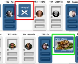
To address (1), we decided to allow users to cycle through scrollable profiles and food listings in order to make more direct comparisons. As this task is largely one of visual appraisal, it was important that the features of these screens (e.g. user pictures, bios, food pictures) appeared to be realistic and differed only in information we intended to manipulate. To address (2), we fleshed out two different versions of a home screen. The ‘list layout’ was created to condense info as much as possible for efficiency’s sake, whereas the ‘apartment layout’ was made to reflect the spatial layout of the apartment. We would like to advance the latter as a way to better support thinking of the building in terms of floors, doors, and neighbours inside them. We imagine stereotypical ‘apartment life’ tasks (e.g. grabbing food from the first floor on the way out) might be best supported in this layout. With that being said, it introduces a lot of clutter. To this end, we prototyped multiple trials for two different search tasks within each layout. As we also aim to ask about preference, we decided both layouts would have realistic food and profile pictures. The apartment layout would also be displayed over a small building to better communicate what exactly users were scrolling through.
We chose to prototype in an iPad frame in Figma in order to best reflect the sort of touchscreen interaction we expect of the final interface (ideal for timing tasks) without significant effort programming for iOS or Android. This tool best supported mocking up screens and overlays for the horizontal prototype, generating believable pictures using plug-ins, displaying profiles in a slideshow-y manner for experiment 1, and mocking up rearranged test trials with time delays for experiment 2.
Prototype Demonstrations
The following is a video demo showcasing features implemented:
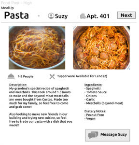
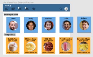
To serve our experimental goals, we have separate playable pages in the Figma prototype consisting of sequences of trials. These can all be played in different orders to easily implement counterbalancing. In experiment 1, users tap through a food post with a description and list of tags (left) into one with a longer description and comprehensive list of ingredients (right).

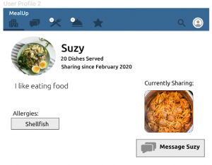
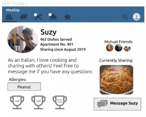
Users also tap through profiles with notable differences in bio length, app experience, profile picture, mutual friends list, and trophies.
In experiment 2, users are asked to find and tap a specific food or browse for and tap a hungry person on a given floor. We prototyped a progression through trials on each layout for each task. New targets are provided in each task in order to factor out memorization, and rearranged in order to cover a reasonable horizontal span of the lists (left) and horizontal and vertical span of the building (right).
The practice trial for each interface begins with a blinking overlay indicating scrolling directions (visible in video). Trials are separated by a timed instance of the following screen: