Further Updated Task Examples
1. Tony – the time-constrained salaryman
Tony is living in a studio apartment with his girlfriend. Both he and his girlfriend work full-time and often work overtime as well. This leaves him with minimal time to buy groceries and prepare food for him and his girlfriend. Tony doesn’t want to keep ordering food delivery from restaurants as the delivery fees and bills are stacking up, and the restaurant foods are too salty and greasy for his liking. However, food delivery is the most convenient and time saving compared with his other options of buying groceries and cooking or eating out at restaurants.
2. Adam – the new cook in town
Adam recently moved from Port Moody to Vancouver to be closer to his new workplace. One of Adam’s hobbies is cooking as it allows him to try food from various cuisines. Living with his family allowed him to cook multiple dishes at a time since he would always have people to share his food with him. This is now an issue for Adam since he lives alone, he finds it hard to adjust his cooking style to cook just one portion. He is constantly finding himself with too many leftovers and feels that the leftovers are preventing him from cooking and trying new dishes. Unfortunately, since Adam is new to his condo, he hasn’t found anyone to share his food with yet.
3. John & Mary – the generous neighbours
John and Mary have been living in the neighbourhood for over 20 years with their 3 children. They own a 5 bedroom house and they are also renting out their basement suite. Currently, Mary prepares meals for her family as well as the tenant. To do this, she has to go grocery shopping twice a week. Mary loves to cook and experiment with cooking new recipes, however, she often makes too much and her fridge is filled with leftovers. Her family is sick of eating the same foods for days until they finish the leftovers, otherwise the extra food will go in the trash. Mary wishes she knew more neighbours that she could share her food with.
Low-Fidelity Prototype Demonstration
Our lo-fi prototype design centers around supporting the user’s ability to act as both a food provider (Adam & some of the John/Mary task example) and receiver (Tony task example) in their neighbourhood groups (in this case, an apartment-specific group). As such, our prototype maintains a mostly horizontal scope in order to reflect a breadth of features. It was also decided that the interface will be a mobile app in order to leverage certain hardware features (assume the following images are on a tablet).
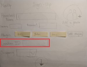
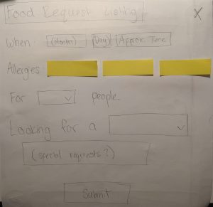
The sign-up process for a group includes both profile creation and a verification or invitation process. Household allergens are also specified here. There is a balance to strike between in-group intimacy and privacy of user information that might look like what we would expect of a private Facebook group dedicated to the apartment, so in this specific example, the group would require some Location ID (given by an admin or creator) to verify you live at a given apartment number.
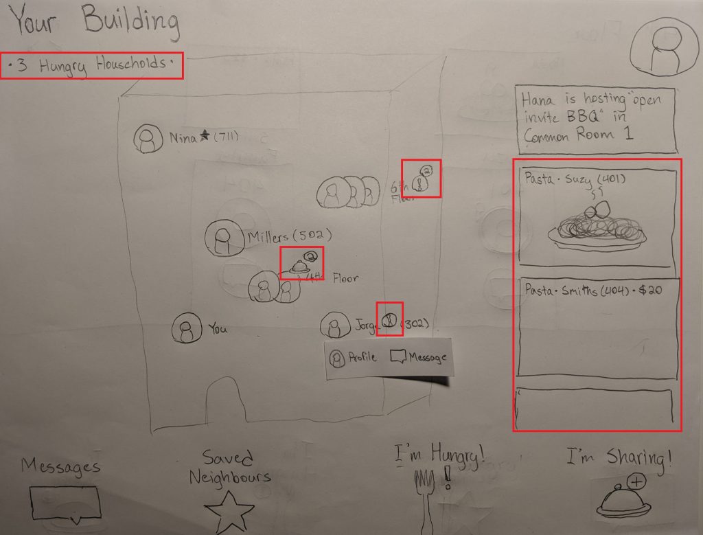
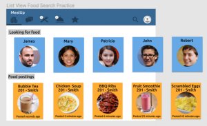
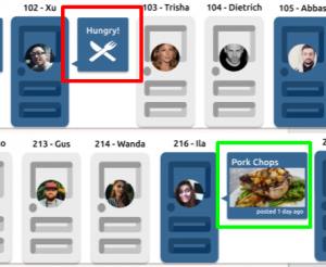
The main screen, from which users are able to take any number of actions, is a spatial layout of the whole neighbourhood at a glance. Neighbours that have marked themselves as hungry and neighbours that have posted food listings are both indicated in multiple ways.
Sufficiently crowded floors might warrant zooming into a hallway view.
A hungry user such as Tony might select “I’m Hungry!” from the main page to indicate he is looking for food. This can be a simple toggle, or it can involve visiting this page and scheduling a future time Tony knows he won’t be able to cook for himself.
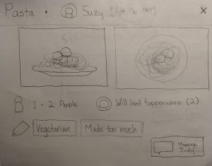
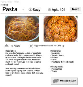
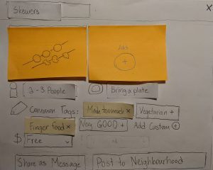
A hungry user such as Tony might also just select the Pasta he sees on the main page, bringing up this box. A name, a price (if not free), pictures, serving size, kitchenware requirements, and tags all provide some insight into the dish.
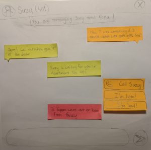
The requesting process takes place in messages, with links to the relevant food item. This process is very importantly conversational. It allows flexible conversation about things such as allergies or pickup times, but differentiates itself from something like Facebook Messenger with important guidance prompts at different food-sharing steps. These include the ability to call food providers without needing to share phone numbers and bookkeeping of things on loan (such as Tupperware).
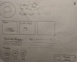
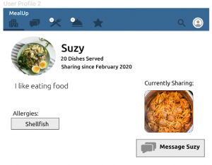
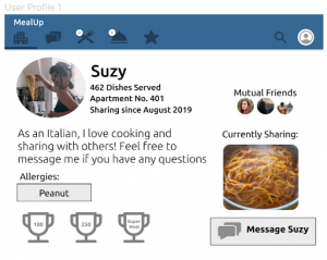
Profiles might also be accessed from either messages, listings, or the main screen. Neighbors can be “starred” to save for quick access in other contexts. Some additional incentive to share food, and, on a related note, some additional incentive to choose trusted cooks (as opposed to our previous review/rating system ideas) might arise from the use of a medal system and count of dishes shared.
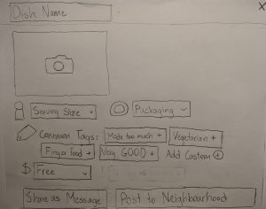
Sharing food, like in the Adam or John/Mary task examples, is initiated from the neighbourhood page. This opens up a box designed with efficient entry in mind–listing food should not be another chore on top of making it. This is supported by features such as tapping common/suggested tags and taking pictures from the device camera.
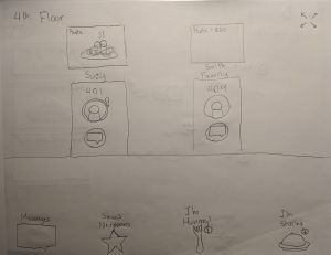
Once completed, a food posting can be shared in one of two ways: 1. As a message to a specific person. This is something John & Mary might like to do, having established themselves in their community and having starred a certain person they know likes their leftovers. 2. As a posting to the neighbourhood group. This better supports Adam’s task example, where it would really just be nice if he met anyone who wanted some food.
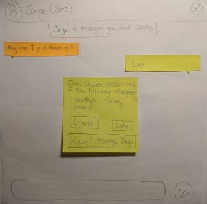
The messaging function, now initiated by Jorge (who would like some skewers), has guidance prompts for the food provider role as well. It prompts the cook to mark dishes as safe for household-specified allergens allergens (and possibly communicate back and forth if there is any confusion).
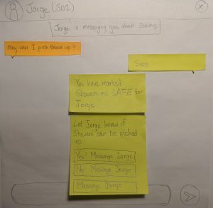
And ultimately let the recipient know they can come over and receive food!
Additional Information about Prototype
All three of our task examples were supported to some extent. In support of Tony, we had to evaluate the task of seeking food from users who had already posted up available dishes. Conversely, we had to evaluate the ability to list available food to everyone else in the area. To further support both Adam and John and Mary, we wanted to demonstrate how a food listing can be efficiently communicated to existing friends.
For this prototype, we made sure to focus on a horizontal scope in order to gain insight into which tasks might be the hardest for users. We aimed to reflect a breadth of buying/selling behaviours without focusing on details such as how the main page is updated with new users or detailed walkthrough of a payment system.
One major design decision we had to make was how we wanted to display other users, how much info should be visible at first glance, and the layout of users. Two of our ideas aimed to have our main page focus on showing a portion of all neighbors at a time and a status of whether they are looking or giving out food. To simplify this prototype, we assumed that this instance was used in an apartment, as it showed the best alignment with our ideas and that if it worked well it can easily be tweaked to include houses on a map. Our first idea was to have the main screen mimic a scrollable hallway that would extend to include all users, and our second idea was to provide a spatial layout of all users that represented the floors each user was on.We ended up utilizing both layouts based on whether the user wanted a wider view or narrower view of other users.
While we hope to explore and evaluate more methods to establish trust between users and create connections in our experimental methods, we chose to display the amount of meals a user has given out as an indication for trust and safety. We also allow for food listings to include information that might be relevant to whether recipients are comfortable requesting a dish (e.g. pictures of the final product, tagging dish as leftovers).
For a form of communication, we chose a simple messenger application akin to Facebook Messenger or WhatsApp because it has shown to be the most common interface for text communication. However, we decided to embed it with prompts and allergy acknowledgements in hopes of creating a streamlined but communicative buying and selling process that is safe.
Walkthrough Report
For our cognitive walkthrough, we asked the user to perform a series of tasks, playing as both a provider and a recipient. These tasks included: signing up, listing food available for sharing, messaging potential buyers or sellers, and browsing and scheduling for a pickup. The overall process was quite smooth however, there were a few areas where the user was confused about.
The first main area of confusion was in the signup page where the user had to enter a location ID and an occupancy amount. For location ID, the user did not know what to enter and needed an explanation as to what it was. This confusion could be because of the naming convention or the lack of information or “help guide” as to what the location ID was and how the user could get it. After entering an ID, there was a pop up that said “verification” and the user was confused as to whether it was a button they needed to click for additional verification or if it was a message. This confusion could be reduced by perhaps changing the lettering to “verified” with a check mark in the front. Additionally, the user was confused about the “occupancy” field and needed further explanation as well.
Another point of confusion was during the task of browsing for food to purchase. The spatial layout on the homepage with the layout of the apartment building with floors was confusing for the user as they did not know where to press or how to browse. They skipped using the spatial layout and browsed for food using the image layout on the side as it was more familiar for them. We had to explain the spatial layout to them before they understood what it was and how they could browse with it. This may be a problem area that we need to focus on and figure out which layout would be better to perform the browsing task.
The task of listing available food to share, messaging potential buyers or sellers, and browsing/scheduling for pickup went smoothly. This is possibly because we used very standard layouts for these tasks and mimicked existing applications. For the listing food to share and scheduling for pickup screen layouts, we mimicked current food delivery applications. For the messaging task, we mimicked the social media app, Facebook Messenger. Since the user was familiar with the layouts already, they were able to successfully complete these tasks without issue.
The walkthrough covered all three of our task examples. For Tony, we incorporated the browsing and pickup of food, for both Adam and John/Mary, we incorporated listing available food for pickup as well as contacting potential buyers through messaging.
Proposed Goal(s) of Experiment
- Evaluate what features of a posting can help increase trust for a potential consumer
- Evaluate whether users prefer having an interface that allows them to scroll through a list of available items or an interface that shows all the users registered for the apartment with their current status
- Evaluate the best way to facilitate conversation between the two parties
One takeaway we gathered from our field study was that participants who have little interaction with their neighbors generally have a lower level of trust with one another. Our first goal is to help us understand what kind of information should be shared to increase trust between users. We will be evaluating this goal through analyzing multiple features such as, attaching pictures of the food in the posting versus not attaching a picture, viewing an user with a completed profile versus a partially completed profile.
Our second goal is to help us better understand how to design our main page in order to maximize the user experience and better display information to the user. A design option we have is to list the items that are available on the main page. Although this option helps users to efficiently see what items are offered at that moment, we feel that this layout hinders the ability to include a community aspect to the application which was one of our original intentions. Our solution to implement this aspect is to create an interface that shows which users are registered in their building alongside their current status.
Our third goal is to better evaluate how users want to communicate with one another. Since we want to increase trust between parties, we plan on including a feature that allows users to easily converse with one another either through call or text.