As Siegfried Kracauer says in “The Little Shopgirls Go the Movies,” films make use of tropes that “reveal how society wants to see itself,” and that “business considerations require the producer to satisfy the need for social critique among the consumers.”
This photo essay seeks to provide a critique of the Vancouver Mural Festival, an arts festival that has been held in the summers of 2016 and 2017 in Vancouver’s Mount Pleasant neighbourhood, the city’s foremost frontier of gentrification, the process by which lower-income (often non-white) residents and businesses are pushed out of areas by landlords and developers, as higher-income residents and businesses replace them.
Multiple local magazine articles have offered critiques of the festival for the sources of its sponsorships, funding, and partnerships: the city government, the Mount Pleasant BIA (Business Improvement Association), and various real estate developers. It’s interesting to also note that a massive international graffiti removal company was also a sponsor. The argument goes that the festival organizers, spurned on by the Mount Pleasant BIA and the city government, are participating in “artwashing,” the method and process often utilized by real estate developers and business associations to distract attention from their presence in areas by using highly aesthetic visual elements.
Some of these methods include supporting local “art” production (such as murals) in specific communities in order to attempt to gain neighbourhood approval of their presence, associating themselves with local artists and art production in order to mix in with larger global art communities, in order to draw attention away from the fact that their interventions in neighbourhoods displace long-time residents and businesses, and destroy the physical character of neighbourhoods at ever-increasing rates. This process has become less and less organic and transparent due to the rapidity and aggressiveness with which it now takes place.
However, it is the uncritical coverage of the event that has made note of the content of the murals, celebrating the Indigenous and female representation in the festivals artists and their respective works. Keeping this in mind, I seek to analyze the assortment of the murals, à-la Kracauer, in order to identify how the city of Vancouver’s urban, upper-middle-class residents view themselves, as well as how they get their fill of social critique.
At this point, it may seem like a stretch to apply Kracauer’s method of analyzing film, a highly collective mass medium onto public art in one area of one city. However, the sheer mass of murals that have gone up over the last two years, as well as the projects’ roots in the upper-middle-class neoliberal realms of boutique businesses, city hall, and real estate result in the comparison being apt. Further, Jesse Mckee and Amy Nugent noted in their article for the online magazine The Mainlander, “Vancouver Mural Festival: The Present Is A Gift For Developers,” that “given that the festival’s programming and selection process rests primarily on securing buildings that say ‘yes’ to a mural, the landlords and developers behind these buildings end up with the power to pick and choose what mural designs go up.”
With that point in mind, there are some easily identifiable tropes that these murals follow:
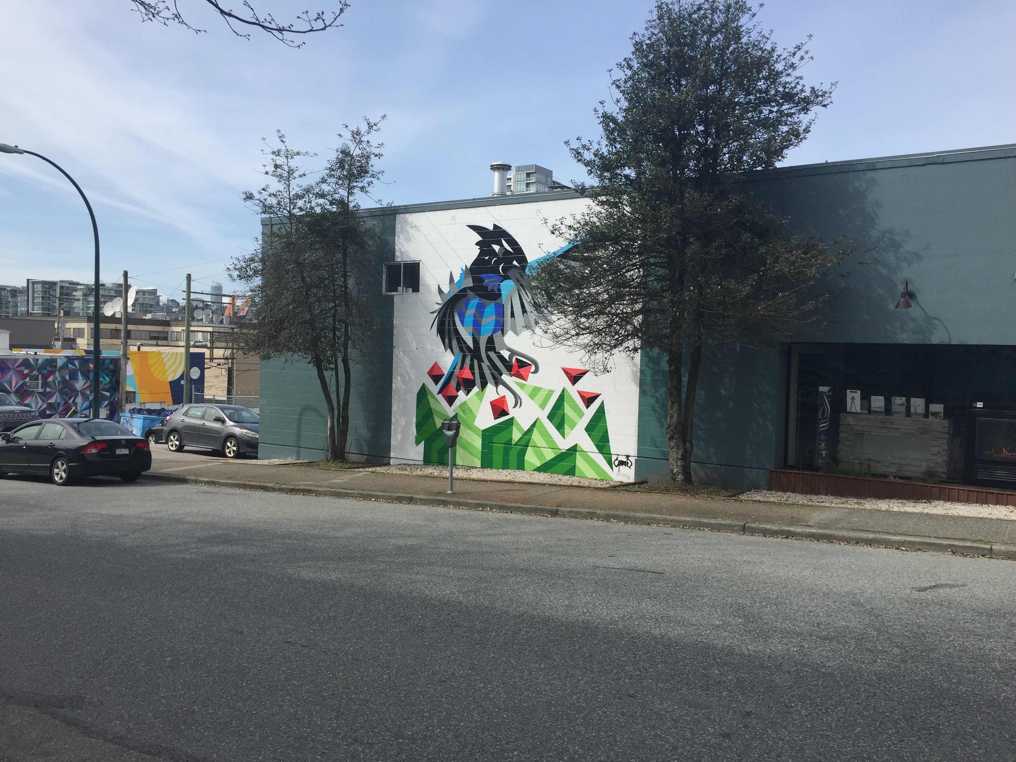
Animals/ Nature
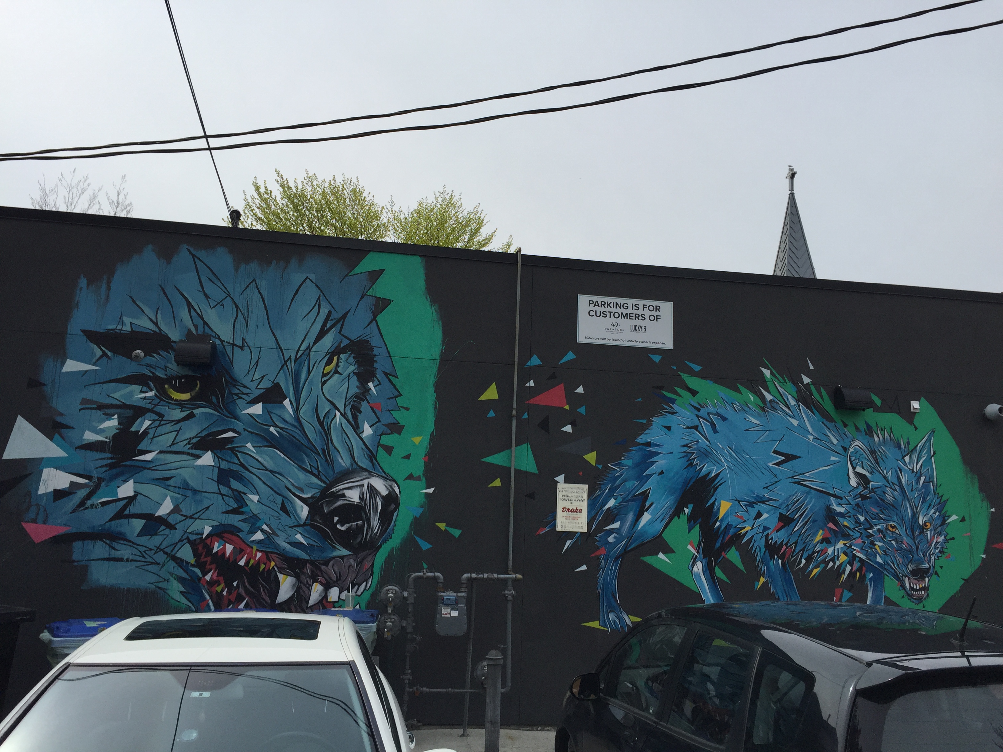
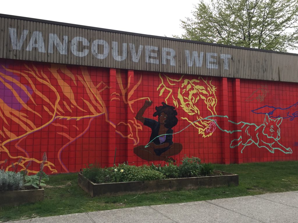
I have no idea what an angry wolf has to do with Mount Pleasant. Perhaps they were around before colonization?
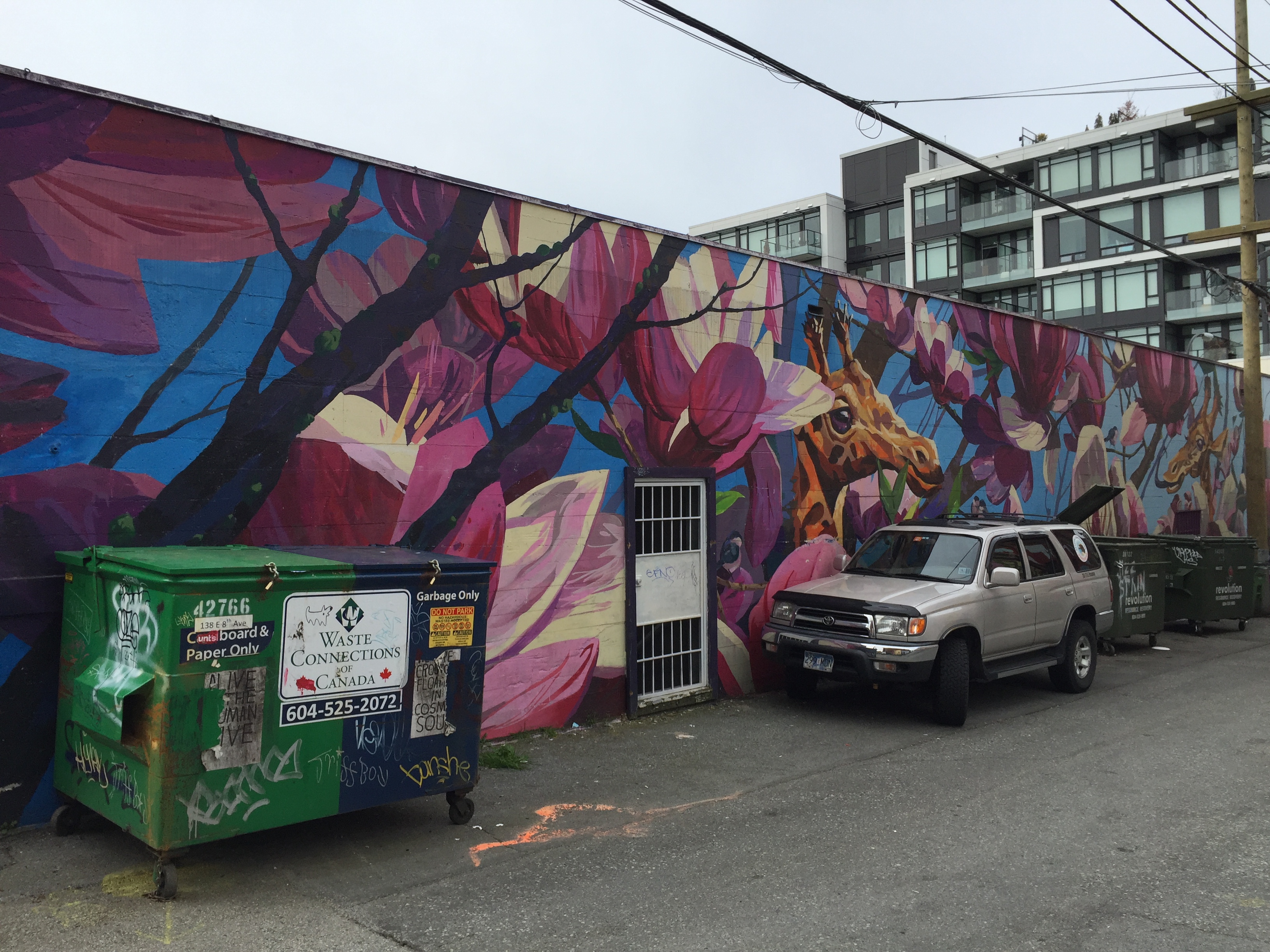
A very pretty giraffe.
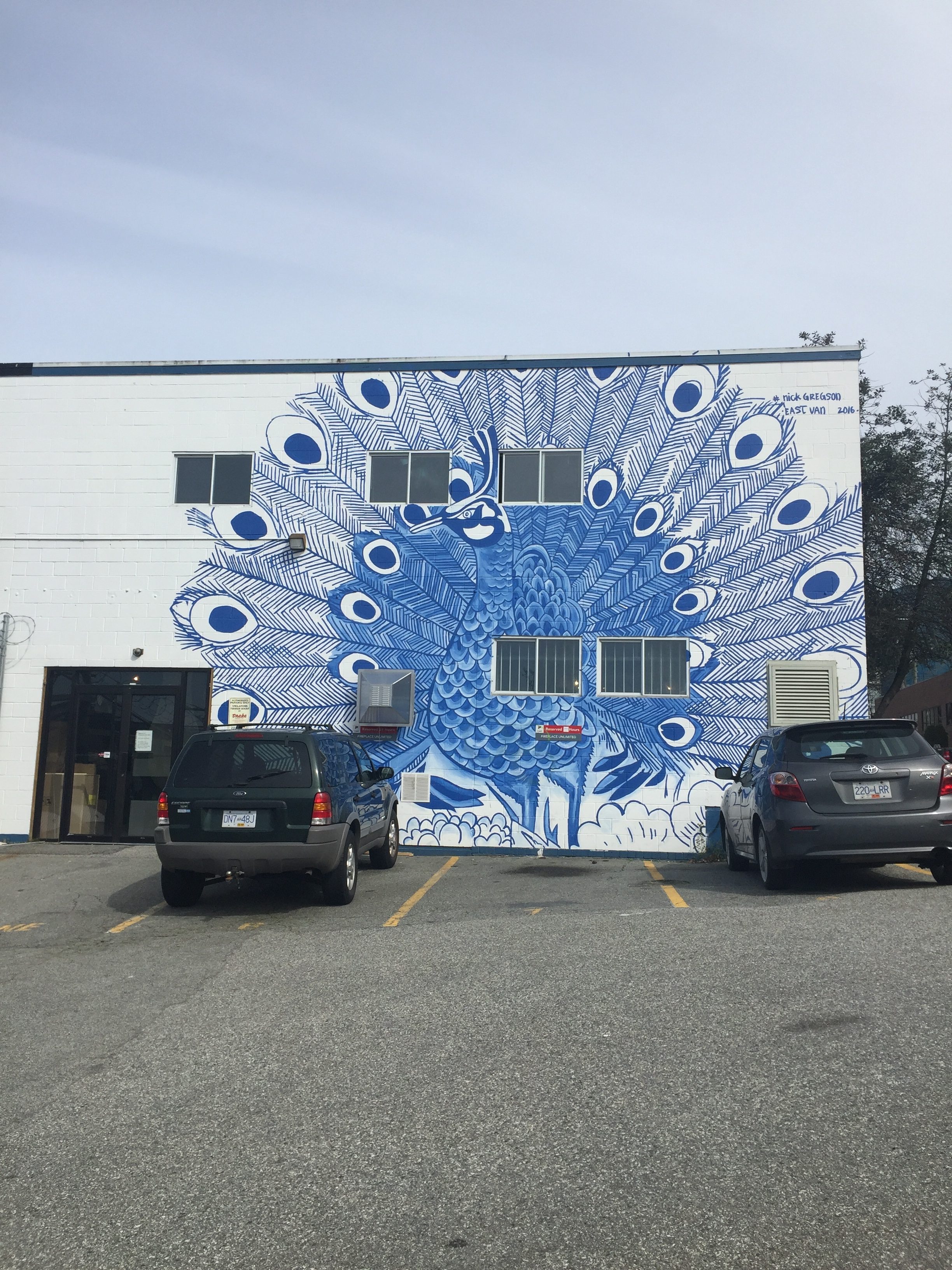
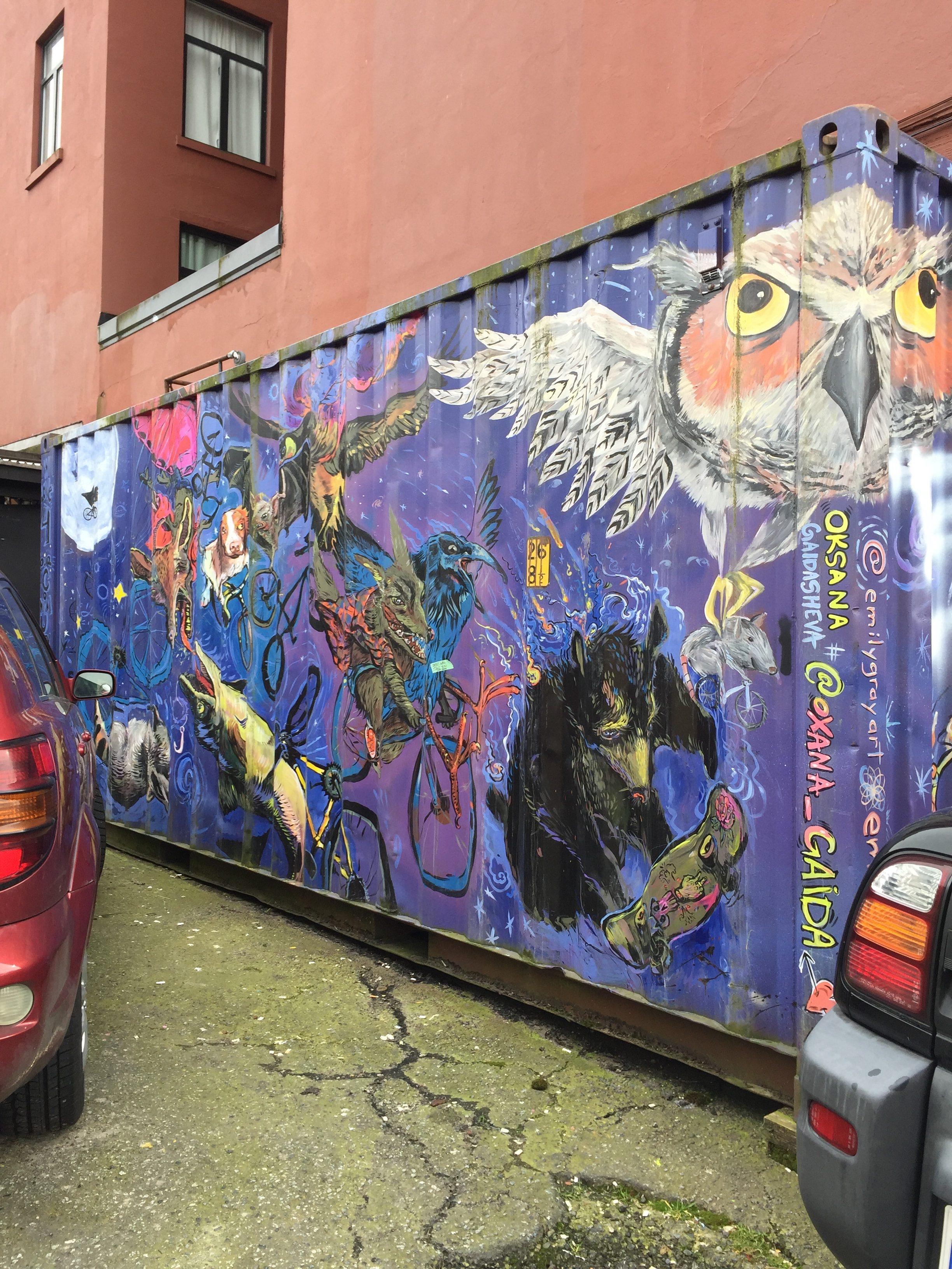
A variety of animals, including a bear skateboarding. How very Vancouver.
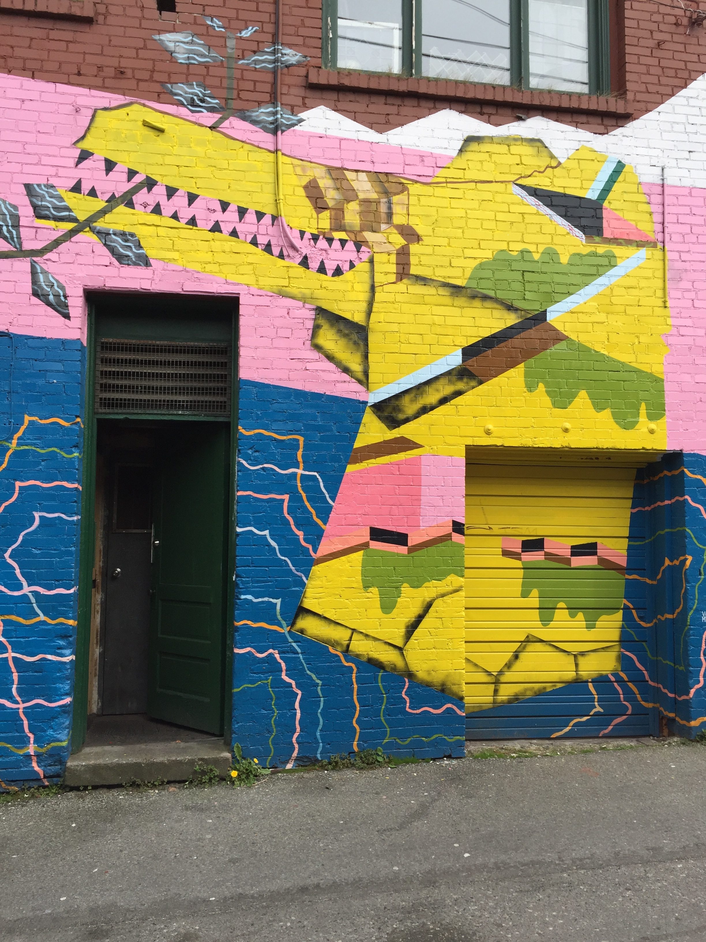
A very random gator
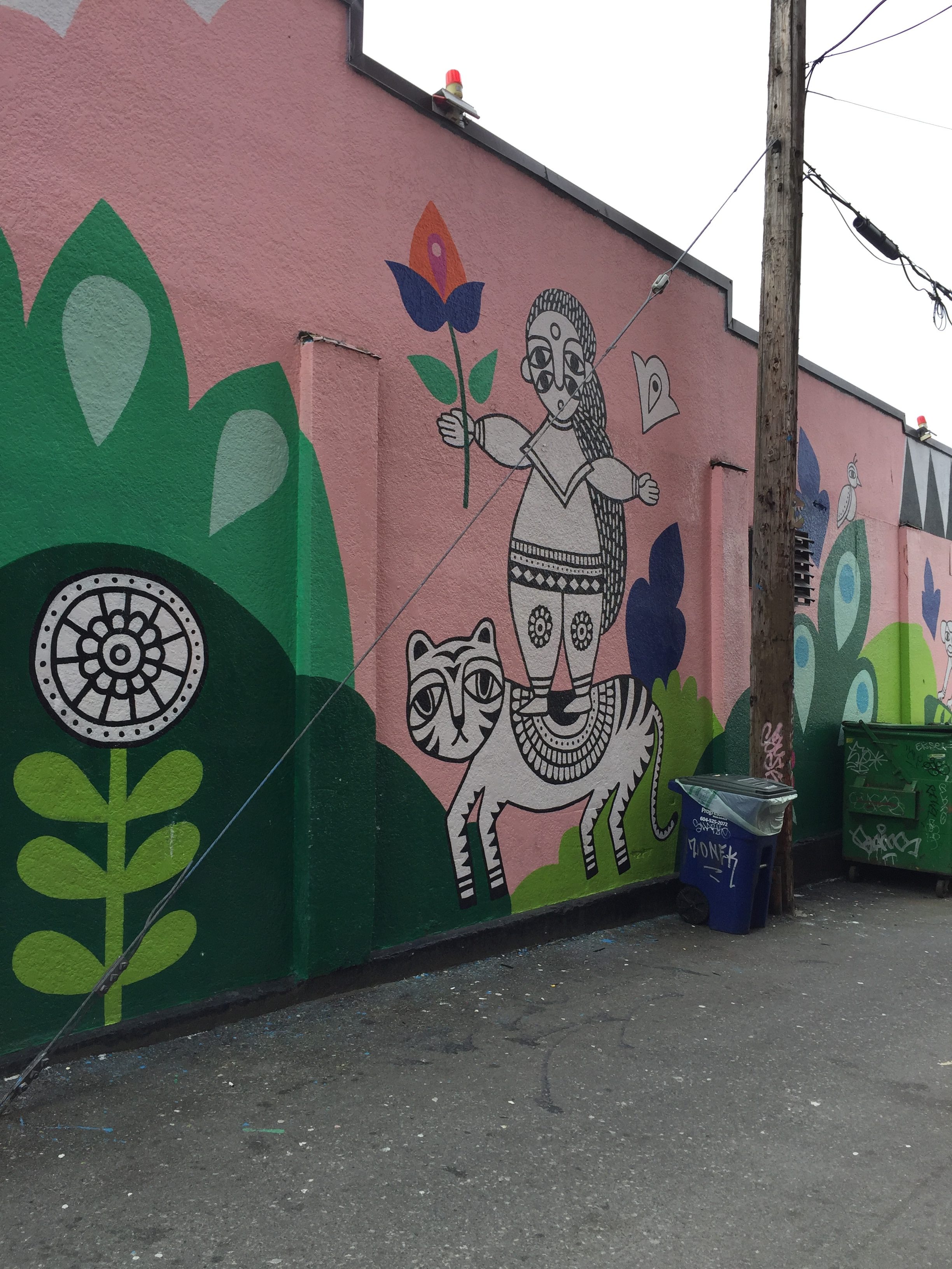
The feline doesn’t look very happy that the human is standing on them.
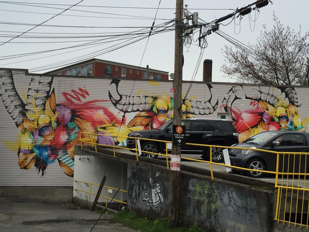
Makes sense. Look North and you see the same thing for real.
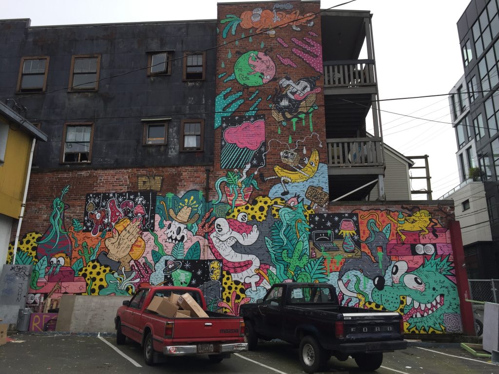
This last image is a bit hard to define. Cartoonish, bugged out animals and animate fruits and vegetables are spread out amongst a variety of vegetation. The snake with dollar signs for pupils could be a critique of commercialism, but this is unimportant in the larger context of the murals. Likewise, the cracking bricks could signify a suspicion of development, or stressing the ephemerality of man-made structures, or simply the threat faced by older buildings and their respective functions in the neighbourhood. In the larger context of the mural though, the cartoonish ugliness doesn’t seem to take on any defined meaning.
Overall, these images suggest of the businesses and artists that they feel a connection with nature that simply does not exist in Vancouver, especially Mount Pleasant. Additionally, many of the animals featured in these murals have no presence in metro Vancouver, seemingly chosen out of nowhere. There is a clear lack of thought towards content, resulting in little meaning beyond looking big, bright, and attractive.
Mermaids and Other Beautiful Women/ Oceanic
This category may have some overlap with the last, however there seemed to be a bizarre amount of murals that were about mermaids. Attractive women and ocean goes together well with Vancouver, according to the upper-middle-class.
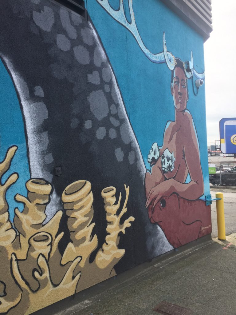
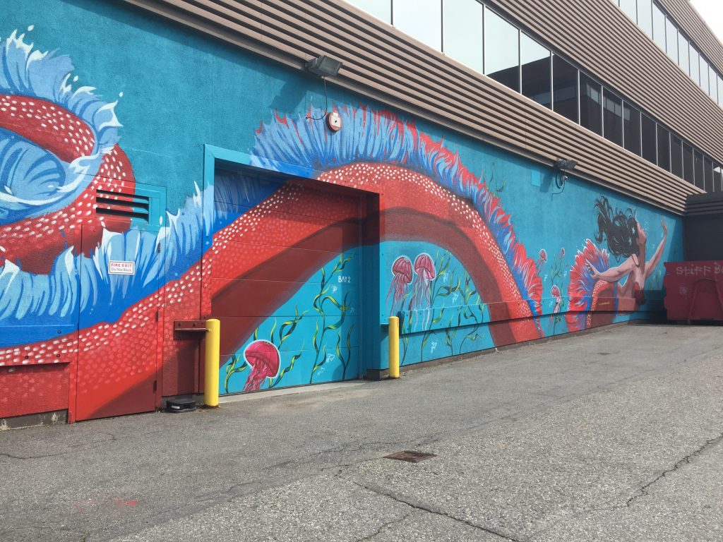
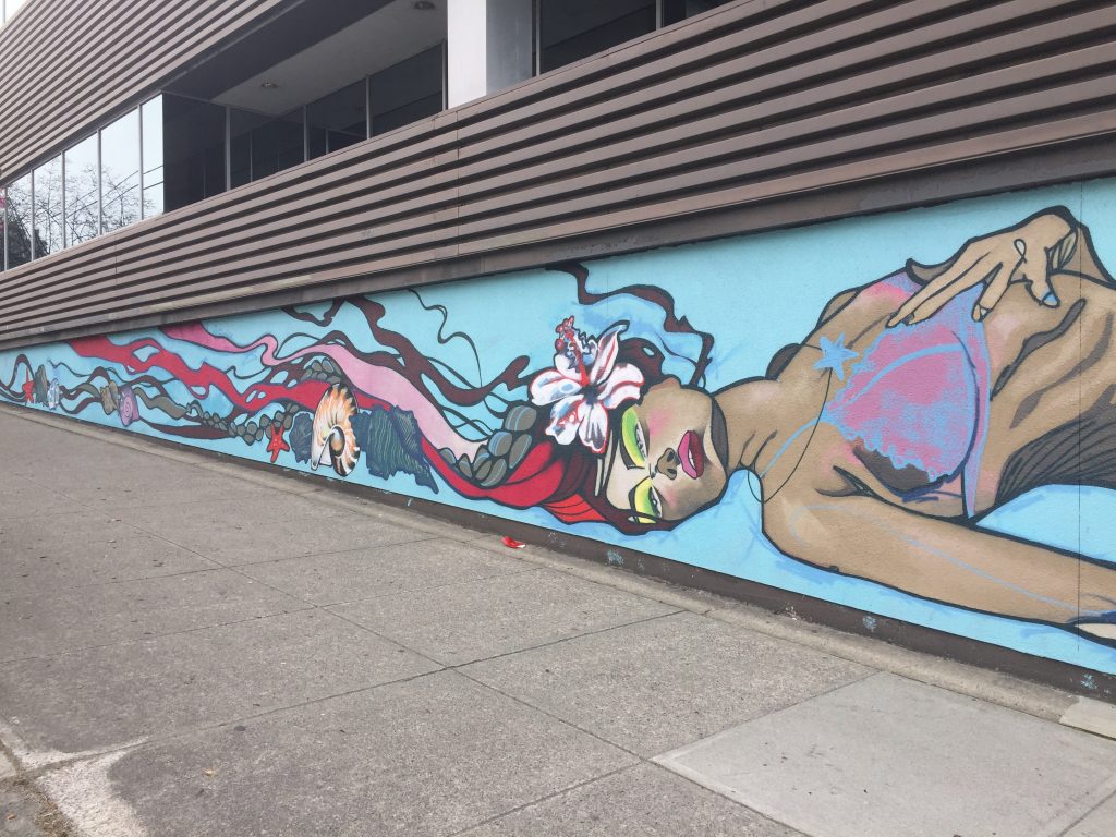
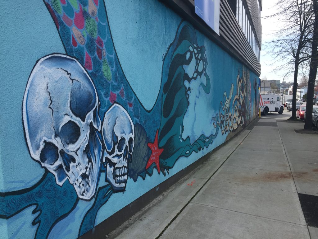
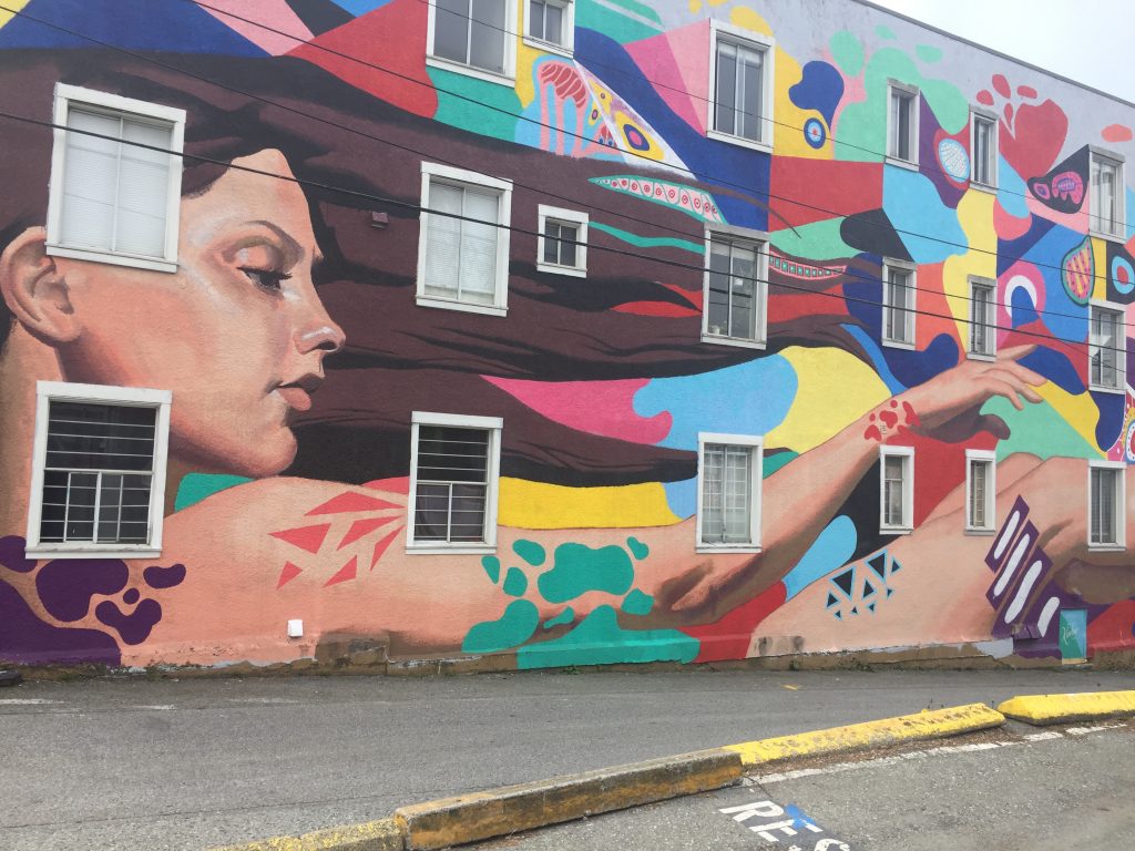
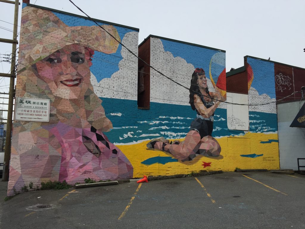
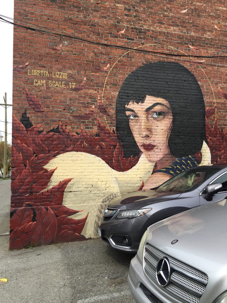
With our previous logic, the business-owning and real estate developing class values attractive women and the fact that Vancouver is on the West Coast. It’s difficult to think of a theme less offensive or straightforward to Vancouver males, and is clearly comfortable with the objectification of women. In fact, it should be noted that in not a single mural except for one (an old man beside an attractive young woman) did I see a male human depicted, never mind an attractive one. Would it be insane to think that the murals, as chosen by real estate developers, landlords and business owners are catering to straight men? Not at all.
Abstract
I was truly struck (although not surprised) by the number of works that featured abstract patterns or figurations.
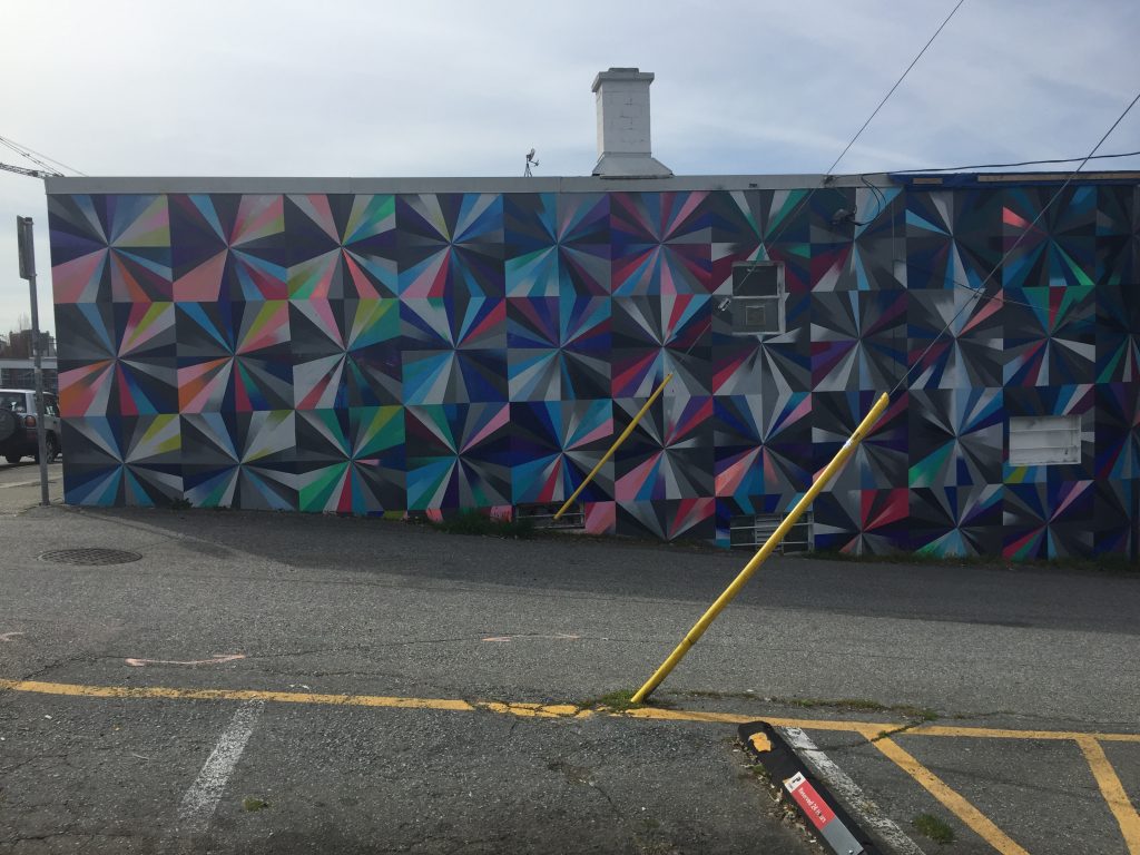
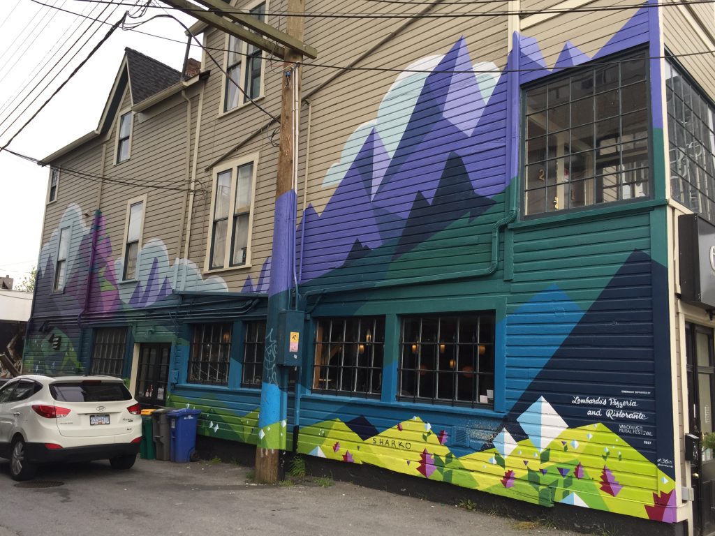
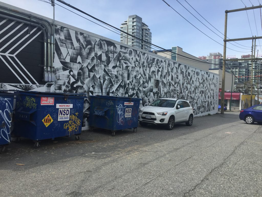 This work would also fall into a “commercial” category, as it advertises the current tenant. It seems the tenants could not resist including the name of the restaurant in the mural.
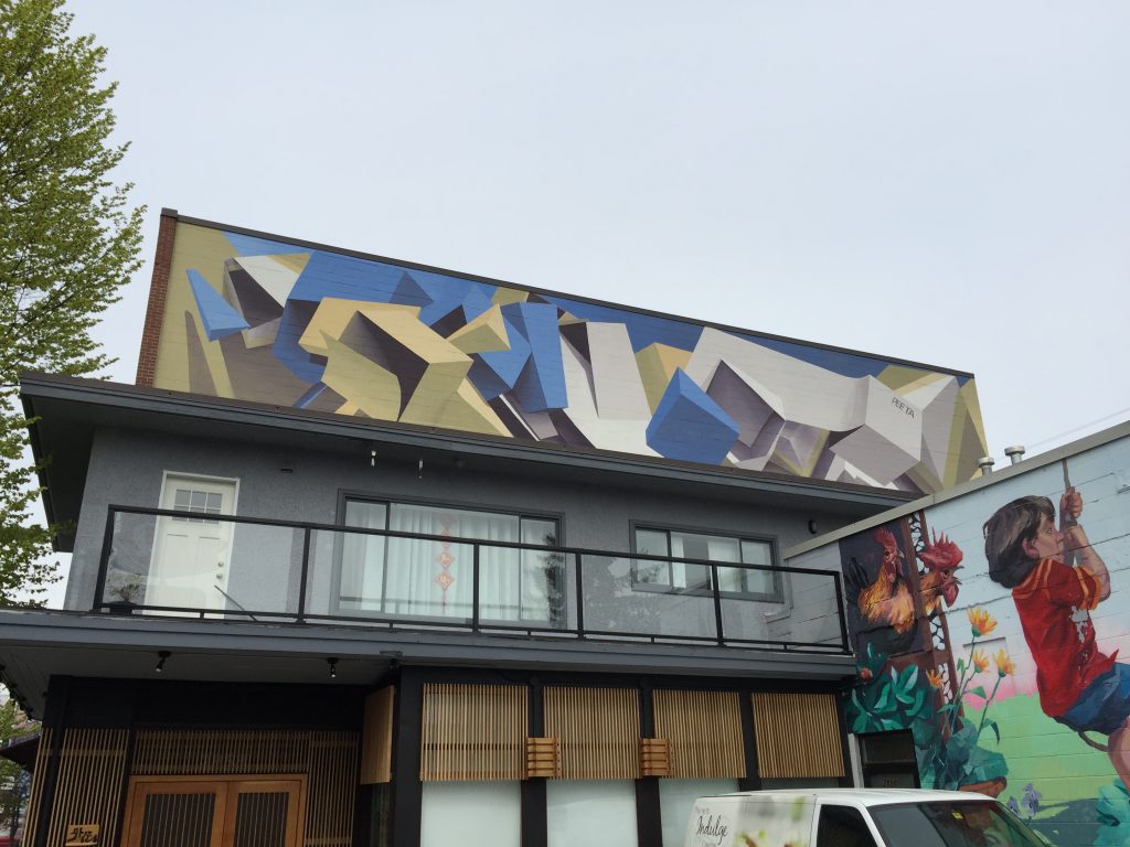
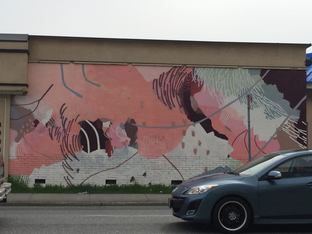
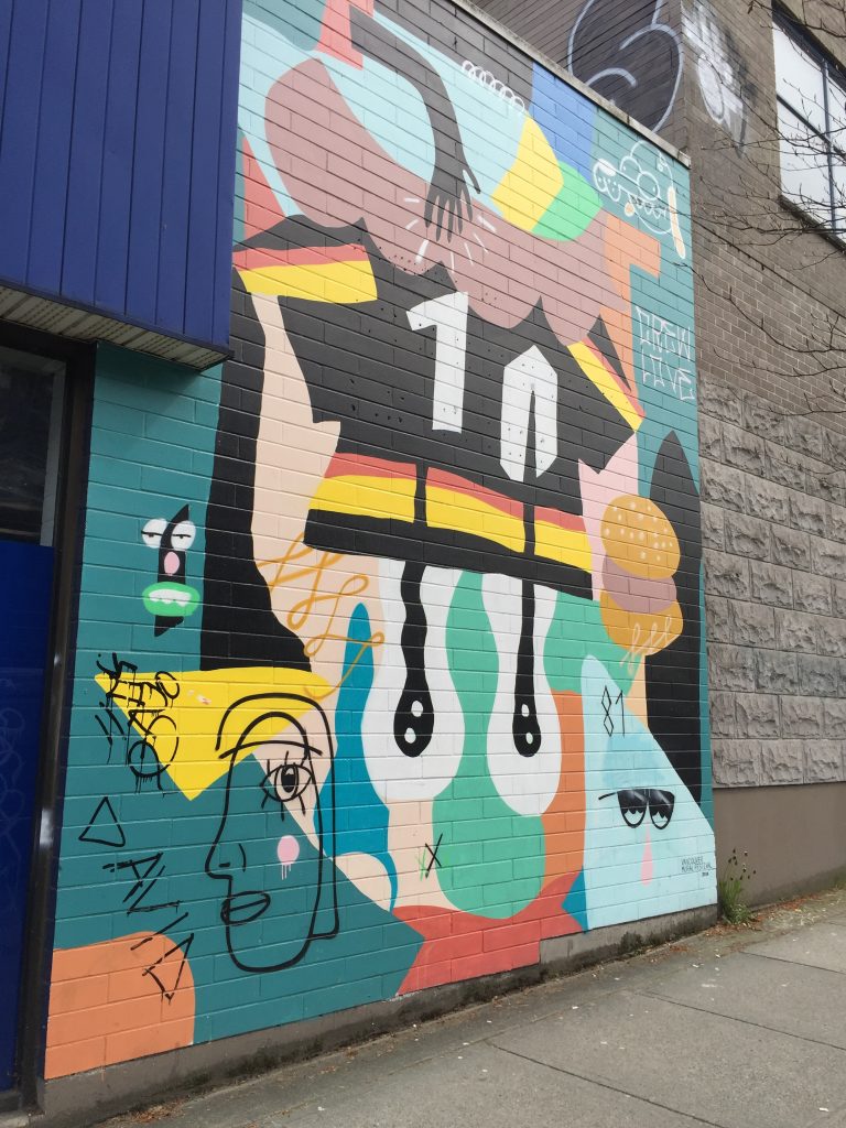
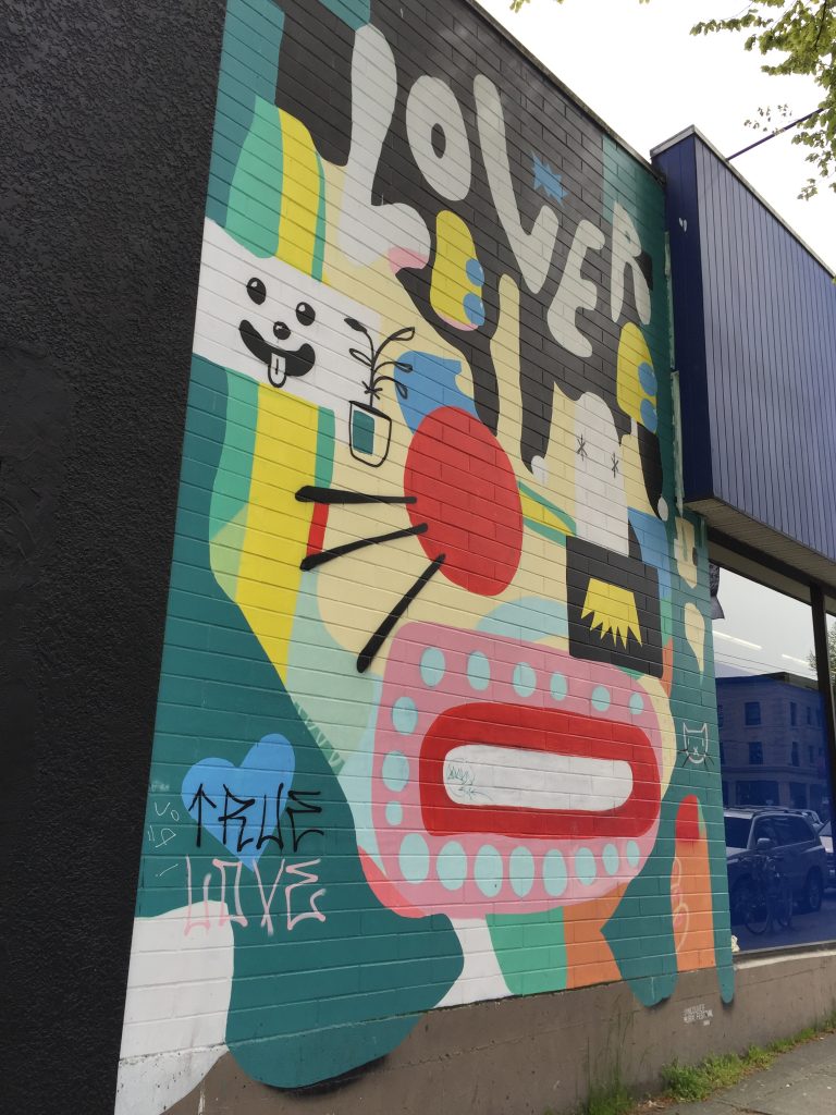
If we are using categories, I would define most of these works as graphic design rather than art. This is significant and should not be ignored, because their function is to look pretty without running the risk of communicating any particular meaning or emotion.
Social/Environmental Concerns
If there’s one thing that makes people feel good about themselves, it’s identifying social and environmental concerns. By doing so, it allows a group to feel that it at least it recognizes what is wrong with the world. This can lead to a sense of righteousness and superiority. Perhaps this essay is guilty of this very activity, but it’s still important to identify the way that this state of simultaneous recognition and complacency manifests, but also seeks comfort in its aestheticization.
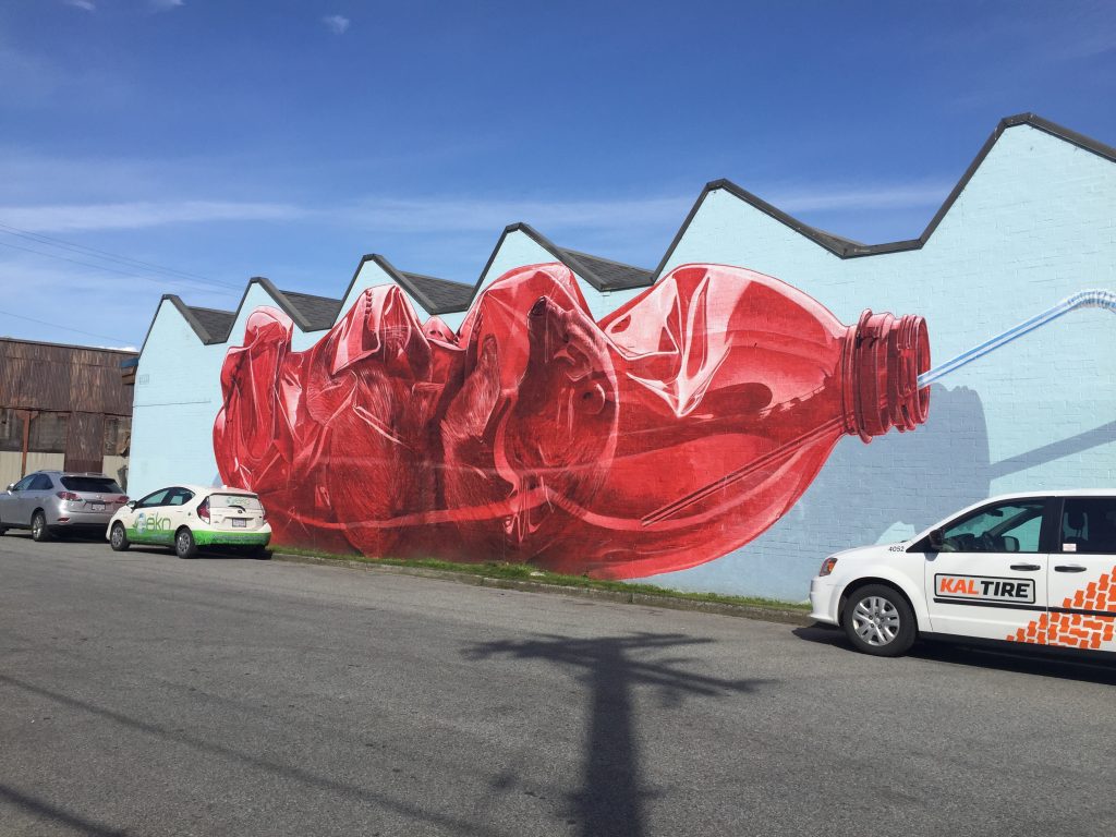
While plastic Coca-Cola bottles are killing polar bears, eight-dollar glass kombucha bottles are saving the world.
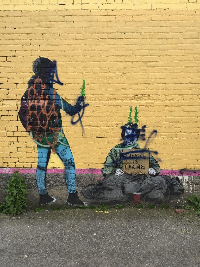
This photo seems to have attracted some discontent, as it is heavily graffitied. What is covered is the phone in the hand of the figure on the left. This piece is a play on words, as the more well-off figure might be “sharing” the photo of the housing-insecure or homeless person on the right who is asking for money. Heavy-handed and an almost complete rip-off of the now laughable street artist Banksy, this piece functions in an entirely different way that it was likely intended. Instead of making one question how the better-off interact with the most disadvantaged people in society, it allows one to reconfirm that they would never act in a such a way, that they respect the worse-off, leading to inevitable self-congratulation. This is the kind of piece that assures the rich that it’s ok to be rich, as long as you respect those less advantaged than you. By looking at an uncomfortable piece of art, society can confirm that systematic mass inequality is okay, as long as you’re not rude about it.
Identity
Neighbourhood Identity
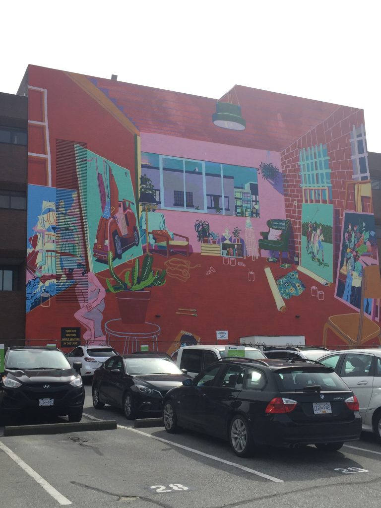
This massive perspectival work was the only mural I noticed that specifically addressed neighbourhood identity. In the work we see an upper-floor artists’s studio or living room converted into one. The brick wall and wood beam ceiling indicates that it is a heritage building “cleaned up” with the addition of plants (plants are weirdly expensive), a large trendy ceiling light, and quaint furniture. inside this room we see a collection of artworks that are oddly conservative: two sculptures, and paintings of a colonial-era ship, a Lamborghini-esque car, a person playing cricket, and a vanitas still life. Across the street we see a clean-looking heritage building, and beside it a new glass apartment building and a second newer-looking building with large windows and a high ceiling.
This mural is highly indicative of the neighbourhood in its current state, but also the one that it risks superseding. Vancouver has become oversaturated with condos that are constructed more for investment than homeownership. In the last six months I’ve noticed about five rezoning applications in a stretch of ten blocks for substantial condo developments. In Vancouver, the process of gentrification happens not over decades, as it has in other cities, but in a matter of a few years. The result – a perfect combination of new luxury condos and rejuvenated heritage buildings occupied by a large upper-middle-class creative community that makes work that does not by any means challenge white, upper-middle-class values and interests. But even this balance is delicate and often temporary, as upper-middle-class neighbourhoods often give way to true hyper-wealthy neighbourhoods in cities with obscene amounts of wealth.
Female and POC Representation
This category was very substantial, as it’s worth noting that any non-white bodies represented in this category were all young, attractive females.
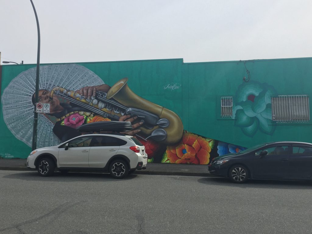
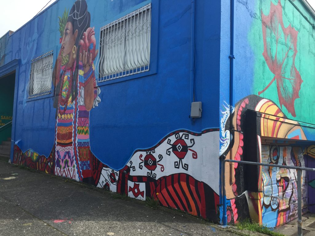
The mural above surprised me because I was not aware of any substantial Mexican community in metro Vancouver. I believe it was on the wall of a Mexican restaurant, so I suppose they are at least representing themselves, if the business is indeed run by Mexican managers and workers.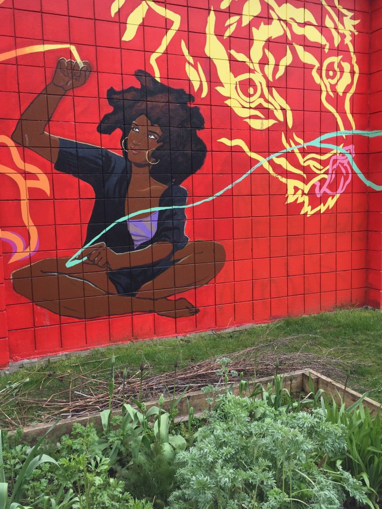
The building above recently changed tenants, from a secondhand store to Burdock and Co., a trendy, expensive organic restaurant.
Indigenous Representation
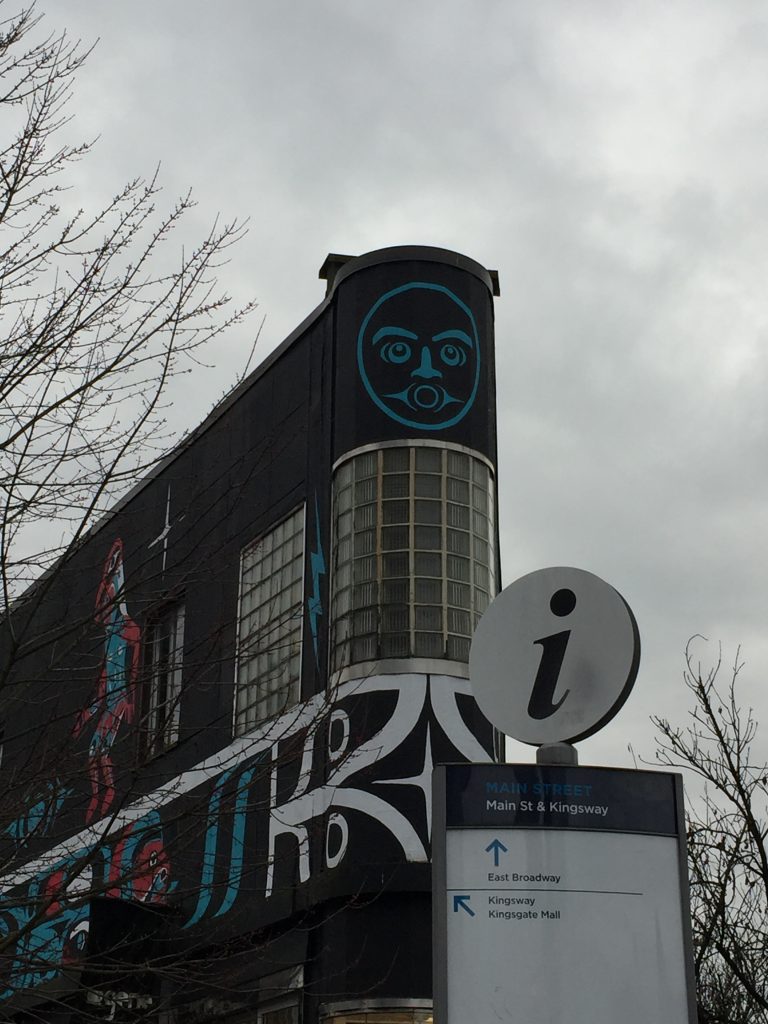
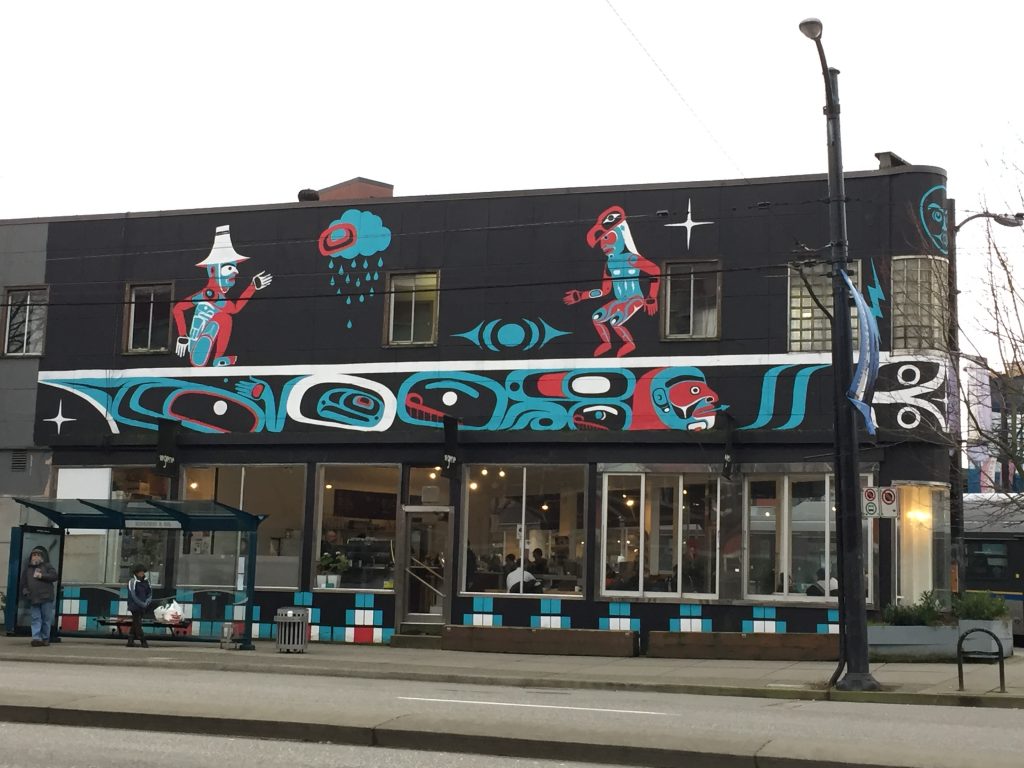
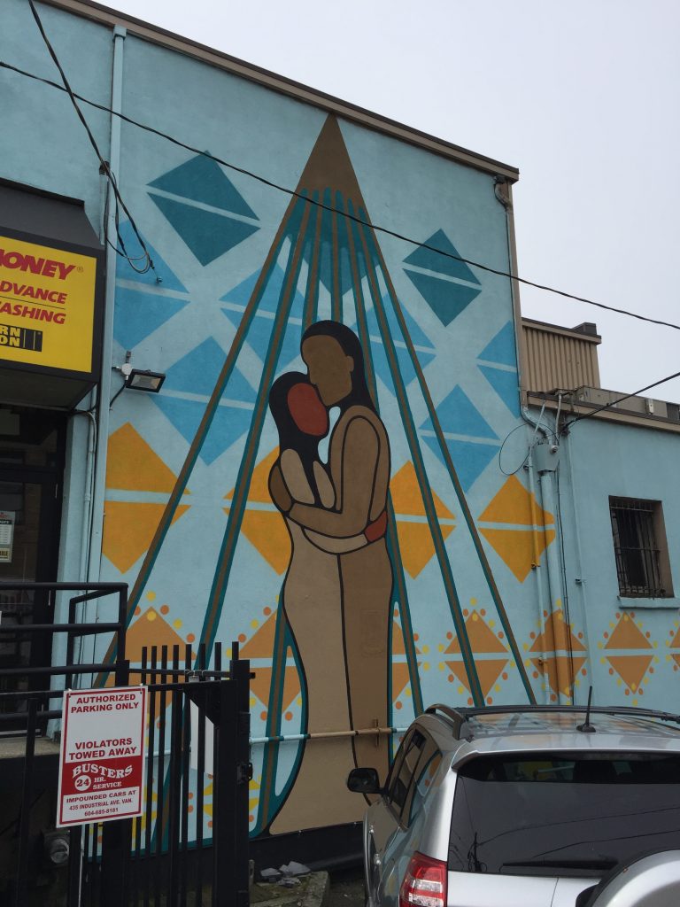
I was surprised at not seeing more traditional Indigenous work among the murals, as this is a go-to when trying to construct a coherent Canadian and Pacific Northwest identity. However, it would not be a leap to doubt that the organizers of the Mural Festival seek to cater to Indigenous interests. Upon doing further research, I discovered that the festival featured a substantial amount of Indigenous artists working with traditional Indigenous iconographies and motifs. I cannot help but be highly critical of this identity politics-related approach in which big money and their institutions so generously offer representation to oppressed groups, because they know they will struggle to attain that representation anywhere else. How valuable is representation when there is ongoing systematic oppression of Indigenous peoples by the federal, provincial, and municipal government? Representation in a mural festival is an empty offer of aesthetic tokenism, with the purpose of making new high-income residents feel good about their supposedly “diverse” community. This is how society wants to see itself.
Sayings
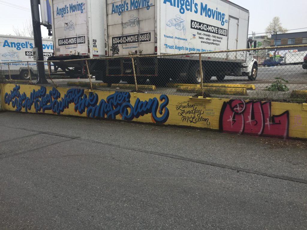
This is a line from the song “Heaven Only Knows,” by Canadian artist K-Os, in which he mentions “Van City.” This line doesn’t really have any meaning when removed from the context of the rest of the song.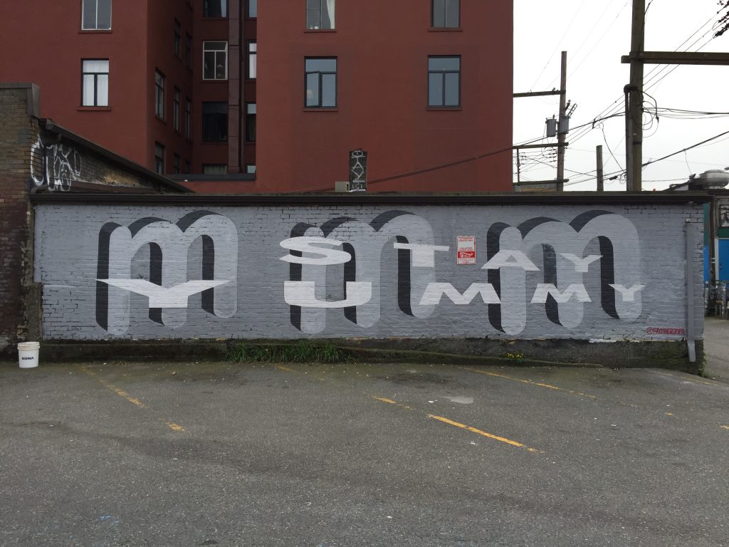
I believe this mural was on the back of a bakery.
There are many more murals that have copyrighted pictures available on the VMF website, such as one that says “everything matters, nothing’s important,” “we’re looking for people who like to look for people, and one that simply says “YOU MADE IT.” Most of the sayings or quotations are significant in that they say nothing in particular, or say something so undecided and non-provoking to the point of being nonsensical. The last two sayings are indicative in that they seem to encourage, welcome, and annoying, congratulate newcomers to the neighbourhood.
This last mural in my essay in particularly interesting in that it seems to fit into multiple categories, as well as having a particularly bitter irony to it.
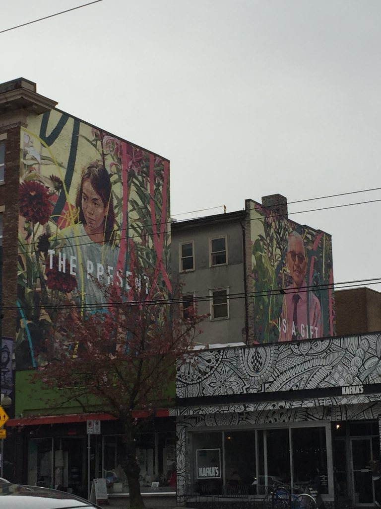
This one is special: it has an insubstantial feel-good saying, an attractive woman, and celebrates nature. Through the saying and the two characters that flank it, it simultaneously makes us aware of the passing of time and the present moment. This is a celebration of the future, and an encouragement to not look back to what was before – you might notice the neighbourhood looked quite different.
And now, the irony. The building that hosts this mural is The Belvedere Court, a heritage building that has been home dozens of artists over the last three decades. Mckee and Nugent note that Jean Swanson, legislator and anti-poverty activist, drew attention last year in her city council by-election campaign launch that the landlords of the Belvedere were at the time renovicting residents en-masse through “evictions, bribes and fixed-term leases signed under duress, it is expected that the remaining tenants will be under intense pressure to succumb to no-fault evictions in the near future.” At the time the authors wrote their article, eight units, one third of the total in the building, were vacant. The authors also discovered that the Vancouver Mural Festival coordinated with the Mount Pleasant Heritage Group (MPHG) on this mural. The original text proposed by MPHG was, “Our Place, Our Home,” which was rejected by VMF. The muralists proposed using two portraits of Belvedere residents, which was rejected by the landlords.
Final Thoughts
In considering these murals, it is clear that society views itself as caring deeply about art, and is even willing to give it to the public, liberating it from stuffy gallery spaces and exclusive artist-run centres. However, this art must be strictly curated by “society” for the public, and must not challenge its values, ideologies, or thought processes. It is even better if this art has the depth of the shallow end of a kids’ swimming pool, or meaning so ambiguous or vacuous that one forgets the piece a moment later. Society likes art, but it also likes animals and nature, the ocean, attractive women, cool designs, and an appropriate amount of non-white culture. Our society cares about the environment and people of every socio-economic class, when convenient.
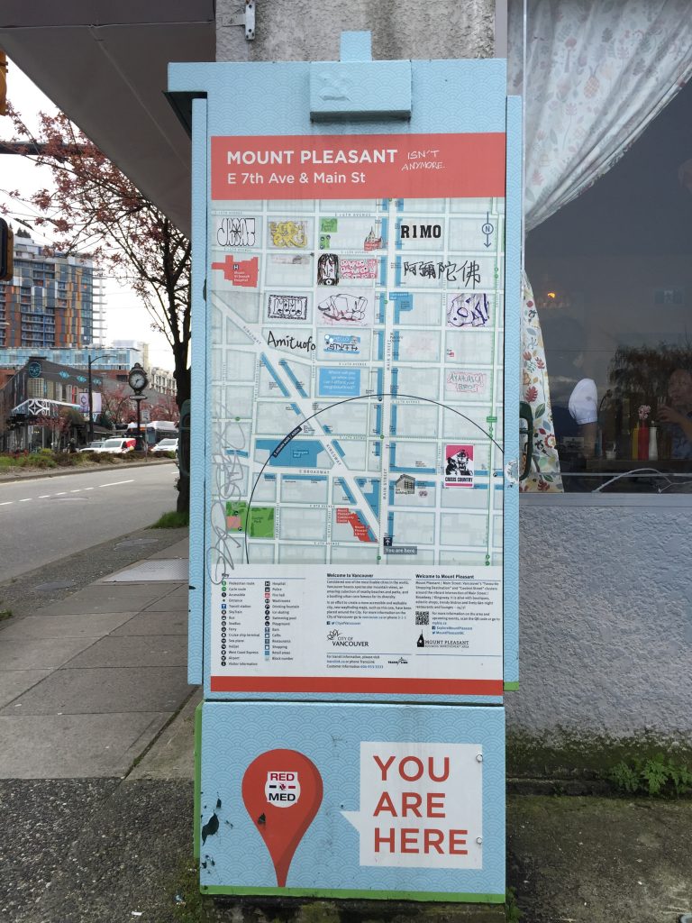
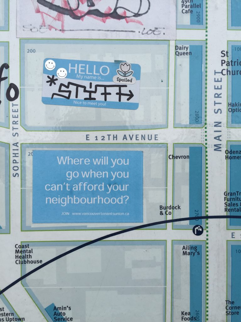
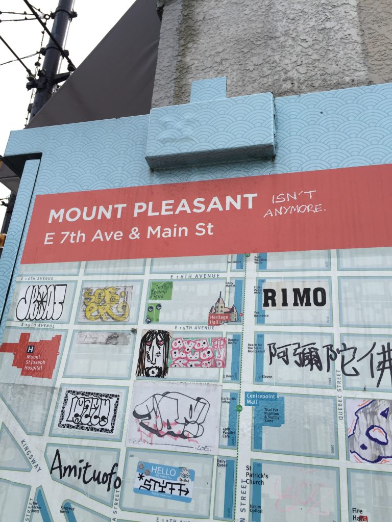
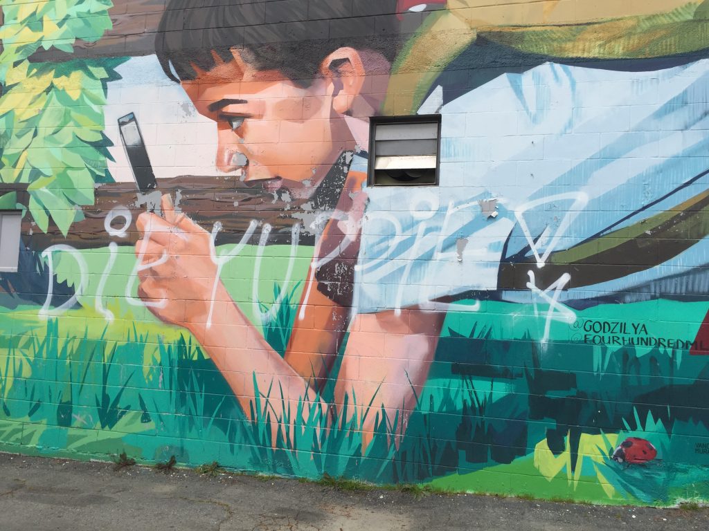
However much society may try, it is clear that not all agree with this new vision for Mount Pleasant.
Sources:
Hyde, Zachary. Vancouver Mural Festival is Caught Up in Gentrification. The Mainlander, October 5, 2016.
Mckee, Jesse, and Nugent, Amy. Vancouver Mural Festival: The Present Is a Gift for Developers. The Mainlander, August 16, 2017.
