
I made it!! I have to say that this site/game is a compilation of the most frustrating websites that I have encountered in my worst nightmares ![]() . I have frequently encountered confusing, deceptive, and poorly designed sites that are very difficult to navigate and frustrating, and could see all the elements of them here. Fortunately, I’m a fan of ‘escape room’ games and I’m used to clicking at random places on screens to find ways to advance.
. I have frequently encountered confusing, deceptive, and poorly designed sites that are very difficult to navigate and frustrating, and could see all the elements of them here. Fortunately, I’m a fan of ‘escape room’ games and I’m used to clicking at random places on screens to find ways to advance.
First of all, there were the examples of intended misdirection – the large fonts/buttons that one is automatically drawn to. The first page shows a green button with the word ‘no’ that is intended to misdirect you into clicking it to advance. Click-bait works like this – the headline will say something like ‘Take a look at what [insert obscure celebrity] looks like now’… and when you actually follow the link, the page is filled with ads and large buttons to click but the one you actually need to click in order to advance to the next slide is written in small print somewhere on the bottom of the page. This uses the psychological tendencies Brignull mentions on the ‘Dark Patterns’ webpage where people just scan pages and follow defaults.
There was the annoying pop-up timer that is intended to cause you to make hurried choices/decisions (confusing to figure out how to get rid of it), and the pop-up on the bottom right corner that was supposed to ‘help’ (with over 400 people waiting in front of you). The predictive text in the ‘help’ box was amusing but annoying as well.
To advance to the second page, the ‘here’ where you had to click was not highlighted or clear, and then to advance to page 3 (after going through one of my pet peeves – ridiculous password requirements), one had to accept the ‘terms and conditions’, but in order to do that, one had to actually access the ‘terms and conditions’ page and click ‘accept’ there (after an excruciatingly long and tedious scrolling task). This actually could be considered more of an example of an ethical/honest practice on the part of the website since one is forced to actually go through the terms and conditions more carefully rather than just click ‘accept’ and move on. That being said, this page is so full of legalese and technical jargon that intended confusion just leads to reluctant submission to the policies set by the website. To ‘upload’ a picture, the instructions were backward – the ‘download’ button was most prominent (going back to the ‘default’ tendencies). This was the most difficult page for me to get past.
Part 3 was just very poorly designed data collection, only giving 2 options for title, not allowing for typing number entry for the address (only being allowed to advance one number at a time), the months being scrambled, and the age slider being quite unwieldy.
Page 4 was another example of one of my pet-peeves on websites – the picture verifications that are always difficult to decipher.
Overall, I think this game was meant to be an exemplar of the most user unfriendly and worst possible website designs and interfaces, but there were also examples of the deception and pressure tactics that subversive companies can use as described by Brignull.
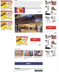
Here is an example of a click-bait site that has so many examples mentioned on the ‘dark patterns’ site (apologies for the poor picture quality – not sure why it came in so blurry). Note the red ‘next’ buttons look like they take you to the next page in the story, but they are actually ad buttons. The button that advances the story is a less prominent blue below.
Here is another example – a pop-up ad that came up on my screen…
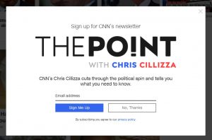
The ‘sign me up’ is first, prominent, highlighted, and appeals to the default mentality. The ‘terms and conditions’ are in small print at the bottom.
Internet literacy and critical evaluation is so vital, and this week has just highlighted the importance of ‘buyer beware’ more than ever before – the importance of carefully reading everything.
References:
- Brignull, H. (2011). Dark Patterns: Deception vs. Honesty in UI Design. Interaction Design, Usability, 338.