ETEC 540 Linking Assignment

Link 1 – Braden Litt – Speculative Futures

Speculative Futures – Braden Litt’s ETEC540 Blog (ubc.ca)

I found Braden’s visions of Dystopia and Utopia interesting in that they were both quite ‘realistic’ per se, and I could conceive of both possible futures coming to fruition.  They both had a bilateral element to them.  In the Dystopian vision, one could argue that the advances in technology and environmental awareness are more of a Utopian vision, especially depending upon which segment of society you were part of.  If you were one of the residents who lived in one of the ‘shining metropolises of advancement and technology’, then it would be a Utopia for you.  However, if you lived in the resource plundered, ‘desolate and decrepit’ outskirts, then this would definitely be the ‘dystopia’.  One could argue that we are living in this sort of world today already.

 There was also a dual element in the Utopian society Braden envisioned, where the main character was still somewhat lonely and unsatisfied.  I mentioned these in the comments and Braden replied with “I don’t know if there truly can be a society that is utopian for all with such diversity in preferences, lifestyle, and ability.”.  While I agree that a true Utopian society may never be achievable, it can be conceived in theory that a Utopian society will have managed to address everyone’s requirements, emotionally, physically, and intellectually.  Can a Utopian society also have elements of dystopia?

Link 2 – Clarissa Guevara

Task 10: Attention Economy – Clarissa Guevara – ETEC 540 64A (ubc.ca)


Clarissa had a similar experience with this task to mine, in that it was frustrating and loaded with misdirection and distraction.  Clarissa does a good job of explaining her process through the game.  I got stuck on the same page as she did, and had the same issues with not initially reading and agreeing to the terms.  When I became aware of the intent and design of this game, I purposely looked for the distractions and misdirections and became more mindful of reading the instructions carefully but this page did pose a challenge for both of us.  Clarissa makes mention of a ‘hidden clue’ that is ‘close to the top’ of the terms and conditions.  I was not aware of this so that entices me to go back and search what she was talking about.  

Clarissa also speaks of universal conventions such as a selected box being coloured and the opposite being used for this game.  This had not occurred to me before – It is interesting how some conventions and universal standards have been developed over time.  I don’t think I’ve ever seen or heard of a ‘rule book for web page design’, but there seem to be unwritten rules about what is expected and normal for user interface design.  

The points raised about not entering personal data also occurred to me.  I didn’t enter any of my real data because I gathered that the page was only looking for the proper format of the entered data, not the actual correct data.  As more of my data is shared on the web, I have become much more leery about what I share online.  When asked for a birthdate, I’ve started to enter the wrong month/day with the correct year.  I’m not sure how much actual security this affords, but it gives me some sense of more safety.

I didn’t have the same level of ‘distrust’ that Clarissa did at the end since I recognized the ‘escape game’ type of ending and knew that I had indeed completed the course.  It does seem that I was not the only one who found this task engaging but challenging at the same time.


Link 3 – Eduardo Rebagliati

Task 7: Mode-Bending – ETEC 540 Eduardo Rebagliati (ubc.ca)


The thing that drew me to Eduardo’s assignment was his creative portrayal of his objects – using a miming video and accompanying sound effects.  Although he had included ‘cheat sheets’ to help identify the objects, he did such a good job of miming the objects that I didn’t need them.

Eduardo mentions that understanding the gestures and sounds are culture dependent where the observer must have a similar background and understand the context of the objects being represented.  I whole-heartedly agree.  A person from 100 years ago would not have any idea what a ‘laptop’ or a ‘cell phone’ is and would not recognize someone miming their use.  However, books(specifically a bible), and eating a banana are something they would be able to relate to, so those gestures would be more recognizable to them.  The point about the universality of emotions also rings true.  One may not understand the gestures that represent a bible, but one can gather from the emotional context that the object brings joy and peace.  Another interesting feature about this project is that even though it may be context and culture specific, it is not language specific.  One does not need to know English or any other specific language in order to understand what Eduardo is communicating.  I spoke of the necessity to diversify communication modalities due to the multi-cultural society we now live and work in, and Eduardo reinforces that concept.

When I did my project, I made note that one can include more information in a more compact form when it is textual as opposed to video which takes much more time and energy to convey the same message.  While Eduardo did a good job of conveying ‘what’ each object was with his gestures, there was little more information than that; nothing to convey the form or function as this would take much more time and creativity.

Link 4 – Dee Dee Perrott

Task 6: An emoji story – Text Technologies (ubc.ca)


I chose Dee Dee’s assignment because it was easy to identify as I am very familiar with ‘The Princess Bride’.  With this assignment, I think it is virtually impossible to identify the title/show being discussed  unless one is somewhat familiar with the title/plot/characters.  I don’t watch too much TV/movies (especially current titles) so my repertoire is rather limited.  Looking through other projects, I found that most of the emoji stories were quite foreign to me.

Something that adds an extra element of variability is the difference in emoji choices.  Dee Dee used an Apple Ipad and I used an Android phone.  Emojis are not standardized and so the selection varies between platforms and this may affect the clarity of the messages.  If a universal system of emojis was adopted across all platforms, then perhaps they might become more easily understood and more practical and applicable for communication.

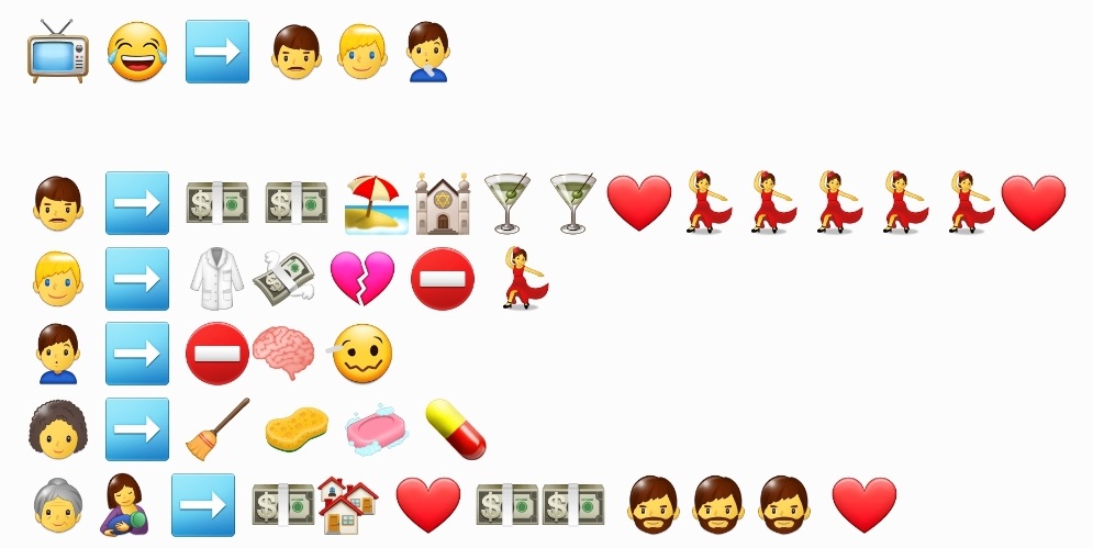
Both of us started with the title because they both consisted of concrete words that would be relatively easy to find representative emojis rather than abstract concepts.  Dee Dee proceeded to describe the main plot of the story whereas I opted to describe characters because the TV show I was describing had multiple episodes and plots.  Dee Dee found, as I did, that even with the multitude of emojis available, it is difficult to represent some concepts and she had to simplify her storyline.  I also had to re-think my strategy because I would have a specific picture/emoji in mind for a concept but it wouldn’t be available so I would have to think of alternatives.  Even with her simplified version, I could still recognize key elements of the characters and plot, but if one wasn’t familiar with the movie, it probably wouldn’t be as easy.

Dee Dee and I came to the same conclusion, that emojis alone are insufficient to convey a message clearly as context, culture, and previous knowledge have a lot to do with how the message is interpreted.  If too much energy is expended trying to decipher a message, then the intent of the message will be lost.


Link 5 – Terri-Lynn Mcleod

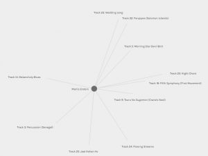
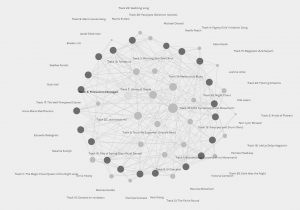
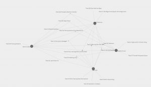
Network Assignment Using Golden Record Curation Quiz Data – Terri-Lynn McLeod ETEC 540 (ubc.ca)


This assignment was very individual and unique for each person in that the data that was collected seemed to lack specific parameters other than to choose 10 songs to represent earth to another planet, so the data could be analyzed and grouped in different ways. 

Terri and I both made note of the overwhelming amount of data that was initially presented in the graph.  She and I both had to ‘play’ with the program in order to understand how it worked, how the data was presented, and how to re-organize it.  Neither of us could determine the criteria the computer algorithm used to group people, and so just had to draw our own conclusions.  Where I made reference to the personal preferences and emotive appeals of the most popular songs, Terri chose to focus on her specific community and the numbers of connections. One comment I found interesting was when she said ‘it took a bit of trial and error to find the connections I wanted to see’.  This reinforces the idea that without parameters, one has to draw their own conclusions, and thus there are numerous interpretations for the same data.  In order to help form my analysis, I returned to task 8 and read people’s ideas about how they picked their songs.  This gave me a bit of an idea of what trends could be noticed, but again, it is all open to personal preference and interpretation.


Link 6 – Anna Marie MacPherson

Task 3 – Voice to Text Task – ETEC 540 blog (ubc.ca)


I found Anna Marie’s analysis of her voice to text assignment quite well done, making pertinent and relevant references to articles and providing a clear and detailed critique of the effectiveness of her software.  Her transcription reads like a ‘stream of consciousness’, but I disagree with her when she states that ‘someone reading this could not make sense of my thoughts’ – I was able to determine the context and general meaning of her transcription despite the errors.  The grammar mistakes and  lack of punctuation, while disquieting, did not change the story contrary to her statement.  That could be due to the fact that this was not a structured, organized literary composition designed to evoke emotions or introspection.  If the intended story was more structured and substantial, then the deficiencies may be more prominent.

That being said, I was glad that I was able to include punctuation in my transcription because of the cognitive dissonance that comes with reading incorrect grammar and punctuation.  All through my education, the ‘proper rules’ for writing and communicating have been drilled and reinforced, so I find it hard to leave a work un-edited.  Despite  the prevalence of text message abbreviations, I still find that I need to write grammatically correct sentences, even in such an informal context.  I use the voice to text capabilities quite often on my phone, but if I wasn’t able to add punctuation, I don’t think I would be so quick to adopt it.  I also found it interesting how Anna tried out editing her transcript while doing this assignment, trying out different commands.  I was familiar with the basic commands before I conducted my assignment, but I’m not sure if I would have been brave enough to try out editing commands spontaneously like her.

I wasn’t sure which platform Anna used to produce her assignment, but it looks like it was on a laptop/pc, and she did note that her Iphone was more effective at transcribing.  The transcription capabilities on phones are probably better than PC’s because phones are much smaller and the keyboards are more awkward to type with, so the oral interface is much more useful in this case.  

 I do agree with her that writing the script ahead of time makes one more mindful of the message and the speech.  It is true that ‘writing is done more deliberately’ since one has time to collect, organize and edit ideas.  Speech is very transitive and once the message is spoken, it is irretrievable.  Therefore, there is less room for miscommunication with writing.  When one adds in a translation factor (as mentioned in Anna’s last paragraph), then the potential for miscommunication and misunderstanding is magnified whether the translation occurs between one person to another, or between a person and a translation/transcription application.

ETEC 540 Final Assignment

Over the past 3 ½ months, this course has explored the changing needs and subsequent products of communication through writing and text. One of our first tasks was to produce our personal definitions of ‘text’ and ‘technology’.  My definition of ‘text’ was very similar to what the Oxford English Dictionary (n.d.) states as “The wording of anything written or printed; the structure formed by the words in their order; the very words, phrases, and sentences as written.”, essentially, taking oral and spoken ideas and converting them to a concrete and static form that can be referenced at a later date. When I think of ‘technology’ however, my definition differs somewhat from the Oxford Dictionary.  Previous to this course, I thought of technology in terms of applying current ideas and knowledge to produce the means to further expand those ideas and knowledge, but for the purposes of this article, I will also incorporate the Oxford Dictionary’s definition of “The systematic treatment of grammar. (Obsoleterare.)”.  My intent with this article is to apply these ideas to western musical notation as text and discuss the history of written music and connect it to the original theme of the course, the reciprocal connections between communication needs, practice and invention with some speculation as to the future directions of musical communications.

What is music?

Music as defined by the Oxford English Dictionary is “The art or science of combining vocal or instrumental sounds to produce beauty of form, harmony, melody, rhythm, expressive content, etc.”.  Music is a form of communication and language just as speech is.  Various emotions and stories can be expressed with a combination of different tempos, volumes, tone combinations (chords) and note lengths. “Like speech, music has an acoustic code for expressing emotion, and even if a piece of music is unfamiliar, we can “decode” its message.” (Interlude, 2021).  We associate and attribute certain vocalizations in speech to certain meanings and do the same with musical intonations.  Cross and Woodruff (2009) expand the communicative aspects of music beyond emotional functions and discuss the cultural significance of music in managing social relationships. “…although many of the uses of music will indeed impinge on the affective states of those engaged with it, music fulfils a wide range of functions in different societies, in entertainment, ritual, healing and in the maintenance of social and natural order” (Cross and Woodruff, 2009).  Kofi Agawu discusses the functional elements of traditional African music and its connection to language, “While transcending language, however, music nevertheless remains dependent on it; it remains a supplement to language just as language remains a supplement to music.” (Agawu, 2001).  Music is used as a means to help memorize and communicate information adding a multimodal element to oral transmission.  With music having such a strong functional purpose, the necessity for a reliable, concrete recording system to preserve the format and integrity of certain musical messages becomes evident.

As with many spoken languages, musical intonations can be transcribed to a textual form which we know as musical notation, and just as there are different languages, there are different forms of musical notation depending upon the genre of music, instrumentation, or purpose.  In order to transcribe music to a written form that can be interpreted by others, there are certain elements that need to be translated to a textual form including pitch/melody, rhythm, and dynamics. The standard notation on 5 line musical staves is the most common for western classical music.  While the purpose of this assignment is not to teach music theory, for the sake of providing context I will attempt to briefly summarize the basics of current western music notation.

In western music, there are 12 musical notes or ‘pitches’ that are represented by the letters A – G.  The basic 8 note scale was described with the song ‘Do-Re-Mi’ in the 1964 movie ‘Mary Poppins’.

“Do-Re-Mi” – THE SOUND OF MUSIC (1965) – YouTube

Additional pitches are indicated by adding symbols to the letters that either raise the pitch or lower it.

Figure 1 Accidentals (taken from What are accidentals in music? – Quora)

The pitch is indicated by its place on a ‘stave’ of 5 lines.

Figure 2 The stave and pitches (taken from The Stave or Staff | Hello Music Theory)

Pitch length is represented by a filled in or hollow oval with the addition of lines and ‘flags’.  A ‘whole’ note is the longest value and the note lengths are divided fractionally from there.

Musical compositions are also segmented into ‘bars’ or ‘measures’ which have a certain value of ‘beats’ which defines the ‘rhythm’.  The ‘time’ signature determines how many beats per measure.

Lastly, dynamics, tempo and articulations are indicated by a variety of symbols that attempt to convey the composer’s intended effects to the musician.

Dynamics in Music

Figure 5 – Dynamics (taken from Dynamics in Music (thinglink.com))


Tempo - Music Theory Academy

Figure 6 – Music Tempos (taken from Tempo – Music Theory Academy)


Even with this wide array of characters and notation options available, each musician will interpret the score differently, and the product may differ from the composer’s vision. “People believe that music is not a stationary object but a fluid performing art which does not produce two exactly identical performances (except for replicated electronic sounds).” (Park, 2017).  This to my mind, is no different than written stories that are read with personal interpretations and inflections each time they are shared, influenced by the amount of specific detail written, and the background and cultural biases of the reader.  “It is generally accepted that the human performer will add considerably to the music, or ‘fill it with life’ through the process of interpretation, as if impregnating the music with the life that got extinguished when it was written down in notational form.” (Magnusson, 2014).

The History of Musical Notation

The very earliest example of basic musical notation was found on a cuneiform tablet in modern day Syria dating around 3400 years old and consists of musical instructions, interval names and number signs. (Davis, 2021 Wikimedia Foundation, 2020)  “The notation was verbal in form and not a graphical representation. The seven pitches described in the text used the same intervals that make up our modern major scale (the diatonic scale) and could be played on a seven-string lyre.” (Gaare, 1997)

Legend credits the birth of musical theory in 600 BC to Pythagorus (Stewart 2017, Sanders 2016, Williams, n.d.) who allegedly walked by a blacksmith’s shop, noticed the different tones that came from the different sized hammers, and was inspired to determine the mathematical ratios and relationships between tones produced from plucked strings and their lengths.  He observed and calculated the sound wave frequency ratios and the corresponding intervals between them, the most notable being the 2:1 ratio which we know as the ‘octave’ which is when one tone frequency is doubled. “ This 2:1 ratio is so elemental to what humans consider to be music, that the octave is the basis of all musical systems that have been documented – despite the diversity of musical cultures around the world.” (Sanders, 2016) This is the basis for our 8 note scale today.

The oldest known complete surviving musical composition with lyrics and notes is the ‘Seikilos Epitaph’ found on a tombstone in Turkey in 1883. (Williams, n.d. Hall & Hall, 2021).  Dating back to around 100 – 200 BC, the Ancient Greeks took the 8 notes of Pythagorus’ scale and labelled them with letters from the Greek alphabet.

Song of Seikilos – 1st century Greek song – YouTube

Around 600 AD, a Monk’s training included memorizing copious religious songs known as ‘Plainchant’.  The volume of songs to memorize was becoming unmanageable, so a sorting and categorizing system called ‘neumes’ was developed. (Williams, n.d.).   This was a system of symbols written over text that indicated where the pitch would rise and fall, and were designed to be more of a ‘cheat sheet’ per se, reminding the singer of a tune that they were already familiar with. (The Optical Neume Recognition Project).

Although an improvement, this system still proved insufficient for young monks struggling to learn all the chants, so around 1025 AD, a Benedictine monk by the name of Guido d’Arezzo is credited with developing (among other things) a 4 line system (staff) with letters that allowed the neumes to be placed on the lines and spaces, thus providing a frame of reference for the chanters to determine pitches.  “Prior to Guido’s invention, music notation was sparse and unclear. Serving only as a reminder of a previously learned melody, the musical notation of the early medieval period provided little help to a singer who was studying a chant for the first time…In addition to placing the lines of the staff a third apart, Guido added colors and clef signs to indicate the specific pitch of the lines and “to show where the following neume is to be placed.”” (Reisenweaver, 2012).

Guido’s system was refined and modified in the following years adding extra lines and colors and ultimately the neumes were replaced with square shaped note symbols. (Williams, n.d.)  There was one missing element however, there was no way to determine the length of time a note should be held.

Mensural notation (or ‘measured music’), being able to represent both pitch and rhythm, was developed around 1300 AD.  In this system (which is very similar to current day notation), different shapes were given to the notes to indicate their relative length to each other.

Figure 11 – Mensural Notation compared to current notation (taken from Mensural notation – Wikipedia)

From this point on, compositions became increasingly complex, adding notations for changes in dynamics, articulations, and more complex time signatures and key signatures allowing composers to express themselves with a more explicit and detailed musical score resulting in the notation we use today.

What is the future of musical composition?

As with any technological advancements, innovations and advances are driven by need.  Just as the need to record and preserve musical compositions let to the developments of increasingly complex and detailed musical notations, there will be more developments that will allow for composers to communicate their musical intentions more creatively and completely.  That being said, musicians will also need room for personal interpretations, allowing for the ‘human/variable’ element in musical performances.

Advances in digital music production and artificial intelligence have pushed the boundaries and capabilities of musical composition and notation.  One can download musical applications for their personal digital devices and compose music without having much theoretical knowledge as the trend is for music to be directly recorded rather than written down and notated.  Hope (2019) describes music that is no longer notated, but rather graphic ‘animated notation’ that uses “…imagery not related to traditional music notation… It can shift the emphasis of music composition towards texture and dynamics over harmony and melody and provide a wider range of choices for performers…” (Hope, 2019).  Thus, it seems that musical notation has come full circle, from being translated onto paper, the development of a system to communicate a creative expression for others to emulate, to personal expression/composition digitally without the need for concrete, textual transcription.  Music is constantly undergoing its own evolution/transition just as any other language.

References:

Agawu, V. Kofi (Victor Kofi). (2001). African music as text. Research in African Literatures, 32(2), 8-16. https://doi.org/10.1353/ral.2001.0037

Cross, I., & Woodruff, G. (2009-04-23). Music as a communicative medium. In The Prehistory of Language. : Oxford University Press. Retrieved 7 Dec. 2021, from https://oxford.universitypressscholarship.com/view/10.1093/acprof:oso/9780199545872.001.0001/acprof-9780199545872-chapter-5.

Davis, L. (2021, April 3). Listen to the enchanting sound of the world’s oldest song, the Hurrian hymn. Classic FM. Retrieved December 8, 2021, from https://www.classicfm.com/music-news/videos/oldest-song-melody/.

Encyclopædia Britannica, inc. (n.d.). Guido d’arezzo. Encyclopædia Britannica. Retrieved December 8, 2021, from https://www.britannica.com/biography/Guido-dArezzo-Italian-musician.

Gaare, M. (1997). Alternatives to Traditional Notation. Music Educators Journal83(5), 17–23. https://doi.org/10.2307/3399003

Haines, J. (2008). The origins of the musical staff. The Musical Quarterly, 91(3-4), 327-378. https://doi.org/10.1093/musqtl/gdp002

Hall, S., & Hall, S. A. (2021, November 4). Engraved on a tombstone almost 2000 years ago, this is Music’s oldest surviving composition. Classic FM. Retrieved December 8, 2021, from https://www.classicfm.com/discover-music/seikilos-epitaph-oldest-surviving-composition/.

How was musical notation invented? A brief history: How to classical. WQXR. (n.d.). Retrieved December 8, 2021, from https://www.wqxr.org/story/how-was-musical-notation-invented-brief-history/.

Hope, C. (2019, July 19). Animated notation means music’s on the move – literally. Monash Lens. Retrieved December 8, 2021, from https://lens.monash.edu/@politics-society/2019/07/19/1375851/the-future-of-music-notation-in-a-digital-world.

Interlude. (2021, April 13). How do musicians communicate while performing? Interlude. Retrieved December 7, 2021, from https://interlude.hk/communication/.

Magnusson, T. (2014). Scoring with code: Composing with algorithmic notation. Organised Sound : An International Journal of Music Technology, 19(3), 268-275. https://doi.org/10.1017/S1355771814000259

Stewart, J. (2017, August 2). Timeline 002: Pythagoras and the connection between music and math. Vermont Public Radio. Retrieved December 8, 2021, from https://www.vpr.org/vpr-classical/2015-05-04/timeline-002-pythagoras-and-the-connection-between-music-and-math.

The Optical Neume Recognition Project a tool to investigate early staff-less music notation. The Optical Neume Recognition Project. (n.d.). Retrieved December 8, 2021, from https://www.cs.bham.ac.uk/~aps/research/projects/neumes/neumes.php.

Magnusson, T. (2014). Scoring with code: Composing with algorithmic notation. Organised Sound : An International Journal of Music Technology, 19(3), 268-275. https://doi.org/10.1017/S1355771814000259

Music 101: What is musical notation? learn about the different types of musical notes and time signatures – 2021. MasterClass. (n.d.). Retrieved December 7, 2021, from https://www.masterclass.com/articles/music-101-what-is-musical-notation-learn-about-the-different-types-of-musical-notes-and-time-signatures#what-is-musical-notation.

Oxford English Dictionary. (n.d.). Retrieved December 7, 2021, from Home : Oxford English Dictionary (ubc.ca)

Park, S.J. (2017). Sound and Notation: Comparative Study on Musical Ontology. Dao, 16, 417-430.

Reisenweaver, A., & Cedarville University. (2012). Guido of arezzo and his influence on music learning. Musical Offerings, 3(1), 37-59. https://doi.org/10.15385/jmo.2012.3.1.4

Sanders, E. (2016, July 4). Music and mathematics: A Pythagorean perspective. University of New York in Prague. Retrieved December 8, 2021, from https://www.unyp.cz/news/music-and-mathematics-pythagorean-perspective.

Wikimedia Foundation. (2020, December 3). Hurrian songs. Wikipedia. Retrieved December 8, 2021, from https://en.wikipedia.org/wiki/Hurrian_songs.

Williams, V. (n.d.). Notation: The evolution of music notation. mymusictheory.com. Retrieved December 8, 2021, from https://www.mymusictheory.com/reference/345-the-evolution-of-music-notation.

Task 12 – Speculative Futures

A vision for a Dystopian Future:

It was another rainy afternoon on the coastal city of Vancouver, B.C. in the year 2051.  35 year old Marek was deep in thought as the automatically driven electric vehicle pulled up to the 80 floor apartment building that held his living quarters.  He really would have loved to go out with some friends tonight, but it wasn’t his allotted recreation day.

‘Arrived at destination’ a dispassionate female voice chimed in.  ‘A reminder that nutrition rations have been delivered and that your assigned regeneration time is from 9:30 PM until 6:00 AM.’

‘Thank you, Sirexa’, Marek replied back.  The politeness incentive that GAPPLE (Google merged with Apple) introduced 20 years ago seemed like a good idea at the time – an increasingly rude and selfish society that could earn points every time one demonstrated good manners and politeness to the digital assistant Sirexa, with the hopes that it would translate to human peers.  It initially was to help teach the children, but adults bought into it as well.  At first, the idea was that the points could be traded in for small rewards such as toys or gift cards at a few participating retailers, and the feature was initially embraced quite warmly by parents and the public in general.  It became a competitive game to see how many points one could collect in a day simply from vocally asking Sirexa to drive to work, order groceries, turn lights on, check the fridge contents, etc.  People would post their daily point scores on their social media in order to brag.  Back then, nobody was concerned about how much control was given to the computer, or how much data was being collected on them as the computer was listening, watching, and assessing.

The data that was collected over time became much more than just about ‘please’ and ‘Thank you’.  Sirexa was keeping tabs on what you were buying with your implanted chip (which took the place of credit cards – they said it was much safer and harder for fraudsters to hack), what food you were eating (Sirexa kept track of fridge contents), where you were going, who you were interacting with over social media… And the data was constantly collected and analyzed. Eventually, newborns were automatically implanted with the chip and data started being collected right from birth.  The computer assigned an intelligence and aptitude score based on social interactions and impromptu ‘fun quizzes’ that would pop up on the social media accounts.

Marek tapped the back of his hand to the payment terminal – the implanted chip would deduct the payment from his account.

In 2035, after dealing with severe food and resource shortages caused by overpopulation and several years of catastrophic pandemics, climate and weather disasters, the ‘Decisive Initiative on Climate Emergency Symposium’ (DICES) attended by all world leaders, decided that drastic worldwide measures needed to be made to preserve humanity.  Food would be rationed and mostly sourced locally.  Travel would be limited to local areas only.  Fossil fuels would be phased out – especially with regards to transportation.  Population would be controlled by mandatory implanted birth control, and birth rate would be strictly controlled.  People would have to apply to have children, and would be granted their wish if it fit with sustainable computer-generated population projections.  People would be assigned a job where they were needed regardless of prior careers or training.  The computer would project areas of need and match up with people with appropriate aptitude scores.  Children in school would be placed in individualized programs based on their computer-generated aptitude and intelligence test scores that would prepare them for a vocation that was projected to be in demand.

These were drastic measures, and it was acknowledged that there would be much resistance, but it was ‘For the good of humanity’.  Enforcement would be through the implanted chips – most people in the developed world had them already so it was an easy transition.  The richer countries agreed to share resources with the poorer ones as long as their population was connected with chips.  Everything would be recorded and controlled through these chips – work attendance, food/resource consumption, health statistics/medical visits, and social interactions.  Compliance would be enforced with ‘fines’.  Those fun points that were collected for being polite now became points for food, recreation time, travel allowance, etc. and points could be taken away as easily as they were given.

Marek entered the building – no key was required as the implanted chip was automatically scanned and the door opened for him.  He entered the elevator and another dispassionate voice spoke up.

‘Which floor please?’

’Home please.’ Marek responded.  The computer knew which floor to stop at.  His apartment was very small, 200 square feet, but it was all that he was allotted.  The 55th floor apartment had a decent view, but not much else.  When he got to his door, he picked up and brought in the weekly food rations left there.

The evening was spent preparing and eating his limited dinner, speaking to family with a virtual reality device, and doing more virtual reality preparation/training for his job.  Regeneration time (sleep) was uneasy as Marek longed for the freedoms he dimly remembered as a child.

A vision for a Utopian future:

It was a typical rainy day in Vancouver B.C. in 2051 as an autonomous car pulled up to the front of an 80 story apartment building.

‘Destination Reached’ the car cheerfully chimed.

‘Thank you Sirexa’ the passenger said as he stepped out into the drizzle.  He tapped his credit card onto the payment console.

The rain was a good sign that the weather was finally in control.  30 years ago, there had been a large series of global disasters caused by climate change that had produced severe food and resource shortages, particularly for the poorer countries.  World leaders of all the nations met together with scientists from all around the world for a month-long summit to deal with the climate crisis.  At this meeting of ‘Action on Climate Emergency Strategies’ (ACES), there was much talk about what needed to be done in order to meet the needs of an exponentially growing population, and an increasingly unstable and unpredictable planet.  It was decided that more resources needed to be provided to long term solutions such as voluntary population control, eliminating plastic waste, building carbon capture plants, and sending mining robots on the moon and nearby asteroids to obtain needed minerals that were becoming too difficult, rare, or environmentally damaging to acquire on earth.

The passenger, Marek, was one of the new line of ‘virtual miners’.  His job was to sit in a room with 200 other miners with a virtual headset and hand sets.  He was connected to one of many mining robots that was sitting on Asteroid 2021 RS2.  When he was connected to his equipment, he could see the asteroid and move the robot as if he was actually there.  Daily during his 8 hour shift, he would activate the robot to drill, clean, sort and package the minerals mined on the asteroid.  Once loaded onto a space shuttle, the ores would make the trip to earth where they would be used for building, medications, garden soil enhancement, or electronics.  At the end of their life, the electronics were recycled and the minerals and materials reused as much as possible.  The virtual mining allowed for safe, efficient and clean operations that provided the materials without the same degree of personal risk and environmental damage to the earth.

Marek opened the door to his apartment.  His wife, Sheila came to greet him.

‘How was your day?’ Sheila asked

‘Not too bad, I managed to drill out 2 tons of potassium ore today.  How was yours?’

‘Pretty non-eventful.  My grade 9 science class is coming along quite nicely.  They are working in their groups and coming up with some cool ideas for new possible species we could find on the new planet.  When I hear them dictate their notes, they seem to have a great grasp on things’

School was held remotely because of the very long battle with the Covid 19 pandemic that eventually transitioned all teaching permanently to virtual.  Each student had a virtual headset that placed them in a virtual ‘room’ with the other students and teachers so that they could interact as if they were actually physically together.

‘How are they submitting their assignments?’ asked Marek

‘Oh, they’re all on an interactive 3-D video that will allow the viewer to interact with the characters presenting the project.’

‘That’s very cool’ Marek said.  I wish they were that advanced when I went to school.’

‘Your daughter could use some help with her math’ Sheila said – go check on her before dinner.

Marek went to see his daughter just as she was completing an exercise on her tablet.

‘I hear that you are having problems?’ Marek said

‘Not any more, I did a short quiz, the program targeted where my weakness was and gave me some extra steps to practice.  I get it now.  All I have to do now is dictate my report for English class.’

Just then, Sheila called them to dinner which was a manufactured chicken casserole (real meat was no longer available – it was all synthetically grown meat).  The rest of the evening was spent on personal interest projects and discussion.  As Marek fell asleep that night, he dreamt about mining, math, and chicken dinner.


Task 10 – Attention Economy

I made it!!  I have to say that this site/game is a compilation of the most frustrating websites that I have encountered in my worst nightmares .  I have frequently encountered confusing, deceptive, and poorly designed sites that are very difficult to navigate and frustrating, and could see all the elements of them here.  Fortunately, I’m a fan of ‘escape room’ games and I’m used to clicking at random places on screens to find ways to advance.

First of all, there were the examples of intended misdirection – the large fonts/buttons that one is automatically drawn to.  The first page shows a green button with the word ‘no’ that is intended to misdirect you into clicking it to advance.  Click-bait works like this – the headline will say something like ‘Take a look at what [insert obscure celebrity] looks like now’… and when you actually follow the link, the page is filled with ads and large buttons to click but the one you actually need to click in order to advance to the next slide is written in small print somewhere on the bottom of the page.  This uses the psychological tendencies Brignull mentions on the ‘Dark Patterns’ webpage where people just scan pages and follow defaults.

There was the annoying pop-up timer that is intended to cause you to make hurried choices/decisions (confusing to figure out how to get rid of it), and the pop-up on the bottom right corner that was supposed to ‘help’ (with over 400 people waiting in front of you).  The predictive text in the ‘help’ box was amusing but annoying as well.

To advance to the second page, the ‘here’ where you had to click was not highlighted or clear, and then to advance to page 3 (after going through one of my pet peeves – ridiculous password requirements), one had to accept the ‘terms and conditions’, but in order to do that, one had to actually access the ‘terms and conditions’ page and click ‘accept’ there (after an excruciatingly long and tedious scrolling task).  This actually could be considered more of an example of an ethical/honest practice on the part of the website since one is forced to actually go through the terms and conditions more carefully rather than just click ‘accept’ and move on.  That being said, this page is so full of legalese and technical jargon that intended confusion just leads to reluctant submission to the policies set by the website.  To ‘upload’ a picture, the instructions were backward – the ‘download’ button was most prominent (going back to the ‘default’ tendencies).  This was the most difficult page for me to get past.

Part 3 was just very poorly designed data collection, only giving 2 options for title, not allowing for typing number entry for the address (only being allowed to advance one number at a time), the months being scrambled, and the age slider being quite unwieldy.

Page 4 was another example of one of my pet-peeves on websites – the picture verifications that are always difficult to decipher.

Overall, I think this game was meant to be an exemplar of the most user unfriendly and worst possible website designs and interfaces, but there were also examples of the deception and pressure tactics that subversive companies can use as described by Brignull.

Here is an example of a click-bait site that has so many examples mentioned on the ‘dark patterns’ site (apologies for the poor picture quality – not sure why it came in so blurry).  Note the red ‘next’ buttons look like they take you to the next page in the story, but they are actually ad buttons.  The button that advances the story is a less prominent blue below.

Here is another example – a pop-up ad that came up on my screen…

The ‘sign me up’ is first, prominent, highlighted, and appeals to the default mentality.  The ‘terms and conditions’ are in small print at the bottom.

Internet literacy and critical evaluation is so vital, and this week has just highlighted the importance of ‘buyer beware’ more than ever before – the importance of carefully reading everything.

References:

  • Brignull, H. (2011). Dark Patterns: Deception vs. Honesty in UI Design. Interaction Design, Usability338.


Task 9 – Network Assignment

This week’s assignment was a large challenge for me.  I watched the assigned videos about how data is networked and linked, but when presented with the visualization of our entered data from week 8, it was quite overwhelming.  I have a fairly large computer monitor, but found myself longing for a much larger screen to spread out the graph so that I could see the connections more clearly.  I played with the interface a bit, trying to follow the links and decipher the meanings behind the sizes of the nodes and how everything was connected.

My next step was to separate my name out and then gradually add more curators to build more and more connections and watch now the networks grew.  I organized the graphic to put the curators in a circle and then the most popular tracks in the center of the circle.


I found it interesting how some tracks came out as fast favourites – such as ‘Fifth Symphony’ and ‘Melancholy Blues’.   The ‘percussion’ track from Senegal,   and ‘Jaat Kahan Ho’ also seemed to be popular choices.  The original selection of the 10 tracks didn’t have much in the way of concrete parameters or criteria so I read the reasonings my classmates wrote on their week 8 blogs.  Much selection was based more upon personal preference, auditory appeal, evoked emotions, and seemingly to a lesser degree on representing different instrumentation or musical diversity – possibly representative of the often expressed limited musical theoretical knowledge in the class.  Since there was a large Eurocentric representation of material in the original list, the multicultural element was already limited as well.  The most popular piece on the list, the Fifth Symphony also seemed to be the most familiar.  The least popular songs were most likely those that didn’t appeal to the emotions or weren’t as pleasing as the more popular ones.  Considering the number of people in the class having to choose 10 out of 27 songs, the number of possible combinations (considering the absence of concrete parameters) is astronomical, especially with the huge diversity of cultures and backgrounds of the curators, but there are some elements of some songs that seemed to have a wide appeal.

As for the community, I was in a group with 3 other people, and there were only 2 songs that all 4 of us had chosen.  Out of the others, 6 songs were connected to three of us, and 3 were connected to only 2 of us.  The rest were all just orphan lines that had no other connections in this group.

Comparing to other groups, I couldn’t really seem to see much evidence to indicate what criteria the computer algorithm used to group people together.  Some groups (such as group 0) had a few more commonalities and connections between them than we did whereas other groups (such as group 2) had fewer.  Unlike in a search engine where context and repetitive occurrences can be derived and used to find appropriate links and connections, there are no defined parameters or commonalities to go from here, so the program is developing its own criteria to group people together.  This criteria is not immediately evident.

Emotive appeal and personal preference are not easily quantifiable entities and thus are not easily adaptable for an algorithm exercise such as this.

Task 8 – Golden Record Curation Assignment

The 10 pieces of music that I chose for this assignment are:

  1. Tchenhoukoumen Percussion – Senegal
  2. Morning Star and Devil Bird – Australia
  3. Cranes in their nest – Japan
  4. Melancholy Blues (Louis Armstrong) – US
  5. Beethoven’s 5th Symphony – Austria
  6. Navajo Night Chant – US
  7. Melanesian Panpipes – Soloman Islands
  8. Wedding Song – Peru
  9. Flowing Streams – China
  10. Jaat Kahan Ho – India

I have played in community concert bands and sung in choirs.  I also have been involved with musical theatre, so this assignment was quite a pleasure for me.  The selection of these pieces was based upon the intent of representing as much of Earth’s cultural diversity as possible.  I quite enjoy listening and learning about the music of other cultures and countries, especially when they use instruments that are unfamiliar to me.  Music is a strong part of cultural identity, it has been used for recording history, sending messages, and for entertainment.

While listening to the podcast and going through the original 27 pieces, one thing that I noticed was the strong representation of music from Europe and North American (US).  Out of the 27, there were six selections from European classical artists (3 alone from Bach, and 1 each from Beethovan, Mozart, and Stravinsky).  While the podcast mentioned the reasoning behind the selections (mathematically significant, representative of human values), I wanted to make sure that the 10 that I selected were more diverse and representative of the different cultures, instrumentations, and vocalizations/choral elements through the earth.  I do have to admit that the selection of Louis Armstrong was somewhat of a personal bias because I like Jazz.  It is interesting that even though the cultures may be quite different, there are similar elements in some of the songs.  For example, I noticed that the ‘Flowing Streams’ track from China had some similar sounds to the guitar in ‘Dark was the night’.  The Peruvian pan-pipes seem similar to the flute played in the Cranes piece from Japan (although the type of song is quite different).

The difficulty with an exercise like this is that the selection of these songs is time-based meaning that if an extra-terrestrial species were to encounter this record, it would be a snapshot of Earth’s history, not necessarily representative of the current cultures and identities.  If that species were to form an image of Earth based on that record, the cultures and people that they would find here so many years later could be quite different.  Music is ever changing and evolving, just as humanity itself.

Task 7 Mode Bending

New things require new words.  But new things also modify old words, words that have deep-rooted meanings.” (Postman, 1993 – chapter 1)

The task this week was to take our first assignment from week 1 and redesign it.  I have chosen to make a video using powerpoint and presented the objects in my bag as characters with a story.  In this video, you will hear them speak of their purpose and value to the owner (me).  I wasn’t able to upload the video file to the blog site (it was too big), so here is the link to it in my google drive…

https://drive.google.com/file/d/1O6tZaseXr-Ngcyx7su8AEkl8d5Ax11Ay/view?usp=sharing

Here is the viewable powerpoint if you prefer…

https://drive.google.com/file/d/12-43LWl845_hC_XOVNl1VOABFTbEHkWL/view?usp=sharing

And here is the pdf transcript of the video in case you have troubles understanding the audio…

Mode Bendiing Conversation

The first thing I noticed while doing this task is that one can include much more information in a more compact form when writing with text.  A video, although it may be more visually appealing and creative, takes more time and effort to incorporate the same amount of information.  If I was to include everything that I said in my first assignment, the video would have been much longer.  I had to refine my story so that the essential elements were included, but also needed to be mindful of the attention span and context of my audience to make it as accessible as possible.

Changing modes presents information in a way that allows one to communicate with a wider array of people.  We are not a homogenous society, but we are made up of people with a variety of linguistic strengths, cultures, and cognitive abilities.  As mentioned in the reading by The New London Group, “Dealing with linguistic differences and cultural differences has now become central to the pragmatics of our working, civic, and private lives…effectively using multiple languages, multiple Englishes, and communication patterns that more frequently cross cultural, community, and national boundaries.”. (The New London Group, 1996).  Nowhere is this more evident that in my classroom where students come from a wide variety of backgrounds with a wide variety of linguistic abilities.  I have always strived to make my lessons as multi-modal as possible in order to access as many learning styles as possible.  When I present a textual document, it is written with my own textual biases and knowledge.  When other modes are incorporated, particularly visual, it is more relatable.  “…the visual mode of representation may be much more powerful and closely related to language than ‘mere literacy’ would ever be able to allow.” (The New London Group, 1996)

This being said, I still had to use oral language in order to effectively present this assignment.  Knowing that my audience (teachers and fellow students in this class) is familiar with English, it wasn’t as difficult to incorporate the linguistic element.  However, if I needed to present this only visually (such as the emoji story), it would have been much more difficult.  Oral and written language add much more context and deeper understanding to the visuals.

References:

Task 6 – An Emoji Story

The task this week was to write the title and plot of a story using only emojis and my choice was to choose a television show that I enjoy and write the title and then describe the main characters.  I have to admit that although I found this task interesting and enjoyable, I had difficulties with it.  I am a person who is very verbal, and I like to rely on text and words to convey ideas.  I find that I am much more able to effectively communicate when I have time to think, write and then edit my ideas into a coherent discussion.  This is one of the main reasons I really enjoy the affordances of a word-processor that allows me to edit/cut/paste as I go along.

I used my android phone for this task with the built in keyboard and available emojis, wrote the stories on the ‘notes’ app, and then screenshot it.  As I was trying to convey specific thoughts, I would actually use the ‘search’ in the emoji field to try and find an appropriate picture to convey my thoughts – so even though the assignment was about portraying ideas with graphics, I still used text to help with the task.  My difficulties may be a function of my age as I did not grow up using texting and emojis to communicate like younger generations so it does not come as naturally.  I find for myself that the most useful element of emojis is the facial expressions because they help to convey the appropriate and intended tone in my text messages.  For example, a text message saying “I would love to see that show” with a brightly smiling emoji attached is a totally different message than “I would love to see that show” with a puking emoji attached.  Other than that, if I want to write a message, text and words are so much clearer than pictures.

Did you rely more on syllables, words, ideas or a combination of all of them?

My process was to make a general list of the ideas that I wanted to communicate (such as character traits), and then try to find appropriate pictures to suit those traits.  Specific words are difficult to translate into this graphic form – for example, does an old lady emoji mean a grandmother, older sister, mother, etc.  Combined with other emojis, hopefully some context is added to increase the clarity of the intended message.  Context is critical for effective communication, and there must be a common understanding of the underlying context.  Does a picture of a broom mean that someone is sweeping a floor, or riding it as a form of transportation, or using it to chase away stray birds?  Different cultures may assign different meanings to different emojis.  For example, a red heart in our society generally means love.  Does it have the same meaning in an Ethiopian culture or a Mexican culture?  This reminds me of an episode called ‘Darmok’ in the TV series ‘Star Trek the Next Generation’.  In this episode, a species is encountered that speaks completely in metaphors and references to historical events, almost like they were communicating with verbal emojis.  When the crew of the Enterprise comes across this species, they are unable to understand anything because they do not understand the underlying context.  In the same vein, I have difficulty deciphering emoji messages without strong context.  “By the standard of phonetic writing, however, picture writing lacks narrative power.  The picture elements extend over a broad range of verbal meanings; each element means too much rather than too little.” (Bolter, 2001)

Did you start with the title? Why? Why not?

Although I initially had some difficulty choosing an appropriate story to portray, I did start with the title because it was fairly easy to represent pictorially with available emojis.  Then as I mentioned above, I listed character traits that I wanted to convey and attempted to find appropriate emojis to fit.  It was difficult because I would try and find a specific type of picture to represent my idea but it wasn’t available, so I had to find other ways to represent that idea.  I also tried to plan out the sequence of the emojis so that the context could be more clear.  The importance of logical sequence is expressed by Kress (2005), “The temporal and sequential logic of speech, and, leaning on speech, of writing, lends itself to the representation of actions and events in time; …The spatial and simultaneous logic of image-representation lends itself equally readily to the representation of salient entities and their (spatially expressed) relations.” (Bolter, 2005)

Did you choose the work based on how easy would it be to visualize? 

Partially, yes.  Since this is a TV show with multiple episodes, an entire episode plot would be extremely difficult to summarize with emojis, so I focused upon the character traits and roles of the main players finding representative graphics to convey concepts such as greed, alcoholism, etc.  Direct relationships between characters were more difficult to express.

In my opinion, emojis and graphics cannot replace text but only supplement it in order to clarify tone and intended meaning.  Without text, emojis have little to no context, and therefore are difficult to universalize.  “In the late age of print, however, the death of prose will never be complete, because our culture will want to keep the patient alive, if moribund, so that the mutual remediation with digital media can continue.”. (Bolter, 2001)


References:

Chapter 4. Bolter, J. D. (2001). Writing space: Computers, hypertext, and the remediation of print (2nd ed.). Mahwah, N.J: Lawrence Erlbaum Associates. doi:10.4324/9781410600110

Kress (2005), Gains and losses: New forms of texts, knowledge, and learningLinks to an external site.Computers and Composition, Vol. 2(1), 5-22.


Task 5 – Twine Task

This week, I have prepared for you a story written with the Twine interface.  It can be found here…

Marlis’ Week 5 Twine Assignment

The first thing that comes to mind when I think of Twine is the ‘Choose your own adventure’ books that I used to enjoy as a child.  One would read the story up to a certain point, and then one would have to make a choice as to the next step of the story; if you choose x then turn to page 12, if you choose y then turn to page 15.  Sometimes the choices would bring a quick end to the story, and other times the choices would continue the story much longer.  I used to go back and re-follow all the other choices so that I could find out what all the other possibilities were – sort of like being able to see all your possible futures depending on what choices you make at what points in your life.

The process of creating a twine (even one as small as this one) is quite a laborious task, it took a lot longer than I thought it would and I underestimated the amount of time it would take to create the short 21 slide story I ended up with.  “All writers have had the experience of being overwhelmed with ideas as they write.” (Bolter, 2001).  I needed to have a basic storyline mapped out beforehand, and then map out all the possible choices and links.  Once my story was roughly mapped out, I needed to go back and make sure that it made sense, and that there were no dead ends. Although no conventional ‘document’ was created, word processing skills were in use in that I could go back, cut/paste/copy and edit text as I went along.  The flow-chart design definitely makes the visualization and organization of the process much easier, illustrating the process Bolter describes when students “…sketch out topics and connect them through lines of association…”  I can imagine that with the right amount of time and coding expertise, one can come up with some very elaborate games (just like The Temple of No).  To be honest, this isn’t my first effort with Twine – when I took ETEC 565D (the gaming course), I created another one for an assignment – here is a link to it if anyone is interested… IP #3 Learning through Game Design

Hypertexting on a webpage makes things convenient for connecting to relevant and related information, but one runs the danger of ‘falling down a rabbit hole’, so to speak.  Bolter (2001) speaks of how each link leads to other pages that ‘…in turn lead the reader to other pages.  The process can continue indefinitely as the reader moves through a textual space. that…can extend throughout the Internet.”  There is so much information that is connected on the web that one can easily get overwhelmed.  News stories will often have numerous links interspersed within the article or at the bottom that can keep one clicking and reading for hours.  That being said, research is made much more efficient where one doesn’t have to go to a card catalogue and pull numerous volumes of books to pore over, rather relevant links in an article can save time where one need only click to access further information.  If I was to think of web-page hypertext links in the same way I thought of my childhood ‘choose your own adventure’ books, I would never be able to go back and explore every possible link.  There will have to be some choices left unexplored.

Oh, and the page that leads to the Zork game was a suggestion from my husband – it was a text-based game that he used to play.  In order to advance, one has to enter simple commands such as ‘open mailbox’, ‘read letter’, etc.  I thought it might be somewhat applicable.

References:

Bolter, J. D. (2001). Writing space : Computers, hypertext, and the remediation of print Lawrence Erlbaum Associates.

Task 4 – Manual Script

For this week’s assignment, I chose to manually write about a segment I had watched on the TV show ’60 Minutes’ about the singer Tony Bennett, and his final stage performance with Lady Gaga.  The unique thing about this performance is that despite the fact that he has progressive Alzheimer’s that is very noticeable in his daily life (he is very dependent upon his wife and others to help him), once on stage he completely transforms into his entertainment persona and there is no hint of the disease.

Here is a link to the segment for those interested  Tony Bennett prepares to sing with Lady Gaga – CBS News

Here are my hand-written pages…

Do you normally write by hand or type? Did you find this task difficult or easy? Explain.

For most of my current correspondence, I tend to type – emails, text messages, assignments, etc.  I find typing on the computer relatively easy because I have learned to type quite quickly (thank you to my grade 9 typing class), and the auto-correct feature makes accuracy easier.  However, that being said, I also do a lot of handwriting.  When doing assigned readings, I tend to take notes in the margins.  For this week’s listening assignment with Robert Lam and Jim McCormack (I hope I spelled those correctly), I took copious notes because it helps me to retain information if there are multiple sensory inputs (oral, visual, tactile, etc).  Here is an example of my listening notes…

I also used to keep a journal before I got married, and I would hand-write pages of random thoughts and reflections.  My writings became less frequent after marriage due to less available time, but I still do try to write when I am able.  Typing a journal is much faster, but less satisfying.  Plus, I like stationary – I like the fancy books and writing utensils.

During my schooling years I did not have a computer (my first ‘tank’ of a computer came when I was in University in the early 90’s), so my assignments were mostly hand-written.  I did have a typewriter, but I don’t recall using it very much because it was difficult to correct mistakes, and my typing accuracy was not very good at the time.  I can imagine this must have been a similar difficulty for those writing on tablets or even scrolls.  Mistakes were not an option then, and it must have been difficult, pain-staking work.  Lam and McCormack mention that although information on written documents was generally fixed, there could still be errors and mistakes during copying.

What did you do when you made a mistake or wanted to change your writing? How did you edit your work? Did your choice of media play a part in how you edited your work?

Whenever I take notes or journal, I prefer to write with a pencil (as seen in my notes above).  I tend to make multiple mistakes, or start a thought and then change my mind, so a good eraser is never far away.  If I misspelled a word, or wanted to change a sentence, it was easy to erase and rewrite.  Ink is more permanent and harder to correct, so one must be more deliberate and careful in their writing as mistakes are much harder to cover up.  My choice of media definitely makes a difference in how I edit my work.  If I am writing an assignment to hand in, it will be written in a word-processing program that will allow me to cut and paste and edit easily.  Anything written by hand, even in pencil, is difficult to edit in terms of large passages, but a computer word-processor makes text editing and thought organization much easier.  When I write by hand, I have to pre-think and organize my thoughts ahead of time, but typing allows my thoughts to flow more freely, and allows me to edit and organize as I go along.

What do you feel is the most significant difference between writing by hand and using mechanized forms of writing? Which do you prefer and why?

The most significant difference between writing by hand and using current mechanized forms of writing is the ease in editing and organizing ones thoughts.  As mentioned before, my childhood was spent without computers or word-processors.  The only mechanized form of writing was an electric typewriter that was unwieldy and difficult to neatly correct.  In high-school, we were taught to write multiple drafts of essays and revise them before submitting a final product.  With my computer word-processor, I no longer had to write multiple drafts on hard-copy but could now revise and edit on a screen which was much easier and saved countless sheets of paper.  For the purpose of assignments and convenient communications I prefer typing and writing on a computer.  However, for a more personal and individual sample of writing, I prefer hand-writing.  Hand-written notes to my husband, or in a Christmas card seem more meaningful than a typed letter.  The unique quality of each personal note is different from a mass-produced, printed informational letter.

With the advent of the printing press, multiple copies of the same text could be produced much more quickly, and without the potential for errors one would get with hand-copying.  This would allow for much wider distribution of written material and the need for more literacy education.  Once books were no longer the exclusive property of the higher echelon, it launched a very different societal and cultural power dynamic.  Section 4.3 of this unit discusses how Innes (1950) writes about the socio-political impact of print technology.  One thing I did find interesting is how Gutenberg aimed to maintain the look of a handwritten text while mechanizing the process of printing them (as shown in section 4.3 of this unit).  Now, we have different type-fonts and go to great lengths to make a document look ‘business like’ rather than hand-written.  The only occasion for a hand-written look might be for a decorative purpose such as a wedding.

On a closing note, I found Lam and McCormick’s discussion of ‘book clutter’ very interesting.  I too have a  great collection of books that I ‘intend to read’ at some point, and have always treasured a large library.  However, having recently moved residences, I question the practicality of physical volumes of text and find myself turning increasingly to e-books and the easy portability they provide.  It does lend an interesting question as to what future libraries will look like.

Spam prevention powered by Akismet