Visualizing the curating of the Golden Record using Palladio
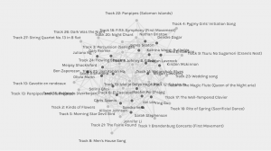
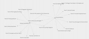
Overall graph matrix
For this exercise we were given the Golden Record quiz choices that were compiled into a .json file and then uploaded that information into the Palladio data tool. From there we needed to explore and analyze the visualizations and reflect on the possible implications and outcomes of their generation and if we can further understand the reasons behind the choices made.
Wow! That is all I could say when I first uploaded the data into Palladio. I am sure this is a common reaction for anyone first looking at all the data sets and connections intertwined in a complex web of information. Looking at all the data was very overwhelming as I tried to decipher how it was laid out and how I could manipulate the graph beyond the basic zoom in and zoom out. After a bit of playing around I began to gain a better idea of how this crazy web of information is laid out and how as stated in the Graph Theory video that, The nodes have properties that can be quantified,” (2015, April 15). When playing around I began to see the nodes of my peers and myself intertwined with the relations of the song choices. As I looked closer I could see how, “The graph showed the multiple edges between those nodes,” (2015, April 15). This quantified data seemed to help understand the meaning of the graph data as it allowed a visual picture of counting the number of interactions and relations between the nodes.
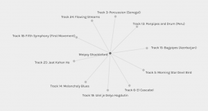
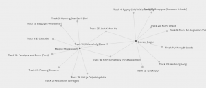
My own graph matrix
As I explored further and tried to understand the nodes and the relations, I did notice that I could start picking out the outlier songs that were not picked as much as others. There was a heavy connection on songs in the middle of the graph matrix with the outliers towards the edges with fewer connections. This seemed to correlate to the people in our class as well. Those people who had more similarities and relations with other classmates seemed to be more towards the middle of the matrix.
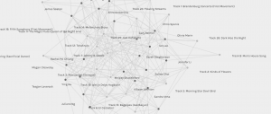
The outliers
I also found that when I looked closer at the graph matrix that I could see some stronger relations with students and the song choices they chose. I found I could choose my name along with another peer and see even further the relations to the songs we had both chosen. I noticed in one comparison that both Gary and I shared a relation with 7 of the same songs and that Anne, Deirdre and I only shared 3 similar songs. On average I shared 8 song connections with the group. As I delved through these various comparison relations, I could see the many relations of songs that I did have with peers. In comparison the most connected song I had was that of Track 25: Jaat Kahan Ho where it connected 16 times, with Track 14: Melancholy Blues coming up closely behind at 15 song connections. The least connected song was that of Track 13: Panpipes where it only connected 4 times. I also noted that Track 24: Flowing Streams, Track 18: Fifth Symphony (First Movement), Track 19: Izlel je Delyo Hagdutin, and Track 3: Percussion (Senegal) all shared 10 connections.
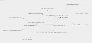
Comparison with Gary
Comparison with Anne
Comparison with Deirdre
Here is a bit more of a detailed look at the connections between myself and peers with song choices:
Anne, Deirdre = shared 3 song choices
Ben, James, Jennifer, Sandra, Sarah, Ying = shared 4 song choices
Ian, Katrina, Kirsten, Nathan, Olivia, Rachel, Selina, Teagen = shared 5 song choices
Chris, Juliano, Megan, Scott, Alison = shared 6 song choices
Gary = shared 7 song choices
Number of times the songs overlapped:
Track 6: El Cascabel = 10
Track 5: Morning Star Devil Bird = 9
Track15: Bagpipes (Azerbaijan) = 11
Track 25: Jaat Kahan Ho = 16
Track 14: Melancholy Blues = 15
Track 24: Flowing Streams = 10
Track 18: Fifth Symphony (First Movement) = 10
Track 19: Izlel je Delyo Hagdutin = 10
Track 3: Percussion (Senegal) = 10
Track 13: Panpipes and Drum (Peru) = 4
Overall, I am not sure if this exploration of data provides me a better understanding of why my peers chose the songs that they did. It is still fairly subjective and open-ended to just what the reasoning is behind the chosen songs. For me, I had originally chosen the songs trying to balance out a song choice of regions around the world but does the graph really indicate that or even tell me more about my peers other than the songs they chose? It is purely data that conveys the similarities and differences in song choices but again does not convey the why or even what the criteria my peers used when choosing the songs which leaves the reasoning open to speculation.
This hands on experience of playing around in Palladio helped provide a better insight into how the internet makes those connections and hyperlinks based on the algorithms that are created when people are searching on the internet. As mentioned in this week’s readings within Web Structure and Algorithms that, “This implies that every potential path in the network between two different documents was as likely to be followed as the next one, and that documents with more hyperlinks were statistically more likely to be encountered if you started following the hyperlinks in the documents.” This helps to understand that the more connections to information points allows us to generally see it as being more important information based on the search and clicks that topic gets and how the algorithms help determine how web pages / sites become more popular or show up faster within our search results. Therefore the more connections a page has to it, the more mentions and links to other important pages etc., the higher it climbs on the search results page. We can assume that this would help us to understand which could be more reliable information; however, we should still be cautious of the information getting the most traffic. We should delve deeper to find out the reliability of information which is what we always encourage our students to do when they are doing research on different topics.
References:
Code.org. (2017, June 13). The Internet: How Search Works. Retrieved from: https://youtu.be/LVV_93mBfSU
Systems Innovation. (2015, April 18). Graph Theory Overview. Retrieved from: https://youtu.be/82zlRaRUsaY
Systems Innovation. (2015, April 19). Network Connections. Retrieved from: https://youtu.be/2iViaEAytxw
http://hdlab.stanford.edu/palladio/about/
Palladio app. https://hdlab.stanford.edu/palladio-app/#/upload