Task 12: Speculative Futures

In this last task we were asked to consider what we have learned over this course and create two speculative narratives about our potential relationship with media, education, text and technology in the next 30 years. 

The speculative futures I have created are based on creating interactive and personal experiences between the individual and the technology. They present an idea of what could be designed and created to provide a solution to a problem. As mentioned by Dunne and Raby (2013) Speculative Everything: Design, Fiction, and Social Dreaming, the curator Paola Antonelli suggests, “We might see the beginnings of a theoretical form of design dedicated to thinking, reflecting, inspiring, and providing new perspectives on some of the challenges facing us.” (p. 88).

AR and VR have the potential to be game changers for the education and healthcare industries and will help make our classrooms a more engaging and healthier place to be.

Speculative Future #1:

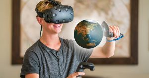
Virtual Reality view of being transported into the life of a student in a developing country.

The first speculative future I have created is based on an immersive experience of students in other parts of the world in order to experience how they live and their educational experiences.

Imagine: “Wake up Francis!” comes a voice from upstairs. Francis reluctantly wakes up and makes his way upstairs for breakfast. As he slowly climbs the stairs, he mutters under his breath that school sucks and that he doesn’t really see the importance of an education. His mom ignores his complaints and tells him to hurry up or he’ll miss the bus. Francis quickly eats his breakfast and is soon out the door and on his way to school.

Francis and his bad attitude makes it to school and into his first block where his teacher asks the class to take out their books. Francis sits and refuses and proceeds to ask his teacher, “Why do I need an education anyways?” Francis’ teacher takes this as a great learning opportunity and takes out the VR headsets to give the students a quick lesson on why an education is so important. 

Upon putting on the headsets, Francis and his fellow students are quickly transported into the life of a student in one of the townships of Capetown, South Africa. Francis soon gets to experience the life of a student in the developing world and the difficulties they must go through just to get an education. Students will be working through a new health initiative called, “Walk In Their Shoes,” which will be made all the more powerful through the use of VR. 

https://www.viar360.com

Speculative Future #2: 

Mindfulness for the Soul

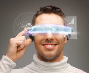
Currently we have apps that we can download with lessons and inspirations to quiet our mind and be more mindful. We have reminders that pop up on our mobile devices that can suggest we take a break or find a quiet moment. Perhaps we can jump to the future and imagine this taking on a more interactive approach, where instead of simply having a suggestion on an app, we instead have multiple pieces of technology that will work in coordination to provide an interactive assistant to actually help guide us in slowing down, taking a breath and help guide us through the strategies needed to help us regulate. 

Imagine: Frank is sitting in class when all of a sudden he starts to feel his anxiety kick into high gear. Immediately his smartwatch picks up his increased heart rate and sends an alert to the TTC (Time To Chill) app that is installed on his Google Glasses. Frank’s glasses turn on and he engages in some augmented reality relaxation techniques. 

Frank’s teacher sees that he is not doing his work but quickly realises that he is taking time to relax so that he can get his anxiety in check and return to optimal learning mode. Seeing as how educators realize the importance of mental wellness, this is not a problem and Frank is given time to get regulated and prepared to join the class once his anxiety is under control. 

It’s great to have apps and for teachers to take time out of the day to teach mindfulness, but in the classroom of the future, students will have real time help to gain control of their anxiety and stress. This seamless integration of technology will be a timesaver and mental health breakthrough for students. 

https://elearningindustry.com/


References:

Dunne, A. & Raby, F. (2013). Speculative Everything: Design, Fiction, and Social Dreaming. Cambridge: The MIT Press. Retrieved August 30, 2019, from Project MUSE database.

Task 11: Algorithms of Predictive Text

Our task this week was to explore predictive text on our phones using one of the five provided prompts and create a microblog.  

Before I began this activity, I had to first enable predictive text on my iphone 8s. It was a feature that I disabled because I always found it so annoying when I was texting and rarely used the feature. Sure I liked the autocorrect feature or that it would help me to input a word faster when I wanted to send a quick text, however I never really used it which was why I disabled the feature. 

After enabling the predictive text feature, I began to play around with the suggested prompts to see what would unfold as I chose the words that would spring up along the way. This reminded me of those fun Facebook prompts that people share every so often where you put your sentence starter in and then only use the middle suggested word. Whatever would show up, you would post and share with your friends and everyone would have a giggle about how their sentences turned out. For this task however, I am not just choosing from the middle word that pops up but rather a selection of a few word choices and even some emoji pictures. 

To begin I decided to go with the prompt: This is not my idea of….

Then I also decided to try: My idea of technology is…

As well as: Education is not about…

Constructing these sentences was a bit entertaining, however I would say none of the predictive text generated sentences that reflect what I would have actually constructed. The constructed sentences sounded stilted and seemed to lack any substance or even sound coherent. If I did not stop the sentence at a seemingly natural break, then I could have continued choosing words at whim until I got tired. The diction choices seem to mostly pull on words and even pictures that I have used in other message formats. My phone is older, so I would assume it would have a larger library of words to draw from, assuming that the algorithm is pulling the data from my phone. Or perhaps it is merely just pulling words that I have used a certain number of times, which is why I see more words that I have commonly used; hence the “predictive” concept of the textual words. This then brings me to consider this week’s readings and podcasts about predictive text and AI algorithms. In particular how algorithms are capable of breaking down massive amounts of text down to their dominant themes and patterns. 

I have used the predictive text feature when using Google Docs and it does seem to give me a more appropriate option that does “sound” like me when I write. I have used this option from time to time when I use Google Docs for writing up lesson plans and assignments for my students.This reminds me of what both O’Neil and Vallor mention in how AI algorithms can be designed to support human growth and development. Algorithms can be a valuable tool to help us become better in our professions as they can pick out patterns, and help inform our decisions. 

When I think of algorithms and politics I immediately think about Donald Trump’s time in office in the United States. I remember his complaints that Google’s algorithms were biased towards negative news articles about him and these same algorithms were silencing other conservative voices. In my opinion, these algorithms were working just fine as most of the news I remember ever seeing were about the disastrous things he was doing. If this news was playing out on T.V, then it seems reasonable that these types of articles would show up the most during Google searches for his name. I think these search algorithms also show that a higher majority of Americans and others that are going Google searches are probably leaning more liberal in their views, which would be the reason that liberal leaning articles tend to show up more in searches.


References:

Bonazzo, J. (2018, August 18). Trump Thinks Google’s Algorithm Is Biased—Here’s Why It’s (Probably) Not. The Observer. Retrieved from https://observer.com/2018/08/google-donald-trump-seo-algorithm/

McRaney, D. (n.d.). Machine Bias (rebroadcast). In you are not so smart. Retrieved from https://soundcloud.com/youarenotsosmart/140-machine-bias-rebroadcast

O’Neil, C. (2017, July 16). How can we stop algorithms telling lies? The Observer. Retrieved from https://www.theguardian.com/technology/2017/jul/16/how-can-we-stop-algorithms-telling-lies

Santa Clara University. (2018). Lessons from the AI Mirror Shannon Vallor

The Age of the Algorithm. (n.d.). In 99 Percent Invisible. Retrieved from https://99percentinvisible.org/episode/the-age-of-the-algorithm


Task 10: Attention Economy

In Your Face!

This week’s task asked us to work our way through the game User Inyerface and take notice of the ways the design of the game manipulates our attention and responses along the way. 

From the beginning, I quickly became stumped and frustrated about how to move past the first page. My first instinct was to skim and scan the information out and just move right away to where I needed to click. It is as Brignull (2011) mentions in that, “People tend to start reading at the beginning of a piece of text and as they advance, an increasing percentage of people give up and do not read to the end.” This skim and scan did not get me very far as I soon realized that I needed to read with more purpose and actually decipher what was being asked of me. Soon I saw how I could navigate better if I just focused on exactly what the game was asking of me. As I worked my way through the Inyerface game, I quickly began to see how the game was gathering information from me and how it was guiding me to put information in or answer questions. With each question or direction along the way, I must admit that I second guessed what the game was asking. It reminds me of how most of the time we can easily interact with other information gathering platforms and not fully see how the information is gathered. We are for the most part pretty unaware of these dark patterns of deception that web and interaction designers use to guide users in different directions. Tristan Harris refers to this in his TedTalk (2017) when he says that the internet and technology are, “Competing for one thing, our attention,” and that, “The best way to get someone’s attention is to know how someone’s mind works.” One other aspect I wanted to speak to was the fact we were asked to see how “quickly” we could finish. I think this immediately made me try to skim more to help me improve my time, which ultimately probably cost me time as I was missing some of the subtle cues and misdirections that were in the game. I did make it to the end to see the famous Carlton dance within 10:07 minutes but certainly thought when I started that I would have cruised through faster.

This User Inyerface game, although frustrating, does show and give a better idea of how information can be gathered based on our response patterns within a time period. The game was challenging as just when you think you have things figured out, the game creates deliberate little distractions and frustrations along the way such as pop-up reminders of the time crunch or the annoying little help box that moves ever so slowly down when you try to get it out of the way. I can see how Brignull (2011) mentions that, “The level of deception is very subtle,” and it is enough that it reinforces how the game is also trying to understand our thought patterns and the way we think. It is as Harris (2017) mentions about, “The internet not evolving at random,” but rather going as fast as it can to learn more about how our brains work to gather information on the products we buy, how we interact with others on social media, what topics create critical discourse and so much more. The whole point of the User Inyerface game was to give us a better insight to those subtle deceptions of the dark patterns in how information is gathered and how it is used in social media, advertising, development of technology tools, apps,  etc., in order for them to improve their own businesses and steer us in certain directions. As we learn more about how information is gathered and how we are manipulated, hopefully we will also become more adept at understanding these persuasions and take control and push back against the way these companies manipulate us for their own end game and purposes.

References:

Brignull, H. (2011). Dark Patterns: Deception vs. Honesty in UI Design. Interaction Design, Usability, 338.

Harris, T. (2017). How a handful of tech companies control billions of minds every day. Retrieved from https://www.ted.com/talks/tristan_harris_the_manipulative_tricks_tech_companies_use_to_capture_your_attention?language=en


Task 9: Network Assignment

Visualizing the curating of the Golden Record using Palladio

Overall graph matrix

For this exercise we were given the Golden Record quiz choices that were compiled into a .json file and then uploaded that information into the Palladio data tool. From there we needed to explore and analyze the visualizations and reflect on the possible implications and outcomes of their generation and if we can further understand the reasons behind the choices made.

Wow! That is all I could say when I first uploaded the data into Palladio. I am sure this is a common reaction for anyone first looking at all the data sets and connections intertwined in a complex web of information. Looking at all the data was very overwhelming as I tried to decipher how it was laid out and how I could manipulate the graph beyond the basic zoom in and zoom out. After a bit of playing around I began to gain a better idea of how this crazy web of information is laid out and how as stated in the Graph Theory video that, The nodes have properties that can be quantified,” (2015, April 15). When playing around I began to see the nodes of my peers and myself intertwined with the relations of the song choices. As I looked closer I could see how, “The graph showed the multiple edges between those nodes,” (2015, April 15). This quantified data seemed to help understand the meaning of the graph data as it allowed a visual picture of counting the number of interactions and relations between the nodes. 

My own graph matrix

My own graph matrix

As I explored further and tried to understand the nodes and the relations, I did notice that I could start picking out the outlier songs that were not picked as much as others. There was a heavy connection on songs in the middle of the graph matrix with the outliers towards the edges with fewer connections. This seemed to correlate to the people in our class as well. Those people who had more similarities and relations with other classmates seemed to be more towards the middle of the matrix. 

Outliers

The outliers

I also found that when I looked closer at the graph matrix that I could see some stronger relations with students and the song choices they chose. I found I could choose my name along with another peer and see even further the relations to the songs we had both chosen. I noticed in one comparison that both Gary and I shared a relation with 7 of the same songs and that Anne, Deirdre and I only shared 3 similar songs. On average I shared 8 song connections with the group. As I delved through these various comparison relations, I could see the many relations of songs that I did have with peers. In comparison the most connected song I had was that of Track 25: Jaat Kahan Ho where it connected 16 times, with Track 14: Melancholy Blues coming up closely behind at 15 song connections. The least connected song was that of Track 13: Panpipes where it only connected 4 times. I also noted that Track 24: Flowing Streams, Track 18: Fifth Symphony (First Movement), Track 19: Izlel je Delyo Hagdutin, and Track 3: Percussion (Senegal) all shared 10 connections.

Comparison with Gary

Comparison with Gary

Comparison with Anne

Comparison with Anne

Comparison with Deirdre

Comparison with Deirdre

Here is a bit more of a detailed look at the connections between myself and peers with song choices:

Anne, Deirdre = shared 3 song choices

Ben, James, Jennifer, Sandra, Sarah, Ying = shared 4 song choices

Ian, Katrina, Kirsten, Nathan, Olivia, Rachel, Selina, Teagen = shared 5 song choices

Chris, Juliano, Megan, Scott, Alison = shared 6 song choices

Gary = shared 7 song choices

Number of times the songs overlapped:

Track 6: El Cascabel = 10

Track 5: Morning Star Devil Bird = 9

Track15: Bagpipes (Azerbaijan) = 11

Track 25: Jaat Kahan Ho = 16

Track 14: Melancholy Blues = 15

Track 24: Flowing Streams = 10

Track 18: Fifth Symphony (First Movement) = 10

Track 19: Izlel je Delyo Hagdutin = 10

Track 3: Percussion (Senegal) = 10

Track 13: Panpipes and Drum (Peru) = 4

Overall, I am not sure if this exploration of data provides me a better understanding of why my peers chose the songs that they did. It is still fairly subjective and open-ended to just what the reasoning is behind the chosen songs. For me, I had originally chosen the songs trying to balance out a song choice of regions around the world but does the graph really indicate that or even tell me more about my peers other than the songs they chose? It is purely data that conveys the similarities and differences in song choices but again does not convey the why or even what the criteria my peers used when choosing the songs which leaves the reasoning open to speculation.

This hands on experience of playing around in Palladio helped provide a better insight into how the internet makes those connections and hyperlinks based on the algorithms that are created when people are searching on the internet. As mentioned in this week’s readings within Web Structure and Algorithms that, “This implies that every potential path in the network between two different documents was as likely to be followed as the next one, and that documents with more hyperlinks were statistically more likely to be encountered if you started following the hyperlinks in the documents.” This helps to understand that the more connections to information points allows us to generally see it as being more important information based on the search and clicks that topic gets and how the algorithms help determine how web pages / sites become more popular or show up faster within our search results. Therefore the more connections a page has to it, the more mentions and links to other important pages etc., the higher it climbs on the search results page. We can assume that this would help us to understand which could be more reliable information; however, we should still be cautious of the information getting the most traffic. We should delve deeper to find out the reliability of information which is what we always encourage our students to do when they are doing research on different topics.

References:

Code.org. (2017, June 13). The Internet: How Search Works. Retrieved from: https://youtu.be/LVV_93mBfSU

Systems Innovation. (2015, April 18). Graph Theory Overview. Retrieved from: https://youtu.be/82zlRaRUsaY

Systems Innovation. (2015, April 19). Network Connections. Retrieved from: https://youtu.be/2iViaEAytxw

http://hdlab.stanford.edu/palladio/about/

Palladio app. https://hdlab.stanford.edu/palladio-app/#/upload


Task 8: Golden Record Curation

There are 27 pieces of music that are on the Voyager Golden Record that draw from the diversity of the human culture around the world. For this task, we listened to the Golden Record and then we were asked to narrow down the 27 pieces of music to just 10. 

Narrowing down the music choices from 27 to 10 pieces was difficult. As I listened to each piece of music, I tried to further consider the significance of each piece of music and just why it was chosen. Having listened to the Twenty Thousand Hertz (2019) podcast, I had some ideas of why the music may have been chosen but I needed to fully listen for myself to see if I could also draw on the significance of the chosen musical pieces. Although the Golden Record does not explain the history of Earth, it does still provide a good glimpse and sampling of the varied musical sounds that provides a listener somewhere in the cosmos a good first impression of Earth. As mentioned towards the end of the Twenty Thousand Hertz (2019) podcast, a quote from Einstein said that, “Imagination is more important than knowledge.” I reflected on what that quote meant while I listened to the musical pieces.  

While I listened to the pieces of music I also felt drawn to just what the conversations might have been among Carl Sagan and the team of contributors as they began to curate this historical record and how in the end they decided to choose the music. I suppose a consideration to remember was that this is only a highlight of the viewpoints and opinions of a select group of individuals. I imagine those conversations must have been rather wild and lively in order to determine the final significance of each piece of music. I am sure this was not an easy process and as I listened to those pieces of music myself, I could see some of the diversity of the music chosen from around the world. I did however find that in terms of a balance of that music, that there seemed to be a heavier emphasis on more of a western influence of artists. 

A thought from Dr. Rumsey that stuck with me and reminded me of what we were learning in the course was that, “We do not add text to the technology, the texts are the technology.” It also reminded me of what The New London Group was talking about in terms of multiliteracies and how all texts are multimodal. Overall, text is the technology because of the variety of ways we are able to represent information. Representation of information and the ways in which we collect that information has become more diverse and complex over the years. The way the text is portrayed on the Golden Record from the musical pieces to the symbols on the outside, shows the diversity of text technologies that are coming from Earth. It reminds me of the last thought from the Twenty Thousand Hertz (2019) podcast stating that it is, A message to the cosmos. We are here and we are listening.” (31:22) or as quoted on the NASA website (n.d) by Carl Sagan, “The spacecraft will be encountered and the record played only if there are advanced space faring civilizations in interstellar space.”

When trying to decide on the type of music, I was reminded of the questions posed in this week’s readings; “What can we afford to keep?” and “What can we afford to lose?” These questions did not make this task any easier. My mind went right away to trying to show a progression and growth of music over the ages; however, after listening to the music, I realised that would be difficult to do with the seeming imbalance of the musical selections. When I finally selected my 10 pieces I kept in mind the original intent that this is, “Music from Earth.” I then tried to make sure my list provided a global diversity of music from around the world while also trying to show the various temporal diversities of sound of voice and types of instrumentation. I have further categorized the songs according to continent to show a diversity of locations from around the world. The song choices also show the varied types of instrumentation, sound rhythms, beats and of course lyrical influences. 

Here are the 10 pieces I selected and have broken them down by Continent:

African Continent:

  • Senegal, percussion, recorded by Charles Duvelle. 2:08

Australian Continent:

  • Australia, Aborigine songs, “Morning Star” and “Devil Bird,” recorded by Sandra LeBrun Holmes. 1:26

European Continent:

  • Germany, Beethoven, Fifth Symphony, First Movement, the Philharmonia Orchestra, Otto Klemperer, conductor. 7:20
  • Bulgaria, “Izlel je Delyo Hagdutin,” sung by Valya Balkanska. 4:59
  • Azerbaijan, S.S.R., bagpipes, recorded by Radio Moscow. 2:30

North American Continent:

  • United States, “Melancholy Blues,” performed by Louis Armstrong and his Hot Seven. 3:05
  • Mexico, “El Cascabel,” performed by Lorenzo Barcelata and the Mariachi México. 3:14

Asian Continent:

  • China, ch’in, “Flowing Streams,” performed by Kuan P’ing-hu. 7:37
  • India, raga, “Jaat Kahan Ho,” sung by Surshri Kesar Bai Kerkar. 3:30

South American Continent:

  • Peru, panpipes and drum, collected by Casa de la Cultura, Lima. 0:52


References:

McDonald, L. (2019). Twenty Thousand Hertz, #65 Voyager Golden Record. Retrieved from https://www.20k.org/episodes/voyagergoldenrecord

NASA. (n.d) Voyager-The Golden Record. https://voyager.jpl.nasa.gov/golden-record/


Task 7: Mode Bending

For the task this week on Mode-Bending, we were to take another look at the What’s in your bag? task from the beginning of the course and to redesign or repurpose the task. 

The intent for this task was not to record myself just stating what the items were in my bag, but to communicate the knowledge in a different way. As the New London Group (1996) stated, “Designing is making use of old materials,” and that the new redesigned material is something that has been, “reproduced and transformed.” With that in mind, I needed to think about how I could still share the information on What’s in my bag? in another way or rather change the semiotic mode. This does make me consider the importance of diversity when sharing information with others. Not all learners learn the same way, so we need to be mindful of how else and what alternate ways we can still communicate the same ideas. As I reflect on text and technologies, I have already noticed a shift of understanding from that first task and over the past month as to how I understand and interpret these literacies. I can see that text is not just focused on the written text but rather also involves the visual and even the auditory to convey meaning. These multiliteracies allow for a deeper and broader understanding of how text is just the medium to how we can communicate. 

With this in mind, I have redesigned my task from that of the original visual to an auditory interpretation. I attempted to incorporate a multimodal understanding of the text to allow for the audio and voice to be woven in with that of the linguistic delivery and perhaps even behavioural where I tried to convey my emotions and feelings as I was on my walk. My intent was to take the listener on a journey with my bag to learn more about what the bag is, how it might be used and finally what is inside the bag. While taking the bag on this journey I will try to engage the listener in a podcast style experience of a “Day in the Life” of my bag. They may discover what some of the items in the bag are as they are more straightforward while other items may be implied and they may even consider what was in the bag that may not have been shared. 

Now that you’ve listened to the podcast, hopefully you were able to capture what you heard was in my bag, or what I implied could be in my bag. Please comment below and let me know what you learned, not just about what was in my bag, but also what you may have learned about how I use my bag and what it says about me?

References:

The New London Group.  (1996). A pedagogy of multiliteracies: Designing social futures. Harvard Educational Review 66(1), 60-92.

Task 2: CLAS

Does language shape the way we think?

For this task, we watched Lera Borditsky’s SAR lecture (from May 2017).

My Annotations with the timestamp:

10:35 -This is such a thought provoking question on whether people who speak different languages think differently. Does this have an impact if you speak multiple languages? 

13:21 -This reminds me of “island time” in some places like Hawaii or Fiji where the culture is more laid back and relaxed and not so time focused. People schedule times to meet and get things done, but these times are more of a “soft” time and being late isn’t really a big deal as you are on “island time.”

18:30 – “When you teach people to talk in a new way, you are teaching them to think in a new way as well.” Just this phrase alone makes me reflect on teaching students and how we help them to approach different situations in life such as developing a growth mindset over a negative mindset. If I approach something with positive speech, I think in a more positive way. If I speak negatively, then I approach things in a more negative way.

20: 15 – I wonder the same thing? How are words assigned a gender? I would like to know more about that process when new words evolve? To make this more complicated are there words that are not assigned a gender? In our household we try not to label things as male or female, yet so many items in our life are labeled as one or the other.

28:54- It is interesting how meanings can be easily changed just by tweaking a few words. I think it’s a real art to be able to wordsmith sentences to mean different things. The example with “Chenney bagging a lawyer” reminds me of trying to speak Mandarin and how one word could mean three different things depending on the accent I used when speaking. Needless to say, there were many times that I was laughed at when trying to speak Mandarin because I used the wrong version of the word in the wrong situation. 

33:42 – When they are only focusing on the more significant items such as the toast then perhaps the participant is filtering out the “noise” or what they see as unnecessary features of information. 

45:15 – “Linguistic diversity” is not something I have ever really thought about before. Lera Boroditsky has really opened my mind to how complex language truly is and caused me to consider all the layers of diversity when we discuss language.

Task 6: An Emoji Story

Can you guess what I watched and what it was about?


Choosing the last movie, TV show or book I watched or read and depicting that in an emoji story without writing anything orthographically was a challenging activity.  At first, I thought this was going to be an easier task than it actually was. Without giving too much away, I had just recently viewed the series but chose to focus on one part of the series. I began with the title and right away I started having difficulties as I was disappointed with the variety of available emojis to convey the title. I tried both the emoji keyboard on the computer (https://emojikeyboard.io/) as well as my mobile (iPhone) to see if there was a difference of options to use. They were basically the same other than I could put the name of my emoji in the search bar on my phone, which was not available on the laptop version.

I did find it easier to begin with the title and then try to build the plot from there. This was also difficult as I again struggled with locating the emojis I wanted to use. If the initial emoji I wanted wasn’t there, then I needed to figure out what I was going to substitute for the one I wanted. In doing so, I risked changing the story that I wanted to share. I tried to find an emoji that would convey the entire word I wanted to use as when I tried to use syllables or chunk the words into different emojis then the meaning started to change as well. Given that Bolter (2001, Ch. 4, 47) says, “Digital media claims to achieve greater immediacy and authenticity by integrating images (and sound) with prose,” then relying just on the image to convey the meaning could be problematic. The use of both the text and the image almost need to be woven together to exact the meaning of what is being portrayed. When I use the emoji icons in a text message I often only use a handful to state what I want to say and if there is confusion on the side of the person receiving the message, then I have a faster and immediate ability to correct. With just using emojis to convey a longer passage, the longer the passage, the more the increase in misunderstandings. As Bolter (2001) says, “Such icons are meant to put the verbal text in context, as the writer tries to enforce a univocal interpretation on prose that is otherwise open to many interpretations.” In using the emoji icons, we use them to portray an emotion to short bursts of text messages and sometimes the meaning could be misinterpreted. We then rely on using the written words to craft more descriptive responses. So to reiterate, creating my story plot and title in only emojis without written text woven in to support the information was a difficult task. I wonder then if you can figure out the title and then the plot I was trying to explain through my use of emojis?


References:

Bolter, J. D. (2001). Chapter 4. Writing space: Computers, hypertext, and the remediation of print (2nd ed.). Mahwah, N.J: Lawrence Erlbaum Associates. doi:10.4324/9781410600110


Task 5: Twine

Catching a Gnarly Wave

Twine: Catching a Gnarly Wave

I had heard of Twinery before, but had yet to try it out. In the beginning, it was fun to start playing around with the story and linking the steps together. Even with the instructions printed off and sitting beside me, things did not make sense until I actually started playing around with it, shaping what I was going to say and providing links and choices for the reader along the way. I found I almost needed to remind myself to provide a choice for the reader to choose, so they feel as if they have control of what they are actually choosing for the next steps of the story. In a way, this reminded me of putting a puzzle together, where the pieces needed to connect together to try and move onto the next step and attach another puzzle piece.  

As I created the Twine, Catching a Gnarly Wave, I reflected on how the idea of what Bolter (2001) referred to as linear and closed script and how script has changed over time with our use of hypertext. I also reflected on the article by Miall and Dobson (2001) where they quoted (Landow 1997, p. 273) in saying that, “hypertext increases individual freedom,” because “users are entirely free to follow links wherever they please.” Using Twine to create a story allowed that freedom of looping ideas together and circling back to make another choice. As a child I loved Choose Your Own Adventure stories and I enjoyed how some of the choices I made linked together and how I could restart the story again and choose a new path. The ease of the Twine hyperlinks allows immediate direction and choice to the path I wanted to follow in the story. One thing I noticed is that in the story I used “I” over “You” to show more personalization and make the reader feel as if they are the central part of the story, whereas “you” makes it seem a little less personal. 

Creating the Twine was fairly easy to navigate and I enjoyed how I was able to insert audio code into my story to try and give it a bit more life. I was able to insert a few sound bites, but the enjoyment soon disappeared as new soundbites were not working and it took me much longer than I thought to delete lines and lines and lines of audiocode. After a few more tries the whole Twine froze and eventually kicked me out. Good thing I had already saved a copy.

References:

Bolter, J. D., & EBSCOhost. (2001). Writing space: Computers, hypertext, and the remediation of print (2nd ed.). Lawrence Erlbaum Associates. https://doi.org/10.4324/9781410600110

Miall, D. S., & Dobson, T. (2001). Reading hypertext and the experience of literature. Journal of Digital Information, Retrieved from https://explore.openaire.eu/search/publication?articleId=issn13687506::feae30569d02fbf0a7451897e74be20b

Task 4: Manual Script

Manual Script:

Reflection on Komodo National Park – The Land of the Dragons

Commentary on Manual Script:

Normally I use a combination of both manual handwriting as well as typing things out on my computer. I lean more heavily on using a computer to capture my thoughts, notes, letters, etc., everyday. However, I do always keep a scribbler on my desk for capturing notes from meetings or lists of what I need to do each day. Those pages are usually covered with an array of multi-colored Post-it notes with little reminders that I leave for myself. When I look at my writing, it is rarely smooth and neatly written.  Usually it is rather messy and more often than not, hard to read by anyone else other than myself.

Knowing that I was going to be writing for this task, I chose to create a brainstorming page of what I wanted to focus on as this would allow me to stay on topic and create a flow to my writing. I also chose to write on a topic that was familiar to me and I therefore drew on a reflection from a travel experience with my family. I wrote as sort of a reflection as well as offering some advice as if I was to share it with a friend. 

As I do not normally hand write this much, I knew I was going to have to be careful to try my best to be tidy. When I first started, right away I disliked my writing and the first few words were immediately full of spelling mistakes. I quickly tore that sheet out of my book, stretched out my fingers and began again. I tried to be careful as I wrote, maintaining my thoughts of what I wanted to say along with keeping the writing legible. I found as I was writing, that writing on a computer allows me to quickly fix what I am trying to write and of course it is more legible to read. As David Collier (Cooke, D. 2012, 1:46) mentioned in the YouTube video: Upside Down, Left to Right: A Letterpress film, “Where technology pushed forward is that we can arrange things in an instant,” which is not easy to do when you are manually writing text by hand. I could feel my fingers start to tire and I would have to adjust the pen I was holding to make it more comfortable. I could see the slight shift in the angle of my writing. As I wrote I also would need to stretch out my fingers from time to time as my hand would tire and at one point I even shook my hand to give it a break. One thing I also noticed as I was writing was how I shifted from printing to cursive writing on and off in the whole piece of writing. I also noted that I was putting too much pressure from my pen onto the paper and that the paper itself started to curl inwards.

One of the significant differences I reflected on between that of using a computer for digital writing and the hand writing, is that after writing out this reflection, I actually felt more pride in the ownership of the end product where I probably take writing with a computer more for granted as it is easier and more comfortable to use in my daily life. It is also easier to make copies of if I was to share it. This in turn reminded me of what Harris (2018) mentions towards the end of the podcast entitled, “The Printed Book: Opening the Floodgates of Knowledge.” In it he talks about, “Cultivating the progress of knowledge in our own time,” and how much has changed and advanced with the printed word. It makes me realize how we take for granted the technologies we use everyday! I am thankful for this advancement considering how much work it is to produce even a small passage writing by hand. I am dating myself, but I recall still hand writing lecture notes and essay writing in university. I remember being so excited when personal computers became accessible and we no longer had to use the university computers with the green or orange text on a black screen. 

References:

Cooke, D. (2012, Jan. 26). Upside down, left to right: A letterpress film. [Video]. YouTube. 

https://www.youtube.com/watch?v=n6RqWe1bFpM&feature=emb_logo


Harris, B. (Producer). (2011, June 11). How it began: A history of the modern world. [Audio podcast] https://howitbegan.com/episodes/


Spam prevention powered by Akismet