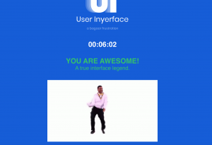
This was not an easy feat and had me do it 3 times before I finally figured how to get through the game. When the buttons do not match or the mouse does not change when it comes to a hyperlink, it is very maddening. This reminded me of those IQ brain teaser computer tests students used to have me do. I can not remember the name of them, but the same context is like you need to click on the word to move on or it says to pick the word purple but it is written in green, etc. The point is I had to think and read. Most times when we answer questionnaires on Facebook or order a subscription on the app we rush through, and even though we may read the fine print it can still be written in a way that is dishonest and we do not notice until our credit card statement comes.
Brignull (2011) opens his article with the statement, “with this in mind it’s no surprise that deception appears in various guises in user interfaces on the web today.” Companies want the most bang for their buck and we want easily accessible products, so without being aware extra hidden costs are being added to our bills. “What’s clever here is that the level of deception is very subtle. Although it’s likely to boost their conversion rates, it also steers clear of any legal issues” Brignull (2011).
How many times have you been looking through Instagram or Facebook talking with your friends about some product or something, and then bam the next time you go in you are flooded with advertisements of what you were just discussing, which makes you question “are our phones listening to us?”
Listening to Tufekci (2017) Ted Talk where she explains how following Trump’s rallies on Youtube had white supremacy videos begin to pop on her feed, really made me stop and think. What happens when a teenager decides to look up what depression is and instead of helpful links is taken to dark sites with dark alternatives. Like Tufekci (2017) said, “the algorithms need to change.” They need to be difficult as it was to do the Inyerface online game. Because when our online interactions are designed to be seamless, there is deception. However let’s not lose faith in the human race just yet as Brignull (2011) discusses some companies do not know that is what they are doing, and with great organizations such as darkpatterns.org when these companies are called out, they will make changes.
It just amazes me, scares me, just all of this possible, just through a click of a button.
References:
Brignull, H. (2011). Dark Patterns: Deception vs. Honesty in UI Design. Interaction Design, Usability, 338.
Tufekci, Z. (2017). We’re building a dystopia just to make people click on ads. Retrieved from (Links to an external site.)https://www.ted.com/talks/zeynep_tufekci_we_re_building_a_dystopia_just_to_make_people_click_on_ads?language=en (Links to an external site.) (Links to an external site.)