Author Archives: mmartin7

The Future of Emoji Final Project

With the development of technology, a new communication type was formed that would lead to future discussions. There has been a lot of debate as to whether emoji is a new form of language or an old language modernized by technology.  If emoji is a new language that can communicate meaning without the use of an alphabet system, then ideas should easily translate across different cultures.


Advantages of Emoji

Alshenqeeti (2016) states that “language is not stagnant, it evolves with society and new forms and terminologies are constantly appearing, and emojis are just another aspect of this” (p.61).  An interesting fact that Skiba (2016) mentions from Mosendzs’ 2014 study was that in order to communicate with millennials, the White House uses emoji.  Those born after 2000 (Millenials) grew up in a technology world which uses text-based devices easily which “raises the question of whether emojis are creating a new visual language for a new technology savvy generation…” (Alshenqeeti, 2016, p.1).

There are numerous advantages to using emojis such as:

1)They are not based on any alphabet system and therefore people can communicate without learning the language first (Alshenqeeti, 2016)

2)Those who have difficulty texting by thumb on a small screen, emojis provide a faster way of replying easily without getting hand fatigue (Skiba, 2016)

3)Emojis do not rely on morphemes or any grammar and therefore emojis can be string together in multiple ways to communicate the same meaning (Gawne & McCulloch, 2019)

4)An emoji can “express emotional complexity in a short and creative way, that cannot be conveyed with verbal language” (Alshenqeeti, 2016, p.60)

5)The file size of an emoji is lightweight but still show detail and is multicolored (Gawne & McCulloch, 2019)


Ties to the Past

Alshenqeeti (2016) referenced Thurlow and Brown (2003) stating that part of the controversy around emoji as a new language was that “Emojis evolved from teen and commercial culture” (p.58).   However, others ave countered this with the idea that emojis are not something new, but revised pictographs from the past.   For instance, early cavemen were the first to depict life in the form of pictures (Alshenqeeti, 2016).  As well, the Sumerians developed Cuneiform and the Egyptians used a hieroglyph system to record historical events (Alshenqeeti, 2016).  Just like Lewis Carroll (author of Alice in Wonderland) who wrote and illustrated a rebus like letter, emojis can be inserted in between words adding creativity into the communication (Alshenqeeti, 2016).  Whether emoji is a new form of language or an evolution of pictographs from the past, the “word emoji has tripled in use since it emerged in 1997” reaching millions of people (Skiba, 2016, p.56).


Emergence of Emoji and Emoticon

Emojis can be confused with emoticons and stickers.  Tang and Hew (2019) defined that emoticons use keyboard symbols combined together to create a picture and originated in China, while emojis are actual pictures that originated in Japan and require a specific software.  For this paper, both emojis and emoticons will be taken into consideration because of the limited data available on the subject.

While working for the Japanese company Docomo, Shigetaka Kurita developed the concept of emoji (Skiba, 2016).  Emojis then began to be available in Japanese mobile phones and started gaining popularity in 1999 but the codification was not standardized at this point (Moschini, 2016).  By 2010, emojis that were commonly used were adopted to a Unicode standard (Tanya and Hew, 2019).  Gawne and McCulloch (2019) related that the “inclusion of emoji in Unicode enabled Apple to include emoji with their iPhone when Apple moved into the Japanese mobile market and made this part of the global release of the iPhone with iOS5 in 2011” (p.2).  The combination of technology and the ease of using emojis across a wide range of audience contributed to its rise.

By November 2015, the Oxford Dictionary chose the “Face with Tears of Joy” pictograph for the word of the year (Skiba, 2016).  Moschini noted from the Steinmetz (2015) study that the President of Oxford Dictionary clarified that the emoji was chosen because it was a form of communication that reflected a global culture because it was playful, emotionally expressive, and immediate (2016).  It is interesting to note that Harvey Ross Ball in 1963 was the American designer who created the original ‘smiley’ face which gained popularity and evolved over time (Moschini, 2016).  Moschini (2016) stated that the smiley face emoji can be seen as a marker in the fusion of Japanese kaomoji and the 1960s pin-button from American culture.  This Japanese-American mash up could be the beginning of universal acceptance of a pictograph (Moschini, 2016).   Tang and Hew (2019) relate from Azuma and Ebner’s 2018 study that graphicons can be a future universal symbolic language as it bypasses linguistic and cultural differences and can reach globally.  However, Tanya and Hew (2019) also noted that “while emoji may be evolving to a language, emoji language is not the same across cultures” (p.2458).


Complexity of Emoji: Global Acceptance and Cultural Variations

Tang and Hew (2019) focused on peer-reviewed journals from Asia, North America, and European countries.  The study found that there was a commonality worldwide where in people use emoticons, emoji, and stickers to express emotions, to avoid misunderstanding, for enjoyment and for social purposes (Tang and Hew, 2019).  The study also found that people tend to use emoticons that are understandable and that senders of friendly emoticons are perceived as more likeable, but senders who use excessive emoticons are seen as insincere (Tang and Hew, 2019).  However, Tang and Hey (2019) relate from Park, Barash, Fink, and Cha’s study (2013) that Asian cultures favored vertical emoticons with variations in eye shape while those from Western cultures prefer horizontal emotions with differences in mouth shape.

In addition, Alshenqeeti (2016) stated that there was global acceptance in some popular emojis from several countries.  For example, the United States had ‘face with tears of joy’ as the most popular emoji  followed by ‘kissing face’ emoji, and ‘heart eyes’ emoji while Columbia had ‘heart eyes emoji’ as the most popular followed by ‘face with tears of joy’ and then ‘heart’ emoji as third (Alshenqeeti, 2016).  Alshenqeeti, H (2016) mentioned from Lu et al. (2015) study that ‘face with tears of joy’ was the most popular emoji for the US, Brazil, Mexico, Spain, Turkey, Indonesia, and Russia.  However, the most popular emoji for Argentina and Columbia was ‘heart eyes emoji’ and the most popular one for France was ‘heart’ emoji (Alshenqeeti, 2016).  Thus, even though there are universal acceptances in some emojis, slight cultural variations within countries can be seen.  The Li and Yang (2018) study focused on ten volunteers using Wechat in China and found that the top emojis frequently used were the ‘thumbs up’ emoji, followed by the ‘rose’ emoji and ‘traditional Chinese way of greeting and thanks’ emoji.  It is interesting to note that the ‘face with tears of joy’ emoji was not in the top three.  The top three popular emojis in China were gestures that were highly functional and efficient for conversations and replies (Li and Yang, 2018).

Additionally, the most common emoji in the Unicode are gestures with the pointing index fingers going up, down, to the left and to the right (Gawne and McCulloch, 2019).  The article reported that “while many Westerners may think of index-finger pointing as the most prototypical, and indeed it is common cross-culturally, it is far from a universal, as cited by Cooperrider, Slotta, & Nunez, 2018” (Gawne and McCulloch, 2019, p.12).  For example, the Arrernte people from Australia uses the middle-finger to point while the Laos people use lip pointing (Gawne, and McCulloch, 2019).  Furthermore, emblems are gestures that are mostly universal and can stand alone without text or speech (Gawne and McCulloch, 2019).  Though there may be some cultural variation within this.  For example, the ‘peace sign’ emoji in North America stands for peace, but if you rotate it with the palm facing inside, the gesture is seen as offensive in Britain, Australia, and New Zealand (Gawne and McCulloch, 2019, p.5). The study also mentioned that in Greece, Turkey, and Southern Italy, that the ‘okay sign’ emoji does not relate a positive meaning, but the opposite (Gawne and McCulloch, 2019, p.5).


Future of Emoji

The potential for emoji is still developing and we are continually learning more about this type of communication.  The future uses of emoji may be able to encompass a more global and “diverse population, including those with low literacy” which in turn can remove a digital divide (Skiba, 2016, p.57).  The advantage of emoji in not relying on an alphabet system is that it allows learning in a creative pictorial way and fosters collaboration since emojis are based on pictures, it cannot “be taught, rather it is acquired over time, through use and sharing” (Alshenqeeti, 2016, p58).

There have been several quantitative researches in emojis.  However, language is complex and emoji is still evolving and new emojis are continually being added to the Unicode.  Thus far, data in this field has been limited.  Further quantitative and qualitative research is needed in order to understand the future of emojis globally and gain a deeper understanding into the slight cultural varieties.  Furthermore, more research is needed into creating a standard for emojis as each vendor can render their own picture of the same emoji and this may lead to miscommunication between the sender and the recipient (Miller et al., 2018).  Lastly, as more emojis are continually added to the Unicode, emoji research would “provide clear criteria for how emojis would have to be used to move towards being more language-like” (Gawne and McCulloch, 2019, p.15).


References:

Alshenqeeti, H. (2016). Are emojis creating a new or old visual language for new generations? A socio-semiotic study. Advances in Language and Literary Studies7(6), 56-69.

Gawne, L., & McCulloch, G. (2019). Emoji as digital gestures. language@ internet17(2).

Li, L., & Yang, Y. (2018). Pragmatic functions of emoji in internet-based communication—a corpus-based study. Asian-Pacific Journal of Second and Foreign Language Education3(1), 16.

Gawne, L., & McCulloch, G. (2019). Emoji as digital gestures. language@ internet17(2).

Miller Hillberg, H., Levonian, Z., Kluver, D., Terveen, L., & Hecht, B. (2018). What I See is What You Don’t Get: The Effects of (Not) Seeing Emoji Rendering Differences across Platforms. Proceedings of the ACM on Human-Computer Interaction2(CSCW), 1-24.

Moschini, I. (2016). The” Face with Tears of Joy” Emoji. A Socio-Semiotic and Multimodal Insight into a Japan-America Mash-Up. HERMES-Journal of Language and Communication in Business, (55), 11-25.

Skiba, D. J. (2016). Face with tears of joy is word of the year: are emoji a sign of things to come in health care?. Nursing education perspectives37(1), 56-57.

Tang, Y., & Hew, K. F. (2019). Emoticon, emoji, and sticker use in computer-mediated communication: A review of theories and research findings. International Journal of Communication13, 27.


Task 12 Speculative Futures

The Continuation of Sam Greenspan’s Podcast 01 Autopilot Off

          ………. sorry let me translate !!

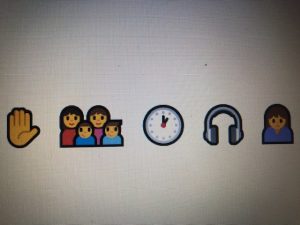
Hi everyone, it’s about 1 pm and you are in time to join me for a holographic meeting with Kaey.  I believe in the olden days they called it an on-line meeting using Zoom.  Nowadays, we meet in a virtual world using avatars.  It’s just more convenient.  I’ve also translated this conversation into an English text that is easier for you to understand.  Normally we converse with just emojis as they are a universal pictorial language that is easy to understand and require a lot less words.

I’m Mell by the way.  It’s the year 2065, post COVID times.  Ikiris, Kaey, and I all work for the same archeology firm but we are based on different parts of the world.  I’m in Iceland.  We are all working on communication evolution from technology.  Hang on a sec while I put my gear on.  I’m meeting Kaey in Singapore at a coffee shop.

Player One Movie  https://www.imdb.com/title/tt1677720/mediaviewer/rm2943833856


Mell: Hey Kaey, how’s it going in Singapore ?

Kaey: It’s great! Really loving the variety of food capsules.  Did you hear anything from Ikiris?

Mell: Yup, she copper wired me yesterday.  She’s living in some short-term cryogenic place in Phoenix with Cass.  The big city she says, but super expensive.  She’s just finishing up an artifact.

Kaey:  I’ve never been to Phoenix but always wanted to go!  We have to definitely set up holographic meet so she can tour us around the city.  I just got a new outfit for my avatar, ultra-sport fiber jump suit.

Player One Movie

https://www.imdb.com/title/tt1677720/mediaviewer/rm2349815552

Kaey:  Anyways, how’s the emoji project coming along?

Mell: It’s pretty interesting. I read somewhere that hieroglyps was an old visual language and emoji was the new one.  It’s like vinyl records from the 1900-1930s that went out and then came back in the 2020s, but shinier.

Kaey: I was looking at the archives and I think the Oxford Dictionary posted in November 2015 that the “Word of the Year” was the emoji “Face with Tears of Joy.”  Probably shocked the world !

Mell:  Yeah, I think that time period was still figuring things out.  Emoji was still evolving back then, but it really became prevalent in history, socially, and culturally as time went on.  I think we need to do further research into this.

Kaey: Well, back then they were using a few emojis in sentences or phrases to express idea or enhance emotion.

Mell:  From some of the archives, some emojis were in the beginning of the sentence, some in the middle, and others at the end.  Can this have any significance in communication?

Kaey: Does placement of the emoji change the context?

Mell: On a different thought……… are there some emojis that are globally accepted and some culturally specific since they are visuals?

Kaey: Or can the emoji be misinterpreted!

Mell: That’s true like the emoji “Face with Tears of Joy.”

Kaey: Or the emoji “Praying Hands.”  It can literally mean praying or “ thank you” or “please” depending on what your saying. But is this culturally specific?

   1) Can you get me a loaf of bread from Safeway on the

   2) The fan was such a nice surprise on this hot day. 

  3) Today I’m taking my mom to    at Saint Vincent’s.


Mell: Lots of people back then seem to use it in their social media like Twitter, Facebook, texts so there’s a lot of data to look at.

Kaey:  Let’s both sift through the archives around culture and emoji use and meet back here same time next week and compile the information.

Mell: Sound good!

To be continued………………………………………….


References:
Arafah, B., & Hasyim, M. (2019). The Language of Emoji in Social Media. KnE Social Sciences, 494-504.
Freedman, A. (2018). Cultural literacy in the empire of emoji signs: Who is crying with joy?. First Monday.
Gawne, L., & McCulloch, G. (2019). Emoji as digital gestures. language@ internet17(2).
Ge, J., & Herring, S. C. (2018). Communicative functions of emoji sequences on Sina Weibo. First Monday.
Guntuku, S. C., Li, M., Tay, L., & Ungar, L. H. (2019, July). Studying cultural differences in emoji usage across the east and the west. In Proceedings of the International AAAI Conference on Web and Social Media (Vol. 13, pp. 226-235).
Mathews, S., & Lee, S. E. (2018). Use of emoji as a marketing tool: An exploratory content analysis. Fashion, Industry and Education16(1), 46-55.
Miller, H. J., Thebault-Spieker, J., Chang, S., Johnson, I., Terveen, L., & Hecht, B. (2016, March). “Blissfully Happy” or “Ready toFight”: Varying Interpretations of Emoji. In Tenth international AAAI conference on Web and social media.
Miller Hillberg, H., Levonian, Z., Kluver, D., Terveen, L., & Hecht, B. (2018). What I See is What You Don’t Get: The Effects of (Not) Seeing Emoji Rendering Differences across Platforms. Proceedings of the ACM on Human-Computer Interaction2(CSCW), 1-24.
Moschini, I. (2016). The” Face with Tears of Joy” Emoji. A Socio-Semiotic and Multimodal Insight into a Japan-America Mash-Up. HERMES-Journal of Language and Communication in Business, (55), 11-25.
Vidal, L., Ares, G., & Jaeger, S. R. (2016). Use of emoticon and emoji in tweets for food-related emotional expression. Food Quality and Preference49, 119-128.

Linking Assignment #6

Linking Assignment 6 – Task 1: What’s in your bag?

For my last linking assignment, I am writing on our first task, What’s in your bag ? I enjoyed reading Jeevan’s post and even though most of our items aren’t similar, we had the same similarity in ideas.

Jeevan Pannun’s Blog: https://blogs.ubc.ca/pannun/2020/05/17/whats-in-my-bag-task-1/

My Blog: https://blogs.ubc.ca/melomart/2020/05/19/whats-in-my-bag/


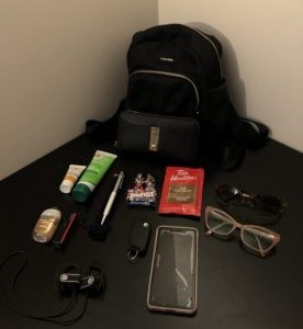
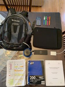
Jeevan’s Bag                                              My bag


Jeevan and I used WordPress and our website are identical in the way it is laid out.  This made it easy to navigate to the post I was looking for.  Jeevan started his post by identifying each of the items he had in his knapsack and the reason it was there.  He mentions the calculator he used in school as a student fifteen years ago and now as a teacher for calculating student marks.  Other items he mentioned where his highlighters, USB stick, water bottle,  Dell school computer and carrying case.  Even though most of our items aren’t the same, we both have a similiar idea to be prepared for anything unpredictable that can happen in a day as a teacher.  If I expanded my picture to encompass my knapsack that I take to work everyday, I would also have highlighters and the same Dell computer and carrying case.

His writing flowed as he went on to mention that items in his knapsack could be considered text since some had written information on it such as his notebook while others had printed information such as the label on his USB stick.  Like him, I have a sticky notepad as well as a planner to keep the information I need to jot down notes.  I like how he expanded this idea further by mentioning that it can be deduced from the items, that he lives in a society that spoke English.

His post went on to mention various text technologies he had such as the Bic pen he used to write, the highlighters he used to differentiate words when he is communicating with others as well as the printed sheets.  I liked the way he tied in that his notebook and pen function together to confirm that he writes language to communicate information.

Jeevan’s post moved on to mention that since there are text items in his knapsack, one can deduce that he is literate in that he can literally read and write.  He went on further to explain that people can also conclude that he may also be numerically literate because of the calculator.  He added on that one can also assume that he is digitally literate from the USB stick and computer he has.  I connected with his writing when he said that from an archeologist point of view examining his items in the future, they can assume that he lived in a period where technology exists, but it is also a period that still uses paper and pen.

I enjoyed reading Jeevan’s post and like the way he explained text, text technology, and digital literacy in a concrete and relatable way from the items in his knapsack.


Linking Assignment #5

Linking Assignment 5 – Task 10: User Inyerface

I chuckled as I read Katlyn’s post from the User Inyerface game.  Although I was connecting with the game in a different way, I can relate to the challenges she faced completing the game.  The words “I know what you mean and I felt the same way” floated in my mind as I was reading her post.

Katlyn Paslawski’s Blog:  https://blogs.ubc.ca/paslawski540/2020/07/09/attention-economy/

My Blog:  https://blogs.ubc.ca/melomart/2020/07/12/task-10-attention-economy/


User Inyerfeace Online Game by Bagaar:  https://userinyerface.com


Katlyn and I are using WordPress so it was easy for me to navigate her website.  She has tabs at the top part with headings for introduction, tasks, linking assignment, and final project.  It was easy to go into the task tab to access the attention economy post.  I also like the background picture of mountains as her back drop.

I connected with Katlyn’s struggle as she faced each of the challenges in order to reach the end of the game.  The short video clips embedded in her post was such a clever way of communicating her frustration and happiness! Like her, in the beginning, I thought that this would be a simple task compared to the other tasks that we had to do in the past.  I also changed computers because I thought I would be faster using a mouse than a track pad.

I enjoyed the way Katlyn led the reader through each of the activity in a humorous way.  She showed a visual of each of the activity and talked about her thoughts and the process such as when she was figuring out what she was supposed to do when completing the email and password part.  I also googled the meaning of Cyrillic ????

Another thoughtful paragraph in Katlyn’s post was when she was completing activity two where she had to choose three interests and upload a picture. She mentioned that the flashing numbers at each level and the highlighted green “cancel” button at the bottom of the screen was distracting.  It was a subtle way of mentioning to the reader that this was a dark pattern at work.

I related to her challenges at activity three because at this stage, I didn’t care about real answers anymore and just filled in the boxes with personal information of what I thought the game wanted.  Like Katlyn, I also struggled completing the birthday and age section because this part had to actually match up.  It was the little details that added to the frustration.

It took me longer to complete the game because I tend to read everything, including the small print, especially when it looked like a form that wanted personal information. Katlyn summed up the experience when she said that the “game goes against what you think you know” and therefore de-stables the predictability that we are use to when filling out forms.  As a consumer, one often gets use to filling out online forms that skipping the fine print and when the order of the meaning changes, we don’t often see it.

On another note, I was playing this game when I visited my elderly mom.  Now, she never pays any bill and never shops online.  For fun, okay, as an experiment, I asked if she wanted to play the game.  I said that she can press any button, it’s safe and she won’t be giving any personal information away.  She never got past the first activity.  She became frustrated with the pop-up cookie button, the timer, buttons that didn’t work, and misleading directions.  Technology isn’t new, but it is continually becoming more prevalent in our lives.  Right now, it seems to be like the wild west because there are no regulations and everything is grey. Brignull mentioned that consumer knowledge is helpful as well as a specific code of eithics with transparency (Zeynep Tufekci), and new models of accountability (Tristan Harris).  I think these are great goals to strive for moving forward with technology.  I can understand that it would be challenging to create specific rules for companies to follow and to protect consumers from dark web patterns when technology changes so fast that things become obsolete or outdated.  There are lessons in school for elementary students around internet safety and internet bullying.  I think it would be great to expand this to workshops offered in libraries for older adults around online consumer safety and knowledge.


Linking Assignment #4

Linking Assignment 4 – Task 7: Mode Bending

I decided to do a linking assignment on Rania’s mode bending task because I felt a connection when I listened to her audio clip.

Rania Ismail’s Blog – Task 7: https://blogs.ubc.ca/met2020/2020/06/26/task-7-mode-bending/

Task 1: Rania’s Bag


My Blog – Task 7: https://blogs.ubc.ca/course9fa832d3ed5e9bc0e2a4b9d769b3ff09f6e98b71/2020/06/24/task-7-mode-bending/

Task 1: Melody’s Bag


After I listened to Rania’s audio clip, I looked into her bag from task 1.  In her audio clip, Rania mentions that you can’t really know a person from the outside of the bag and that this can be misleading.  In order to identify who a person is such as their personality or interests, one must look inside the bag at the items.  Our dark colored functional bag shows that we are often on the move and therefore carry items that are essential.  This is true as we are both teachers and live in Vancouver.  Other items we have in common are a wallet, cream, pen, cell phone, car keys, and an emergency bar to eat.  A person looking at our items can say that a personality trait is being practical since we carry emergency bars to eat, we have hand creams, and we prepare for different types of weather.

Rania mentions that the items in your bag can tell who you are and I am going to add to this that it can also show smaller specific groups that you belong to within your community.  For my post, I used a playlist consisting of brand names for the items in my bag.  Just the type of cell you have can communicate if you’re an Apple person or Microsoft. Items can also share specific items you like such as the brand of hand cream you use.

This task was quite open ended and led to various forms of creativity and individuality.  From the New London Group’s idea on multiliteracies, I think this is an area that is still evolving.  Classrooms in the past relied heavily on traditional ways of teaching and output is usually in the form of a paper.  Technology opened a new dialogue of communicating, learning, and options for the final product (video, audio, emoji, text).  Unlike hand stamping which was time consuming, labour intensive, and output was minimal, technology opened up multiple forms of communication where each of us can be authors.

I found Rania’s website easy to use as she was using UBC’s WordPress.  I am still a novice in creating a website and therefore find it helpful that some of my colleagues were using the same UBC WordPress as I was.  I like looking at the different ways people customized the architecture of their WordPress site.  Rania had her recent posts and comments at the right bar which was the same as mine.  The additional home and sample page were slightly changed from mine in that they had a black background which made the heading show up more clearly.


Linking Assignment #3

Linking Assignment 3 – Task 6: An Emoji Story

I decided to do my third linking assignment on Ryan’s emoji story because I connected with his ideas and I enjoyed the layout of Ryan’s website.

Ryan Dorey’s Blog: https://blogs.ubc.ca/ryandoreyinetec540/2020/06/18/%F0%9F%87%A8%F0%9F%87%A6-%F0%9F%8E%A5-%F0%9F%91%A6%F0%9F%92%8A%F0%9F%98%A3-%F0%9F%86%9A-%F0%9F%8C%8E/

My Blog: https://blogs.ubc.ca/melomart/2020/06/19/emoji-story-plot/


????????????????????????????

Retrieved from: https://emojikeyboard.io/


Ryan and I both used WordPress so I was familiar with navigating around it.  However, our textural architecture is different.  I had headings for the list of my tasks and past comments from people to the right of my post.  I this is useful for the reader in the event they want to go to another page, it’s just one click.  I also had my comment page at the bottom of my post for people to easily comment on after reading.  This was a bit challenging to find in Ryan’s website.  The tabs for tasks and the linking assignment for Ryan’s website were categorized at the top of the page and he also included a biography.  Having the tabs at the top created a cleaner page with less distraction.  I like that the weekly tasks where each numbered since it allowed the reader to jump to the post they want easily, though to do this required an extra click.

I find it interesting that I wrote my emoji story from left to right with periods and then did a return sweep to the left again.   Ryan had one line for his emoji sentence with a page break to show the end of a paragraph.  We both started with the title and then built the emoji story from this.  In his post, Ryan made a valid point in mentioning that non-verbal cues such as facial expressions or gestures were difficult to portray when just using emoji, while I felt that emoji allows the reader to get to the point without the pleasantries one does in a real conversation.  However, we had the same thought that this made it difficult to have connection you would have in real life and sometimes meaning may get confused.

The only difficulty I found attempting the emoji task was finding the specific emoji I wanted, but perhaps that’s part of the point.  At first glance, the emojikeyboard looked like it had a lot of emojis but categories were limited.  This exercise was definitely thought provoking, because most of us use emojis in our text without thinking too much of it. It’s an easy short cut to typing the word or sentence.  But unless you know the person well at the other end of the conversation, meaning may get misinterpreted as emojis revolve around association and therefore may not convey the same meaning.  This makes me wonder if some emojis are culturally specific?  Additionally, since emojis conveys an idea without the specifics, then it would be a struggle to have meaningful conversations at a deeper level.


Linking Assignment #2

Linking Assignment 2 – Task 4: Manual Scripts and Potato Printing

I decided to do my second linking assignment on Bailey’s potato printing because we had similarities in the visual layout of our website, but difference in author voice.

Meggs Keating’s Blog: https://blogs.ubc.ca/baileysblog/2020/06/05/white-whilt-while/

My Blog: https://blogs.ubc.ca/melomart/2020/06/04/manual-scripts-and-potato-printing/


Since we both used UBC WordPress, Bailey and I had a lot of things in common on our online platform and therefore it was easy for me to navigate around it.  We both didn’t have tabs at the top of the page and our recent posts and comments are to the left of the page.  One thing that she had that I didn’t was an Archive heading on her side bar.  I am thinking that in the future I should either create another heading to group my tasks in one section and linking assignments on another because the content is different.  Or maybe I should create different headings at the top of the page? WordPress and creating a website are new to me so I am still in the exploratory, information absorption, and thinking stage.  I find it inspiring having the time to browse through my colleagues’ websites.


                                   VS         

Walmart.ca                                                                                     Ikea.com


I really enjoyed reading Bailey’s post on her potato printing task because I was drawn to her storytelling.  I sense that she is an amazing writer and I love that I can hear her voice in the text.  The tone of her writing for this task is informal, yet scholarly and very relatable. As she describes her trip to the grocery store and the process that she went through to do her potato printing, there was precise vocabulary choice in words that evoked emotion in the reader.  For this task, I wrote quite a lengthy post and talked about the process for my potato printing and manuscript writing.  I also included reflection and integrated some of the readings, but after reading her writing, I think I may “play” around more with different voice in the future with different styles of text, maybe poetry?

We both noticed that potato printing was quite labour intensive and that writing would be more efficient if time is a constraint.  Now this task was straightforward: buy potato, cut potato into a letter, print potato.  However, there is room for interpretation to show your individuality.  A constraint for me was that I have tendinitis in my left elbow which was why I wrote in shorthand.  At the end of Bailey’s text, she noted with humour that “nobody said the letters had to be in the same direction.”  I chuckled at this ????


Linking Assignment #1

Linking Assignment 1 – Task 8: Golden Record Curation

I decided on a linking assignment to Brian’s blog on the Golden Record Curation.  When I completed task nine which was the network assignment using the Golden Record, I was in group two with one of the members being Brain.   After analyzing the data using the Palladio tool, the graph showed that in my group, I had four songs that were not connected to anyone while Brian had only one.  Brian seem to be a central node where his songs had connections with everyone in the group.  Thus, I was intrigued.

Brian Ham’s Blog: https://blogs.ubc.ca/brianhametec54066b/2020/07/03/task-8-golden-record-curation/

My Blog: https://blogs.ubc.ca/melomart/2020/07/01/task-8-golden-record/


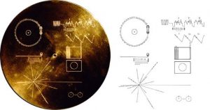
Picture retrieved from: https://voyager.jpl.nasa.gov/golden-record/golden-record-cover/


This was a straightforward task where we had to pick ten songs out of the twenty-seven songs.  I think it is the process that gives this task individuality.

It’s interesting that Brian and I had the same goal in that we wanted to have a list of songs that would represent different geographical places and have as much cultural diversity in sound and instruments.  However, our approach in choosing the list was completely different.  I went in a very methodical way by picking different countries first, then adding songs that would give a glimpse of culture, and then moving on to picking instruments to complete the list.  While I enjoy listening to different kinds of music, Brian’s post showed his background knowledge in the history as well as his talent in knowing the different instruments and how each functioned.  He was able to give a comprehensive detailed reason for each of his choice.  I enjoyed reading the historical background he gave for the songs he picked.

To complete this task, we both relied heavily on text without audio or visual but Brian’s post had different font sizes and spaces between paragraphs that gave an interesting texture to the text.  Our layout was completely different from each other.  I wrote my top ten list first and then wrote my thinking process in a paragraph after. Brian did the opposite and delineated his process as a beginning paragraph followed by his detailed list with an information blurb under each one.  Looking at his layout, I could see that his post was easier to read because his introduction set the stage for the reader on what is about to follow.  As well, the larger font size and bigger spaces between paragraph made it easier to read.

Both of us used UBC WordPress as our online platform.  Brian’s website was not distracting and it was easy to navigate.  He had a clear vision of how he wanted his website to look like and I had a feeling of being in a mellow jazz lounge.  Even though his cover page was black with an outline of a person, it was still an impactful image and his home page with a picture of him and a short biography.  This is my first time using WordPress and this just made me realize that I don’t have a home page.  The only part I wondered about was that I had to scroll to the bottom of the page in order to find links to other posts.  However, if the headings were at the top or as a side bar, it would deter the clean and sleek image of the post.  I do like that the website had two very clear headings for recent posts and comments.  I also found it useful to have the tasks numbered in chronological order for the reader, whereas I had a mixture where some tasks were numbered and others weren’t.  Thank you Brian for the interesting post on the Golden Record !


Task 11: Algorithms of Predictive Text

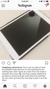
For this task, I went with the prompt “this is not my idea of………….” on Instagram.


I have an Instagram account but I don’t use it often and I haven’t posted anything in a year or two.  Therefore, I found it interesting that the text came from historical data from when I texted friends on my cell.   There were phrases such as “go back to school and get stuff done first” and “what the weather looks like” are statements I have used in the past.   It’s a bit scary because the words does sound a bit like me, but there is something odd about it, like the quirks from an individual personality feels flat.  The predictive text doesn’t fully sound like me because it doesn’t take into account that I modify what I’m saying base on changes in the environment and who I am talking to.  The algorithm just generated an output based on data (words) that I have used in the past and what works in the past should work in the future.

I think this type of predictive text can be useful if your blogging to lots of viewers on social media and since it’s to a wider audience, you can post short messages frequently that sound relatively like  you.  It’s definitely time efficient because you don’t have to ponder about each content.  A fault with this is that you begin to rely heavily on the predictive text that you can get lazy in checking what you actually wrote to see if it is what you wanted to say.  For example, there are times I have quickly texted friends and sent the message only to look at it later and notice that a word or two was not the word I wanted to use, but what the algorithm predicted.

The pros and cons of predictive algorithm reminded me loosly of the movie Money Monster with George Clooney.

Money Monster movie

In this movie, Lee Gates is a TV host who picks winning stocks.   One day, an angry investor Kyle Budwell lost all of his savings on the IBIS stock when Less said it was the winning stock.  The story moves on to uncover the truth and the “glitch in the trading algorithm.”

This was interesting because Lee Gates picks the winning stocks based on an algorithm that help with making decisions, predicting winning stocks, and profiling good stock buys. Some positive aspects of a predictive algorithm.  However, the algorithm went wrong when Kyle Budwell followed Lee Gate’s advice and the IBIS stock went down.

Here are some of the difficulties of a predictive algorithm which were seen in the movie.  Someone can build the algorithm, input the data, and set the parameter for what the output of success is.  However, it doesn’t take into account that future events may change.  Furthermore, it doesn’t take into consideration human error due to greed or bias.  As well, the end result can be skewed based on the data provided or the fact that there just may not be enough quantitative data for an accurate prediction.


References:
O’Neil, C. (2017, July 16). How can we stop algorithms telling lies? The Observer. Retrieved from https://www.theguardian.com/technology/2017/jul/16/how-can-we-stop-algorithms-telling-lies
The Age of the Algorithm. (n.d.). In 99 Percent Invisible. Retrieved from https://99percentinvisible.org/episode/the-age-of-the-algorithm/

Task 10: Attention Economy


User Inyerfeace Online Game by Bagaar

https://userinyerface.com/


It was my first time playing User Inyerface  and I wasn’t sure what to expect.  Once I made it to the second page it was a bit easier to navigate. Perhaps it’s because I know it’s a game so less pressure and I’m familiar with online persuasion architecture ( Zeynep Tufekci).  I wasn’t extremely frustrated, but I was still frustrated at parts of the game such as when I had to fill out the email and password portion and all these pop-ups kept appearing again and again. It also took some time to navigate through the buttons that didn’t work and the texts that try to deceive you.  I had to re-read these parts a few times. Upon reflection, in the past, I’m going to say I was caught in some of the dark patterns employed such as the hidden costs when your paying for airfare or for a cruise.  I’m going to agree with Tristan Harris in his Ted Talk video that a step to change is to acknowledge that we can be persuaded.  When Zeynep Tufekci mentioned about googling for boots and suddenly those boots pop up everywhere on my Facebook to articles I read, it’s scary how learning algorithms work.

Using Brignull’s Dark Pattern types, I was trying to categorize some of them in the game. One was the Forced Continuity where it showed the four easy step visual to complete the form, but if you check the terms and agreements that was in small print which was lengthy, confusing and required additional steps to complete.  Do I sense a trap here ?  This could also be under the Trick Question type also. The Roach Motel in the game was when the pre-select mode for the email gave the illusion that it was trying to help the consumer by making it easier for them to complete the form and I see this a lot in online subscriptions, but it’s always a difficult process to get out of it.   The beginning page of the game was under Disguised Ads as I see this on a lot of online articles where in the middle of the article there are usually words that are highlighted, underlined, or capitalize to draw your attention to click on it.


References:

Brignull, H. (2011). Dark Patterns: Deception vs. Honesty in UI Design. Interaction Design, Usability338.

Harris, T. (2017). How a handful of tech companies control billions of minds every day. Retrieved from https://www.ted.com/talks/tristan_harris_the_manipulative_tricks_tech_companies_use_to_capture_your_attention?language=en

Tufekci, Z. (2017). We’re building a dystopia just to make people click on ads. Retrieved from  https://www.ted.com/talks/zeynep_tufekci_we_re_building_a_dystopia_just_to_make_people_click_on_ads?language=en