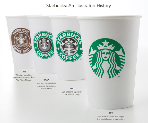
After reading one of my classmate’s blog about Starbucks’ new logo, I got to think that packaging really does matters for a company’s brand image and recognition.

Image Link: http://www.polkadot.it/wp-content/uploads/2011/01/d90e4a46265b4a3f949382332ba907d0.jpeg
Starbucks, in particular, is changing its logos whenever it experiences some big changes within its company. This time, after 40 year anniversary, Starbucks changes to a more simple and modern style of the logo using only green and white color without even the brand name “Starbucks”. As shown in the image above, this is the first time Starbucks actually abandoned mentioning the name. I wondered if this is a wise decision for Starbucks as it is a company with a very long history, and this may be losing some its tradition. However, as pointed out by Yun Wang, this change of new logo will get people talking about Starbucks, thus leading to increased brand awareness. This might be a strategy for developing its new market, but I still prefer the old 1992 version design, as it seems more traditional, with a sense of history, mixed in multiple levels, just like Starbucks coffee.

0 responses so far ↓
There are no comments yet...Kick things off by filling out the form below.
Leave a Comment