
When first looking at the data, I felt overwhelmed with lines and dots. Deciphering which dots and lines belonged to what spot was tricky for me to do, and I’m still not convinced I’ve mastered it. When looking at the data as a whole with all four communities, it is pretty hard to understand what dots belong to people and what dots belong to songs. Once I learned that you could click on the dots to see what they belonged to, it made it easier to break apart the data. One pattern I seem to have found is that the darker colored dots correlate to people’s names, while the lighter dots correlate to tracks.
Breaking down the data into smaller communities allowed me to better focus on sections of data. By using additional facets and dimensions, I could more clearly see individual people and the connections (choices). The nodes get further apart when selecting fewer peers’ data, and the visualization becomes clearer. When studying the smaller data set, it seemed that the more nodes (song titles and contributors) included in the visualization, the more important and popular that particular song was. Something I found interesting is that my own name did not appear in all the communities. I took this to believe that these were communities I didn’t have similarities with all of the communities, which logically makes sense. Because we could only choose 10 songs, not all of our choices would align. Something I found interesting about the smaller data communities was that some people had single lines to tracks coming from their name. For example, community 2 Track 16: Rite of Spring (Sacrificial Dance) is only coming off of my name. I assumed this meant that I was the only one in my community to choose that song, whereas, on the map of all the communities, the lines from this track go to one other person and me. I wonder why that was not shown in the smaller community cluster?
Looking at the numbers in the communities, It seems that this shows how many nodes and edges match one another. I have shared preferences in musical styles with my peers whose nodes I have the most significant number of links (lines), and the smaller the community, the fewer matches there seemed to be. The question of why our responses are similar is something that cannot fully be captured in this type of visualization. All we can see is that the community web containing our name shows the community of others who chose the same songs we did, but no further explanation is given. For more information to have been collected, we would have needed to share our insights in another survey for the data to be more accurate. I can only assume that we chose similar pieces because they are songs familiar to us in one way or another as bound by the parameters of the assignment. One possible way to learn more about similarities would be to go into peers’ blogs that we had similarities with to read a previous post, but not all peers may have addressed every individual song choice.
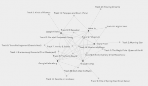
The videos in this week’s module allowed me to further contemplate the visualizations created from the class data. As mentioned in the video A Journey to the Bottom of the Internet, the internet is a network that connects us across the planet (Nat and Friends, 2016). The video The Internet: How Search Works goes on to mention that when we are searching on Google, something called ‘page rank’ is used to assume that if a lot of websites think the web page is interesting, it will likely match our search (Code.org, 2017). If I understand this correctly, internet users are working together without even realizing it to find similarities so that our searches are more accurately populated; who knew! When considering this information and the visualization of our song choices, it may seem that the more popular peer choices populate, similar to a Google search. Below is an image of community 2, where my name is populated.
References
Code.org. (2017, June 13). The Internet: How Search Work.[Video]. YouTube. https://www.youtube.com/watch?v=LVV_93mBfSU&t=207s
Nat and Friends. (2016, December 16). A Journey To The Bottom Of The Internet. [Video]. YouTube. https://www.youtube.com/watch?v=H9R4tznCNB0&t=456s
Hi Trista, I like how you spoke about the connection of how the most popular song choices in our data collection last week is similar to how the search engines operate to bring us the most popular search items. I also started to wonder if maybe that led to people feeling a bit isolated when their own associations with certain words or searches don’t show up at the top of the list making them feel perhaps as different or socially ostracised in a sense.
Thank you for your comment, Alexis!
I think the feeling of isolation is a great point! I was definitely surprised to see my name a lot less on the webs. But I also figured this was bound to happen because of the number of songs we had to choose from. Great observation nonetheless!