
I have selected a 6-letter word with one repeated character, I hope that is alright!
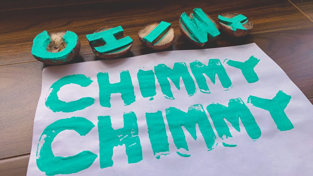
I had a lot of fun making these five potato stamps. I haven’t done this in so many years (last time I made this, it was with shapes for some homemade wrapping paper). I had to redo a few letters after seeing how some ended up much smaller than others. I’m pretty happy with how the block letters turned out! They’re all roughly the same size and the letters have roughly the same thickness. Since I’ve done this before, I knew that the C had to be reversed (only to realize at the end, it didn’t really matter if I just turned it upside down). It took me about an hour in total to craft them. I also let the potatoes dry out for a day before inking.
I tried to avoid letters that were round (aside from the C, where the natural shape of the potato definitely helped). I also chose to carve them all in capitals because I felt they might be easier to read. Letters with straight lines, like the H and I were the easiest to create.
Despite my best efforts to replicate the word exactly like the first, it was quite challenging because the pressure of my stamping varied, the paint distribution was uneven, and the slippery nature of the potatoes made the final product ‘unique’ from the first. In the podcast, “The Printed Book: Opening the Floodgates of Knowledge,” Harris (2018) notes that Gutenberg’s moveable type printing relied on metal alloy that yielded letters that were precise, took ink well, and durable against the compression of the press (36:36). Of course, my potatoes were unable to do any of that. Even if I had perfectly crafted potatoes, the manual labour involved in setting the letters, inking, and printing—not to mention the likely possibility of me making mistakes—make me appreciate the mechanization of writing.
On this episode’s site page, Harris identifies the privilege, prestige, and worship-nature of texts because of how expensive it would cost to produce one book (para. 3). With the moveable type, the increase in production of books, the rise of secular authors, block picture printing that allowed semi-literate people to ‘read,’ gave way to increased access to books. In turn, this democratization of knowledge allowed more people to educate themselves and thereby stripping down the sacredness of the written word (both what was written but also the actual object of the book itself). All this makes me think of the many textbooks that I have purchased in my years of higher education. Physical textbooks are so expensive. I remember bringing around 12 of them to sell back to the UBC bookstore, only for every single book to be turned away because their editions were ‘too old.’ I was three years too late! But the fact that knowledge changes so rapidly, makes me question why we still use printed textbooks, why value is placed in these physical items, and why they are so expensive? What is lost from making textbooks more financially accessible to all people? Have we, or should we, be moving towards open access textbooks and journals?
References
Harris, B. (Host). (2018, February 5). The printed book: Opening the floodgates of knowledge (No. 17) [Audio podcast episode]. In How it Began: A History of the Modern World. https://howitbegan.com/episodes/the-printed-book/
Hi Jennifer!
I never even thought of carving one letter per potato. I immediately thought to carve my whole word on one potato. In hindsight, what you did more accurately reflects the printing press where each letter is its own stamp. What is “chimmy”? As I read our peer’s potato reflections, I find that I am most curious about the chosen word than anything else!
Hi Ying! I was the opposite…I didn’t even think to combine the letters to one word! I guess after watching and reading the articles, I assumed we were imitating those wordpresses and having to “put together” individual letters to create words, hence the single potatoes! Your “haiku” stamp was so well done…I loved the ‘font’ and how it turned out. “Chimmy” is just the name of a character I really like =)
Unrelated, but thank you for the kind words in your linking assignment (I read it, hehe)!
Hi Jennifer,
I can tell that you have some experience designing potato stamps. Your block letters are impressive! You mentioned that you let the potatoes to dry out for a day before inking. I think I would have had a better outcome if I had done that. Like Ying, I also wonder why you chose to use the word “chimmy”.
Though I prefer to hold a book as I am reading it, I think that we should move towards open access textbooks and journals. Throughout University, the editions of the textbook that were required changed so quickly. Like you, I also had trouble selling many of mine. I only got back a fraction of the price for the ones that I did end up selling.
Hi Ravneet, thank you for your kind words! “Chimmy” is just the name of a character I really like.
Drying the potatoes helped with the water problem, but the letters also shrivelled a little (not to mention they also rot a little faster!).
I also prefer holding books than reading off a screen. I’m sure the politics and business behind for profit publishers is the main reason why we haven’t moved towards open access!