I enjoyed exploring Palladio and visualizing the data generated by our class. Upon initial glance, this network of nodes and edges was somewhat overwhelming. My initial thought was to manipulate the data manually by sorting the nodes. I moved all the students to the outside of the screen and the tracks to the inside of the screen.
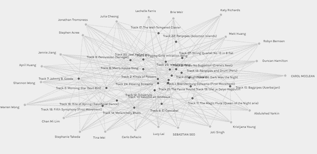
This provided a somewhat more organized representation of the data but did not allow for interpretation of the lines. The one thing that did stand out to me was that all 27 tracks had been selected at least once and that Track 22 was the only track selected by just one student. This was apparent as only one edge or line was attached to a single node. The degree of connectivity of each track was not easily visualized by the size of the node as I had expected it to be (Systems Innovations, 2015).
As I became more familiar with the application and its data manipulation capabilities, I began to see its potential. This tool could provide a wealth of information. For instance, I could select a few participants and compare the tracks they had in common and those they didn’t. The possibilities for exploration are vast and intriguing.
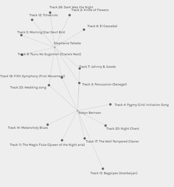
In this image, for example, I can demonstrate the tracks that Steph Takeda and I had in common and which tracks differed. I chose Steph in particular because we have completed other courses together, and I know that we both work in healthcare, are in the same age range, and have young children. Despite our many similarities, we chose only four of the same tracks.
One key realization that emerged from my exploration is the need for more data to answer the questions posed in this assignment. A more comprehensive dataset is essential to establish any meaningful correlation between the group participants and their choices and answer the assignment question – Why are these responses similar?

Johnny B. Good was the track selected by the most students in the class—16 out of 23 students. I could assume that this was likely because, out of the 27 tracks, it was produced the most recently or perhaps the most familiar, having been featured in the popular movie Back to the Future; however, this is purely speculation.
In ETEC 500 – Research Methodology in Education- we delved into the distinction between correlation and causation. With more data added to Palladio, we could see a correlation between the data, but this does not necessarily indicate causation. For example, if we added information indicating the participants’ age, we may see patterns indicating a correlation between age and music selection; however, it is important to recognize it as that and not make misleading assumptions.
Finally, this assignment has led me to reflect further on algorithms and the assumptions they make based on what is viewed or what links are clicked. With each view or click, the relationship between you and your associated data is strengthened (ETEC 540, n.d.), and correlations are made. If I click on multiple plant-based recipes, for example, the algorithm will likely continue to send me similar content. This can be helpful but also detrimental depending on the content being viewed. Scrolling can quickly snowball and impact what is viewed daily, feeding more material based on these assumptions and potentially influencing your perception of the world around you.
References
ETEC 540. (n.d.). Web Structure and Algorithms. In Module 9 – A Network of Texts. https://canvas.ubc.ca/courses/142635/pages/9-dot-1-what-is-the-web-and-what-is-not?module_item_id=6728887
Systems Innovation. (2015, April 19). Network connectionsLinks to an external site. [Video]. YouTube.
One response to “Task 9 – Network Assignment Using Golden Record Curation Quiz Data”