
Phew! The online game of User Interface definitely got my heart rate up, which, upon reflection, was likely the point. I’ve broken down my experience below and summarized the key takeaways.
Step 1: Entering the site
The first thing that became apparent when playing this game was the confusing language and the site’s counterintuitiveness.
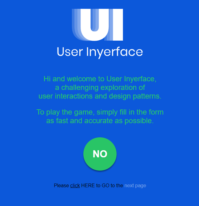
The instructions state to click HERE; however, 3 variations of hyperlinks were present, implying that these should be clicked to proceed. After multiple failed attempts, I stopped and re-read the sentence, followed the directions, and clicked on the word “HERE,” which allowed me to move to the next screen.
Step 2: Creating a password

This was much more challenging than I had anticipated. After a few failed attempts due to skimming instructions, it became apparent that the criteria were more specific than those of a standard internet password, including a Cyrillic character.

Among all the roadblocks and frustrations, what I found most challenging was the ticking clock. This made it incredibly hard to concentrate on the instructions for creating a password. I skimmed directions and did not systematically approach password creation.


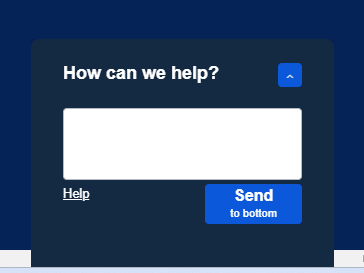
Various prompts, as shown above, would also pop up. They did not appear to have any role in creating the password, but they were distracting and broke my concentration.
Step 3: ???
What is step 3? I am uncertain, as I did not complete step 2!! This was partly because I could not figure out how to access a Cyrillic letter on my computer. Also, with each failed attempt, I lost trust that this was possible and debated how much time I was willing to commit to this task. Due to several dishonest prompts and the overall confusion of the site, I started to question if there even was a way to beat this game.
Takeaways – Dark Patterns
- The first thing that stood out during this exercise was realizing how much I navigate the internet site on “autopilot.” This concerned me, especially after listening to the TED talks by Tristan Harris and Zeynep Tufekci. Despite the foreshadowing of our readings and knowing this was a game to beat, I still failed to read instructions clearly and relied on the intuitiveness of the website. I clicked on large prompts that said NO, for example, simply because it looked like it was meant to be accessed.
- Another takeaway was my reliance on skimming details and making assumptions. For example, I assumed the password criteria for this site would be the same as those for other websites. Brignull (2019) notes that psychologically, humans are inclined to skim pages, and this can be applied honestly to benefit website users or dishonestly to benefit businesses.
- The pressure of a time clock in this game was incredibly debilitating. I found it challenging to focus and tried to rush through the game instead of taking my time and reading directions thoroughly. This made me think of tactics I have seen on websites such as VRBO – “5 other people have viewed this property in the past hour.” In other words, you had better commit to this property, or you’ll lose it! Don’t worry about reading the fine print; I’m sure they will give refunds.
Brignull, H. (2011). Dark patterns: Deception vs. honesty in UI design.Links to an external site. A List Apart, 338.