
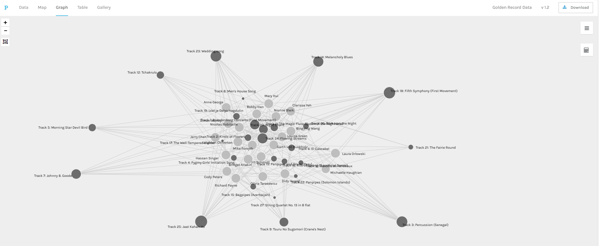
This week’s task left me with more questions than answers. The task was to interpret a Network Database generated from a survey/quiz of last week’s Task 8: Golden Record Curation completed by all members of the class.
I started my analysis of the data by isolating the songs that I had selected to see how many other students had also included those songs in their curation.
Nine out of the ten songs that I had selected were also selected by at least seven other members of the class. The tenth selection being Track 21: “The Fairie Round” which was selected by four other members of the class. While it was nice to see that I had songs in common with other students, it really did not tell me much about their selection process as the survey/quiz used to collect the data did not ask for the rationale behind our choices. One could presume that their criteria were similar to mine, but that would be a misinterpretation of the data and likely lead to other false conclusions, though it is common in advertising to use out of context data like this to support claims and positions.
For part of my linking assignment, I might investigate their reasonings for choosing these same songs using the information provided on their blogs/webspaces.
I next turned to looking at which songs were represented in the network (Systems Innovations, 2015).
I started by wanting to see if all of the original tracks were represented in the collected curated lists. It was comforting to see that every track on the Gold Record was represented in the network, this was not surprising however as with a class population of twenty-two the likelihood of each of the twenty-seven tracks being selected at least once was quite high especially given the class composition.
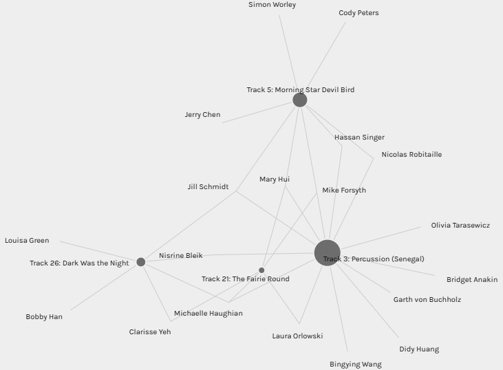
Looking at each song as a node, or vertex, it was comforting to see that many of the nodes with the highest number of connecting edges were culturally diverse and did not simply represent colonial sources or origins (Systems Innovations, 2015). Different culture and styles of music were seemingly well represented in the class’s selections.
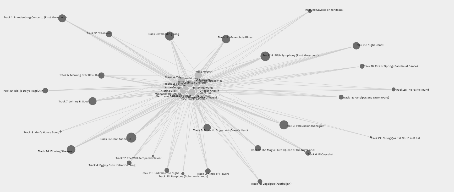
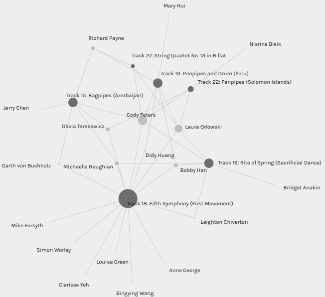
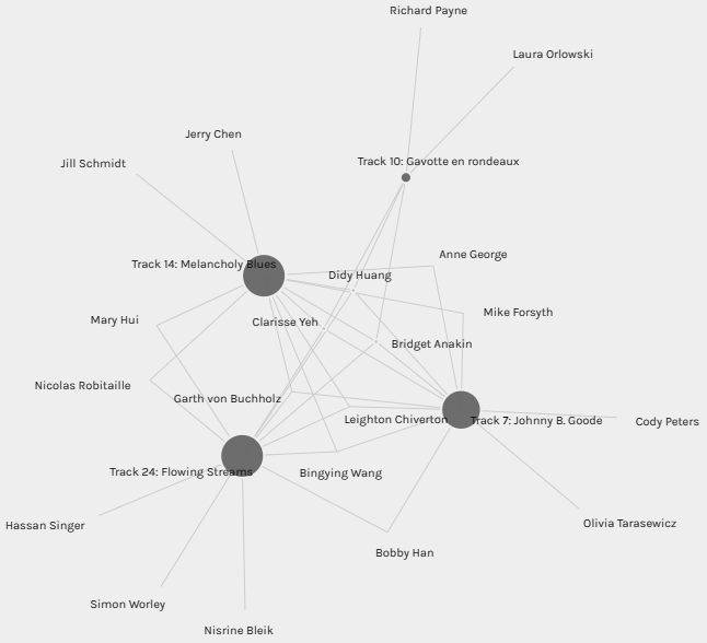
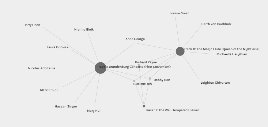
As mentioned above, what can not be determined from the provided data is the reasoning behind why students chose the songs they did, and conversely why they excluded the songs they did not select for their curated Golden Record. Why did only three select Track 8: “Men’s House Song”, Track 17: “The Well-Tempered Clavier”, and Track 27: “String Quartet No. 13 in B flat”? On the other end of the spectrum why did fifteen students select Track 25: “Jaat Kahan Ho”, or fourteen select Track 18: “Fifth Symphony (First Movement)”, or thirteen Track 3: “Percussion (Senegal)” and Track 23: “Wedding Song”, or twelve Track 24: “Flowing Streams” and Track 14: “Melancholy Blues”? Why were these songs more popular amongst our class than the other options? Were the reasonings behind their selection the same, or was each song selected for different reasons by each student? The provided data does not give answers to these questions. It might be possible to correlate the reasons for each student’s selection by visiting their blogs and webspaces and reading their reflections. While this might give insight into why, or how, they made their selections it might not give the reasons behind why they didn’t select other songs.
I next turned to looking at the six “communities” present in the graphing.
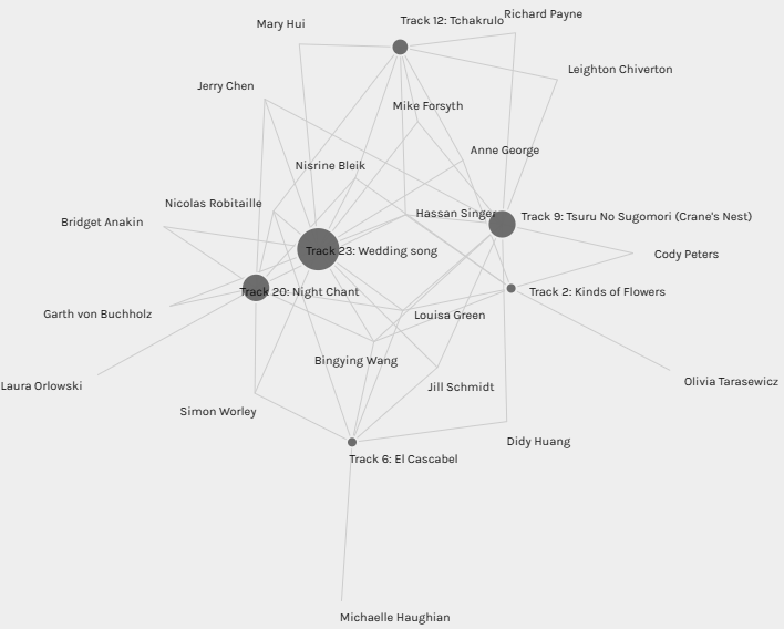
How are these communities connected, or how were they formed?
Their numbering from one to six does not match their weighting based on the number of edges present, though 1 does have the highest with 55 and 6 the lowest with 22, but if they were to be ordered in a weighted list it would be 1,5,4,3,2,6.
Community 6 and possibly 2 could be considered to be grouped by musical style or genre, but the rest of the communities each incorporate different musical genres within them.
Geographic location does not appear to be a factor in their formation as most represent music from all over the world.
The number of songs present in each community also varies with Community 6 having three songs, 5,3, & 2 having four songs and 1 and 4 having six songs.
The number of participants selecting the same songs also doesn’t appear to be a factor in the ordering of the community numbering/labelling, though it does appear to coincide with the weighting within each community.
In the end I was not able to determine a definitive rationale for why these communities were formed, and why others were not.
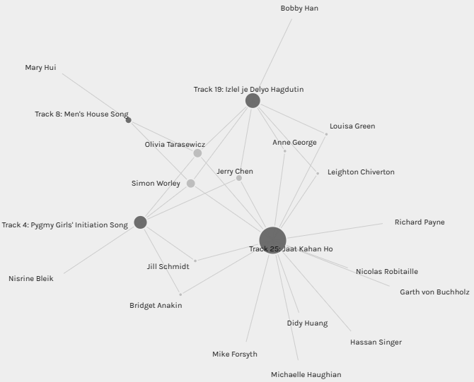
It is strange that Track 25 with the highest single number of edges at 15 doesn’t appear as its own community, it appears only in Community 2. One would think with 15 participants including it in their curated Golden Record that this song would have the greatest degree of connection with other songs through those 15 edges. Based on the established communities it is only shown as having common connections with three other songs.
Reflection
As this post shows, while I was able to identify some patterns within the network as a whole, the reasons behind those patterns remained elusive, if they can be shown by the provided data at all, to me anyways. When digging deeper into the “community” subsets, the images and patterns became murkier for me and left me without answers to the questions that emerged. An uncomfortable place to end a task at this later point in the course and my MET program as a whole.
References
Systems Innovation. (2015, April 18). Graph theory overview [Video]. YouTube. https://youtu.be/82zlRaRUsaY