The most memorable experience I had with a design trying to grab my attention wasn’t on a website, but in a video game. In one section of the PC game Pony Island (the game is nothing like it sounds) on Steam, the player is suppose to be paying attention to the center of the screen, yet at a crucial moment the game has a pop-up in the corner as well as a sound notification mimicking that of the Steam User Interface to trick the user into thinking that one of the their Steam friends was messaging them. I found myself being distracted by this fake message from a friend, and missed the information at the center of the screen. A quick Google search led to a 2016 video from a streamer, DrDroo, who experienced the same thing as I did: https://www.youtube.com/watch?v=2J55kfbR0bk
A combination of sound notifications and visual indicators, associated with an instant messaging application, are the most distracting to me. Pony Island mimicked Steam friend messages, and I find myself distracted whenever I receive a Whatsapp (sound + the web tab giving a number to indicate new messages) or Discord message (sound + a number next to the discord icon in the task bar changing to indicate new messages). Below are two screenshots that demonstrate the changes on my screen whenever I receive messages.
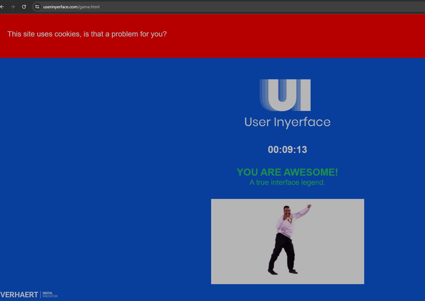
In comparison, User Inyerface was less about things that grabbed my attention, but deceptive and/or inefficient design choices that affected how long it took me to complete the website. Also, having experienced various dark design practices in Brignull’s 2010 article, especially ever since EU law changes that led to most websites in the world providing options to accept or reject cookies, I’ve been far more careful in reading websites carefully before clicking things. I found that I managed to evade most of User Inyerface’s descriptive dark designs, but it was the inefficient design choices that slowed me down.
For instance, after the first screen with the deceptive colourful “No” button that I ignored, unlike most websites one cannot jump to the next text box using the “tab” key. This is a shortcut that has saved me a bit of time whenever I fill out forms on the internet. In addition, unlike most websites, when clicking on a textbox, the descriptor of the textbox (e.g. “choose a password”) is not erased automatically, prompting me to ctrl+a and backspace to get rid of all the text before engaging with the task.
On the next page, I quickly unselected a few of the boxes with interests until I was met with the “hurry up time is ticking!” pop-up that took me a while to deal with. Knowing what the arrows icon represent (maximizing) as well as “lock,” I tried to ignore the textbox and return to the task (I couldn’t), drag it around to move it out of the way (I couldn’t), until I got desperate and tried the other two red herring buttons hoping it’d lead to more options (they didn’t). Eventually, I noticed the “close” with the copyright symbol for C and clicked it. Interestingly, while trying to get rid of the pop-up, I noticed the “unselect all” option (that isn’t typically another checkbox) and used it; if the pop-up did not occur, I probably would have unselected all the interests checkboxes before noticing the unselect all option.
The personal details page had similar issues with text input that I described earlier, with additional complications such as using flags for the country (luckily Canada is fairly early in the alphabet so I didn’t need to scroll), or that the months of the year were in alphabetical rather than numerical order. I chuckled at the age slider that could go up to 200, but I managed to luckily scroll to the right age without having to slowly click around to fine-adjust my age. The colour of the gender selection did get me: I’m accustomed to think that the button with the same colour is the not-selected option while a different colour than the background is the selected option, but this was a quick fix.
The human verification is what took the most time for me. I was assuming the verification was being pedantic, so “panes of glass” doesn’t qualify as “glasses,” nor do “checkmates” qualify as “checks,” and as a Canadian I don’t consider “checks” a correct spelling for cheques. Likewise, bowties are not the same thing as a bow, and several images just more than one person bowing rather than “a bow.” During the selection process, I also noticed that the images correspond to the check box above the image, rather than the typical convention below, so as I was carefully selecting images, at times I realized I made the wrong selection and had to scroll around and correct myself. The verification must of took me more than five minutes and was the most frustrating part before I did a “hail mary” and clicked all the boxes.
Use Inyerface was a frustrating, yet fun exercise that highlights some ways in which websites use dark patterns (the main one that got me was the gender selection colours to indicate which choice was made), but otherwise just featured inefficient/frustrating rather than purposefully deceptive website design. In terms of designs that manage to actually rip my attention away from a current task, a combination of audio/visual notifications like those from instant messaging applications were far more effective. It’s because of this that I’ve started to keep my phone permanently on mute, and that if I’m busy working on a task I would put myself on “do not disturb” mode for all the instant messaging applications I use.
References
Bagaar. (2019). User Inyerface. [web game].
Brignull, H. (2011). Dark patterns: Deception vs. honesty in UI design. A List Apart, 338.
DrDroo. (2016, February 3). (PONY ISLAND SPOILER)I get a message on Steam [Video]. Youtube. https://www.youtube.com/watch?v=2J55kfbR0bk


