Likelihood Surface Analyses

Figure 4. Likelihood Surface Analyses for predicted 0.5m and 0.95m sea level rise scenarios
The likelihood surface analysis shows the expected results; the RCP 8.5 scenario map shows a far larger area along the coastline with high confidence of being flooded than the RCP 2.6 scenario. The dark blue areas with values of -1 are places that the analysis has 100% confidence will be flooded under the respective scenarios, while the lightest grey areas with values of +1 show the analysis has 100% confidence they will not be flooded. As shown in figure 4, Miami Beach is one of the most at risk areas, and is likely to be almost completely submerged in a 0.95 meters sea level scenario. These maps provide a useful context for the suitability models shown below, because they only consider the physical variable of elevation. As a result, one can compare the predicted likelihood of sea level rise to the predicted vulnerability.
Suitability Models
One verification that indicates the success of the models is that the raster cells around inland rivers map the path of those rivers; if the water boundaries layer was not visible, one would still be able to see the river path (given the ‘distance from coastline’ variable), as those raster cells display higher vulnerability.
Sensitivity Analysis
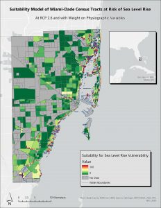
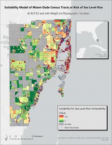
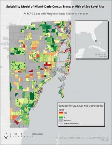
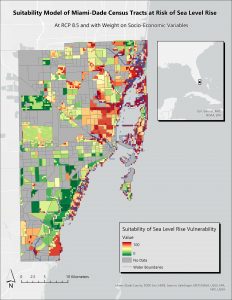
The format of the four maps shown above is ideal for a visual sensitivity analysis, and allows for direct comparison. The depth of this analysis prevents a total quantification of uncertainty of the input variables, and the lack of mathematical modelling in this sensitivity analysis means that no quantitative results can be achieved. In pursuit of increased understanding of the relationships between the inputs and outputs in our models, one can compare the spread of colours across the models; the varying colours indicating suitability for sea level rise vulnerability, allow for a good general view of the changes incited by the varying inputs.
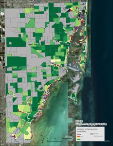
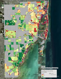
Addressing the variation in elevation inputs, it is noticeable across both sets of different weights that, by increasing the midpoint of elevation in the fuzzy membership of the models (as is done in the transition between RCP 2.6 and RCP 8.5), the number of census tracts and neighbourhoods at risk of sea level rise increases significantly. This is important because the only input change within the model pairs (physiographic and socio-economic) is elevation. Thus, it can be seen that if the midpoint of predicted sea level rise changes by 0.45m, the population that are at total risk (dark red = 100 = most at risk), increases across both model forms, and areas in the range of risk (anything that is not the darkest green shade) also increase. Considering figure 10, the majority of Miami-Dade County appears to be less vulnerable to sea level rise, with the only areas deemed ‘suitable’ (ie. vulnerable) being those directly along the coastline or inland rivers. With the elevation input increased (figure 11), many more areas become vulnerable, with the darker shades of red spreading inland from the coast and almost engulfing Miami Beach.
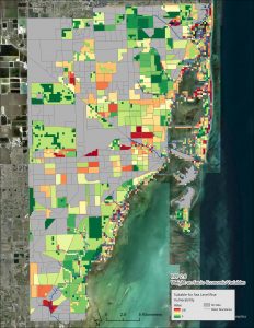
When the weights are varied between models, there is a stark difference between areas that are considered vulnerable. As fits the models with heavier weights on the physiographic variables (elevation and distance from coastline), generally inland, higher elevation census tracts and neighbourhoods are not shown to be vulnerable or at risk. Whilst the socio-economic variables are still considered (if they weren’t, the entire of the county at higher elevation and far from water would be dark green), they do not impact the model’s output significantly.
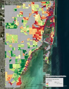
The models with heavier weight on the socio-economic variables display, as expected, model outputs with greater variation across the county. Areas with higher non-white populations, lower median household incomes and greater numbers of housing units (crowding), are marked with higher vulnerability. For example, Miami Beach, as seen in figure 13, has a high population living in a small total land area, making the majority of it at risk. Comparing between figures 11 and 13, Miami Beach is mostly red in both, but in different areas, showing the results of input change of weights. It must be noted that across all four models, areas of highest vulnerability generally remain the same, with the neighbourhoods of Coconut Grove (Southern coastline), the Upper East Side (Northern mainland coastline), and the city of Miami Beach consistently containing orange/red pixels.