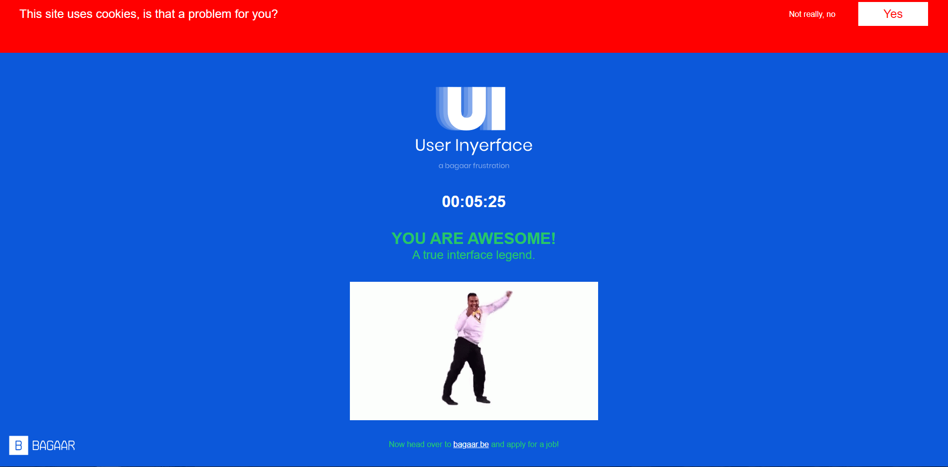
While you do, notice the ways in which the GUI is designed to manipulate your attention and responses, you will use this information as a prompt for your reflection on this task.
First and foremost with this task – I found this to be frustratingly entertaining as all the negative aspects of web navigation were consolidated into this one game. As a fairly active digital citizen I feel I encounter aspects of this game quite frequently, be it deciphering true download links from a sea of false ones or simply meeting the increasingly complex requirements for passwords. I found approaching the tasks with a literal-to-a-fault approach helped considerably. My reflections on each aspect is as follows:
- First page: Uses bright colours and capitalized letters to emphasize (whether or not the emphasis is useful). I found this page to be largely simple as it simply asks the user to literally click “here” to go to the next page. I’ve encountered links like this before and was able to progress quickly.
- 2nd page: Directs attention with its flashing green numbers and “Hurry up, Time is Ticking!” popup which keeps the user focused and/or alarmed. Hiding the close button on the popup behind the copyright sign and swapping a maximize button in the regular place confuses a user and keeps them preoccupied or frustrates them entirely
- Subverts expectations by entering password before email. My first action was to enter a fake email in this box by reflex. User is kept longer on the page as you need to delete the text from Choose Password, Your email, and Domain.
- Super slow send to the bottom button on How Can We Help?
- Cancel button is highlighted to clear user input if not too close attention
- Password language subtly changes – had me questioning the requirement for a Cyrillic character before reading that the password merely COULD include one.
- 3rd page: Slows users down by putting the unselect all option at the very end of the list
- Pop ups continually slow down the user and obstruct input fields
- Wasn’t quite sure if they legitimately wanted an image uploaded from my personal machine or not.
- 4th page: Maintains user attention with the double-checking of info I feel this actually is a more effective way of taking in user data if accuracy is important. I usually default to inputting my birthday as January 1st, 1900 (I look good for my age) only to have this game point out that my listed age didn’t match my birth date. They also misdirect your choice for gender by ignoring regular practice of colours in highlighting.
- 5th page: Challenges the user and focuses their attention by having to decipher if there truly is any difference between the shown images in terms of simple labelling. Once you realize the definition applies to all items, the only real challenge here was dealing with the Hurry Up popup and the How can we help window obscuring the items.
So many of these tricks are intended here to frustrate the user and prevent them from progressing which hints at a darker purpose of obstructing a user from leaving a site. It is interesting to see all of these practices active in one place to show the obfustication that occurs with technology and digital services. It was interesting to read that these “dark patterns” have gained notoriety world-wide and California recently banned certain uses of dark patterns that prevented their citizens from opting out of having their personal data sold: https://www.theverge.com/2021/3/16/22333506/california-bans-dark-patterns-opt-out-selling-data
It is eye-opening to witness these tactics used in conjunction with the TED videos from this week as we can see the engineered methods to maintain a user within a service through more than enticement and appeal. It will be interesting to see if the recent shifts in legislation ripple out further into the online community and what changes may stem from this.
