
Graph Theory : The Abstract Language of Networks
As I was viewing the videos describing graph theory and network connections, I gained some key points from the information provided. The graphs we are analyzing through the Palladio app are known as directed graphs. Directed graphs are where the edges are quantified and viewers can “analyze the degree of interaction between the nodes as a weighted graph.” The nodes in these graphs represent people, or more specifically, members of ETEC 540. The edges of the graph define some sort of relationship between the nodes and in this case, it is the selection of tracks from the Golden Record Curation.
I believe the point of this task was to observe how data can be missing and/or assumed. The results for this task are purely subjective and this can make room for data to be misinterpreted. I will go into further analysis and explanation with this later.
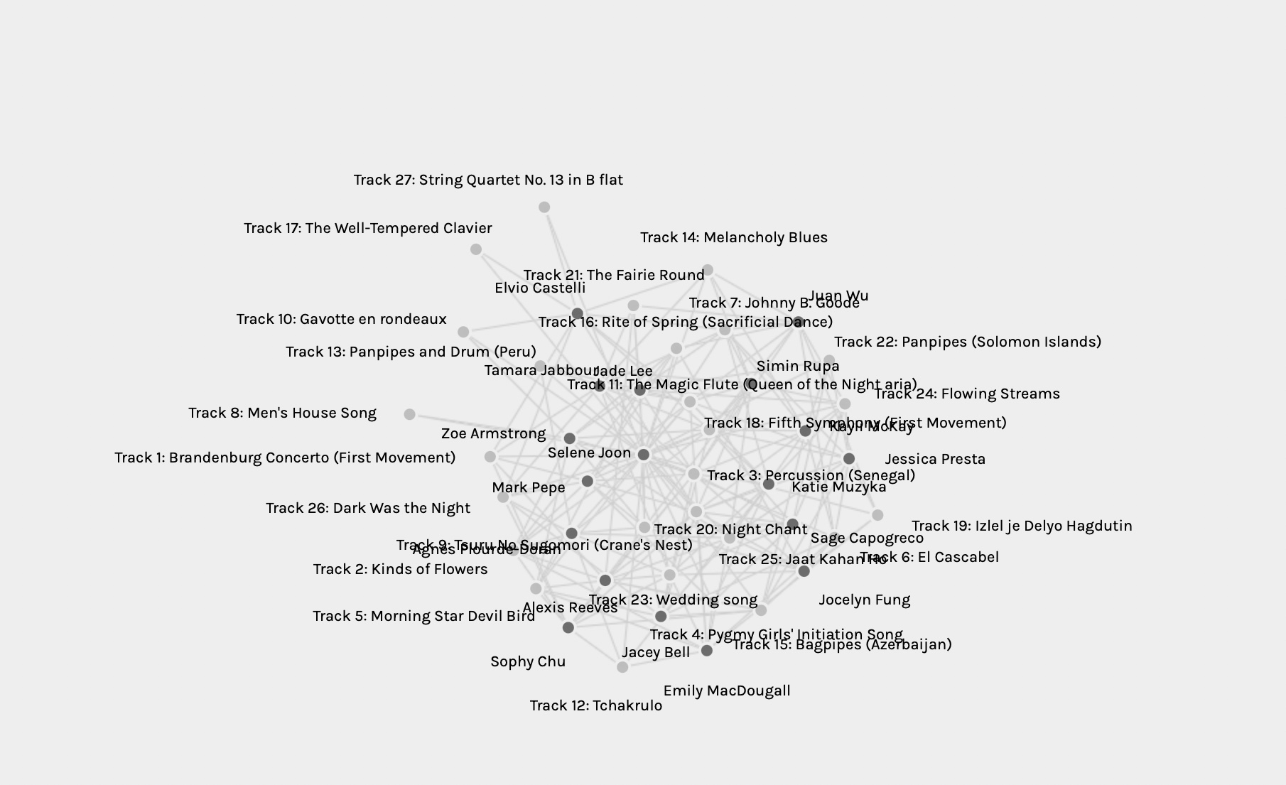
Whole Class Graph
The Whole Class Graph
As I observed the whole class graph above, my first thought is that this is a web of information that seems organized, but it’s more of a tangle to me. The multiple interwoven edges connecting to various nodes is extremely hard to track. I am a visual learner and colour would’ve benefited in supporting the analysis of this graph. As I started filtering this graph into communities, the graph became much easier to read. This post will be based on the analysis of the community that I was organized into. Please see below.
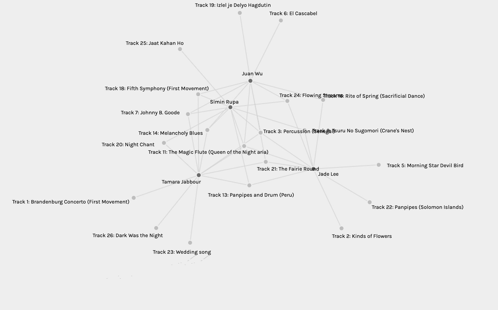
Community #1 (Members include Jade Lee, Simin Rule, Juan (Jane Wu) , and Tamara Jabbour

Community #1 : Analysis and Reflection
Is the visualization able to capture the reasons behind the choices? Can the reasons for these “null” choices ever be reflected/interpreted in the data?
The “Community #1” graph is a visualization that includes how the members are connected with their choices. You could hypothesize the reasonings behind their choices but unless I read each of their blog posts explaining their selection process, then I wouldn’t know for sure. What is also missing, that could be useful in analyzing reasonings, are the demographics of each of the community members.
In the Table, I filtered the Degree and the Betweenness Centrality from highest to lowest, so that I am able to decipher what the Top 3 choices were. The tracks were the following:
- Degree 4 (0.0802317861) : Track 11 – The Magic Flute (Queen of the Night Aria)
- Degree 4 (0.0802317861): Track 3 – Percussion (Senegal)
- Degree 3 (0.0520310723): Track 21 – The Fairie Round
As I look at the Direct Graph, I can see that these tracks are all located within the middle of the “web” or interconnected edges. I also notice each community member selected 1-3 tracks that others did not choose. Simin Rule only had one track that the others did not choose, which placed their node within the interwoven edges. Tamara, Juan (Jane), and myself are within the outskirts of the graph according to the location of our nodes. After reading Jane Wu’s post, she relayed that each community member had the same criteria for their selection process and that is “the best representation of the sounds from Earth, and a good combination of nature and man-made sound.” If that is the case, then why were there selected tracks that not all of us chose? Why are we not all within the web of intersected edges like Simin? This goes back to my previous point that this task was quite subjective because everyone’s sense of musicality is quite different although our criteria may be the same.
Reflect on the political implications of such groupings considering what data is missing, assumed, or misinterpreted?
The video Network Connections, states that when looking at the degree of connectivity, “the higher the degree, the more connected you are.” As I look at the levels of degree amongst the community members, I noticed that Tamara is at the top of the list, followed by myself. Looking a little closer at the numbers, Tamara chose 11 tracks in comparison to the rest of the members selecting 10 as assigned. This extra track addition accounted for her Betweenness Centrality to become a higher level to the rest of the members. This kind of data can have implications to the authenticity of the information being graphed by making it misrepresented. If we go by what was quoted above, then at first glance, Tamara seems to have the most connectedness with the data and community members. In fact, this may not be the case since her data is inconsistent with the criteria of the task. I wonder how the results would’ve changed, in terms of the Betweenness Centrality, if Tamara had only chosen 10 tracks? If this was a political situation, then her votes would’ve been disqualified or null from the final results. It makes me question the validity of data and results when you see them online or in journal articles. How reliable can data actually be?
References:
Innovation, S. (2015, April 18). Graph Theory Overview [Video]. YouTube. https://www.youtube.com/watch?v=82zlRaRUsaY&feature=youtu.be
Innovation, S. (2015b, April 19). Network Connections [Video]. YouTube. https://www.youtube.com/watch?v=2iViaEAytxw&feature=youtu.be
Palladio. http://hdlab.stanford.edu/palladio/