Linking Assignment 6
StandardI chose Tanya’s task 12 as we both went for more of a visual representation than just a written narrative. Her dystopian video is actually quite realistic, not an extreme. My approach was more of an extreme in regards to the negative side of technology in the future. I was also very impressed with the video animation in general. This representation is probably quite likely, there is actually an ad for Alexa that is similar in that ‘she’ starts your day for you and gives you the highlights. Also with COVID there is a bit of a taste of modified schooling which can be seen in the video. Once again I really liked the comic that she created for her utopian narrative. This narrative or something like it I hope will actually happen in the future. When you think about it the ratio of 1 teacher to ~30 students is not ideal and because our learners all have different needs it would be incredibly beneficial for such personalized learning.
Tanya’s blog has more of a traditional WordPress style to it. The top taskbar makes it easy to navigate with the drop-down menus that allows you to quickly choose what specific post you would like to see. The header photo looks like it may be a personal photo and I would guess that she is from BC as well.
Linking Assignment 5
StandardI chose Connie’s mode bending task because we both did a remix of 90s/00s songs. I will admit I had to search for her original post, introducing herself to know who’s blog it was, after saving the link but not noting who’s it was. We both stated in our reflection that we were stumped to start so I imagine this was a common starting point for most. It is interesting how in general most people are more comfortable with visual than they are with audio, I know for myself I do not like hearing my own voice playback over a recording, even my voicemail recording. We both created purely audio interpretations but also included a written transcript. She made an interesting point that “while visuals are appealing, audio provides communication advantages that are impossible to set aside.” Often there can be miscommunications when we are reading written word as in our mind we may not read it as intended. With audio, there are more cues such as tone and pace and it is much easier to interpret meaning or intention.
Connie chose the same format for her blog as I did, including the same accent colour. I had a bit of a hard time navigating it as I found I couldn’t scroll through the posts they were all separate. This made me curious about my own as I typically viewed it as an editor, not as a visitor. I personally like it when there is a taskbar that separates the types of posts. Connie opted out of having the photo or logo in the top corner where I have my personal logo I had previously created.
Linking Assignment 4
StandardI was drawn to Eduardo’s emoji task because it was a song. I felt like most people chose either a song or movie so I liked that he had done something different. I am admittedly pretty terrible at song titles and the names of the artist but ironically the title is how I figured out what the song was. Based on my guess of blackbird I actually googled the lyrics to cross-reference if I was correct. I used the lyrics to compare the emojis and he did a great job. I made the statement that emojis in many ways are not language-based but we may interpret them differently. Eduardo similarly comments that they can be biased stating “an individual from another culture or from another time might not be able to derive meaning from the symbols I’ve selected to represent ideas, the world, and experiences.”
Eduardo’s blog was created using the UBC blogs however he didn’t have a taskbar so I found it quite hard to navigate his site. At the top, there was a link to a sample page which I assume was a part of the initial template. The only way to find his posts was through his homepage. He kept his site fairly monochromatic with classic fonts. His header displayed written text which I assume he chose based on the more traditional sense of text in this course.
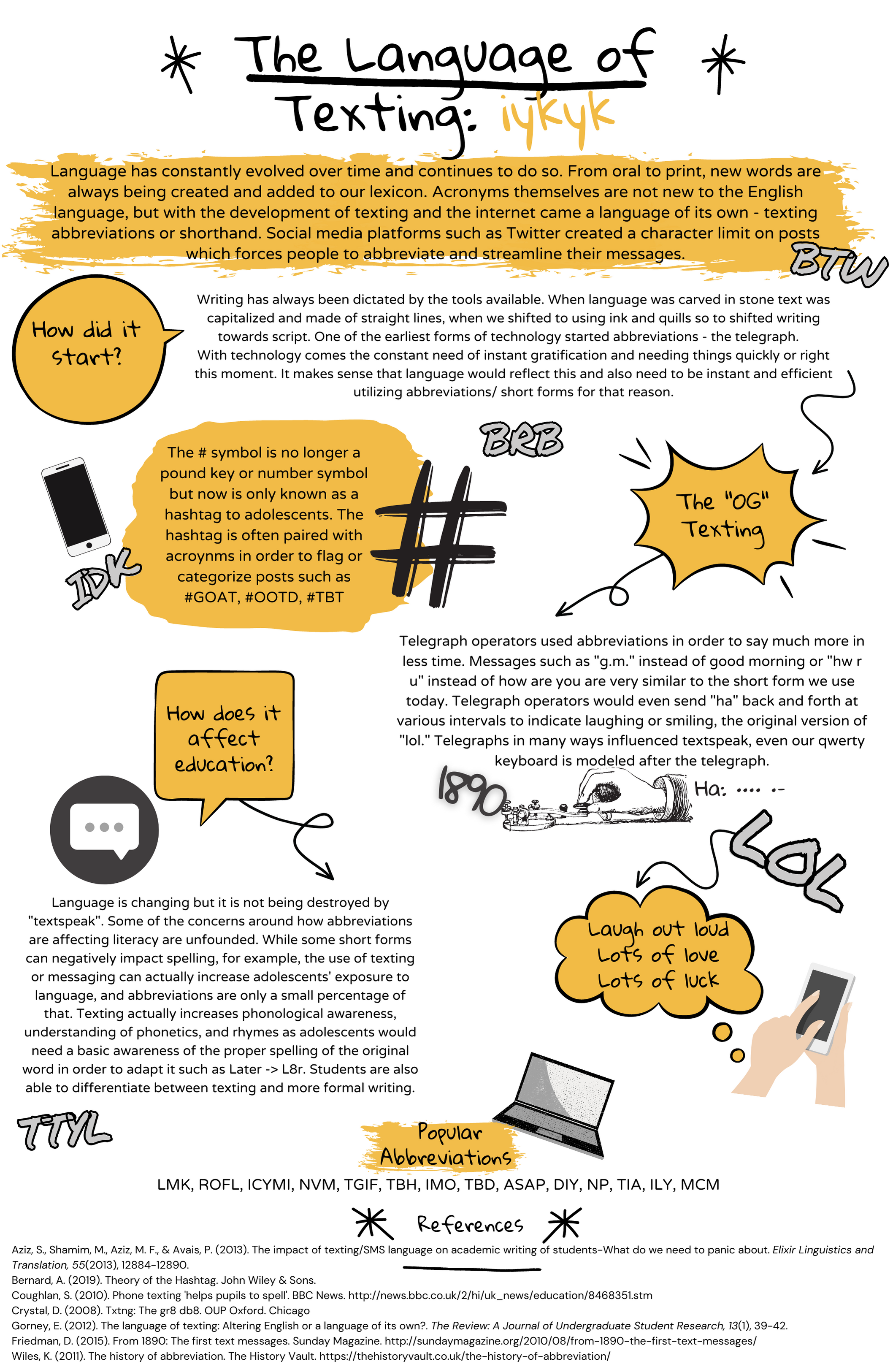
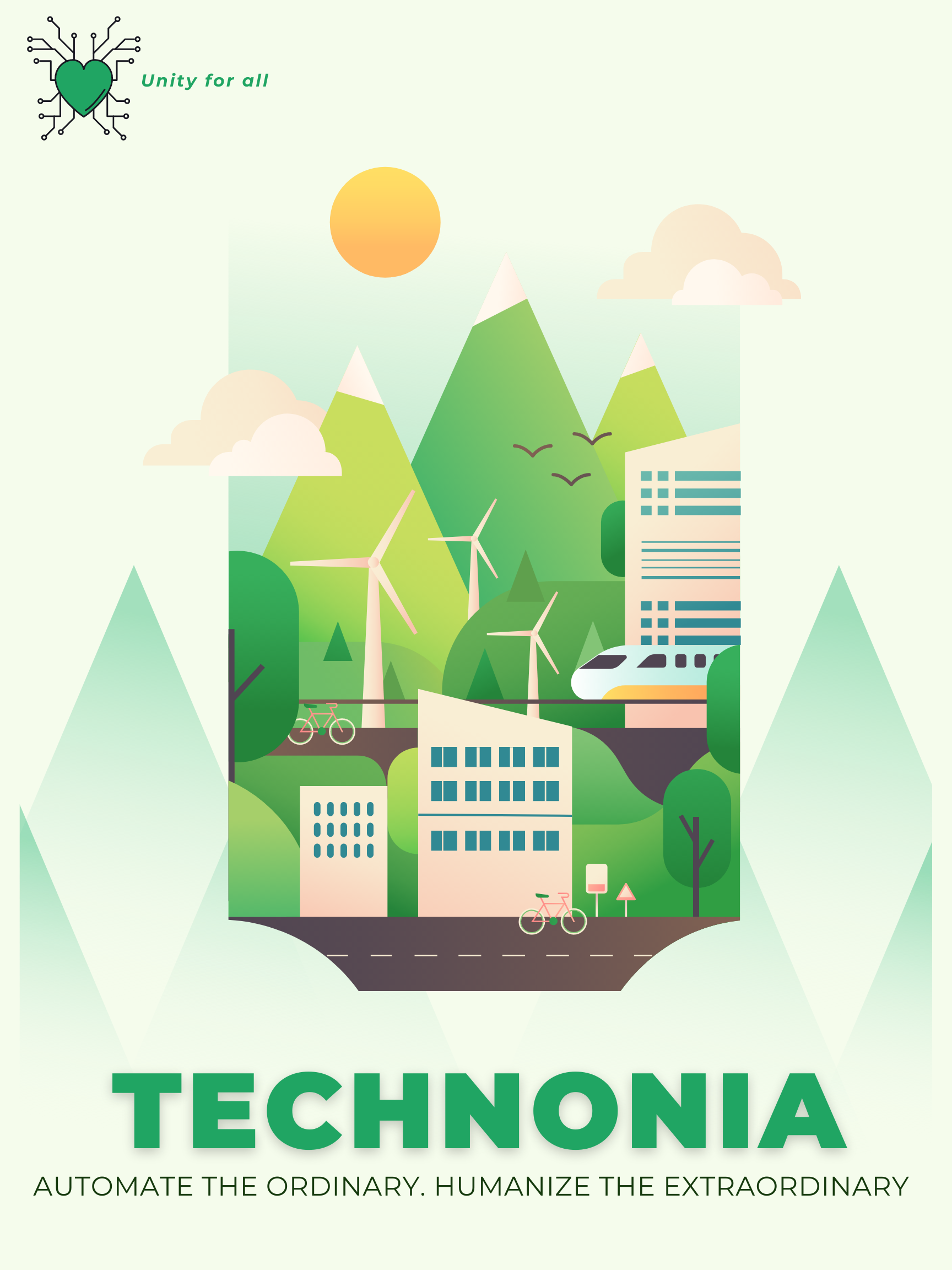
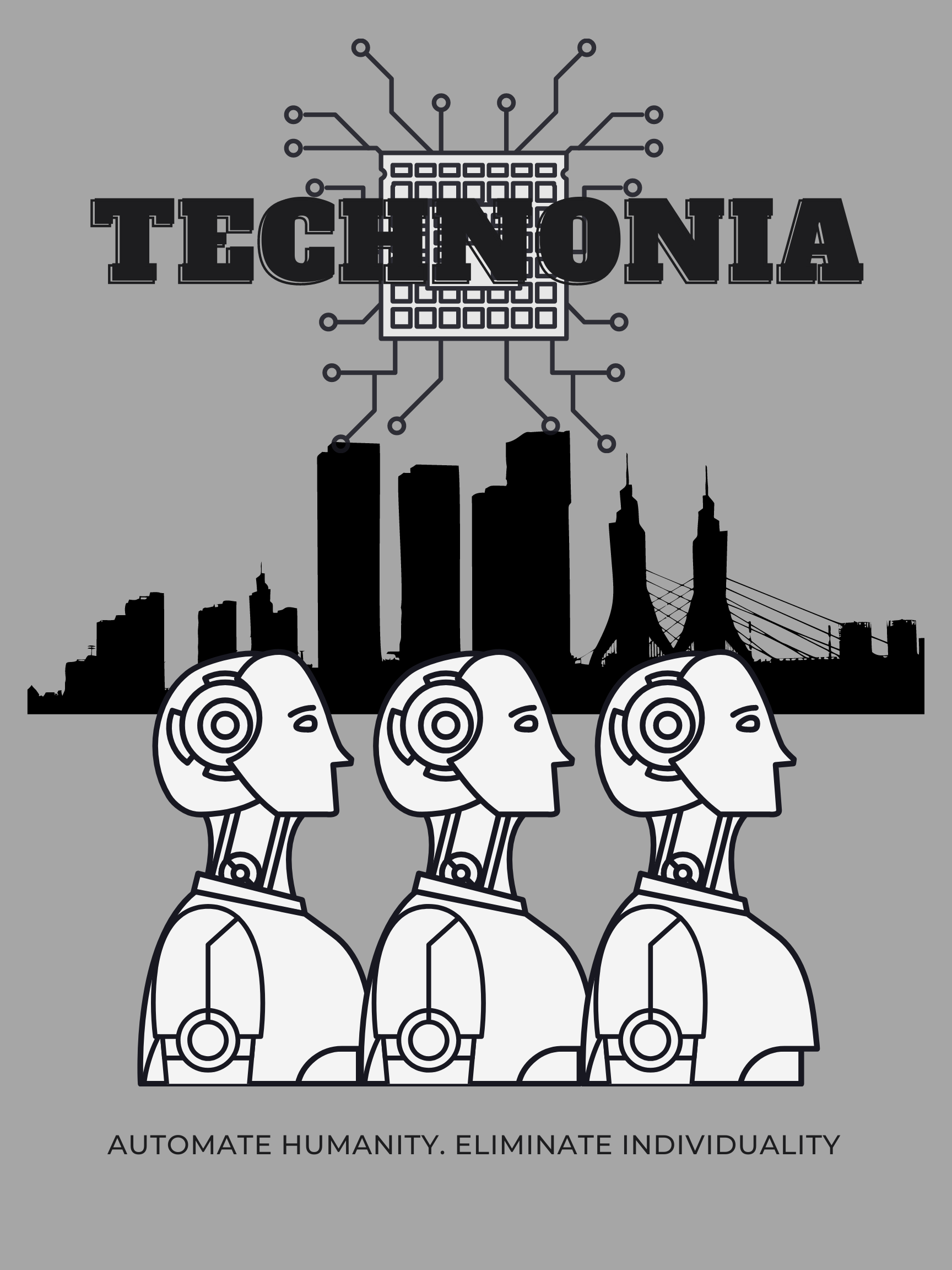
Task 12 – Speculative Narratives
StandardTECHNONIA
Welcome to Technonia where technology serves people. We automate the ordinary so that we can live out the extraordinary. In Technonia we coexist in harmony with technology in order to live life to the fullest potential.
Welcome to Technonia where automation is key for compliance. People serve technology in order to maintain conformity. Technology has enabled us to reduce individuality and streamline humanity.
Linking Assignment 3
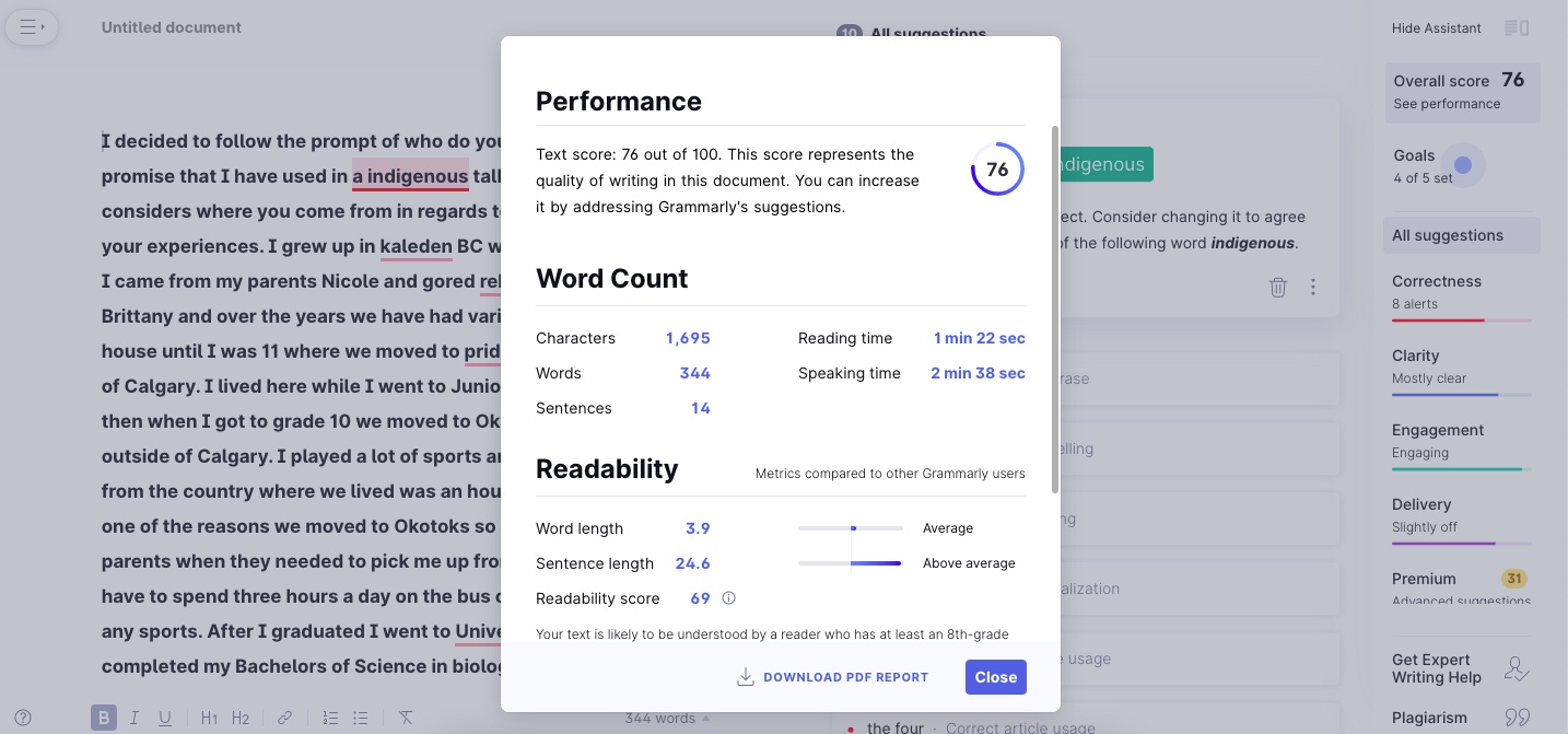
StandardPamela found this task somewhat stressful like I did. We both found it difficult to tell our story live without practicing or fully knowing how it would go. This tells me she might have a similar personality to me in that we like to have control of things. Because of this, we had the same approach in that we tried not to look at what was being written as we spoke as we knew we would get thrown off by the mistakes. One thing that Pamela did that I thought was interesting was that she added her “story” to Grammarly to see what it had to say. Surprisingly it determined there were no errors which I guess goes to show that technology doesn’t always know best. In terms of context, it is much easier for a person to catch certain things even if they may be grammatically correct. I was curious about mine so I did the same. It had 10 suggestions for me and gave me a score of 76.
I am realizing that this is the third link I have written and so far they are all 3/3 with this same template for their blog. Pamela has chosen a background however that I am not 100% sure what it is, a ski lift perhaps? She has created a drop-down menu to categorize her different posts. The title of her site is PJ MacGregor – which makes me wonder what does the J stand for?
Linking Assignment 2
StandardI chose Vera’s potato printing task as I was initially drawn in as she had also done a timelapse video. While my timelapse was shot from above to just focus on the process she included herself in the video which helped to give the whole picture of the experience. I think this shows that we could be of similar age that we are familiar with time-lapses as well as thought to make one for this task. Vera mentions that she also came to the realization that the letters needed to be backwards. Her letters were much narrower than mine and she used individual potatoes for each letter whereas I created my word using only one potato. The order of the potatoes mattered more initially for me as I wouldn’t be able to change them after the fact whereas she could isolate the potatoes individually.
Vera has created her website using the UBC blogs WordPress platform. She has headings on the top of the page for the different categories. Her tabs had landing pages which has links to each post instead of a drop-down menu. She named her site “ideasworthsharing” instead of just the course name. The homepage has boxes to display previews of her various posts and for some reason, her emoji post has a pinned symbol on it. Her blog has a mellow vibe with the wheat field background.
Task 10: Attention Economy
StandardThis online game User Inyerface is an online game or challenge that includes poorly designed elements of web design meant to deceive, distract, confuse and frustrate you.
Right off the bat the game tries to get you with the big green button that your instincts lead you to want to click, despite it saying “NO” instead of “GO”. This task reminded me of the tests that you may have seen before where the first instruction is to “read/go over the test prior to doing anything”. Most people just dive right in but then when they get to the end, the last thing it says is to return the test without writing anything, which for most people it is too late at that point.
I made sure to read things thoroughly before doing anything as my competitiveness wanted to “beat” the game. The first issue I got trapped at was the “time is ticking” pop-up page I couldn’t escape it until I realized there was a cancel hidden where it said ©ancel2021. The next piece I got stuck at was the fact that you could scroll down to find the “.com” where it asked for your email address, I had put “other” which was resulting in me not progressing to the next page. Part of me was feeling untrusting with if I had to put a real email in or I could just do a fake one, I ended up using a fake one with a gmail.com domain. I found the first page the most difficult to move past, once I got to the rest of the pages I didn’t find them as challenging. This in a way is kind of like a virtual escape room – but you’re mostly trapped just due to bad design.
The pop-ups were the most frustrating. As you’re trying to figure out what you’re supposed to do there comes the time is ticking pop up or the “help” window that blocks the button to move on or make other selections. On the first page when you had to go through the terms and conditions it was very slow to scroll which was a little annoying, and then you had to make sure you unclicked the box which is the opposite of what you would normally do. On the second page, the main issues that stood out to me were the reverse order of the date of birth years, the random order of months, and the “wrong” colour for male and female which made you think you had the opposite selected than you actually did. By the third and fourth page, I found I was in the rhythm of knowing what it was expecting, although, it did have one trick that the first row of checkboxes were hidden so at first, I had checked off the pictures underneath instead of above which meant I needed to go back and switch my selections. The last page was the easiest as everything was a “check”. In the end, it took me 13:15 to complete the challenge, which could’ve been worse but also better if I didn’t get stuck on that first page for so long.
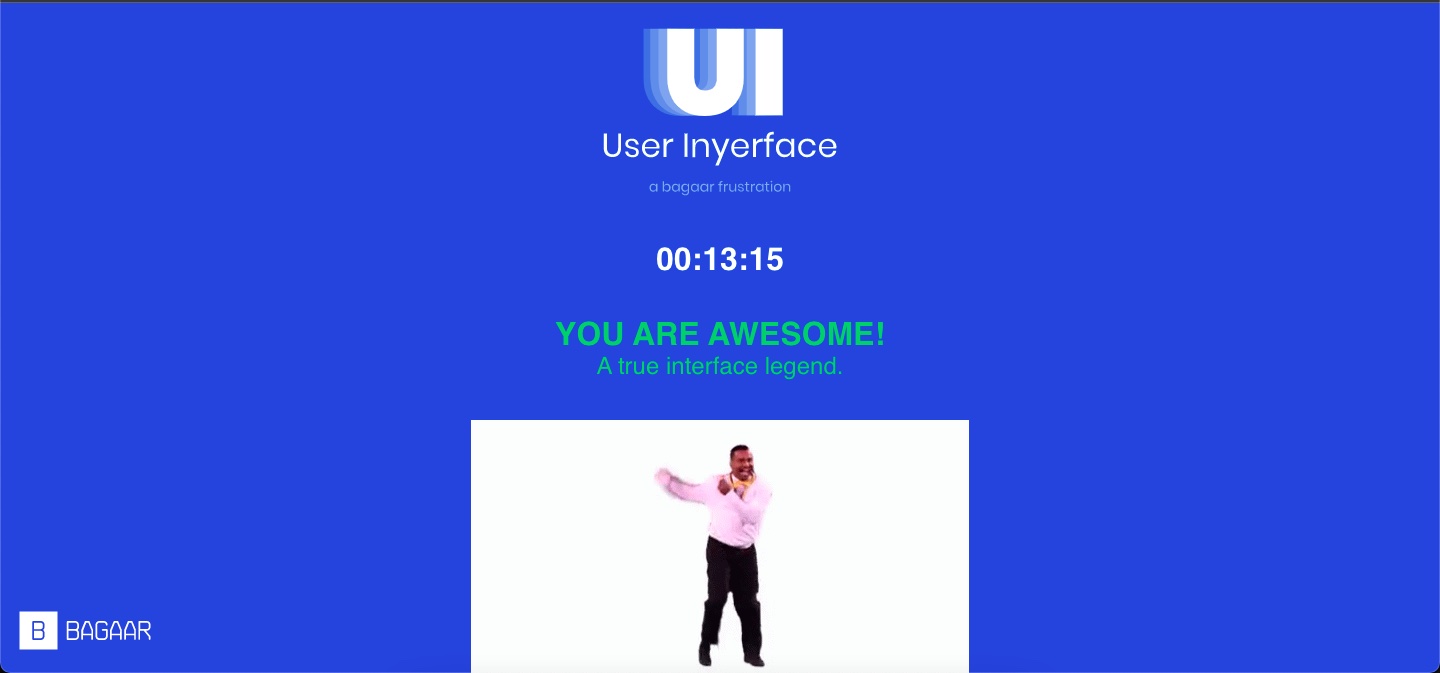
This game serves to include all the components of what NOT to do for good design. We’re so used to just clicking without thinking or really reading, scrolling through terms and conditions without reading and automatically accepting no matter what it said. Like dark patterns discusses, deception is the name of the game, they want to pull us into clicking that big green circle because we are conditioned to it. This is a similar idea to the “Stroop Test” – which I have included a video below.
How does your brain perform? Do you find it easier to read the word or notice the colour?
Task 9: Network Assignment
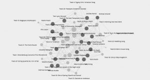
StandardI will admit that when I loaded the data it was overwhelming at first. The web/graph of data is an interesting way to represent all the connections that exist within the data. This network represents an extensive amount of information from our previous task.
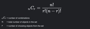
In looking at the data table of curators there were 21 individuals, who chose 10 songs from a possible 27 pieces. Now forgetting my probability calculations from the finite mathematics course I took during my undergraduate, I can’t tell you exactly but I know that would lead to a very small probability that someone would choose the exact same combination of songs. However, using the formula for combinations (where the order does not matter) we can deduce that there are 8 436 285 possible combinations.
Where n = 27 songs/ r = 10 chosen songs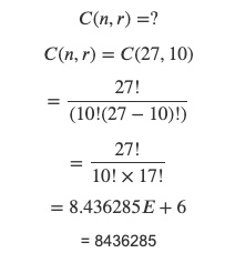
Each person has at least a few different commonalities with our peers. It makes for a good metaphor that you can find some sort of connection with anyone. In analyzing the data further, I played around with the different communities first as that was the default facet dimension.
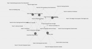
The community I was a part of was the second one and consisted of four other people and myself – Anna-Marie MacPherson, Vera Xiong, Justine Johal, and Maurice Broschart. Maurice was the only one who shared every choice with one of us while the rest of us had 1-3 unique choices that no one in our community shared with us. Dark was the night was the only song that all 5 of us had chosen – represented by the larger node in the middle. With only their names as the main source of information, I can make the assumption that we are mostly females in our community and that our names come from different heritages. I am unable to assume age, or where they may live, or any emotional connections to the music they may have based on their personal experiences. This leads me to the part of the picture that is lacking – the reasoning behind our choices. In our own blogs for Task 8, we described the ‘why’ or our approach to choosing our 10 songs but looking at the data we can’t make those assumptions on others’ choices. There are many contributing factors to someone’s choices – gender, age, culture, religion, where they live as well as something as simple as their taste in music.
From the collective data, the largest node or most chosen was Beethovens 5th symphony and the lowest chosen were Men’s House song and Kinds of Flowers – both options I did not choose. The graph shows connections between people based on their commonalities, but how would the visualization differ based on our differences?
Linking Assignment 1
StandardMandy similarly utilizes the ubc blogs wordpress platform for her blog. The task bar on the top of her blog made it very easy to navigate her different posts as well as the feed on her homepage that displayed previews of each of her posts. The background of her blog displays a photo of mountains which I am not sure if it was a stock photo or one that she has taken. I read that she is from the west coast so it is very likely that it is a personal photo as a fellow BC resident I can recognize similar landscapes.
Mandy uses bitmojis to customize many of her posts. I found that our bitmojis look quite similar and it is interesting how despite looking fairly different in person that our digital avatars can be less unique. She also customized many of her photos with text and arrows which in many ways I found to show her sense of humor.
I was initially drawn to Mandy’s task 1 because similarly to my “bag” it also reflected that she is a Mom. I found the labels on the photo to be more helpful than just listing the contents like I had done. Her bag had more of a 50/50 mix of her items to her kids items whereas mine was a little more baby focused. This could also be indicative of the ages of our kids. She touches on her use of bitmojis in this post as a way to express her personality and convey emotion. She mentions being from a home where another language is spoken and makes me curious what language this might be. Looking at her post it reminds me how our bag can give some insights into the lives or personalities of others but it can’t provide the full picture.