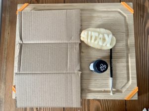
For this task, I chose to use my own name for my potato stamp – Katie. I utilized capital letters in order to create straight lines as much as possible because I knew that trying to do a lower case ‘a’ and ‘e’ would be difficult to get a smooth round edge. I lucked out that all my letters in uppercase had straight edges (no ‘O’ or ‘S’ for example), however, the ‘A’ provided a little more difficulty in cutting out the inside piece. I thankfully caught myself before I made my template by realizing it had to be a mirror image in order for it to print the word properly on the paper. This added a bit more difficulty because I had to visualize each letter to ensure I was flipping it properly. I created this stamp with a russet potato due to its more oval shape in order to provide me with more space for my letters. I had to try to plan out my spacing in order to fit all my letters on the potato. I used a sharpie to try to make a template, however, the ink didn’t really work so I kind of carved them out instead. I was unsure if it was better to make individual letter stamps from separate chunks of potatoes but in the end, decided to do the whole word on one so that it would be easier to create a duplicated print. It was also difficult to cut out the pieces between the letters without snapping off unwanted chunks of the letters.
I created a timelapse of me creating my potato stamp.
I used an acrylic craft paint in black that I applied with a paintbrush in order to try to consistently apply the paint so that I could try to replicate my “word.” I tried using a fairly heavy coat of paint each time I applied it to the stamp in order to make a more consistent print. I used cardboard to apply my stamp which in hindsight wasn’t the best because it isn’t a smooth surface and some of the cracks resulted in ‘blank space’ from the stamp. It took me 5 prints to get two stamps that I felt were close enough to be identical. Once I starting trying to make my print I also realized that it was essential the letters were level or it wouldn’t show up on my print, part of the E for example seemed a little sloped which resulted in a less crisp print.
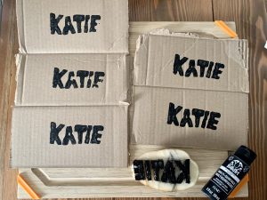
It took me 7.5 minutes to create my word and then another 8 minutes or so to get close to identical stamps. I felt the two bottom prints were the most consistent. If I were to consider this in terms of words per minute it would work out to 0.67 wpm. This is incredibly inefficient In comparison to the 80-90 wpm I can type or what I can write by hand. The mechanization of writing was a way to increase the efficiency of creating text. If you think of how long it would’ve taken to make a book by hand vs after the printing press and then now with digital printers we have been able to become faster and more efficient at creating text and on a larger scale. Instead of the ~15 minutes, it took to create 5 stamps, I could’ve probably printed 3000 “stamps” (considering 5 stamps per page, with a printer with a speed of 40 ppm). Along with efficiency thanks to mechanization is consistency. Having to create this stamp by hand had a lot of variability between the letter spacing, size, and alignment. Applying the paint or “ink” by hand also resulted in variability in my prints – something mechanization would also improve. They say time is money and in the world of printing, the mechanization of writing has allowed for greater output in little time.