The peritext of a cover is very important in catching a reader’s attention. The book cover is the first thing that someone sees when identifying a text. It gives the first reaction and therefore will influence how attracted a person is to the book. The common phrase “don’t judge a book by its cover” is widely used and many agree with it however research shows that how a cover looks will in fact in one way or another influence the reader. In this blog post, I will be analyzing the peritext of I am Malala by Malala Yousafzai and Cockeyed by Ryan Knighton. I will look at the image represented on the cover, as we as the blurbs, comments and the typography of the covers.
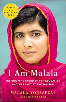
Firstly, I will be looking at the autobiography I am Malala written by Malala Yousafzai with Christina Lamb. I feel the cover immediately catches and audiences eye. One way it which it does grasps the attention is by looking at how colour is used to represent a deeper meaning. The pink Malala is wearing shows her femininity and compassion. The bright colours attract a reader and the contrast between the pink and yellow makes the words ‘I am Malala’ stand out. As well as the colours used, another focus of the cover is Malala’s face which is located in the center of the cover with a plain contrasting green background again focusing out attention on her face. Her smile makes the reader feel sympathy for her as she looks so innocent and kind yet the sentence below shows us that there is more to her than her face. The sentence reads ‘The Girl Who Stood Up for Education and Was Shot by the Taliban’. This contrast appeals to the reader and engages us to want to know more about the situation thus making us read the text. This book is a best-seller and was named the ‘Non-Fiction Book of the Year’ as well as this Malala won a Nobel Peace Prize. The fact that this is placed on the front cover ensures to the reader that it is a good read.
The second autobiography is Cockeyed written by Ryan Knighton. The cover is very simplistic and plain which can imply that ever since Ryan went blind his life has been plain and boring. The central image on the cover is a man who appears to be blind, he is wearing black glasses and is holding a walking stick. It is a mostly in black and white with touches of red. It highly contrasts with Malala in ways of colour, simplicity and attracts a reader in a different way. The back of the book is a blurb with comments from others, it reads a true story of being blind. Ryan does not sugar coat what it’s like to be blind, he states true facts. This draws the reader’s attention as they know the get to know the truth, sometimes being harsh is what readers want to read.