In these Palladio visualizations, I was grouped in a community with four of my classmates based on our ten selections from the Golden Record task. I have filtered the graphs to focus on the community that I am in, as shown in the screen shots below.
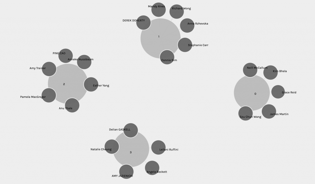
In this visualization, the nodes consist of the tracks that are selected by myself and the members in my community, and ourselves. The edges connect the members to the tracks they chose, and simultaneously intersects the members that chose the same tracks, creating a linking web of paths. Interestingly, the size of each track node reflects the number of members in the community who selected it. From the simple display of the graph, nodes, and edges, the links are nondirectional and unweighted. For the graph to be directional, it should depict that it is the individuals who chose the tracks. For it to be weighted, there should be a rationale for the connection between the two nodes (e.g. a reason for an individual to choose the track).
After some exploration of the interface, it seems that the visualization only reflects the number of times a track is selected by an individual, and who selected which track. The data input consists of only our names, the track’s names, and which tracks were in our selection. From there, a graph of communities is created based on the similarity of responses. Based on the data input, the “similarity” of responses only refers to whether an individual has a similar selection to another individual. The more tracks that are matched between two individuals, the higher the likelihood that they will be in the same community. The size of the track node increases as its edges crosses paths with other individuals in the community who also selected the track. The graph is unable to reflect the actual meaning behind why the responses are similar. In other words, the visualization only offers a purely mathematical representation of the number of times a track is selected, and groups individuals based on the higher percentage of similar tracks chosen in their selection without showing any of the actual reasons behind these choices.
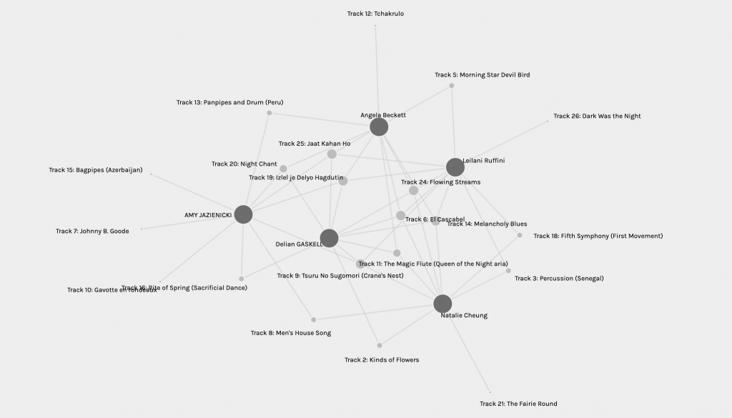
This visualization cannot capture the reasons behind these choices. Our justifications, criteria, and parameters that we adopted in the previous task are completely removed from this graph. The graph is generated with the results of our selections only and strips away the process and findings of our exploration. The reasons why an individual chose and did not choose a track cannot be inferred or interpreted in the data. This graph only scrapes the surface level of the curation process, and generalizes the communities based on the final results.
Since the graph does not show the reasons behind the similarities, I went to the websites of each member in my community to read about their reasonings for their golden record selections. Prior to my exploration, I had thought that we were brought together because our parameters aligned in some way or another, since there were no boundaries to how we created our criteria. And perhaps the similarities in our criteria also led us to selecting similar tracks. However, to my surprise, we all had a distinct set of parameters that sometimes overlapped, but were not enough to call them similar. In my community, the parameters ranged from selecting based on personal preference, evocation of emotions, cultural representation, depth of meaning, richness of the song’s story, historical significance, and geographical and cultural diversity. This shows that even though we made our selections with different criteria, the community brought us together based solely on our results.
If every individual worked on the same set of parameters and criteria, then perhaps one could infer from the graph why each piece was chosen. The communities may also represent individuals with the same line of thinking, grouping them together due to their similar interpretations of the criteria and process of curation based on the same parameters. In the end, the graph could represent an individual’s interpretation and application of a set of parameters to each track. However, due to every individual’s unique perception of music and application of criteria, the results would likely differ greatly and create some disparity. This may not be an accurate representation of an individual’s intentions because the possibilities are endless, whether or not parameters are set.
This visualization could be seen as a representation of website algorithms and how web search works today. The track nodes that increase in size the more they are selected (“mentioned”) by individuals symbolize Google’s Page Rank, where pages rise in their web search ranking based on how many times they are hyperlinked or mentioned in other pages. This makes me think about YouTube, Instagram, Facebook, and TikTok algorithms and how they boost pages that are more marketable and profitable (among other arguably controversial reasons).
How many times have we thought about “beating the algorithm” or “succumbing to the algorithm”? As shown in the lack of background reasonings behind the Palladio visualizations, algorithms are intensely powerful and efficient at retrieving and sending information, but it does not seem to take into account the content or connections of the webpages and the users that are creating and accessing them. For one, why is that when we search or click into a specific topic or keyword, the entire algorithm of our feed is immediately tuned to show posts upon posts and articles upon articles on that one specific topic that we just briefly visited? Sometimes, it would be unintentional: we would receive a message containing a link to that webpage, or we would accidentally click into a video, or we would pull up a quick google search about something new, and then our feeds would explode with similar content. The more you search for something, the more the spider gathers information from the web to predict what you will search for in the future. It’s already creating and participating in communities for you based on these topics, and you are already a member of these communities, whether you know it or not. “Similar searches,” where our interests seem to lie in the webpages we click regardless of our intentions, is equivalent to the Palladio communities generated based on our track selections, regardless of the reasoning behind them. Both just require the end result (the search term, the track name) to generate a community. This process is purely mathematical and results-based, and thus can be easily misinterpreted because of the removal of context, reasoning, and other factors influencing the final outcome.
References
Code.org. (2017, June 13). The Internet: How Search Works. Retrieved from https://youtu.be/LVV_93mBfSU
Systems Innovation. (2015, April 18). Graph Theory Overview . Retrieved from https://youtu.be/82zlRaRUsaY
Systems Innovation. (2015, April 19). Network Connections. Retrieved from https://youtu.be/2iViaEAytxw
One reply on “Task 9: Network Assignment Using Golden Record Curation Quiz Data”
Hi Natalie,
Great analysis of the data! I also had similar answers to what you said. The data is mathematical in nature and only really gives us quantitative data. This data set lacks qualitative data (the reasons behind the choices or lack of choices made). Like you mentioned, there is a danger in not getting the full picture as it can lead to misinterpretation. If I had no clue what questions were asked to gather this data, just based on looking at this data, I might just interpret this as “favourite songs chosen by selected people.” Without the context, I wouldn’t have an accurate interpretation of the data. This is often seen in studies or new media when talking about new findings. They often say just the main conclusion or finding, but without proper context or knowledge, the finding presented may be taken out of context. Like the study that supposedly found that “vaccines cause autism.” Without knowing the researcher, who’s funding it etc, this can be taken out of context. I think it is very important that people learn and understand how to read and analyze data, looking for gaps between what is presented and what is missing.