I had the pleasure to complete the User Inyerface game. Despite the minor frustrations that struck a small nerve, I actually quite enjoyed it and found the intentionally misleading design quirks to be surprisingly insightful after a deeper analysis.
REFLECTION
Homepage:
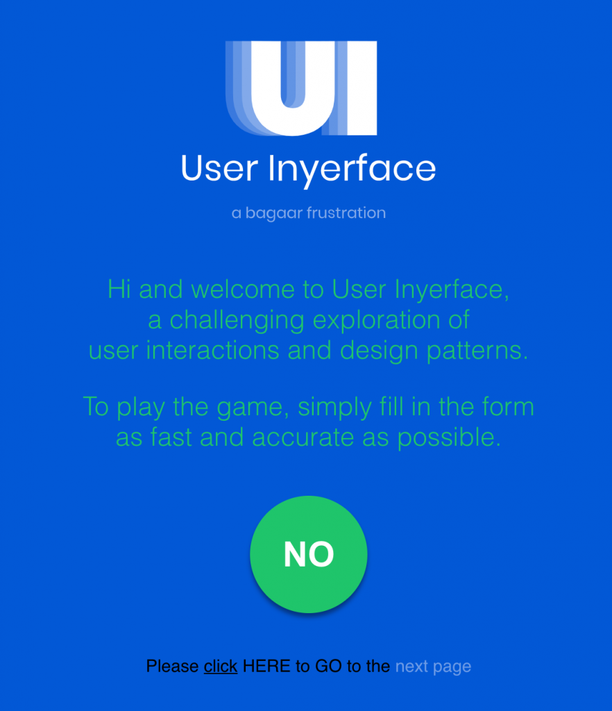
Right at the start/homepage, I was greeted with a confusing set of features to enter the game. My first instinct was to click the green coloured text “next page,” but it was not the correct response. My second instinct was to click the big green “NO” button, ignoring the fact that the word I was clicking was opposite of what I intended to do. I clicked both of these multiple times. When that did not work either, I clicked at the underlined “click”, and then the HERE, which allowed me to enter the game. I was surprised at how tricky that already was, as this one page had multiple features designed to draw my attention. Each method (underlined, capitalized, bolded, coloured) strongly clashed with each other, fighting for my attention.
Stage 1:
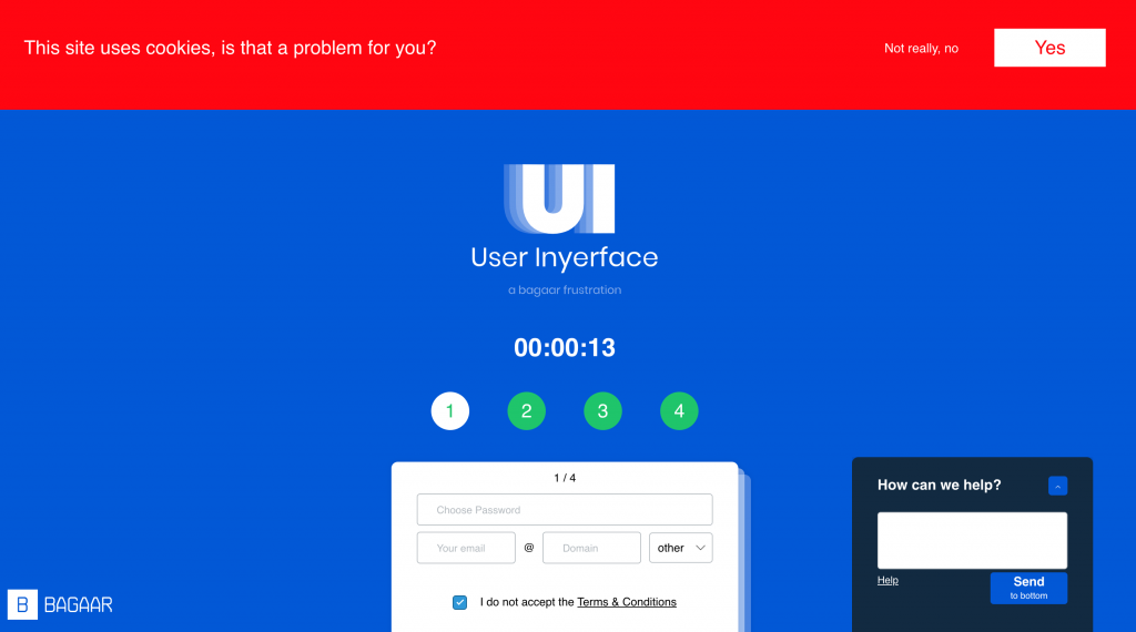
In the first stage, I was prompted to create a username and a password. Once I entered the page, I was immediately greeted by a jarring red banner about cookies and a pop up question submission box. I understand that a cookies acceptance banner is usually very distinct from webpages since they must prompt for your action first before you continue, but using red is a strange choice (as opposed to white or grey) because it seems like a warning to me. Moreover, the question itself is deceptive because it is not explicitly asking you to accept or decline the use of cookies like most websites do, instead it just asks if you have a problem with it. Even if you did click “YES”, no action would be taken by the webpage to attend to your situation.
A pop up help box usually appears in completing forms like this, and there is usually a live chat feature where a representative or a smart bot is there to instantly answer your questions. The help box on this website however, was amusingly unhelpful. Once you try to submit a question, it displays an unnecessarily large number, saying you will be waiting in line. The “Send” button in blue tricked me to click it without reading the small text that prompts it to send the box to the bottom of the page at a painfully slow pace without submitting your question. This feature was the opposite of how most send and submit buttons function. This pop up box constantly reappears on screen, continuously reminding you of its ironic unhelpfulness, and every time you click help, the number of people in line increases.
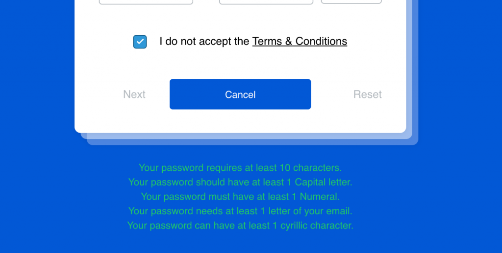
This stage integrated a number of deceptive features that made me read everything twice or three times before I clicked. Although I admit my first attempt was to proceed with my first instinct, which was to leave the checked box for the terms and conditions (I missed the “do not accept” part of the question). I also mistakenly clicked “Reset” and then “Cancel” instead of “Next”. This was my first time seeing a form that directed the user to do the opposite of proceeding to the next stage. Why would the “Next” button be on the left side, when it should be on the right? Why was the “Cancel” button resembling a “submit” button? Why was the reset button in a place where the user could mistaken it for the “Next” button? I did not click the Terms and Conditions, but I could imagine that it would just show me a tremendously long wall of text.
Not to mention, the conditions for the password were tedious, but felt like satire on the dreaded requirements that websites must ask you to satisfy when creating an account.
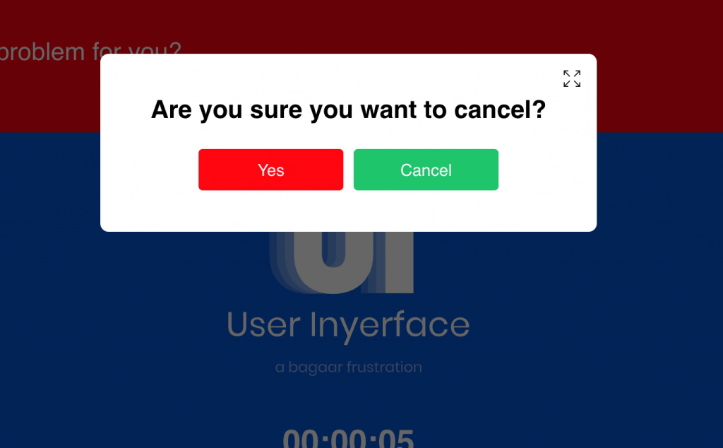
When I pressed “Cancel” just for the fun of it, my first instinct was to click the green button without reading the text. However, once I actually took a moment to process this feature, I realized that it could lead to some confusion. “Are you sure you want to cancel?” gave you two options, both of which could mean yes. Is it the red “Yes” I want to cancel, or is it the green “Cancel” meaning “Yes I want to cancel? Or does the green “Cancel” button indicate that I want to cancel my decision to cancel? This was the most unclear “Cancel” prompt I have ever seen!
I also did not understand why there was a an option on the top right corner to make the text box full screen. This option appears on every pop up text box, even though it was unnecessary and could further contribute to the annoyance.
Stage 2:
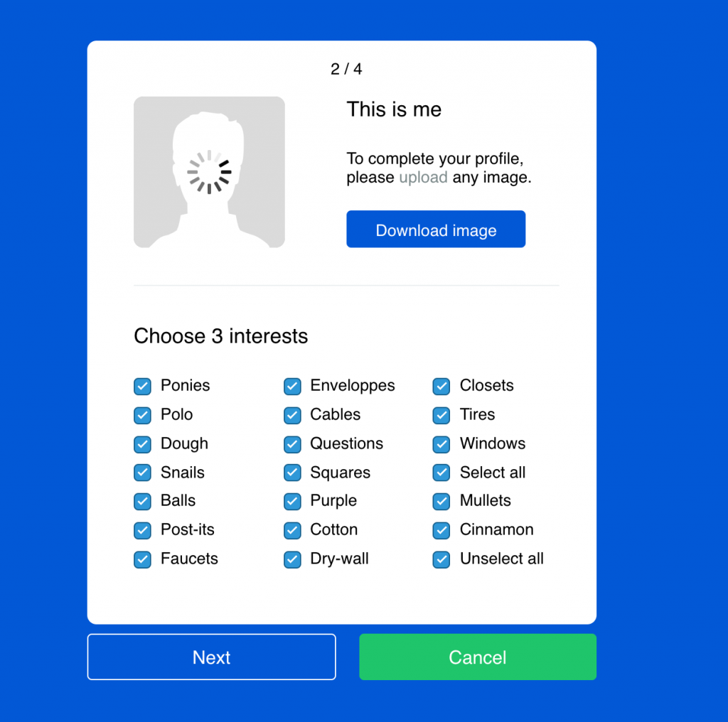
The next step was to upload a profile image and select three interests. At first glance, I wondered why the default profile image was “loading”, which of course it was not, but made me think about how easily we are tricked by those fake loading indicators or “skip ad” buttons on comedic videos. I first clicked the blue “download” button, which prompted me to upload an image, despite the text saying otherwise. Then I realized there was a small coloured “upload” button embedded in the instructions, which was misleading.
I was taken aback by the random assortment of interests, which were not sorted in any way. I would at least think that it would be arranged in alphabetical order, like most forms do. I also noticed that the “unselect all” and “select all” are useless, and became frustrated when all the boxes were ticked. Usually these boxes are not ticked, especially when you only have a limited number of options to select. And again, I was deceived to click the green “Cancel” button instead of the “Next” button. Why was “Cancel” in green and more representative of a “Next” button than the “Next” itself? This was the opposite of an ordinary form’s intention.
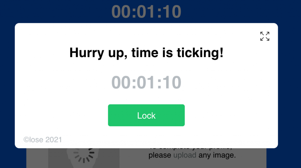
I was not entirely sure why there was a “Lock” feature. I immediately clicked the green “Lock”, thinking it meant “Ok”. Of course, it did not do as I intended, and I was stuck clicking “Lock” and “Unlock”, and even fullscreen, until I realized that the “Close” button was hidden in the copyright. How inconvenient! It was agonizing every time I saw this text box pop up, which was often.
Stage 3:
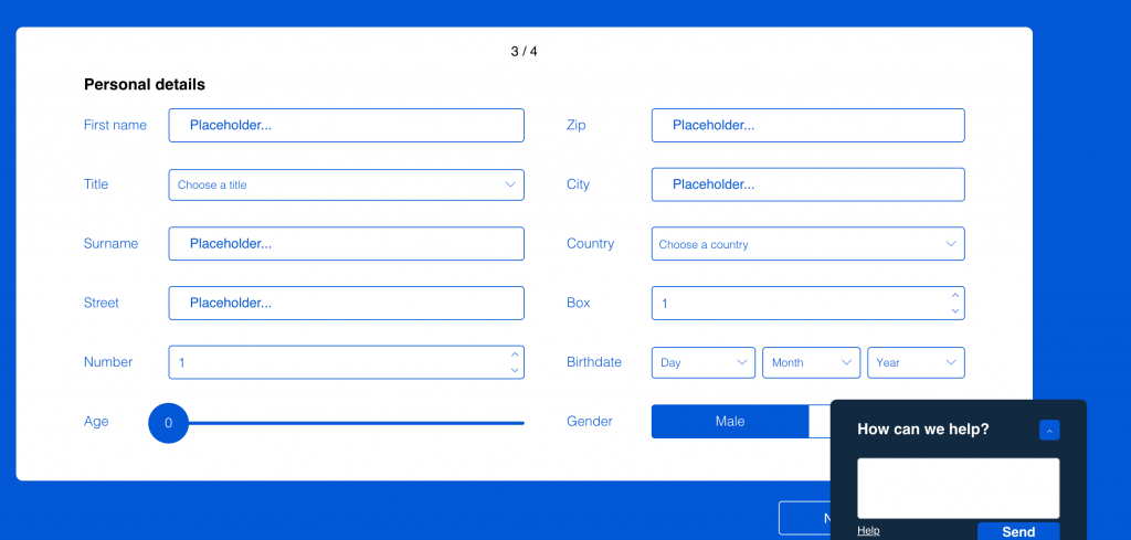
This stage required you to fill-in-the-blank with your personal identification information. Although we have seen this series of questions many times and know that it can be quite monotonous to complete, this type of form is usually a no brainer. Just quickly click each blank, type in your information and click next. Simple. Well, as soon as I approached the midway point of this task, I can confidently say that, for me, this stage was the most excruciatingly infuriating to complete in this game.
Firstly, I was not impressed when I had to delete each letter of the placeholder text in each box. I had begun typing in my response immediately after I clicked the box, assuming that the placeholder text will disappear and automatically be replaced by what I typed. I also wondered why the “Title” blank was sandwiched in between “First name” and “Surname”. I was close to making a mistake and typing in my surname instead of my title.
I grew impatient when I had to use the slider to select my age. A sliding scale is certainly the most inefficient way to select an exact factual number, because it takes a disciplined wrist to move the mouse with the slightest accuracy to reach that number. I was even more baffled when I saw that I had to find my country’s flag instead of finding the country’s name on an alphabetical drop down list. That were a lot of flags to go through, but I found myself subconsciously sorting the flags by “alphabetical order” (e.g. if I wanted to select Canada, I would swipe to the front of the list for “C”). Both of these options would benefit from an alphabetically sorted drop down list of names instead.
When I thought I was finally a few clicks away from completing this stage, I was thrown off when my title did not match my gender. I was confused, because surely, I had selected the correct gender! After I tried again, I realized that I had instead de-selected the right option when I had clicked on it! Again, another inconvenience, as it seemed strange that the form’s default selection is deselection, or disagreement.
Stage 4:
This stage prompts you to verify that you are human. The task was simple: to select every image that corresponds to the text. However, there were a lot more than just several images to select (compared to the 3×3 or 4×4 grid usually given). The word prompt was “light”. I quickly noticed that the images are all different, but correspond to the prompt either literally or figuratively. Images included flames, a feather, a traffic light, a bonfire, a flashlight, etc. I figured that it would be too time consuming to scrutinize every image on the grid to see if it fit the criteria, so I just selected them all as they all seemed to correspond to the prompt after a quick scan. My frustration increased once I reached the bottom and found no boxes to tick. I clicked around the screen, but nothing worked – I could not proceed if I did not select the images on the last row. I fumbled with the interface for a little while until I scrolled up, by chance, and there were the extra tick boxes! I realized that the boxes I thought I was ticking were for the images below, instead of above. It is usually the case that we would see the image first before ticking it off at the bottom, so I was tricked by that. I actually did not expect the grid to scroll at all, as they usually do not move on an ordinary website. If I had not accidentally scrolled up, this task would have easily taken the longest time to complete.
INSIGHTS
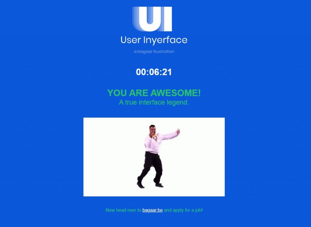
Once I completed the game, I must say that I was disappointed with the ending screen (just some simple text and a meme GIF), but I also gained a sense of accomplishment after knowing more about my own use patterns and attention span.
Once I hit a dead end in the task, my first reaction was to mindlessly click everywhere on the screen, hoping to land luckily on the correct hidden button. I already did that right at the start, on the homepage. I noticed that every time I got “tricked”, my patience dwindled. I felt some pressure when the timer box kept popping up in the middle.
After playing this game I started thinking more about how the designers implemented features that would almost guarantee an erroneous response. They just seemed to know the response patterns of an average user and intentionally used that to their advantage to drive them away from completing the task. As I reflected on my irrational, automatic, and subconscious actions and decisions, I realized that:
1). My attention span is extremely short, and even more short when faced with an online form to complete. Since I have completed online forms many times, they are all monotonous and follow roughly the same procedure to me. I tend to rely on autocomplete, or at least mindlessly clicking agree or next to proceed to the next page. I just want to quickly finish the form. This mindlessness was also shown when I would frustratingly click on random parts of the screen when I was stuck, not wanting to decipher the text and features.
2). Our “mistakes” in the game are us succumbing to the “dark patterns” (Brignull, 2011) in dishonest and deceptive UI Design. Since it is just a simple game, we likely did attempt our best, but we were not as careful as if we were to play a high stakes stimulation or game.
3). Attention economy: The game designers used many ways (as mentioned above) to distract the user. The misleading features and functions loudly clash against one another and are meant to overload and misconstrue the attention span, line of direction, and decision-making. The features are real, but they are not real. They look like they will work, but they do not. They are all too familiar, but they are not at all what they seem to be by appearance. This design purposefully frustrates the user into making the wrong or ill-informed choices because the designers know the average user’s patterns all too well. Since our attention spans decrease when we are facing a screen, our rational decision-making abilities are also twisted. We tend to be impatient when dealing with a challenge or “getting stuck” and we are likely to make irrational and “riskier” choices because we always have the “undo” button. That might be why I just clicked whatever was in my view, because I knew I could go back or start all over. Because our attention spans are short, we are always looking for the fastest way to get to the next page, to reach the next click. We want to see something new at all times, such as from the constant refreshing of our social media feeds.
4). I seem to love clicking buttons first. Every single time. It’s something about a big red round button, or a slightly protruding green button that is so tempting to click. My eyes immediately arrive at the button, regardless of the screen displayed in the game.
5). As I reflected on my clicking patterns, I noticed that I upon seeing the task, I would, without thinking, immediately select the option or feature that I usually do when I complete these online forms. My first instinct. Even when typing in a response or selecting an answer, I already had a predetermined pattern to approaching these tasks. It’s as if I already knew what to expect, subconsciously. It seemed like I already had an expected image and line of direction for the questions, the options for selections, the way the options are displayed, and the way to proceed throughout the form. Like my brain autofilled what needed to be done to proceed to the next stage. I have done this many times already, and this should not be any different. Well my expectations were completely torn apart and almost all my decisions were erroneous as I played this game.
How much information are we actually processing? What has stolen our attention on screen? Have we truly disregarded everything else that is not in our short attention span and line of view? Have we ignored everything that may obstruct our end-goal? Are we that impatient?
These expectations and first instincts that I based my split-second decisions upon may be already engrained in my subconsciousness when I increased my exposure to various interfaces that aligned themselves with similar user-friendly design standards.
The point is, these instincts and habits that I have as a user, might have been already conditioned patterns that rooted themselves in my constant interaction with interfaces that follow this unwritten standard of user-friendly UI design. This game intends to challenge the norms and standards of these conditioned user patterns.
I shared this game with my younger brother yesterday, and after a few minutes into the game, he told me it was like “[the game designers] practically inserted every single inconvenience into one form.” He was completely right. The form was just a large detour of inconvenience.
References
Brignull, H. (2011). Dark Patterns: Deception vs. Honesty in UI Design. Interaction Design, Usability, 338.
One reply on “Task 10: Attention Economy”
I’m still not sure how you were able to enjoy this “game.” But I can appreciate the value of it and the insight it provided. If you want to have a good visual of the different kind of dark patterns, I enjoyed reviewing this one: https://uxknowledgebase.com/dark-patterns-3b41ed7a690e