Suitability Analysis
This project’s overarching goal was assessing the NextGen Bus Plan through the lens of equity of transportation access in Los Angeles. To establish a basis for evaluating Metro’s proposal, we perform a suitability analysis to identify the most suitable regions in Los Angeles County for equity-focused growth. The suitability analysis was performed using a multi-criteria evaluation (MCE) process, with the goal of identifying regions that were suited to transit development based on environmental and socioeconomic factors.
Understanding Relevant Factors
Our search for appropriate factors began with the following focus questions: Which segments of the population are overrepresented in transit ridership? Does the existing infrastructure adequately service them? What physical or environmental factors may discourage transit ridership? Which regions would benefit the most from increased or improved transit services?
A literature review of transportation development and planning research provided a basic understanding of the recurring trends in discussions around equity and public transportation. Our criteria and process were shaped by a 2016 study of the built environment in relation to transit ridership (Kim, Ahn, Choi, & Kim), as well as literature discussing the impacts of the first/last mile problem (Boarnet, Giuliano, Hou, & Shin, 2017; Hoehne & Chester, 2017), which provided illuminating knowledge on the factors which impact transit ridership. Ultimately, we structured our criteria around Brian D. Taylor’s and Camille Fink’s classification of “internal” and “external” factors influencing transit ridership aligned with our goal of incorporating a wide range of variables in our assessment (2013).
According to Taylor and Fink, external factors are representative of broader societal trends which play a role in determining the demand for transit services, whereas internal factors are largely connected to the logistical and operational side of transit systems. In order to capture the impacts of physical influences on transit accessibility, we incorporated an additional category focused on environmental factors—though we acknowledge that the work of environmental justice scholars has shown that the line between the physical and the sociological is often blurred. These three conceptual delineations served as a basis for the selection of the sub-models we would choose to focus on (Model 1).
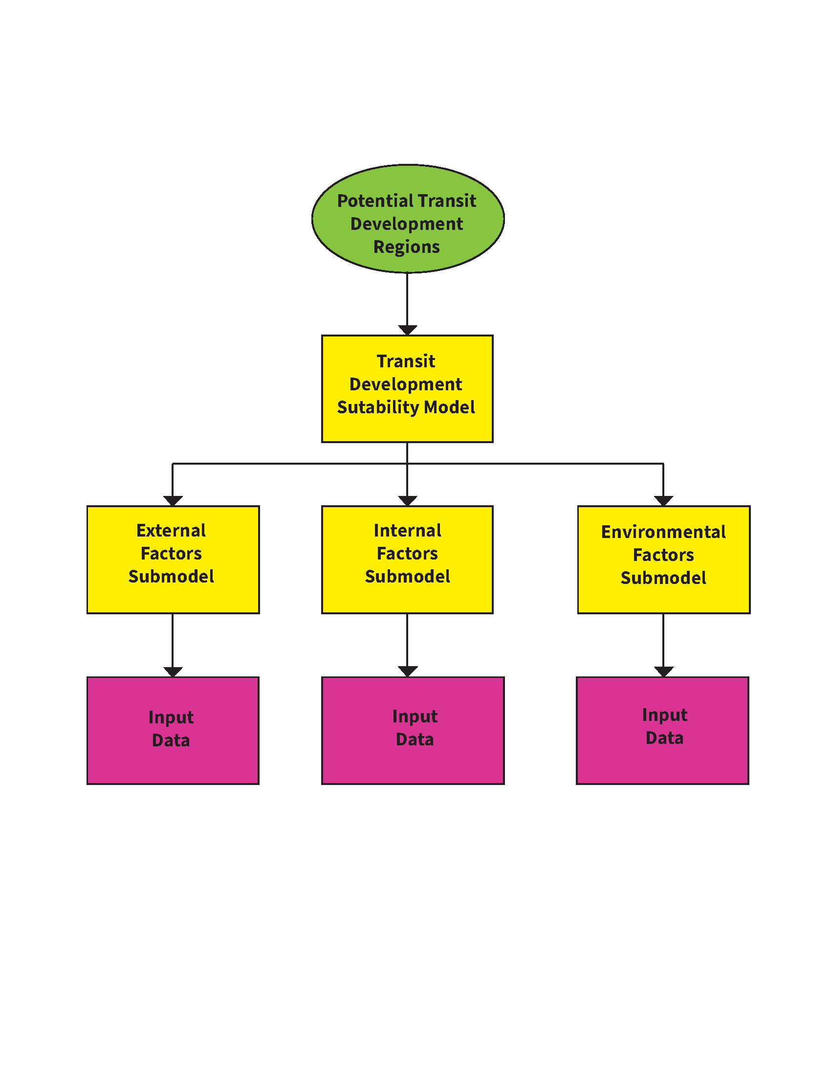
Model 1: Transit Development Suitability Mode
Criteria Identification and Data Collection
With our overarching factor categories defined, we began to search for relevant data in each of the three categories. Internal data was primarily obtained from Metro’s published GIS files, while external factors were mostly evaluated using census data. Environmental data was accessed through published data sets from academic research or government offices.
The external factor submodel includes census data on median income, employment status, population density, age (15-24), school enrollment, work travel time and employment in the service industry. The identified socio-economic factors assess regions where transit need may be higher due to low incomes, higher population density, long commutes, and significant populations who are more likely to utilise public transportation as a means of travel. Our internal factor submodel consists of bus density and proximity to rail, both of which serve to limit development in areas near existing transport infrastructure, while also factoring out areas already well-served by a rail station within walking distance. With regard to environmental factors, pollution exposure, tree canopy coverage, climate, and slope were chosen as relevant criteria. The environmental factors identify regions of increased exposure to negative effects in order to balance the distributional inequities in negative environmental phenomenon.
Data Cleaning and Transformations
We chose to limit the scope of our analysis to census tracts contained within an 5 km buffer of existing rail lines. As such, areas in the outskirts of Los Angeles that are primarily serviced by transportation companies autonomous from LA Metro were not considered in our analysis. This also ensured that our assessment of the NextGen Bus Plan was not effected by noise beyond their proposed area.
Using the Metro Bus Stop vector point layer and Bus Headways table, a Density Analysis was conducted to understand the spatial reach of the existing network. A neighbourhood of 800m (approximately half a mile) was chosen to reflect an appropriate walking distance. Stops were weighted by buses per hour, which was calculated by joining bus frequencies from the Headways table and dividing 60 by the frequency in minutes. The resulting analysis provided a density map of existing bus service per hour per square kilometer (Figure 1), which we used as an internal input layer.
The rail input was constructed using multiple ring buffers of 0.5 km each ranging from 0.5 km to 6 km from each rail station. The layer was then reclassified to score areas 1 km or closer to an existing rail station as lowest priority, with areas between 1 and 6 km rescaled using a Gaussian transformation with midpoint 2 km to reflect the importance of bus networks close to rail but outside of walking distance in providing a solution to the first/last mile problem. All areas beyond 6 km of existing rail were given a middle score of 50.
Due to the quantity and complexity of data used in our analysis, a 1 to 100 scale was chosen for our function transformations; this allowed us to more precisely represent each factor’s impacts. The transformation functions for each individual layer were chosen on a case by case using previously conducted research on transportation development and planning to determine which ranges or characteristics of the data are most important. For instance, research suggests that lower-income populations are more likely to use public transportation than their middle- or higher-income counterparts (Lehmann, 2018). Thus, the MSSmall transformation function was used to rescale our median income data, as it rates smaller values of the input data more highly. In this case, MSSmall was chosen as opposed to the Small transformation function since the value used for the midpoint parameter is chosen based on the mean value that is inherently present within the data as opposed to some an arbitrarily selected value. We also used a mean multiplier of 0.75 to further reduce the values rated most highly to incomes lower than 75% of the mean. When using Gaussian functions, we first graphed the function with chosen midpoint and various spread values to ensure the curve best captured our desired range of values. The full list of transformations used in our analysis can be found in Table 1.
Table 1: Function Transformations for each input layer
| Layers | Transformation Function | Why? (i.e., What characteristics of the data do we want to preserve?) |
| External Factors | ||
| Population Density | Gaussian
Midpoint = 7000, Spread = 0.0000001, Lower = 164 with value 1, Upper = max |
Preference increases with higher values and tapers off around 1 Std Dev above the mean. This was done in order to account for outliers concentrated in the DTLA region. |
| Travel Time to Work > 60 min | Logistic Growth
Max = mean + 2 std dev |
The distribution of CT’s with a travel time greater than 60 minutes is mostly in the lower rungs of the data (i.e., 0 to 12%), thus to control for outliers, the logistic decay transformation was used, as it tapers off at larger input values. |
| School Enrolment | Logistic Growth
Max = 2 Std Dev above the mean |
Regions with a higher student population were favored in this analysis. A logistic growth transformation function was used to account for census tracts which contain university campuses and are thus majority student populations. |
| Occupation (Service Industry) | Linear, max = mean + 3 std dev | Preference increases as value increases |
| Age 15 to 24 | Linear, max = mean + 2 std dev | Preference increases as the proportion of the population between age 15 to 24 increases. |
| Median Income | MS Small, mean multiplier = 0.75, std dev multiplier = 1, lower = 1 with value 1 | Preference increases as values get smaller with decline in preference beginning at 75% of the mean |
| Employment Status | Gaussian, midpoint = mean, upper 1 with value 1 | Preference decreases at tail ends of distribution in order to account for outliers. Further, some regions such as university campuses are overrepresented in the lower rungs of the data, and may not be |
| Internal Factors | ||
| Bus Density | Gaussian, midpoint = mean, spread 0.0005, lower 0.1, upper = max | Highest preference around average existing density with moderately gradual decline outwards, spread chosen for rough coverage of 99.7% of data, lower limit set at 0.1 or 1 bus stop per 10km2 to exclude areas where expansion is impractical |
| Existing Rail Access | Gaussian, midpoint: 2 (representing km buffer), spread 0.01, lower 1, upper 10 | Highest preference at 2 km from existing rail (where added bus service assists in rail access, with gradual decline moving outwards and sharp cutoff at 1km from existing rail station (walkable distance already well serviced) |
| Environmental Factors | ||
| Pollution Exposure (air pollution, contaminants, etc.) | Large | Areas of greater exposure |
| Tree Canopy | Logistic Decay | Favouring lower tree coverage areas (i.e. lower shade areas) with a more rapid decrease in preference towards higher values |
| Climate | Large | Higher temp areas prioritised for more service |
| Slope | Linear, min = 0, max = 6, upper = 6 with value 1 | Restricted thresholds of 0 to 6 to examine only buildable grades, linear function between the two to slightly prioritise greater slopes where walk times across the same distance may be increased |
Factor Weighting and Weighted Sum
We used a two-tier approach of Analytic Hierarchy Process (AHP) priority analysis to weight the criteria in our suitability analysis. An initial AHP process was conducted to determine the weights of the three factor categories (Internal, External, and Environmental) with subsequent AHP processes within categories to determine the weights of individual factors within their categories. The category weights were then used to adjust the individual factor weights to create the final weighting scheme (Table 2). The consistency ratio value for each process was kept below 10% to maintain sufficient consistency in the priorities.
Table 2: Analytical Hierarchy Process outputs
| Factor Category | Category Weight | Factor | Weight in Category | Final Weight |
| External | 22.90% | Median Income | 36.00% | 8.24% |
| Employment Status | 18.40% | 4.21% | ||
| Population Density | 18.30% | 4.19% | ||
| Age – 15 to 24 | 11.40% | 2.61% | ||
| School Enrolment | 8.30% | 1.90% | ||
| Travel Time to Work | 4.00% | 0.92% | ||
| Occupation Service | 3.60% | 0.82% | ||
| Internal | 69.60% | Bus Density | 95.00% | 66.12% |
| Rail Access | 5.00% | 3.48% | ||
| Environment | 7.50% | Pollution | 10.90% | 0.82% |
| Tree Canopy | 29.00% | 2.18% | ||
| Climate | 52.50% | 3.94% | ||
| Slope | 7.60% | 0.57% | ||
| Total | 100.00% | |||
Locating Regions
We utilized the Locate Regions tool to identify suitable locations for public transportation development based on our weighted multi-criteria evaluation suitability layer. The parameters set apart from the defaults were:
Total area: 200
Area units: Square km
Number of regions: 6
Region Maximum area: 40
Region selection method: Sequential
These parameters were specified to limit the size of regions to what we deemed areas of reasonable size. We also used the default parameter of a 50% Shape/Utility tradeoff as we wanted to balance consistent region shapes with selecting areas with high suitability scores.
To ensure the regions located were meaningful, we compared the map of identified regions to various individual factor layers, checking for alignments between modeler-identified regions and spatial patterns in the various criteria. A sensitivity analysis was also conducted to check the impact of weighting changes on the regions output.
Sensitivity Analysis
Because AHP-weighting is an extremely subjective process, sensitivity analysis is an essential step in evaluating the significance of that process in the final result. We conducted a sensitivity analysis on the AHP weighting by creating a second suitability raster with factors equally weighted and using the same locate regions parameters to create a second identified regions map (Figure 3). The regions located using this second map were then compared with the AHP-weighted regions, using the Plus tool to see where the regions overlapped (Figure 4).
Comparison with NextGen Bus Plan
To assist with final analysis, we created a model that compared our final output map with the NextGen Bus Plan proposal (Model 2). The model first ran a density analysis on the NextGen bus network and then looked at the change between the existing bus network and the proposed network. Because the NextGen layers were only available as lines, a new bus density map was created from existing bus lines using Line Density Analysis to ensure a matched comparison. Both maps used a 800m neighbourhood and were weighted by average buses per hour, calculated by dividing 60 by the bus frequency in minutes.
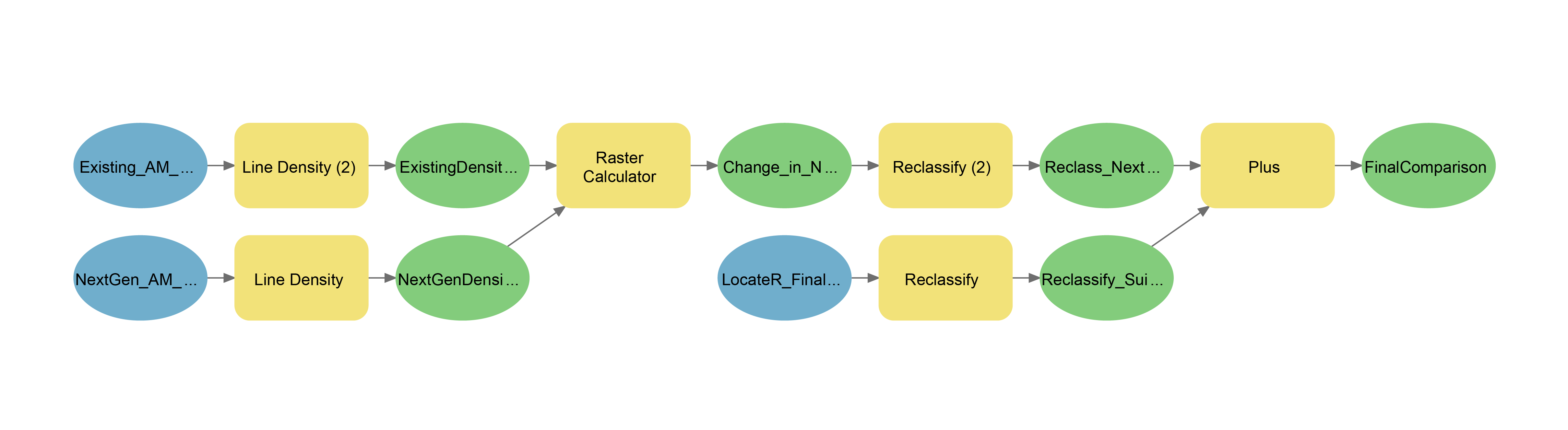
Model 2: NextGen-MCE Comparison Model
After the two density rasters were created, the model used the Raster Calculator to subtract the existing density from the NextGen raster layer, creating a third difference layer. This layer was then reclassified, with all values below 1 assigned a value of 0 and all values at or above 1 assigned a value of 1. These parameters were set to (a) focus the resulting raster map on areas of growth in bus density, rather than reductions and (b) reduce the noise from small fluctuations between 0 and 1. The result was a raster layer displaying areas where bus density was improved by one bus per hour per square kilometer or more.
Finally, the model combined the reclassified NextGen growth raster with the reclassified suitability modeler raster created during sensitivity analysis, using the same Plus tool to create a map representing the two growth regions and their overlap (Figure 2). This comparison map was also used in our subjective evaluation of the NextGen Bus Plan in relation to our suitability modeler identified regions.