Task 9: Network Assignment Using Golden Record Curation Quiz Data
This was a very engaging, interactive, and insightful way to explore the data that was co-constructed by the course participants. Beyond visualizing connections between song choices, this exercise highlights the implications of how data is structured and interpreted. It became clear that while the tool shows connections between participants based on selections, it does not account for the reasons behind those choices, assumptions about musical familiarity, preference, or the absence of certain selections. This demonstrates how networks, in other contexts, with missing data or misinterpretations could impact decision-making. Taking raw code and watching it come to life and visually represent the connections between users and song tracks made the data more interesting and tangible. The ability to move and sort the data in such a wide variety of ways provided countless opportunities to interpret the data and find meaning in the graphs created.
At first, I began by clicking on the various facets at the bottom of the tool to see how they would change the datasets, I quickly became confused at what was happening to the graphs. I decided to modify the graphs myself by positioning my name in the middle of the circle and placing the tracks I chose around my name. I then positioned the other participants in a larger circle around my name. This allowed me to easily see which people had shared songs with me and who did not. It also showed the connections between others in the group who were the only person or two people to choose a particular song. I found this chart lacking in data and so continued to move the spheres around.

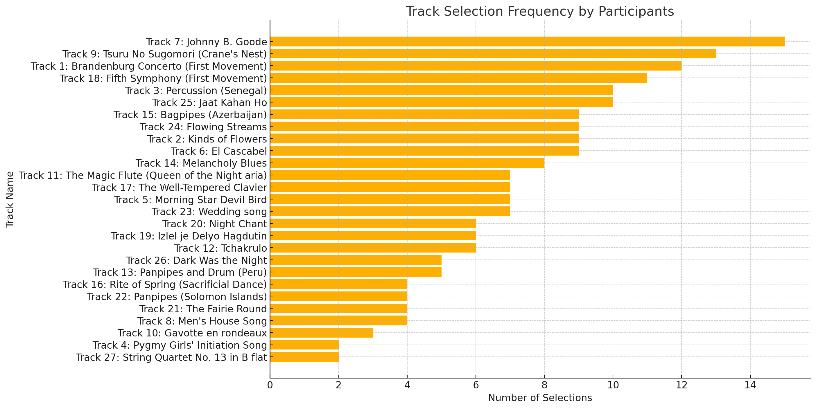
I found that the facets would often hide some of the data, removing my ability to understand the holistic dataset. I wanted to be able to see all the data at once, so I continued exploring. I naturally started to sort the spheres by putting the names of the participants on the outside, creating a circle. I then placed the largest (most connected) tracks in the very center of this circle and positioned the lesser connected tracks in outer circles. A screenshot of this can be seen below:

From this organization, it was easier to see which songs were the most chosen by the participants, with the top four being:
- Track 7: Johnny B. Goode (15 votes)
- Track 9: Tsuru No Sugomori (Crane’s Nest) (13 votes)
- Track 1: Brandenburg Concerto (First Movement) (12 votes)
- Track 18: Fifth Symphony (First Movement) (11 votes)
This visualization provided clarity around the choices that were made at a macro level but made it difficult to read as the names of the tracks quickly became overwhelming in the middle. However, while it successfully mapped shared selections, the visualization lacks context such as cultural background, personal memories, or musical exposure, which likely influenced our choices. Without this information, the network can only present surface-level connections rather than deeper motivations, assumptions, or constraints behind participant selections. With more time, I could have organized the data better, but this still made the information accessible enough to draw conclusions about the popularity (or lack thereof) of song choices. However, this structure does not allow one to easily determine who shared song choices and who were the outliers.
This .json dataset was fun to explore, but I did find it lacking in data. It was not only difficult to analyze based on the graphs, lines, and lack of color coding, but there are questions that are impossible to answer based on the data. For example:
- Why did we make the choices that we did?
- Why did we leave out the songs that weren’t chosen?
- Are there patterns in song selection that correlate with geographical location?
- If participants were given another chance to choose songs after seeing this network, would their choices change?
These are all pieces that would help flesh out the data and make it even more insightful for drawing conclusions. Without these demographic and contextual elements, the visualization may present an incomplete or skewed perspective of participant choices. For instance, if the dataset lacks age and cultural background, it becomes difficult to determine whether song selections are influenced by generational preferences or regional familiarity. Additionally, without knowing why certain songs were omitted, the absence of choices might be misinterpreted as a lack of interest rather than constraints imposed by prior exposure or personal biases. These gaps introduce potential blind spots in the analysis and limit the depth of interpretation that can be drawn from the network visualization.
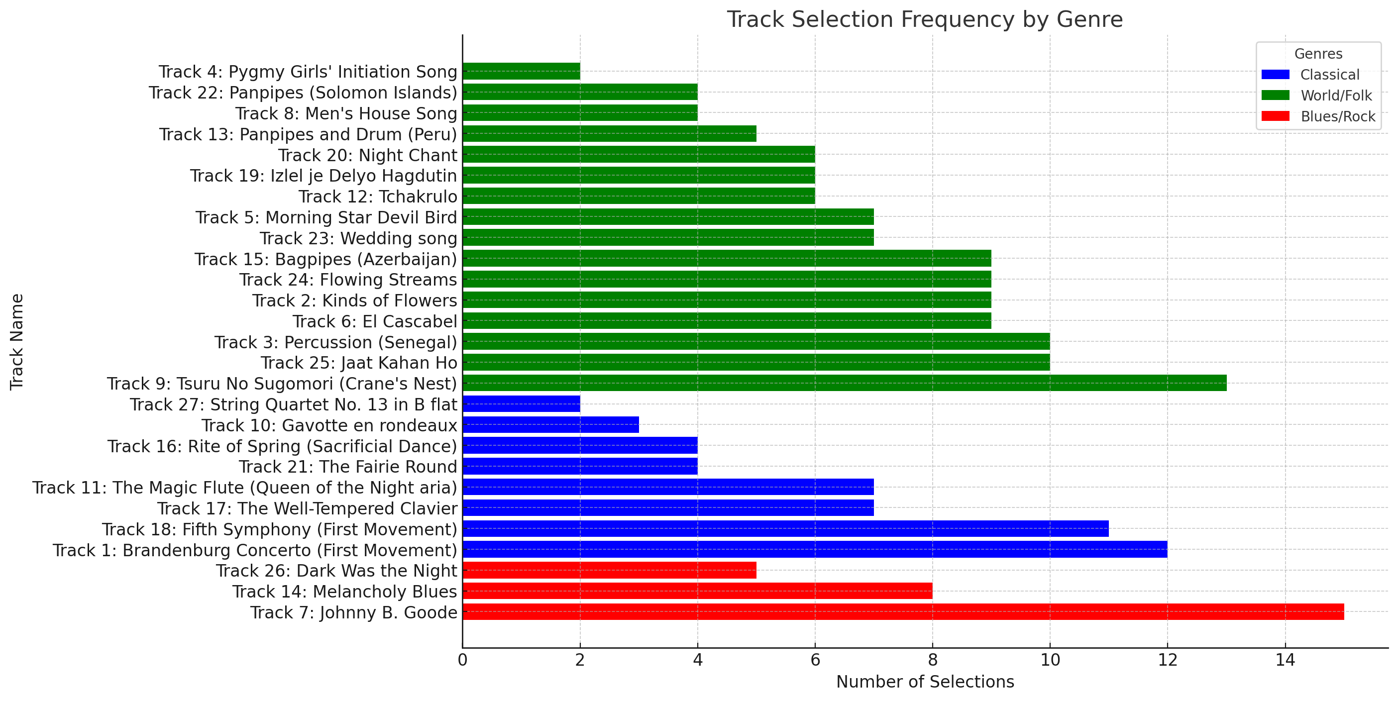
While Palladio provided valuable insights, I found it somewhat limited in its ability to reveal deeper patterns. This is likely also due to my lack of knowledge and experience with the tool. Additionally, the inability to use customizable color coding and advanced analytical tools made it challenging to extract deeper insights. To explore alternative methods of analysis, I uploaded the dataset to ChatGPT and asked it a series of questions. From my initial glance, it appears that the data is correct, but I have not been able to thoroughly verify it. This experience was fantastic and made the data even more accessible than Palladio did. I could ask specific, targeted questions regarding my exact interests and did not need to be an expert with the Palladio tool to gain insights into the areas that I wanted. Some of the graphs ChatGPT and I produced can be found below, along with a link to our conversation. One fun fact that I would like to point out is that supposedly Nick S (me) and Sheena S shared eight song choices in common, this was the most similar responses among any participants. I interested in now reading her Task 8 submission to see if I can find out why our choices were so similar.
I did not provide ChatGPT with a list of genres or tell it which songs to put into which category; however, it appears to have done a good job at deciding on three overall categories and placing the correct songs into each. Again, please note that this data has not been verified.
This task brought to light the strengths and weaknesses of networks and the web in general. A huge sprawling network of links connecting data together is an amazing technological marvel. As this task demonstrates, networks of data do not contain any of the deeper nuances to the choices or decisions behind the data. I think its fair to assume that this is also the case on the world wide web. It makes me excited to think about the evolution of this technology and writing platform and the potential for what the future might be able to bring.
References
ChatGPT. (2025, March 10). Conversation with ChatGPT about Voyager Golden Record .json Data Analysis. OpenAI. https://chatgpt.com/share/e/67cebf80-6be4-8013-a1fd-004c2ee0c7e5
Be First to Comment