Final Project

For the final group project of the course, I formed a group with the people sitting immediately next to me in the lab and we went with the first idea on which we agreed. We heard that Uber may be coming to Vancouver later this year and wanted to work with that. Uber is a sort of taxi service that uses a phone app to conveniently catch Uber taxi rides in your city. My group mate came up with the idea to try and map out where Uber hub zones might be placed throughout Vancouver. The idea behind the concept of a hub zone is that it is a dedicated spot where Uber customers can wait to be picked up, or Uber drivers can wait to pick up customers. These hubs can make Uber a much more convenient service to use, especially in parts of town where it  may be difficult to give an exact address of where you wish to be picked up, like downtown for instance.

Here is a link to the report my team created: GEOB270-Final-Project-Report-WED5

Here is the map we created:

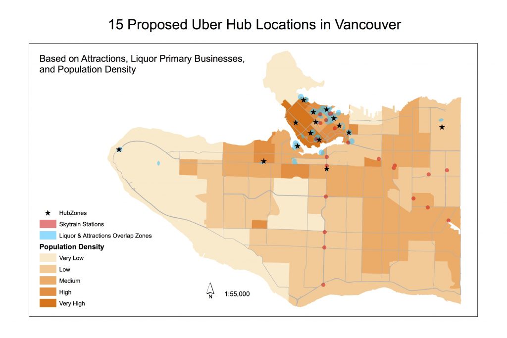
To determine the best locations for Uber hubzones in Vancouver, we used data on daytime attractions, night time liquor primary establishments, transit stations, and population. We wanted the hubs to be in zones where daytime and night time activities overlapped, while remaining at least 100m away from transit stations, and tried to place the hubs in census tracts containing at least a medium level of population density.

Collecting the data for this project was tedious, but not too difficult. There was some data that came only in an excel file, so we had to run it through google spreadsheets before we could input it into ArcGIS and that did take some time. Once we had inputted all of our layers onto the map, we realized we did not exactly know what to do next. Determining the “best” locations for hubs was not something we could easily do with the click of one button on ArcMap and it did involve some subjective judgements on our part. We used our discretion in this final stage of making the map.

I definitely found working in a group difficult. I do not enjoy group projects; I already knew this about myself. Since our lab work is normally done individually, I was used to working on GIS alone and found adjusting to working with three other people was not enjoyable. Four people sharing one computer was not exactly conducive to much work getting done. I also noticed there were many moments where the “two heads are better than one” phrase did not work at all. We would all find ourselves stuck, wondering, unable to properly think and put our heads together.

Something I learnt is that it is extremely important to really think hard about your project before you start working on it. Our project ended up not working out so well because we did not properly determine whether or not it was something we could feasibly do; it turns out it sort of wasn’t. None of us have enough experience with GIS to perform things like network analysis, which would really have come in handy for a project to do with cars and roads. I think we should have picked a simpler topic that we could have gone more in depth on, and figured out all the necessary steps to complete the task before embarking on it.

What could have made our project better is if we had more data, and less assumptions/simplifications of reality. We only had two sets of data for reasons why people might take Uber; daytime attractions and bars/clubs. Of course in reality there are probably countless other places where customers might take Uber: shopping malls, their friend’s house, the airport… So our simplification of reality meant that the map might not end up conveying the actual “best” places to install Uber hubs. As well, we did not take into consideration if there is actually enough physical space in area to build a hub and have cars waiting to pick people up.

All in all, it was quite testing to have to figure out all on our own an idea, and then all the steps to make it become a reality. Through the completion of this lab I gained confidence in the use of ArcGIS and successfully used the software to complete a map for a social geography issue.

Lab 5

For Lab 5 I successfully created a map and used it for an environmental impact assessment to determine the feasibility of a proposed project, and in doing so learned that many factors and stakeholders come into play when considering environmental projects. I made this map showing all the protected areas and the snowline for the Garibaldi at Squamish ski resort project. I also wrote a memo to the British Columbia Snowmobile Federation, who opposes the project, from the point of view of a natural resource planner, and I let them know that I believe there is sufficient evidence to continue to oppose the project because there are simply too many environmental concerns. 
MEMO: To BCSF
After careful examination of the Environmental Impact assessment and the criticisms presented by the Municipality of Whistler, it is clear that the Garibaldi at Squamish proposed ski resort is not an environmentally feasible project. More than half of the proposed project area falls within protected areas, including old growth areas, ungulate habitat, red-listed species, and riparian areas. On top of that, nearly a third of the project area may not receive enough snow for skiing, due to its elevation. As a natural resource planner, I am confident that this is sufficient evidence for the BCSF to continue to oppose the project. Here are the simplified steps I took to analyze the data:
Acquired the data from DataBC (Old Growth areas, Ungulate habitats, Terrestrial Ecosystem Mapping, Elevation, Rivers, Roads, Project boundary)
Clipped the layers (Old Growth areas, Ungulate habitats etc) to the project boundary
Reclassified the elevation layer so I could easily tell how much area would receive enough snow for skiing (the area above 555m elevation)
Searched the Terrestrial Ecosystem Mapping layer to find any red-listed species,
identified six: Flatmoss, Falsebox, Salal, Kinnikinnick, Cat’s-tail Moss, Cladina. These areas account for almost a quarter of the total project area.
Put a 50m buffer around streams at altitudes above 555m, and a 100m buffer around streams at lower altitudes. Clipped the buffered area to the project boundary, calculated the area, found that more than a quarter of the project area falls within fish habitats / riparian areas around streams
Combined all the different protected areas to create one whole protected area, and calculated this area to find that 53% of the project area falls within protected areas
Results:
Ungulates: 8% of the project area falls within ungulate areas
Old Growth: 7% of the project area contains old growth forests
Red-listed ecosystems: 25% of the project area affects red-listed ecosystems
Fish habitat: 26% of the project area affects fish and their habitats
Area below 555m: 30% of the project area falls below 555m of elevation
The two greatest environmental concerns would be for the red-listed ecosystems, and the riparian areas, whose habitats are most encroached upon with this proposed project. The red-listed species areas take up most of the area below 555m of elevation; it would be very difficult to construct anything in this area without disturbing them. Likewise with the fish habitats, which are found all throughout the project area. In conclusion, there is sufficient evidence to continue to oppose this project, and indeed I think it would be in the best interest of the environment to oppose this project.
__________
I do agree with what I have written in my memo. I personally do not see why this project was approved other than because it is an opportunity for a lot of people to make a lot of money. A lot of effort would have to be put in to work around the protected areas and it just seems like too much of a hassle to me. Plus, with climate change happening, who knows how much snow the area will get in 20 years time, when the resort is finally done being constructed. And 20 years after that. All in all it does not seem worth the time, the money, and the environmental impact to build this resort, but alas, it has already been approved.

Lab 4

Quantitative Data Classification:

In this lab, I used multiple classification methods when creating maps to learn that different methods of data classification can influence the interpretation of data on maps. The maps below that I created of the cost of living in Vancouver show four different ways of displaying the same data.

The way you show the data matters. You might interpret the cost of living in Vancouver to be different than what it actually is depending on which map you are shown. The natural breaks and manual breaks maps make Vancouver look severely unaffordable, but the equal interval map makes it seem as though Vancouver is actually quite affordable. So if I was a real estate agent I would most likely use a map that looks like the equal interval map in order to convince people to buy property in Vancouver by presenting it as cheaper than it really is.

Housing Affordability:

Here are maps that I have made in order to compare housing affordability in Vancouver to London:

Housing affordability is different than just house cost. Affordability is the house cost normalized by residents’ income. This makes it more fair to compare housing cost between cities whose residents have different levels of income. And since Vancouver is a big city and London is a smaller city, people will have generally higher income in Vancouver. So we would expect also that housing prices would be higher where there is higher income, but looking at the map, it is clear that even though people in Vancouver have higher income levels, the houses are still priced way too high to be considered affordable.

The way that affordability was determined was by using the ratings provided on the Demographia International Housing Affordability Survey 2017. You can see the 5 categories in the legend on my map. I think that, for what they are, these can most likely be trusted, and Demographia seems like a reliable source. However, the question I have is whether or not using price normalized by income is the best way to determine affordability. In Vancouver, it is well known that housing prices are driven up by foreign buyers with massive wealth, and their income is not reflected in calculations of local income. And income is not the only factor playing into what house a person can afford: think about savings, or inheritances. So we have to keep in mind that while Demographia’s affordability categories can give us some idea of the affordability of a region, there are other factors to keep in mind.

Affordability can be a good indicator of a city’s livability but it is definitely not the only indicator. Other indicators you may want to look for would be low crime rates, good health statistics, low levels of unemployment and homelessness, good quality of education, and even very specific things like if you want to live in a place with lots of bike lanes. Affordability is a big factor that plays into whether or not you can live in a region, but even if you can afford to live there, you may not want to, because of crime rates or poor employment opportunities.

Lab3

In this lab, we used data on elevation as well as distance to create a map to determine what parts of Vancouver would be affected by a tsunami.

The education and healthcare facilities that would be affected by a tsunami in Vancouver are as follows: Emily Carr Institute of Art & Design, Henry Hudson Elementary, False Creek Elementary, St Anthony of Padua, Ecole Rose des Vents, False Creek Residence, Villa Cathay Care Home, Broadway Pentecostal Lodge, and Yaletown House Society. To figure this out, I used select by location, and selected the education and healthcare facilities that fell within the danger zone. I then created new layers to show only those facilities in danger.

As shown in this map, in dark purple, the proposed new location of the St Paul’s hospital falls directly in the tsunami danger zone. This region is referred to as the “tidal flats” for a reason. It is possibly not such a good idea to build a hospital in this spot, especially considering that Vancouver is due for an earthquake at any time. In fact it would be quite ironic to see a hospital fall right to the ground shortly after being built.

Lab2

To fix misaligned and improperly referenced spatial data, the first important step is to look at the properties of your layers and figure out the coordinate system information: what is there, and what is missing. If the coordinate system for a layer is unknown, then the data is improperly referenced and will be misaligned when placed on the map. To fix this problem, all you need to do is go into the properties of the improperly referenced layer, find the coordinate system tab, go into geographic coordinate systems, and select a coordinate system. The coordinate system you select should be the one that was originally assigned to the data before it was lost. The project-on-the-fly feature of arcmap will make the layers line up nicely even if they have different coordinate systems. If you want to match up the coordinate systems of the layers so that they are all the same, you can use the project tool to permanently alter a layer’s coordinate system.

An advantage to using remotely sensed Landsat data for geographic analysis is that new information is released every 16 days, so it is always possible to have up to date data. Another advantage is being able to compare images all the way back to 1972. The best part? All the data is free to access and use.

Geog211 Research Paper: The State of The Earth

For my geography 211 class, I had to write a term paper about the state of the earth. My topic was annual average surface temperature anomaly. To me, this topic meant discussing climate change as a whole, in terms of the temperature constituent. Using the DPSIR framework, I wrote about the key drivers and pressures that led to anomalously high average surface temperatures of the earth. I went into detail about how rising temperatures would influence other components that make up the state of the earth. I then discussed impacts that would result from a temperature increase, and finished off with responses.

In writing and researching for this paper, it dawned on me the absolute complexity of the issue of a warming planet, on both sides of the equation: drivers/pressures and impacts/responses. It seemed impossible at first that I would be able to type out 3000 words in a document but in the end I think I went over by about 18 words or so (oops). Because of the amount of information I felt I had to include, I did not get to go very in-depth at all in my explanations. This, I found, made for a rather boring paper. As well, since it was a research paper and I had a specific framework to adhere to, I was not really able to show much creativity in my writing.

Rather than post my whole paper, I will summarize parts of it below in simple terms:

Average Annual Surface Temperature Anomaly: Anomalies are used to show how things differ from their normal values. Average temperature anomalies of the earth indicate that the earth’s temperature as a whole is, on average, increasing. This represents a shift in the state of the earth. Projections indicate that the anomaly will only grow with time. There is substantial scientific evidence to support these claims, to the point where they cannot be disputed.

Drivers: As I have been learning in this class, we are currently in the anthropocene: a time where the dominant influences on the environment stem from humans. Therefore, the key drivers of global temperature increase are all because of human activity. Specific economic sectors that drive climate change are energy, industry, agriculture, and transportation. I did not get the change to discuss this in my paper, but it is important to consider how global capitalism as a whole is a driver of climate change. Capitalism is an extractivist system whereby humans have a dominance-based relationship with the earth; we see the earth in terms of resources to be brutally extracted rather than being a complex living system that needs to be protected.

Pressures: The dominant pressure created by drivers is emission of greenhouse gases, namely carbon dioxide, methane, and nitrous oxide. These gases enter the atmosphere, trap outgoing radiation, and have a net warming effect on the planet. A secondary pressure is land use change, most notably in the form of deforestation. Plants are great at storing carbon, so when we cut them down we reduce the amount of storage for carbon and this results in more entering the atmosphere.

State: Surface Temperature Anomalies constitute a shift in the state of the earth, but this also affects the earth in many other ways. Glaciers are melting at increasing rates, sea level is rising and expected to continue rising, weather patterns are become more volatile/extreme, biodiversity in decreasing. The earth as we know it is beginning to look drastically different than what we’re used to.

Impacts: The major impact is reduced ecosystem services, which means that nearly every aspect of our lives will be affected. Humans absolutely rely on the services provided by ecosystems in order to survive. Water scarcity is expected to become a major future issue, as well as food scarcity. Agriculture, transport, industry, and energy sectors will all have to adjust to changing conditions and changing levels of demand. Human health will likely suffer, because of volatile meteorological conditions and increased diseases and pests, which will be felt most by vulnerable lower-income groups.

Responses: Though we are seeing global-scale agreements such as the 2015 Paris Agreement, there is little incentive for states to actually adhere to decisions and goals. Agreements are not legally-binding, and even if they were, who is the one unifying global leader that would reprimand a state for not participating? (There isn’t one). Responses also generally fail to address actual drivers of the problem. Sure, governments want to reduce emissions, but this would involve drastically redesigning the ways our societies function – and these types of redesigning plans are not being put into action.

Surface temperature anomaly is a complex state change that has many pieces to it, but to sum it up in one sentence: Humans are driving climate change, and humans will be adversely affected by climate change, so humans need to act to stop climate change.

Example of my Work: Geog 122 Paper

Last term, I took Geography 122 which focusses on modernity and globalization. For the term paper I decided to do a supply chain analysis for a foreign fruit, and I chose to research the coconut. Performing a supply chain analysis means looking at all the people and processes that a product goes through to get from the supplier to the consumer. In my analysis, I talked about various different ways in which coconuts are used, and then looked more in-depth at a couple of specific supply chains. As well, I compared a traditional supply chain to a fair trade one, and noted the differences.

The research for the paper made me think about how complicated supply chains can be, as a result of globalization. Even for just one fruit, there are so many possible routes it can take and products it can be turned into that I really had to be selective in my research. I learned just how hard some of the coconut farmers have to work just to survive, though many of them live in extreme poverty, unlike those higher up in the supply chain. When I looked at a fair trade coconut supply chain, although it still didn’t mean total equality for everyone involved, there seemed to be a significant improvement in the lives of the farmers. Taking a closer look at supply chains furthered my passion for being as ethical of a consumer as I can possibly be.

Below is the introduction to my paper.

One of the most versatile and celebrated fruits to exist, the coconut has important value and high popularity in many places of the world. The coconut has a long list of different uses, associated with different parts of the fruit. It forms an important part of the food basket of the peoples in the countries from where it is cultivated (Kumar & Kapoor, 2010), as well it is exported in large quantities. It would seem, then, that those who do the job of picking and preparing the fruit are rightly rewarded. However, this is not always true. In order to understand what happens to those who produce coconuts, we have to consider supply chains. Supply chains look at the full range of activities and participants involved in moving products from suppliers to consumers, and each person in the chain has a link to the next. (Kumar & Kapoor, 2010). Those at the lowest levels of the chain often do not receive the pay they deserve, and it seems as though they are stuck in this system. The supply chains can often be quite inefficient, and can negatively impact the environment as well as the people in it. But all hope is not lost. Fair trade coconut producers do exist, and they demonstrate that a coconut industry supply chain can work smoothly and benefit everyone within the chain. In my paper I will discuss coconut industries globally, and then I will use a few specific examples of chains in some of the major coconut producing countries. I will also discuss fair trade coconut supply chains and how they differ from traditional ones. I would like to make the point that there is lots of diversity in the way that different coconut supply chains are structured, and although there are several issues throughout the different supply chains, there is so much possibility to fix those issues. Though the recent surge in popularity of the coconut has so far not necessarily provided benefits to everyone in the supply chain, there is great opportunity for improvement in this industry, and the first step is to understand the workings of the supply chain.

Spam prevention powered by Akismet