The data is displayed as a web of connected nodes, similar to the way in which the internet is ‘organized’. On the web data is accessible only if it is connected to other data points, or in internet lingo, nodes must be connected by edges to . The more connections a data point has the more significant is it. Placing importance on the number of connections is one of the major ways that internet search engines sort and organize the web. Algorithms play a role in determining the hierarchy of webpages as they appear in your results sections. The more connections a page has to it, the more mentions and links to other important pages etc. the higher it climbs on the search results page (Code.org, 2017). This ensures that pages with good, reliable information continue to make it to the top of the results, and that pages with unreliable information, that other pages deny or don’t link to get pushed to pages 2 or 10000 of the search results.
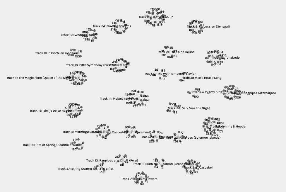
For our small collection of data it is possible to visually observe what kinds of connections are made and which tracks are “most popular” among the curators. It is also possible to see which curators had similar selections. Playing around with the different ways of sorting the data different aspects of the data become clear.
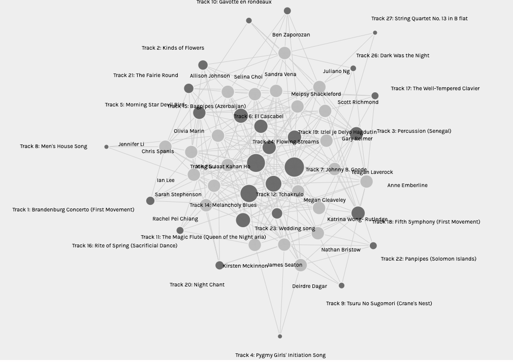 It is obvious that the most popular song among different students was the Johnny B Goode track. It is connected to the greatest number of other nodes since it has the greatest number of edges. (Systems Innovation, 2015) The reason for people’s selection of this song is not made clear by the data. They may have chosen it because it is one of the few contemporary songs, or because it is objectively pleasing or maybe for completely other reasons. The data cannot give us insight into the reasons for choosing the songs.
 Tracks number 4, 8 and 27 were the least selected songs. Each only chosen by 3 curators. If I were to speculate I might say that track 27 was least selected since it was one of many classical pieces and being the last on the list may have been left off since other classical pieces were already selected for inclusion. Track 4, Pygmy girls initiation song and track 7, Men’s House Song, may have been left off because they were not well understood by the curators, being from remote cultures. These thoughts are wholly speculative. Nothing in the data itself allows us to determine why the track were selected or left out by the curators.
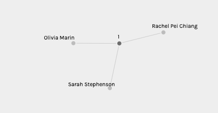 When sorted by Modularity Class certain groups of curators are bound together. Presumably by their similar selections, although that is not explicitly described in the graph of the data. I am in a Modularity Class with Sarah Stephenson and Rachel Pei Chang. Going back to their sites and looking through their selections I can see that we have 3 song selections in common, which doesn’t not seem like very many. There are several more songs that are selected by 2 out of the 3 of us but on the whole our selections are more different than they are the same. When reading the reasoning given by my fellow students they give very different arguments for their song selection than I did.
Data visualization is an amazing tool, and the Palladio software shows some interesting links and connections. It does not however give us all of the information we might want to know about why the selections were made and what significance they have for the curators.
References:
Code.org. (2017, June 13). The Internet: How Search Works . Retrieved from https://youtu.be/LVV_93mBfSU
Systems Innovation. (2015, April 18). Graph Theory Overview. Retrieved from https://youtu.be/82zlRaRUsaY
Systems Innovation. (2015, April 19). Network Connections . Retrieved from https://youtu.be/2iViaEAytxw