Lab 1
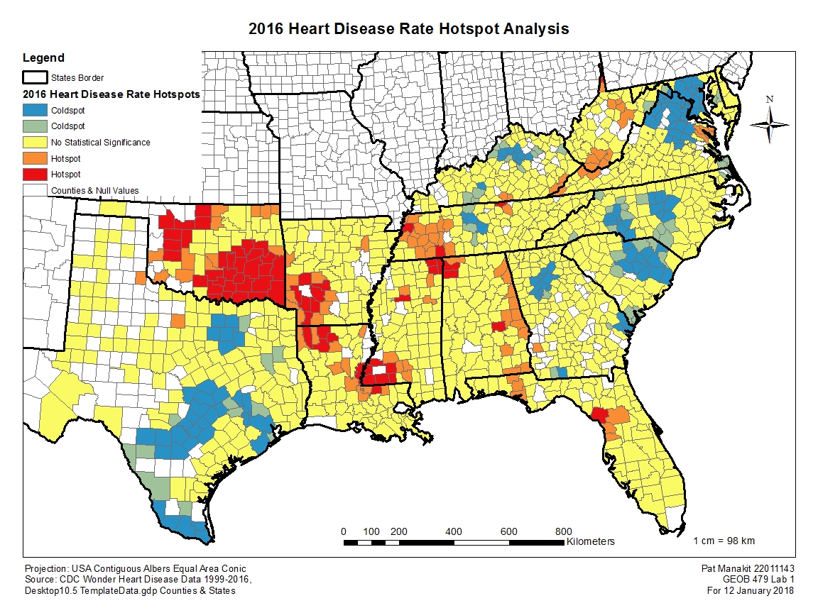
With Lab 1, we investigated a new spatial statistics tool called the Modelbuilder tutorial. The dataset we worked with was large with heart disease data for the entire US dating back to 1999. I chose 2016 by virtue of it being the latest year, therefore implying the most recent, reliable data with the best chances of verification if need be. The general pattern of the 2016 map seems to be of high heart disease prevalence in the rural areas of the region, particularly of areas in Oklahoma, Arkansas, Louisiana and Mississippi where all have areas of 99% confidence level hotspots. In contrast the low hotspot areas for the disease seems to be centered around major population centers, such as those of Dallas, Austin, San Antonio and Houston all in Texas, those around Virginia and Maryland, and smaller clusters around Charlotte, Atlanta, Nashville and Lexington. The statistically insignificant areas are around the two areas of hot and cold hotspots, which seems to be randomly distributed and filled into most of the remaining counties where there is available data. Curiously, the no-data counties do appear rather widespread in Texas and less so along other states, with the exception of Miami, Florida and the Everglades having no data, which raises questions about why a major population center isn’t able to deliver or even collect such information. I am not inclined to say that areas away from major cities automatically has a higher chance of people with heart disease clusters. Population density itself plays a role, so is the clusters bigger simply because there is less people around? Is it just the lack of healthcare services in the rural areas? What about the questionable reporting and reliability of data from low population areas? These are all areas worth an investigation into.
Lab 2
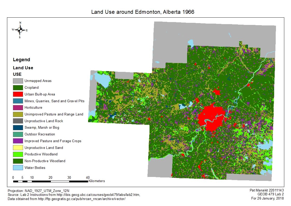
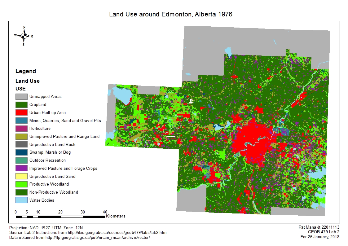
In our second lab we explored the Fragstats application, which allows a myriad of selection of landscape metrics for analysis. For this particular lab, we looked at the land use in and around Edmonton and the observable changes from 1966 to 1976. Fragstats allows quantification and assigning variables to each land use class, making it a lot easier to keep track of which land use transformed into which through that 10-year period. Land use changes comes naturally with the required expansion of a city to house all of its inhabitants, as well as alterations made to the surrounding landscape to meet secondary demands pertaining to livelihood. Between 1966 and 1976, the urban area of Edmonton spread considerably and very evidently on both maps across the ten years, as well as on the raw data table figures in land use changes. Of the urban area of 1976, only around 40% of that area were urban areas in 1966, and the rest coming in the form of development, taking over from mostly cropland and unimproved pastures. The expansion is such that the city develops an obvious ring around its existing demographical features. Based off of Statistics Canada, Edmonton has maintained the kind of population growth rate throughout its history, consistent with that of 1966-1976 values, indicating that the city’s outward expansion of urban area would continue under a hypothetical analysis of a modern landuse map. This lab was surprisingly difficult and very time consuming to organize and file the report, especially when it came to the graph metrics to see the numerical changes, but with challenges comes the learning experience and i’m grateful to have done it.
Lab 3
Lab 3 brings us to a regression analysis technique called the geographically-weighted regression (GWR), complementing the Ordinary Least Squares (OLS) regression I picked up from 370 last semester, but I would eventually use that as well as the Grouping Analysis as well for this lab. The geographically-weighted regression (GWR) analysis is one of the spatial regression techniques available for use to determine the local model of the variable or process that you are trying to map. It will construct a regression equation around each and every variable available to predict the pattern for the overarching entity. GWR constructs these equations through the variables, which are both the dependent and explanatory variables, and will output the shape and size of the bandwidth which includes Kernel type, Bandwidth method, Distance and Number of neighbors parameters. GWR works best with datasets with several hundreds of datasets, as the model caps off at 1000 and really does not work well with small datasets. A lot of the ArcMap geoprocessing in the earlier 270 and 370 classes deal a lot with the Number of neighbors parameters, as these results clump together the classes adjacent to each other which exhibits the most similar characteristics.
In the context of our lab, we are looking at how different social behaviors of kids vary spatially over Metro Vancouver, and whether the different explanatory variables of social skillsets of kids can help to explain their collective performance in the form of tests, which is part of the data we obtained from the start in a zip file. But there are other much more simple methods of GWR, with one example being combining basemap DA or CT data with three explanatory variables. The first one – important to the analysis – could be the residential break and enter, car thefts or other type of crime, combined with a map for population centers and a map of income levels across the city. These three variables on top of the basemap then provides a good crime map which shows the relevant crime areas in relation to where the highest population density is, where the highest income areas are located, and whether there is a trend among different CTs and DAs. Interpretation if these maps is a separate issue and with it comes the issue of ethics and oversimplification in perceiving a particular neighborhood as rampant with crime, therefore constitutes as a place to avoid, but that is beyond the realms of base GWR analysis.
Attached along with this submission are two maps, which I chose to base it on a Grouping Analysis map background, and one with GWR results while the other is overlayed with OLS results. I feel that this would be the best overall representation of the indicated data showing the spatial distribution of the two parameters. I decided in favor of this against more ‘custom’ maps, such as attempting to overlay a normalized variable onto a map of just loneparent as an example.
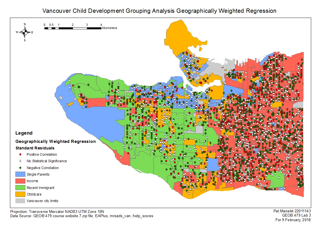
The GWR results for this particular scenario exhibited relatively poor trends to understanding the relation between a child’s social skills and their explanatory variables in relation to where the child is living across metro Vancouver. The scores that are scattered across the city all exhibit varying degrees of accuracy that both verifies and denies claims of the area having any relation to influencing the child’s social skillsets. There is a slight but poor trend to show that more of the lone parents and recent immigrants are slightly more relatable in their respective groups than the other three variables are. Income, childcare and family of four were all displaying highly random values unrelated to the grouping results. The income designated grouping area in particular are highly random, and a look at the map suggests absolutely no correlation at all, with lots of scores everywhere showing relation to go both ways. This is not good for analysis and would be better to be more specific about the values or to lower the amount of classes so that the area can fall into a subset of the other 3 groups.

The OLS results also similarly show some correlation, but not much between the social skills variable to the input variable of the scores. The graphs that OLS provides are helpful in understanding the trend, perhaps a little more visually pleasing than the raw data that came with it. Gender and ESL are virtually a yes/no type of variable with two answers and the data going one way or the other so it is virtually useless to try and interpret its trendline. Both ends of both variables contain roughly the same value anyways so indeed it doesn’t really require a trendline. On the opposite end of the scale, the most relatable feature in the OLS analysis is the Language factor. Here it is fairly evident that there are more social skills and interaction involved with a higher level of language acquisition, proficiency and understanding of its use and communication skills. All the other variables are roughly the same, as they have a lot of data points but with none of them pertaining to any particular trend. Lone parents, family of four, recent immigrants and income factors – ironically the ones the lab dictated to make a grouping analysis out of – fall under this category. One consistency to the Grouping Analysis is the family of four, which exhibits the lowest correlation in the OLS output graphs, therefore the class didn’t make it to the final grouping analysis which required me to choose from 5 variables but allocate only four groups anyway. In any case, I doubt having a 5th group would help as the variable is so poorly correlated anyhow. Over to the map, the scores are all in the same location as the GWR map, with all the variables having different values, and displaying that same level of weak correlation. Would be nice if I could take the language factor and tailor it to the OLS results for its own map but that will not show the overall results, as is my goal here.
Lab 4
In addition to FragStats, in this lab I was introduced to CrimeStat, another tool ideal for an analysis of crimes in a city, albeit not one that works seamlessly with ArcGIS. There was a lot of back and forth required between the two applications and an understanding of data transfer between them was required. There wasn’t any need to modify the format, but as stated the two programs aren’t designed to work in parallel.
The 1st order comparison of spatial aggregation for both B&E’s and car thefts are roughly not too different in value. There is spatial aggregation between B&E Commercial and stolen vehicles more than there is towards B&E Residential. This index does change as a function of the type of crime; although all three are some form of theft, break and enter crimes are when criminals successfully infiltrate or breach a property, and not necessarily considering factors beyond that, which could lead to theft, assault, murder and whatnot. The index is therefore considering spatiality of the success of each breach. Stolen vehicles on the other hand deal more directly with the actual theft of a vehicle, thus has a relationship between spatial aggregation and the reported missing vehicles by each owner.
The point files on ArcMap and the Indices graph attached below pertains to a visual representation of the spatial distribution across these three types of crimes. Both the point files and graph has evidence to suggest that B&E Commercial and Stolen Vehicles are more spatially aggregated than B&E Residential crimes. The two former types are more spatially clustered downtown, where all the economic hubs are located. Thinking with respect to the OTTLU layer, this does make sense in the way that cars are the form of transport for a lot of individuals going to work, and cars parked in a public spot is perhaps easier to take away compared to being parked in a garage, but yet city areas are under more camera surveillances. But if criminals know the right people who know the right spatial patterns to where these cameras are, they can perform their crimes undetected. This is also a prime area for repeat offenders. maybe a little further away. Residential B&Es are found also in the area, but has a pattern straying a little bit more away from the city center areas, representing areas where people live just around and outside the busiest of downtown businesses.
The fuzzy mode visual clusters are point based shapefiles converted from a data table of xy values. They roughly correlate to the Residential B&E points when I overlayed the two together on the same map. I chose to break the classes into five, with the highest associated with values approaching and including 247 frequency, which pertains to the most amount of residential B&Es in that particular spot. As for the nearest neighbor hierarchical spatial clustering results (NNH), it is an area map highlighting the spatial value factored into see the proximity of residential B&E crimes to another crime of the same type.
The two results compare rather well. Not all the fuzzy mode points lie within the NNH cluster areas on the map, but the correlation is generally good and the relationship is strong in that downtown and midtown areas where the intensity of people living in close proximity to one another exhibit strongly correlated residential B&E crimes. One advantage of these two is their focus of downtown, but this does overlook the results of the suburbs to the south and west, where people also live but the spatial distribution and population density isn’t considered dense enough to be deemed worthy of inclusion.
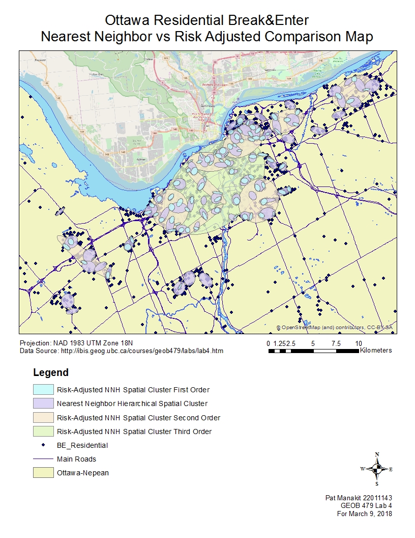
The standard NNH results go further in the instructions when a risk-adjustment variable is thrown in. From there, the risk-adjusted results (RNH) yields three orders of maps 1, 2, 3. Order 3 is one single large oval downtown, showing very generally where the majority of residential B&E crimes exist in Ottawa. Order 2 is better with a greater focus, but still lacking depth compared to the standard NNH results. It is the Order 1 map which I see very impressive levels of correlation between the NNH and the RNH. Attached to this writeup are three maps in which I overlayed all the RNH results with the NNH and with the BE residential shapefiles just for referencing. I had to place the first order RNH data above the NNH as the details are very specific and they fit within the NNH ovals, which I find remarkable.
The first order RNH shows a very specific map where crimes of detail locales are displayed, but actually adjusted for risk rather than being a flat spatial analysis like the NNH. Both show clusters around downtown and midtown Ottawa very well. The downtown area falls also under the second and third order, thus exhibiting the highest number of residential B&Es in relation to population density and the risk adjustment that came with it. If I ever had to pick a good visual representation of the crimes out of all the maps talked before and after, I would choose to have these two portrayed, perhaps on top of a Kernel density estimation if need be.
The Knox index variable was tested with the stolen vehicles variable. It examines the theft of vehicles and assess whether there are any correlation across spatial and temporal means. The results are attached as an Appendix as per the guidelines. The results suggests that there is only a weak correlation between thefts of ‘closeness’ in time, by that meaning it is within the confines of 6 hours between one vehicle theft and another. This points to a series of ‘preferred’ times when people are away from the vehicles and makes for a prime opportunity to steal the cars. This does not necessary lead to suggests that a repeat offender works within 6 hours. The results also suggest a stronger correlation that there is no closeness in space (for our parameters within 5000m) between two vehicle thefts.
The two kernel density estimation maps are an advantage in a way that it does not restrict results to around downtown and midtown Ottawa, but rather show results everywhere on a given platform. The drawback to this is some of the readings are high outside of city limits and not adjusted for population density. For both maps I used the z value as display data, with a sampling increase of x100 to include all the cells, under a geometric interval scheme with 10 classes to see the gradual changes in this vector-based map with squares.
The single kernel density estimate map (KBeR) exhibits consistent trends downtown with all the other NNH and the three RNH results, albeit there are strong correlations to the south and west side of the town which is not covered by the earlier variables. These are slightly misleading, as they do not have many people living in and around them. I still find it to be better than the dual kernel density estimate (DKBeR) however. The DKBeR does not even exhibit strong z values downtown where all the important crimes are, instead showing strong signs near the highways to the southeast and further west out of shot of the map as well. Perhaps the increased ratio of densities and the use of a secondary variable in DA06_Pts had strong implications into the results of the data.
On both kernel density maps I decided to include all the prior analyses onto the map to judge the accuracy and closeness of the values. However there were some errors with getting the Fuzzy mode to show above the layers, accompanied by the removal of the B&E Residential point files layer to keep the maps from being too cluttered. Overall the KBeR has great consistency to the NNH and RNH outputs, with all ‘hotspots’ correlating very well to the KBeR areas. This is true for midtown Ottawa, as the less populated areas exhibit strong trends in KBeR they are not covered in the clustering results, irrespective of the risk adjustment. DKBeR shows less consistency with the clustering results.