
link to in-class presentation & deliverables
Full report: Project Executive Summary
This project has an overarching goal to visualize needs assessment for Building Operation landscaping unit. Based on the rationale provided by community partners (municipal landscapist & head gardener in UBC), the amount of green space on campus and the work needed to properly maintain it far outreach the capacity of building operations staff, funding, and time. An apparent gap between current and desired status of maintenance has been observed, and the issue needs to be brought to the attention of Building Ops directors / stakeholders.
The initial data given was a spreadsheet containing all soft landscape areas in UBC and the building they are affiliated with, as well as the current man hour & man hour needed to properly maintain the area. The key issue at hand is to turn the “raw and dull” spreadsheet data which can be confusing and ambiguous to look at into visual, clear and direct messages. Key indicator of gap of maintenance should be distilled, the reason that’s causing this long-standing issue should be clarified, and the action needed to address the issue should be pointed out.
It’s then decided that the project would have a two-fold focus. First is to visually assess the current status and the gap of maintenance, and summarize the issues faced by Building Operation Landscaping Unit. An infographic can be dedicated to this purpose to establish the issue at hand by integrating map of existing gaps and indicative figures. Second focus is to identify the main reason behind the gap of maintenance, and create an advocacy message to push for the proper address of the issue. Another infographic incorporating calculated figures, backgrounds and a proposed measure to move forward can be dedicated to this purpose. These two primary deliverables are intended for external advocacy purposes. They aim to succinctly summarize the issue to decision makers / stakeholders who doesn’t have a first-hand understanding of the situation.
Other side-deliverables are generated along the process which include several static maps showing the gap of maintenance / current maintenance level on a campus-wide level. Zoomed in maps on main-campus crew area is also generated. These can be used internally as reference materials, and can be more effective and up-to-date compared to previous hand-drawn maps. Lastly, a spreadsheet containing the most current information on area summary & maintenance levels is exported, with standardized building names, as an updatable “database” for landscaping unit’s internal use. Future maps can be easily generated, and man hour can be allocated based on the spreadsheet, and future development can be further added to the existing information.
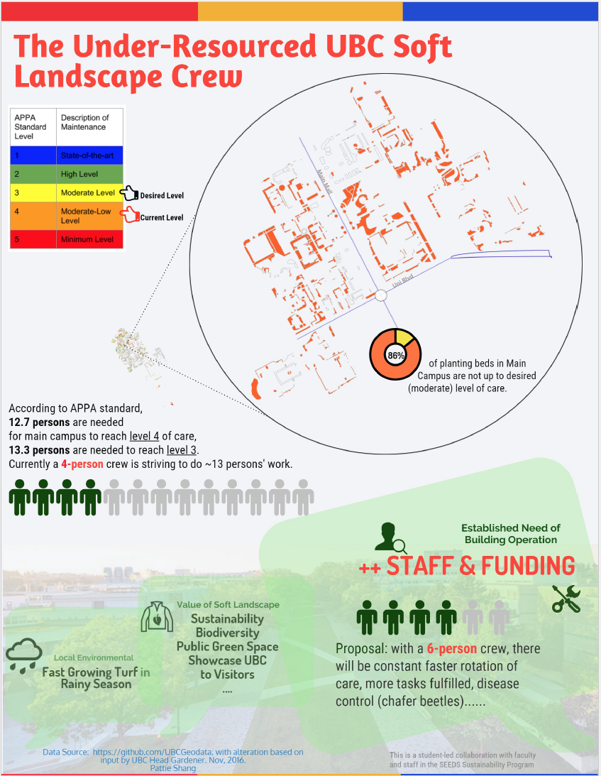
In the makings of infographics, APPA’s (Association of Physical Plant Administrators) five standard level of maintenance are adopted as the key variable to illustrate the gap of maintenance. Compared to man hour which is proportionally assigned to landscape areas based on sizes, APPA standard can generate a more uniformed assessment of gaps. Planting beds are selected as the subject of the study since comparing to lawns, they take more man power to maintain. The most important piece of data is the GIS layer that contains all soft landscape polygons in UBC (>10000 entries) obtained from UBC GIS specialist’s UBCGeodata site. The landscape areas have also been assigned building affiliations, sizes, and crew area attributes. This project is only feasible to complete within 3 weeks thanks to these existing information.
The data is then parsed to standardize entries and filtered to adjust spatial scopes of maps. Additional data such as current service level assessment for main campus had been obtained from an interview with head gardener, and was then updated in GIS. Issues and concerns, as well as a proposed 6 man-crew scenario was also noted during the interview with head gardener – the community partner who experiences the issue first hand and knows the best. The data was then mined to obtain key indicative figures (portion of area with gaps, labour needed to reach standard etc).
Two infographic is then generated with maps of maintenance gaps on campus. Other key figures used to establish the severity of the issue include:
1) the majority status of campus area (level 4) that are not up to desired level of maintenance (73%-93%…)
2) the relatively humble “desired level” – moderate level of maintenance (level 3)
3) the beetle issues and inconsistencies of maintenance caused by aspects that are not brought up to standard (grass cutting, disease control….)
In second infographic, the most important message is the illustration of the key reason behind such large gap of maintenance noted above. That is, there is a significant shortage of crew member all across campus landscaping divisions. The existing 4 man-crew is compared against a recommended APPA standard of an estimated ~13 man-crew to illustrate the apparent shortage of labour. It can be also noted that such status can be deemed as severely unsustainable since a constant expansion of campus green spaces. Significance of issue is also expressed through the great values that are associated with campus green spaces – sustainability, biodiversity, public social spaces etc. Combined the considerations for those who maintain landscapes for years to come, with the significance and public expectations of campus landscapes, a case can be made to call for more resources (primarily labour) to properly maintain landscapes. A humble request, and a very realistic scenario has been proposed – a 6 man-crew expansion plan. With this increase in available labour, numerous benefits and an enhancement in overall service levels can be foreseen.
If this project can successfully advocate for such a cause, and bring a change to the landscape unit, future projects can be initiated to generate interactive map based on the situation. The map can focus on visualizing the time lapse of campus maintenance level, which would hopefully be able to showcase the progress and improvement in maintenance that’s brought by the increase in crew-member. The success of such an initiative would largely be based on the constant update / maintenance of the spreadsheet information that’s generated in this project.
Upon reflection, the infographic design is meant to be succinct with one key takeaway per work. It’s expected that the key messages contained in the visualized form are combined with expert’s elaboration and explanation on the issues. The infographic design try to utilize figures in a way that captures attention and convey information in a plain language manner. The effect of the infographics would be enhanced if a person experiencing the issue first-hand can provide further insights on the points showcased. If a synergy effect between such graphic illustration and people’s experience can be formed, then an effective delivery of information can be expected.
Appendix:
Infographic 1 – https://drive.google.com/open?id=0B8bwZqR-a9UYWVdSNkVQV09ram8
Infographic 2 – https://drive.google.com/open?id=0B8bwZqR-a9UYQ2YySi1RdVN4alk
Presentation Summary: https://drive.google.com/open?id=1aHkgZr88cNzRZjDAoeYQBfvXKSzJjNxjHOC-vlGiTok
Spreadsheet: https://drive.google.com/open?id=0B8bwZqR-a9UYeGlKVl9tYUJ0Xzg
Static map sample 1: https://drive.google.com/open?id=0B8bwZqR-a9UYT3dEV0NEVkRTOWM
Static map sample 2: https://drive.google.com/open?id=0B8bwZqR-a9UYcjNQWnZaRVlDck0
Briefing on Updating the Base Files:
- The infographics, if can serves their purpose, would be likely a one-time use material that’s illustrating the current status of issue, needs and actions needed at this point particularly. The figures would change based on the Excel sheet information (base data), and new maps and figures need to be generated / inserted if wanting to use the infographics again. They are created through online-infographic maker combined with pre-processing in ArcGIS and Adobe Illustrator, which are both proprietary software. Thus, the updating of infographics may not be simple to achieve. On the other hand, the hope is to effectively utilize the opportunity to make the case using the infographic and they will be archived after the resolve of current issue.
- The spreadsheet base data file, on the contrary, can be simply modified / updated using Excel. The spreadsheet contains key data on building assignment, crew area, service level and shape area. Service level (APPA standard) can be changed upon different assessment being made on the status of maintenance. New statistics can be generated to assess what proportion of area has not reached the desired level of maintenance (sample equation please see “main campus” sheet column O; or “within soft landscape crew area” sheet column N). New planting beds (e.g. in newly built Ponderosa / Orchards) can be entered in as new entries in the spreadsheet. Man-hour can be assigned based on beds’ relative proportion to the total bed area etc. Liaison with UBC GIS specialist is recommended in order to gain up-to-date spatial data (e.g. new planting beds) for this file.