
Winchelsea Elementary School Website
http://www.sd69.bc.ca/school/WES/Pages/default.aspx
My Taxonomy
Warning:
After spending way an incredible amount of time due to complexities of this site I first wrote my Full Version Summary and decided to add a Simplified Version Summary too. Please scroll down to whichever meets your needs.
The Simplified Reflection
I chose to use my school website for this project. I realize that the school website is an aspect of the school district portal, but I am just focusing on my school site.
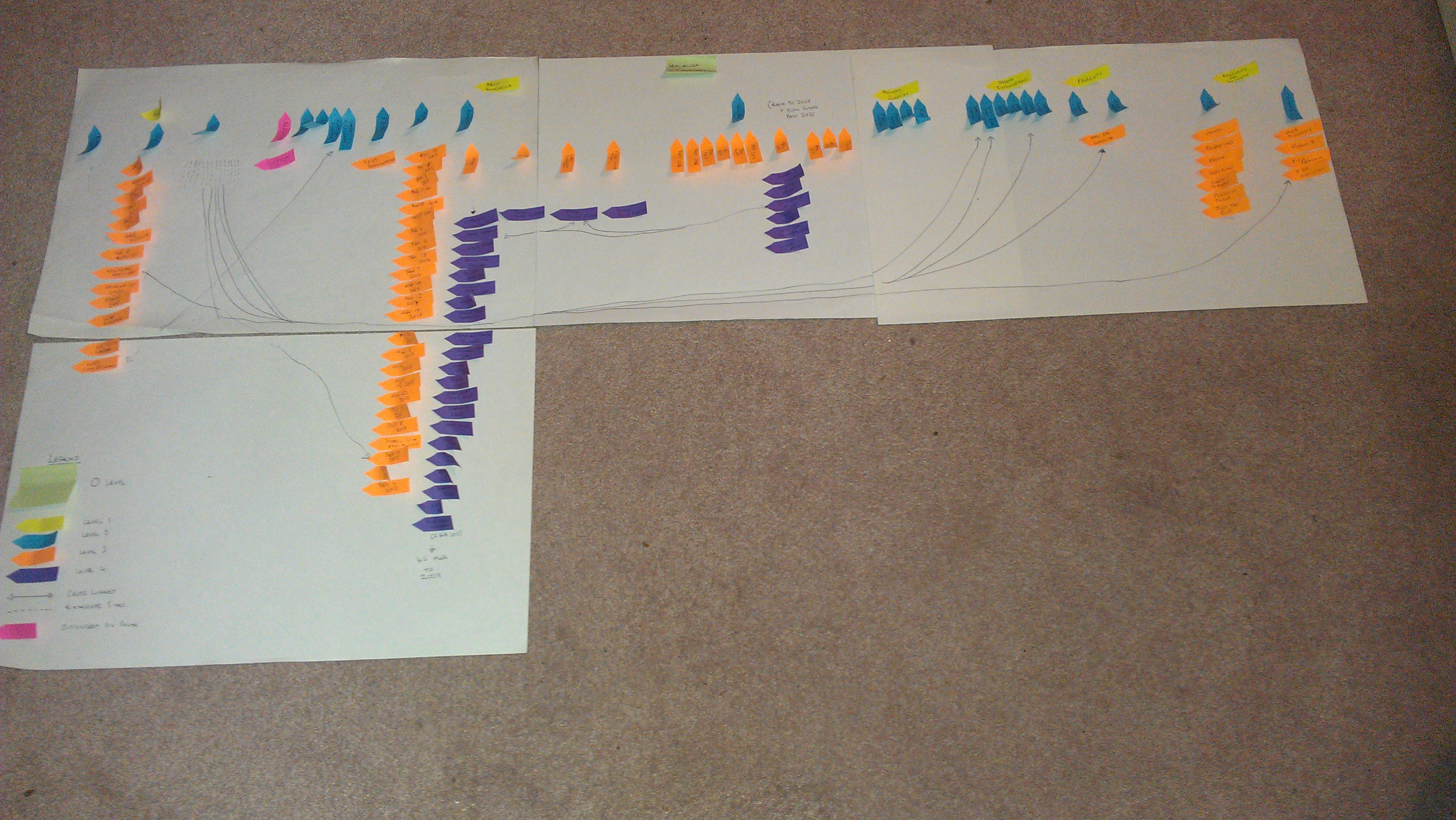
Initially I felt this this site was based on a flat hierarchy design with up to four levels with an overload of cross-linkages, not enough breadcrumbs and external links from different levels. Despite my regret at choosing a complex site I decided to continue this process would deepen my understanding of information architecture.
Level 0: Home
When I was not encumbered by “blind spots” as described by Kristi Hines (http://www.loop11.com/what-you-can-learn-from-popular-eye-tracking-studies/) I looked at the complete page as opposed to the two quick links I use in the bottom right hand corner.
Wow! Home is an informational overload.
I appreciate the clarity of the Level 1 headings in a navigational bar that is used consistently on all pages with a search option and drop down menus.
Below is a sea of cross- linkages some of which are repeated that add to the complexity of this site. Immersed in this page are three sections with information not displayed elsewhere. I felt it necessary to include Home in my Level 1 headings on my taxonomy to address this.
Despite the designers best intention to highlight lots of important information on this page it is too much and understandably discourages users to navigate to all levels of the website.
Level 1 &2:
There are 6 sections, three have drop down menus on the Home page. I am curious why they do not all have drop down menus? I am not impressed with this inconsistent information architecture. Under the 3 sections with drop down menus and on the left hand side of each of those sections there is a repeat of the drop down menu for easy navigation of Level 2 categories. Unfortunately, there are inconsistencies within both these menus this that appears as errors in design. There are blank pages with only the word title on a page that appear the site is still under construction and add unnecessary information to the hierarchy. “Less is more” has not been adhered to. Some links to external sites lead to dead ends that need to be removed.
Level 3 &4:
There are sections within these Levels that contain too much complexity. To have all 24 Newsletters not listed in chronological order was perplexing at best. I was astonished to find over 50 Level 4 entries under Announcements dating back to 2009. This is in need of serious weeding. Calendar contains information back to 2009 and is understandably full of many cross linkages. This level of historical record is too complex for the purpose of this site.
Conclusion
Overall, this site is too complex and in need of weeding, updating and simplifying to make it more user friendly. It needs to address labeling, cross linkages and repetitions in a consistent format. I did like the drop down menus in the navigational bar within each page header. Ultimately I believe this site needs to return to the planning stage. I liked the Sun Microsystems Website planning that includes paper prototypes, card sorting and usability testing to ensure a useable site was created. I think the site needs to consider the purpose and users of this site to make it easier to understand for parents.
The Full Version Reflection
I chose to use my school website for this project as I was put off navigating past the first page after I mentioned spelling errors to the school principal who felt I “had too much time on my hands” two years ago. (They have since been corrected.) Honestly, I use the home page at school to link to my school mail and district portal for reporting. I realize that the school website is an aspect of the school district portal, but I am just focusing on my school site.
I read the following articles to help me reflect on the website:
http://www.nngroup.com/articles/flat-vs-deep-hierarchy/
http://www.nngroup.com/articles/usability-testing-1995-sun-microsystems-website/
http://www.upassoc.org/upa_publications/jus/2011august/faulkner2.html
http://www.loop11.com/what-you-can-learn-from-popular-eye-tracking-studies/
Initially I felt this this site was based on a flat hierarchy design with up to four levels with cross-linkages, not enough breadcrumbs and external links from different levels. I really became overwhelmed in the process at times and posted questions to help clarify. I did begin to regret my decision and contemplated changing my choice but decided that it would be a good opportunity to understand information architecture more. This site follows the same format used across the district. I decided to stop once a link left the website for another tab to be opened as I realized I would go on to so many links. (more about that later) The more I began to study the website the more I felt it was heading in a more deeper hierarchy.
Level 0: Home
When I was not encumbered by “blind spots” as described by Kristi Hines (http://www.loop11.com/what-you-can-learn-from-popular-eye-tracking-studies/) I looked at the complete page as opposed to the two quick links I use in the bottom right hand corner.
Wow! Home is an informational overload.
It has a nice clear header and navigational bar with 6 sections across the top. Three of the sections have drop down menus for easy navigation. There is a search box in this header. This header is visible on every page. Below this, are a rotating slide show on the left side and 6 colourful tabs that cross-link to pages within the different sections. This is just the beginning of the confusion. The Community Links tab took off to a district website page. The other five stayed within this site. When I read Whitenton’s article, http://www.nngroup.com/articles/flat-vs-deep-hierarchy/
breadcrumbs (which show a link for each level of the site from the homepage to the current page) can help users orient themselves and understand the site structure.
I would agree if there were breadcrumbs for each page to help navigate at the very top. It just has Qualicum School District #69>Winchelsea Elementary School at the top. I realize that the URL addresses support the page but do not assist in navigation of the site. Then I scrolled down with some trepidation as I was beginning to realize that this site was no easy task. There are 8 blue subtitles in the same font and format that resonated with Lesson 7s description of navigational hierarchical labelling- maybe this was going to be workable. No! This was just a ruse to confuse me, as some of these were 3 only part cross linkages (News & Announcements, Calendar and Newsletters) and 3 were leading to external links (Live Eagle Cam, Quick Links & Where are we Located), another was for signing up for electronic newsletters and the last was WES Documents that took off to new information not retrievable anywhere else on the site. It was full of cross linkages- the colourful calendar at the top, blue subtitled calendar lower down and not to mention the calendar in the drop down menu under About Winchelsea Elementary School in the top navigational bar, which were all going to exactly the same place. Is it possible to drown in cross linkages??? It certainly felt that way so I quickly dashed off to ask questions to help get clarification. To stay focused I moved on to reflect on other aspects.
I am guessing that this page is attempting to highlight the more important aspects of the site but I think it is too overwhelming and repetitive with the cross linkages. I know that this Home page is in need of simplification and reorganization. It is very easy to see why nobody navigates to other parts of the site and may miss important information. I have asked parents in the past and most say they do not use the website.
Level 1 and Level 2:
There are 6 sections, three have drop down menus on the Home page. I am curious why they do not all have drop down menus? I am not impressed with this inconsistent information architecture. Under the 3 sections with drop down menus and on the left hand side of each of those sections there is a repeat of the drop down menu for easy navigation of Level 2 categories. Unfortunately, under About Winchelsea Elementary School, the Announcements and Publications & Newletters are missing from the left hand side menu and meanwhile a new category of Classrooms is added. All of which is an added confusion. With this new addition I began to question if the website was a deeper hierarchy instead of just flat. I had not added Classrooms into my sticky taxonomy, as it was not obvious when I built my sticky picture. So I decided to add a new colour of pink, as I did not know how to include it. I placed the two pink stickies in Level 2 and 3 as I think they should go there. I feel that it was a mistake not to include Classrooms in the drop down menu. Under Programs & Services the initial page has the left hand side menu and the word title but nothing else. Likewise with Education– strange to look at blank page-the three other sections under Programs & Services do contain information. Will a person continue to check out the other pages in this section after opening two blank pages? Will they think the site has an error or is under construction? This should be addressed. Under Staff Information there are Staff Links menu on the left hand side that navigate off the website. All but one lead to different aspects of the School District site and one is to a WES Teacher Weebly account of more external links to resources. The eReporting Staff Login is a dead end whereas the others require a password to go further. I chose not include them in Level 3 as the links left the site. Under Parents the initial page has the left hand side menu and the word title but nothing else. Resources for Parents had a link to an external WES PAC page and School PAC had the same link with information about PAC. I think the Resources for Parents page could be deleted to avoid the repetition and help simplify this area. Under Resources for Students were two sub sections that were not in a drop down menu. One for links to external sites with Room 8 that reaches a dead end and need to be removed (the teacher left over a year ago). The other Links for Students goes to an external site for more links to approved sites. This was designed to keep students on safe sites. Unfortunately when students are logged in at school the box saying Links for Students only appears as a red x and it is hard to explain to students to go there to access sites. It is another quirk of this site that could do with correcting.
Level 3 and Level 4:
Under WES Documents that is drowning on the Home page there are 13 Level 3 documents that do provide useful information for parents. Within Newsletters & Publications there are 24 Level 3 documents that are not listed in chronological order that upsets my understanding of hierarchy with the latest being placed at the top. Within Announcements there are 4 Level 3 links- 3 being current links that are cross-linked on the Home page and each going into Level 4 with more information. Then I hesitated as I contemplated the fourth, which has the scary title of More. When I hit it I felt myself sinking into depth and time continuum. There are over 50 Level 4 links that date back to 2009. I began to include them on my taxonomy and stopped after 21. There are cross- linkages between the Level 4 documents and lots more cross-links to the Home page. I knew I had to go to Calendar and decided to be strong by only adding March Level 4 links. As previously mentioned, there are two cross-links to it on the Home page and the drop down link under About Winchelsea Elementary School. So each month of the calendar has information as far back as 2009. I took a deep breath and scrolled forward as far as 2035 (it probably continued for 100 years…)to see the blank months that lay ahead. I returned to take stock of March 2014 with Level 4 links that cross-linked to Announcements and the Home page.
Conclusion
This site is way more complex than I had expected when I chose this site. If you are reading this far then perhaps you would agree! It is in serious need of an update, spring clean and simplification to make it more user friendly. I do not believe it is necessary to maintain information on this website from previous school years. It needs to address the labelling, cross-linkages and repetitions in a consistent format. While I see that the cross links are accurate I believe that this causes informational overload to the user. It might be helpful to have better breadcrumbs to support the cross linkages. I do like the use of drop down menus and wish they had been used consistently across the top navigational bar. I think it needs to go back to the planning stage. I liked the Sun Microsystems Website planning that includes paper prototypes, card sorting and usability testing to ensure a useable site was created. I feel that the website designers have created a complex site that is full of too much information. I think the site needs to consider the purpose and users of this site to make it easier to understand for parents. It would be nice to see an introduction to the school on the home page with more explanation on how to navigate this complex site.
Site Map
I chose to use Microsoft Word in a table format to attempt to simplify it. I used colours that matched the Taxonomy and there is a Legend underneath on page 3.