Creating a planting design involves combining many of the topics laid out in this blog. The intention behind a planting design can vary, but in general, the aim is to enhance the function, ecology and/or aesthetics of a site¹. In order to achieve these goals, understanding the desired program and the conditions of the site (see sections in Conditions for Planting), will often be the leading steps in the design process. While this section focuses on theories relating to the aesthetics qualities of the design, it is important to understand that it is just one element in the whole design process.
Design Terminology
Source ²
Line | Element linking points in space
Form | The plants three dimensional shape
Mass | Filled form of a plant, for example the density of foliage on a plant
Texture | Visual impression of smoothness or roughness on the plants surface.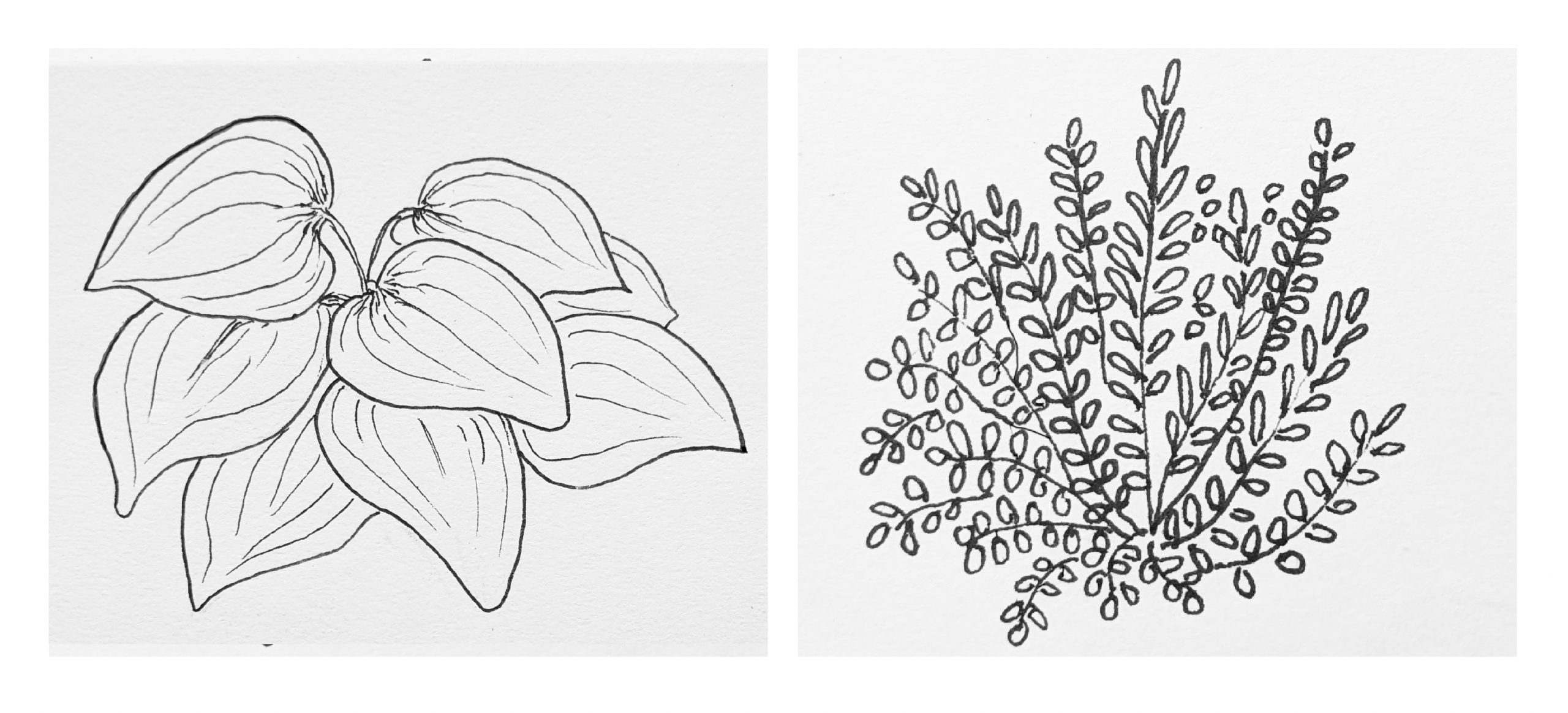
The textural appearance of a plant is seen through the leaf size, shape and surface texture.
Unity | The quality that makes the design be perceived as a whole and nothing is out of place
Complexity | Element of Visual richness
Harmony | Occurs when elements in a design mean suited together (supports unity)
Juxtaposition | Combination of plants that are different from each other
Colour Theory
Colour can have a big impact on the aesthetics of a design. Colour can stimulate and soothe, create patterns, provide a sense of knowing and support exploration in the design². As landscape architects, understanding colour also involves understanding lighting on the site as it changes throughout the day and year. For example, when yellow is contrasted with the dark shadows of the high summer sun, it can appear to be a more intense colour then it does in the spring and fall³. Understanding the basics of colour theory can help to understand the atmosphere the design creates.
Common terms used in colour theory ²:
Hue | Hue is the appearance of colour, the hue is the name of a colour, such as blue or red
Saturation | Saturation is the vibrancy/ intensity of colour
Value | Value is is the brightness of a colour (how much white or black is added)
Effect of colour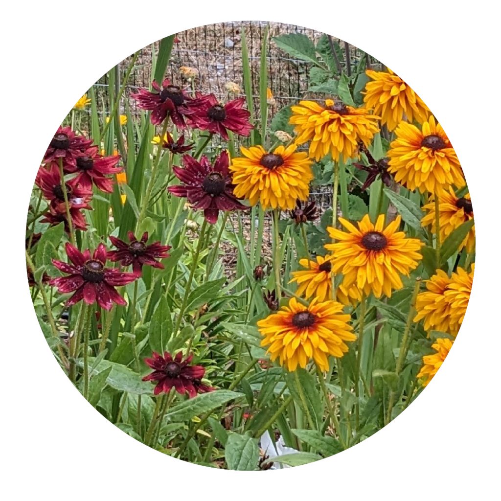

Photo by Mikhayla Roht
The colour of plants can have an emotional effect of people. In general, warm colours such as red, orange and yellow are more stimulating, where as cool colour such a blue and violet are more relaxing². These effects can change based on the saturation and value of the colour.
List source¹
Red – energetic, and dramatic
Orange – Warm and lively
Yellow – Warm, can be stimulating but gentle.
Green – neutral, soothing and balancing.
Blue – calming and serene
Indigo and Violet – can be uplifting, but cool and receding
White – takes on the quality of light
Colour Schemes
Source ²
Analogous | Analogous colour schemes use adjacent colours on the colour wheel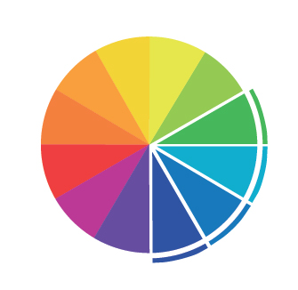
Complimentary | Complimentary colour schemes have opposite colours on the colour wheel
Split Complimentary |Split complementary colour schemes use a primary colour and intermediate colours on either side of its completement
Analogous Complimentary | Analogous complementary uses two complimentary colours and intermediate colours on either side of one of the complimentary colours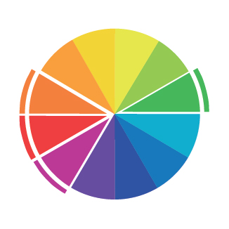
Monochromatic | Monochromatic colour schemes use only one hue. There are no true monochromatic planting design due to the pigment in foliage and flowers having having variation.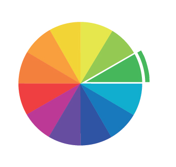
1. Robinson, N. (2016). The Planting Design Handbook (3rd ed.). Routledge. https://doi.org/10.4324/9781003074953
2. Mooney, P. (2019). Planting Design – Connecting People and Place. The restorative landscape. Routledge 1st Edition. pp.156-210.
3.Lawson, A. (2015). The gardener’s Book of colour. London: Pimpernel Press