Results
Temperature
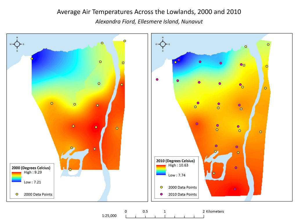
Figure 2.2 Maps showing the interpolated temperature in 2000 and 2010, respectively, with underlying data points. Note that temperature scales are different.
Comparing the average temperatures of 2000 and 2010, it is clear that a general warming trend has occurred. Average temperatures have increased over the lowland in the span of these 10 years. The areas that on average are the coolest and the warmest are generally the same, with cooler temperatures recorded nearer the water, and warmer temperatures recorded further inland throughout the lowland. Average temperature generally increases with distance from the water.
Because the 2000 map did not extend across our whole study area, we didn’t think any correlative analysis would be very informative, or trustworthy. What we would have liked to do was to compare the plant communities and temperature from 2000, to a more updated version. Unfortunately, although we have the updated 2010 temperature map, we did not have an orthophoto from 2010 that could be used to create an updated plant community map. We did have our orthophoto from 2016, however we did not have temperature data, nor could did we have reproducible data we could use to create a comparable plant community map (See ‘Image Processing’.) We did want to include this in our results, however, in order to show the changing temperature patterns, given how relevant this is to the plant communities of the area. This would be an analysis to prioritize in a future iteration of this project.
Snow Cover
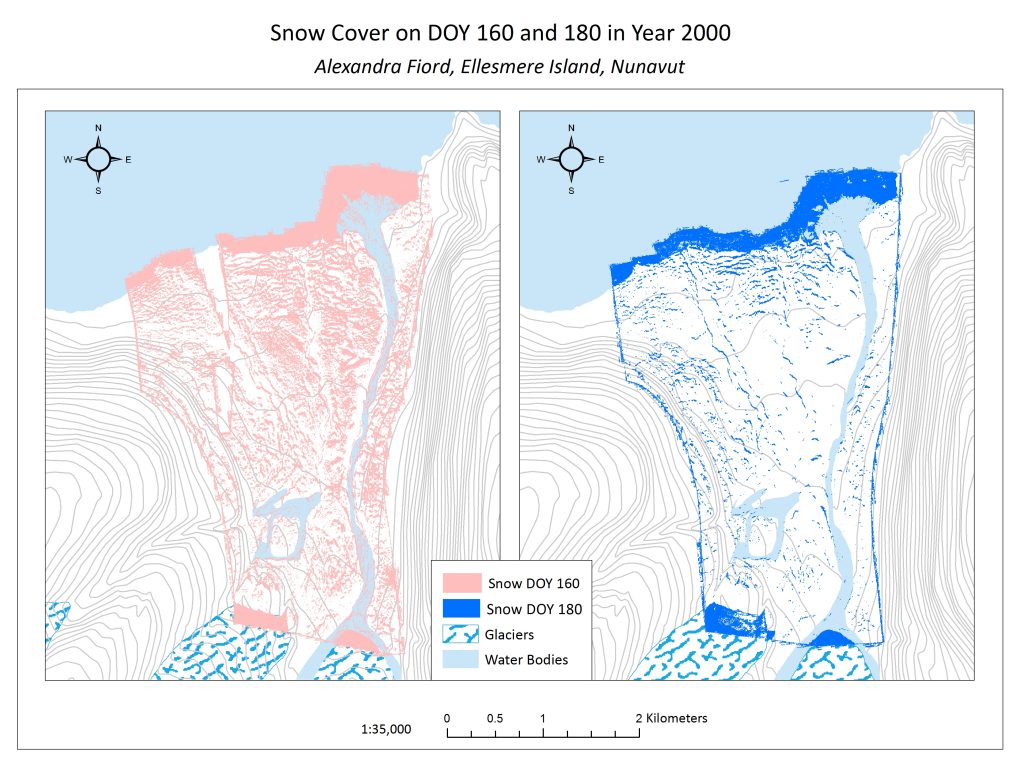
Figure 3.1 Snow Cover across the Alexandra Fiord lowland on day of year (DOY) 160 and 180.
Snow melt can happen quickly at Alexandra Fiord. In the span of 20 days between June 8th and June 28th in 2000, we see significant snow patterns. At a finer scale, however, snowmelt occurs more slowly in some areas, such as bases of ridges and rocks. This can be attributed to factors such as snow drift accumulation, and compression, and less direct insolation. In contrast, areas of more rapid snowmelt include south-facing slopes where insolation is higher. At a broad scale, in these map these two maps from 2000 (Figure 3.1), snowmelt occurred more quickly at the base of the glaciers and more slowly closer to the water. Throughout the lowland, at a finer scale, we see that snow remained on north-facing micro-topographic features, such as the north faces of boulders or large hummocks. Snowmelt is critical in terms of plant phenology as it dictates the time at which a plant will be exposed to solar insolation, and thus be thrust into a growth period. The other side of snow cover, however, is that plants receive insulative protection from low temperatures and wind as long as they are covered by snow. Seeing which plant communities correlate with areas that are released from snow first gives insight into how community types are likely to change with changing snow conditions in future climate change scenarios.
Table 3.1 Plant communities and snow cover. ‘% Snowcover’ tells us the percentage of the total plant community area that was covered in snow on DOY 160, 180 and both days.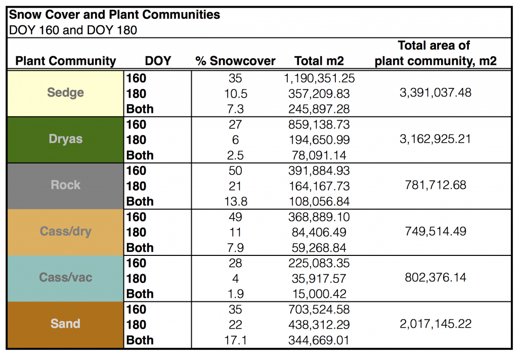
Table 3.1 summarizes our analysis of the above snow cover maps (Figure 3.1) with our plant community layers (also includes rock and sand.) Most communities increased the area that was released from snow by approximately 20%, with the exception of ‘cassdry’ which increased its snow-free area by almost double that, 38%.
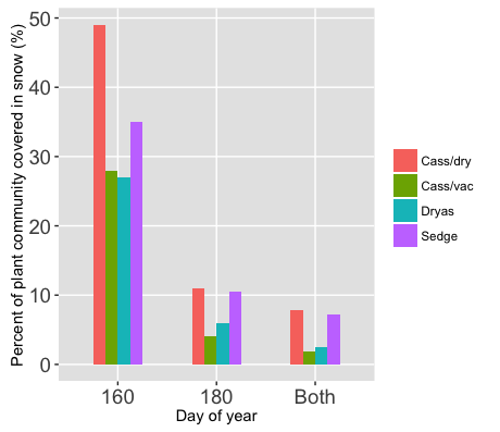
Figure 3.2 Percent (%) of plant communities (excluding rock and sand) that is covered by snow on DOY 160, 180 and both days.
Figure 3.2 shows us the proportion of each of the plant communities under snow cover from DOY 160 to DOY 180 (and both). We can see that there is a fair amount of variation in the proportion of snow cover between plant communities, and also that proportions stay relatively constant between the community types from DOY 160 to 180. This pattern in conjunction with the consistency of the pattern between the two dates, suggests that there is a difference between the community types and their correlation to snow cover. Our analysis cannot speak to what the cause of this correlation is, but we can perhaps inform the development of hypotheses to be tested in future. For example, we can speculate about the relative hardiness of the plant community types, with the hypothesis that the cassiope-dryas community is hardier, and therefore can persist in areas where there is less solar insolation and thus higher snow cover.
Solar Insolation
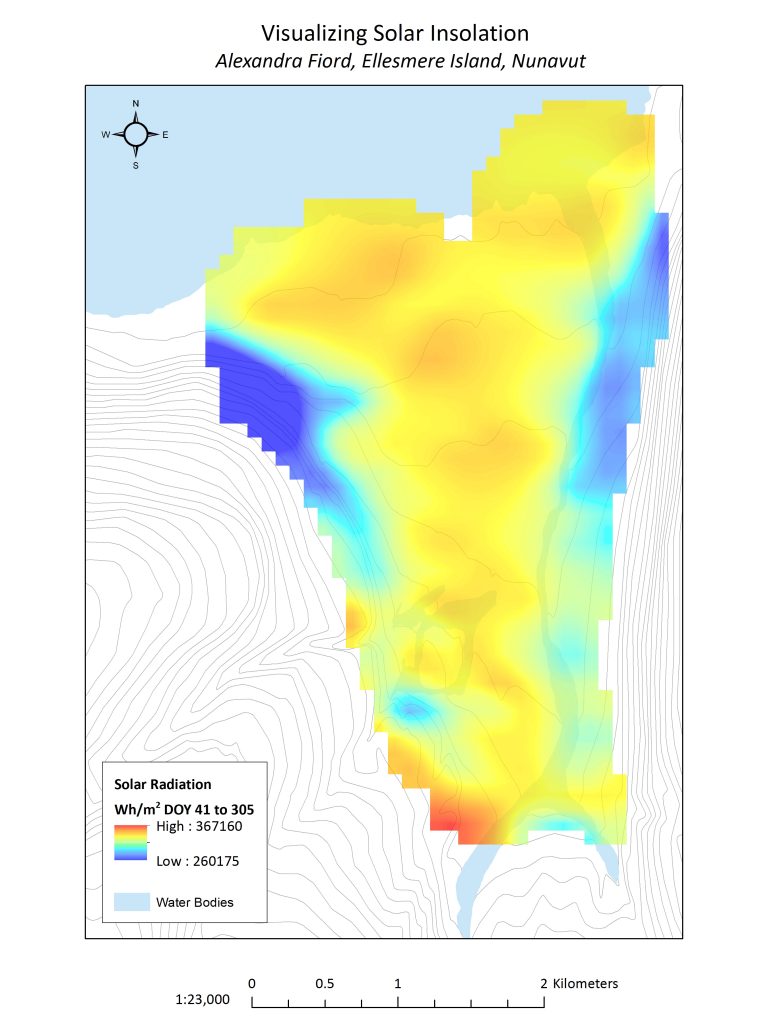
Figure 3.3. Solar insolation at Alexandra Fiord averaged during the typical total insolation period (February 10th – November 1st)
The high Arctic is characterized by continuous sunlight in the summers and darkness in the winters. The absence of sunlight in the winters, which at the latitude of Alexandra Fiord begin in the first days of November and end in the beginning of February, severely limit the growing season of Arctic plants. Along the lowland, different locations receive different levels of solar radiation that are dependent on factors such as aspect and slope. Additionally, some areas will receive larger quantities of solar energy by reflecting less incoming solar radiation due to factors such as vegetation height and ground colour.
Figure 3.4 shows how solar insolation varies among communities. There seems to be a clear indication, based off the map alone, that there is a trend the degree solar insolation and where plant communities are found. When considering the amount of solar insolation independently from the scale of each plant community; rock types receive the largest levels of solar insolation, followed by sedge.
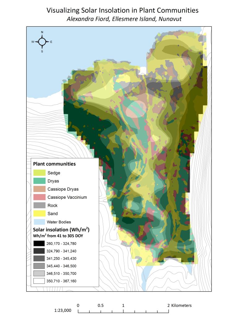
Figure 3.4 Solar insolation overlaid on top of plant communities at Alexandra Fiord.
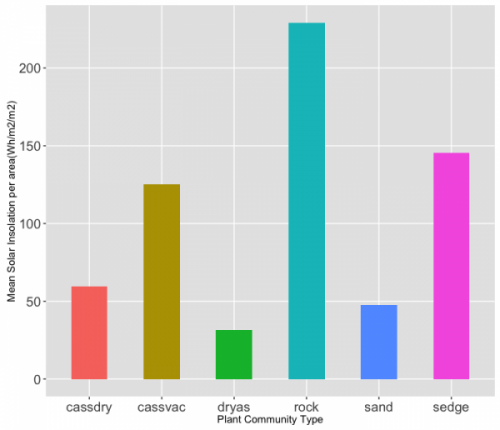
Figure 3.5 Mean solar insolation by community type, normalized by area.
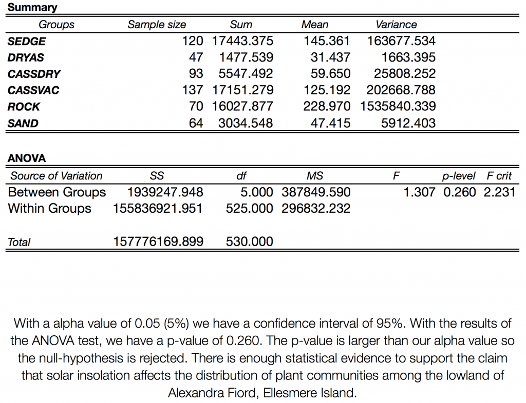
By calculating the mean solar insolation per plant community (Figure 3.5), we were able to test the hypothesis that plant communities are determined by solar insolation with an analysis of variance (ANOVA) of the means for each community (Table 3.2). With a confidence interval set at 95%, we found that the ANOVA resulted in a p-value of 0.260. With this p-value, we can 95% confident that there is enough statistical evidence to support the claim that solar insolation affects the distribution of plant communities.Drawing from the results, it is suggested that those communities that have the highest rates of solar insolation per given area are ‘rock’, followed by ‘sedge’ and ‘cassiope-vaccinium’. Again, though this doesn’t address the causation of plant communities and solar insolation, this can give us insight into hypothesis testing. For example, in Figure 3.4, we can see that Dryas seems to aggregate in areas of lower solar insolation. This can also perhaps be attributed to the hardiness of this community or this can investigated through the lens of ecological theory, hypothesizing that the cause is a result of differential life history strategies. Additionally, we could speculate that ground colour, vegetation height, and snow-free days would contribute to the patterns we see in Figure 3.4. Future testing would benefit from the inclusion of elevation and aspect, as well, as we had hoped to do and of course, our other abiotic parameters already discussed.
Table 3.2 ANOVA test of mean solar insolation by community type, per area unit (Wh/m2/m2)
