On Stranger Tides

Pirates of the Caribbean 4 Official Trailer 1

Pirates of the Caribbean 4 Official Trailer 2

The newest Pirates of the Caribbean movie is set to release on May 20, 2011, and it is sure to attract numerous fans, despite the mixed expectations.  While the film has a greater focus on Johnny Depp’s character this time, the newly cast actors do not disappoint.  Among those joining the swashbuckling adventure are Ian McShane portraying the infamous pirate Blackbeard and Penélope Cruz playing Blackbeard’s daughter.

There is no doubt that Disney’s marketing magic will attract numerous fans to theatres.  As a big fan of Johnny Depp and the Pirates of the Caribbean movies, I will definitely be seeing it!

Disney has a way of attracting and retaining loyal customers through its effective CRM.  Loyal Disney customers seek not only the end product, but the experience that comes with it.  Disney rarely fails to exceed expectations when it comes to entertainment, and this is likely to be the reason that customers will see Pirates of the Caribbean: On Stranger Tides, no matter what they hear from others.  If we look at earlier “Pirates” films, we see that The Curse of the Black Pearl earned about $46 million in its opening weekend, while Dead Man’s Chest and At World’s End earned approximately $135 million and $114 million respectively.  Despite declining expectations for the third film, At World’s End, it was extremely successful.  The excitement and action that the “Pirates” films bring, along with the charm of Johnny Depp, are sure to be adequate for a successful opening weekend.

Check out official trailers 1 and 2 above!

Starbucks’ New Sleeve Hides the New Logo and Possibly the Company’s Identity

Ever since Starbucks’ customers started receiving cups with the new logo and the new sleeve, I’ve seen many people carry around the “green and white” coffee cups.  The launch of their new logo seems to signal a shift towards a brand image that is more luxurious, as is the case with most logos without any form of writing. 

With this purpose in mind, I do not understand why Starbucks has chosen to proceed with the current sleeve design.  As seen in the images above, the new sleeve is coloured bright green, with the logo faintly drawn in the background.  From a distance, it is not obvious that a person is carrying a Starbucks cup of coffee anymore.  The product does not look very prestigious – it does not remind me of Starbucks.  Moreover, the sleeve’s design completely hides the new logo on the cup, which defeats the purpose of having the new logo.  The new logo is rarely seen on cups when everyone has a sleeve covering it up.  The desired portrayal of Starbucks’ brand image (luxury, lavishness) does not seem in line with the new product packaging. 

Some people may argue that Starbucks is trying to portray a different side of the company’s mission, environmental stewardship, by embedding this “green” symbol in the minds of consumers.  This objective is hardly carried out when the new sleeve requires so much green ink to print.  The older sleeves actually passed as being made of recycled material, with their rugged and unrefined look.  It may have been better to have the new logo on the old brown-coloured sleeves.  Overall, if Starbucks’ goal is to appear more luxurious while maintaining its aura of environmental responsibility, then the current packaging is not likely to make this happen. 

Photo credits:

Starbucks New Sleeve (1st Image)

http://entertaintheplan.blogspot.com/

Starbucks New Sleeve (2nd Image)

http://magicottage.blogspot.com/

Newspaper Advertising Becoming Obsolete?

I came across an article that claims that newspaper advertising in the United States has hit a 25-year low as more and more advertising has shifted to the Internet.  Back in 1985, about $25 billion were spent on newspaper ads, which would equal approximately $49 million today.  Last year, only $26 million were spent on such advertisements.  The article states that newspaper advertising totalled $7.3 billion in the last three months of 2010, down 4.7% from the previous year (Newspaper Association of America). 

Print advertisements have been a large source of income for newspaper publishers, and the decline in newspaper ad sales presents a growing concern.  As more consumers are becoming immersed in electronics, it may be in the best interests of publishers to discontinue printing, and move towards online newspaper subscriptions, where more companies would be willing to place their ads.  Society is becoming more technological every day, especially with the growing number of applications available on smartphones, allowing individuals to control so much of their lives through a small electronic device. 

Overall, with today’s technology-savvy society, consumers are likely to be more responsive and reachable through online promotions than print advertisements.  Many people are staying away from paper these days: laptops for note-taking, e-book readers, news articles on smartphones and electronic billing.  While this trend presents many benefits to the environment, they may not outweigh the costs of a society conquered by technology, which we all know, is never perfect. 

Photo Credits:

Print Newspaper

http://hosquashclub.com/ESW/Images/newspaper.jpg

Online Newspaper

http://farm2.static.flickr.com/1249/876620545_0fc3b7c761.jpg

iPad 2 – Apple Stirs Excitement Despite Lack of Many New Features

I recently came across an article in the Financial Post that claims that Apple may be “losing its touch” when it comes to advancements in its products.  It discusses the new iPad 2, and mentions its new features: 

  • front- and rear-facing cameras
  • black or white models available
  • faster processor (dual-core A5 chip)
  • thinner design
  • smart cover in various colours 

The article critiques Apple’s ability to offer much more than the iPhone 4 or iPod Touch 4G in the new iPad 2.  One of the more prominent new features of the iPad 2, namely the front- and rear-facing cameras for the FaceTime application, can already be found on the iPhone 4 and iPod Touch 4G.  Besides this, there is not much to get excited about.  

The interesting thing is that Apple continues to enjoy customer advocacy, even with relatively small offerings.  Even when Apple introduced the first iPad, consumers went into a frenzy, trying to get their hands on the iPad on the release date.  If we think about it, the iPad is really no more than a larger iPod Touch or iPhone.  The features are virtually the same – the only “new offering” is the bigger screen size.  However, Apple has embedded their name in the minds of consumers in such a way that any new product they release is sure to draw their interest, whether or not they decide to purchase it in the end.  The ability to get their customers as excited and passionate about their products as they are, no matter what the product features, is truly a sustainable competitive advantage. 

Photo Credits:

iPad

http://www.aingaran.com/ipad-coming-to-canada-in-late-april?nomobile

iPad 2 with Smart Cover

http://www.shoppingblog.com/blog/3031125

Seiko Watches – Taking Accuracy to the Next Level

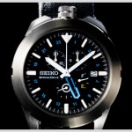
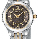
Seiko is my favourite brand of wristwatches.  Each timepiece is finely crafted, high quality, and as some may call them, an affordable luxury.  Seiko launched the world’s first quartz watch, called the Seiko Quartz Astron in 1969, and since then, it has revolutionized the way watches are made.  In December 2008, Richard Garriott, a video game developer, wore Seiko’s Spring Drive Spacewalk wristwatch as he was launched into space.  The watch was designed to withstand the extreme temperature and pressure changes during this journey, and it performed flawlessly, keeping time accurately and “requiring no winding or adjustment” (Seiko Watch Corporation).  

Now, as Seiko prepares to unveil its 2011 collection at the Baselworld international trade show, one can only imagine the extent to which Seiko will go to produce yet another collection of highly accurate watches.  Seiko’s latest Spring Drive collection is the one that truly conveys the company’s value of accuracy.  Through the years, Seiko has successfully positioned itself as a company that strives for perfection, and this is reflected in its products.  The Spring Drive collection is extraordinary in that it has provided the accuracy of the quartz watch while using many elements of a mechanical design.  

Many individuals think of brands such as Rolex or Omega when they think of luxury watches, but many of their timepieces are known to be less accurate and of lesser quality than those of their competitors.  Seiko has marketed itself as a brand that believes in quality and style, which to me is far more valuable than a pricey watch studded with diamonds.  Seiko’s competitive advantage seems far more sustainable than that of its Swiss competitors, which has led to its resilience during the recent economic downturn (PRLog). 

Photo Credits:

Seiko Quartz Astron

http://www.watchsites.net/watches/seiko-quartz-astron-vintage-specs-pictures/

Seiko Ladies’ Watch

http://www.watches-trusty-times.com/faces/seiko-le-grand-sport-two-tone-steel-bronze-ladies-watch-sxda02.jpg

Seiko in James Bond

http://www.coolthings.com/seiko-g757-sports-100-james-bond-watch/

Seiko Spring Drive Spacewalk

http://www.seikospringdrive.com/spacewalk/watchinfo/index.html

Nutella – Nutritious or Not?

http://www.theglobeandmail.com/report-on-business/industry-news/marketing/nutella-faces-lawsuit-over-healthy-claims/article1893240/

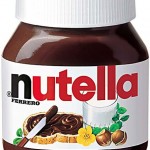
Nutella is widely advertised as a component of a nutritious breakfast, providing much-needed energy to “fuel the day”, as Ferrero puts it.  The company has created an image of health and nutrition towards their product.  TV commercials for Nutella emphasize that each 400g jar contains “56 hazelnuts, a cup of skim milk and a hint of cocoa”.  

Ingredients: sugar, modified palm oil, hazelnuts, cocoa, skim milk powder, whey powder, soy lecithin, vanillin. 

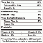
Looking at the nutrition facts, it is evident that Nutella might not be a very healthy choice for breakfast every day: each serving provides 18% of the daily value of saturated fat and 17% of the daily value of total fat.  The ingredient list provided on Nutella’s website has sugar at the top, implying that there is likely more sugar in the product (by weight) than anything else.  Those percentages are high considering that the spread would likely make up a small portion of a person’s total food intake in a day.  

After hearing about a class-action lawsuit in the United States against the product, I wondered whether these people actually took the time to read the nutrition labels, or if they simply accepted what they heard on TV.  The information in the TV commercials gives us part of the story when it comes to the ingredients; however, as consumers trying to make healthy choices, it would be in our best interests to do our own research in order to gain a better understanding of the facts.  When it comes to a healthy diet, it is crucial to understand the pros and cons of all the food products we consume.  It is not adequate to simply accept what we see on TV.  Some products may provide huge benefits to certain groups of people, while having negative effects on others.  In the case of Nutella, the nutritional value of hazelnuts is there, but the flavor is only enhanced through higher sugar content – there is a tradeoff between nutrition and taste.  In the end, it is up to consumers to decide what is more important to them. 

Photo Credits:

Nutella Nutrition Information

 http://www.nutellausa.com/nutrition-facts.htm

Nutella

http://www.abc.net.au/news/photos/2007/12/04/2109440.htm

Marketing – Disney Style!! – Linking to “Walt Disney’s marketing tips” by Drew McLellan


Drew McLellan: http://www.drewsmarketingminute.com/

McLellan discusses something that Walt Disney never forgot to do when it came to marketing, and that is “wooing and winning someone’s heart”.  I have experienced this personally during my trips to Disneyland, and I can definitely say that this is a very powerful tool.  

The moment one steps through the gates to Disneyland, there is a magical, welcoming ambience, which is created not only by the vibrant, colourful appearance of the park, but more importantly, by the behaviour of the “cast members”, as the park employees are called.  A visitor is referred to as a “guest”, and he or she is treated no less than a guest in their kingdom.  All cast members are extremely friendly and helpful; every one of them is trained to provide the highest quality customer service. 

Walt Disney paid great attention to detail, and his values have been kept alive to this day.  Every aspect of the park is paid great attention: streets are kept squeaky clean, landscaping is maintained to the finest details, and certain fixtures are repainted nightly in order to keep everything looking absolutely perfect.  Even outside the gates, McLellan discusses that the street signs are purple in colour, and the arrows are surrounded by Mickey Mouse ears.  Before guests even enter Disney parks, they know that something truly special awaits them.  When guests are surrounded by such a work of art, it is extremely hard not to fall in love with the place. 

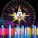
Over the years, Disney parks have evolved from the family-friendly experience to something much, much more.  The size of their target market has increased with time.  The parks now offer an adventure for people of all ages, with new bigger attractions and captivating shows.  World of Color, a brilliant display of colourful fountains, lasers, fog, and fire, was launched in June 2010.  This was an enormous success with people of all ages, and remains one of the best night-time displays at Disneyland. 

Disneyland has truly won my heart, and I always dream of going back there again and again. 

Photo Credits:

World of Color & Mickey’s Fun Wheel

http://en.wikipedia.org/wiki/World_of_Color 

Disneyland Park

http://www.family-vacation-getaways-at-los-angeles-theme-parks.com/Main-Street-at-Disneyland-California.html 

Main Street, U.S.A.

http://www.hkdlsource.com/park/mainstreet/ 

Mark Twain

http://en.wikipedia.org/wiki/File:MarkTwainRiverboat50th.jpg

Columbia

http://www.flickr.com/photos/23720661@N08/3417138946

Logo Remodelling – Linking to “Logo Changes – Target, YMCA, Starbucks and Children’s Miracle Network”, by Lucas Palovic

Lucas Palovic: https://blogs.ubc.ca/ubcsauder/

Lucas Palovic pointed out that not only Starbucks, but Target had recently modified its logo as well, eliminating the word “target”, and placing red cross-hairs over the single ring and dot.  This made me wonder, are they removing the wording to showcase their popularity and strong brand image, or is it just another way to attract those who do not already know what their logo is about, and to utilize people’s curiosity to attract them to the company and its stores?  

Many successful brands have been able to use no more than a symbol to convey their identity, such as Apple’s apple logo, Lululemon’s horseshoe-like symbol, as well as various car companies such as Maserati, Mercedes-Benz, and Audi.  These companies are well-known, and most consumers see them as high-end.  

The absence of writing in a logo may portray luxury, or specialty goods.  This may be the reasoning behind Starbucks’ and Target’s logo changes.  The change could steer their brand image towards a higher level, with a greater feeling of lavishness.  Those consumers who are familiar with the brands might feel a rise in status.  On the other hand, those who see a prominent display of a new symbol with no writing would want to find out what all the hype is about.  I am not sure if this is the case with most people, but if I see a logo worn by many people, or on many shopping bags being carried around, I would want to know what people are so intrigued by.  

It is a smart move to take an old logo, and give it some freshness using only slight modifications to help it get noticed – not to the extent that those loyal to the brand feel a loss in connection.  Companies should take care not to change their logos to the point that people cannot identify with it anymore.

Photo Credits:

Target New Logo

http://weeklyworldnews.com/headlines/27303/new-target-logo/

 Target Old Logo

http://www.tubapants.com/2008/04/06/security-guard-fired-for-securing/

Starbucks New Logo

http://seerpress.com/starbucks-reveals-new-logo/21008/

Starbucks Old Logo

http://themarketinghub.ca/blog/starbucks-loyalty-marketing-surprises-in-store/

The Post-Christmas Retail Slump – Linking to “January: No Longer a Retailer’s Nightmare?” by Natalie Shojania

Natalie Shojania: https://blogs.ubc.ca/natalies/

Retailers are resorting to larger price reductions to attract customers at this slower time of year, in order to empty out their winter inventories, but they have not seen a proportionate rise in customers.  

Are consumers passing the shopping mall out of concern for their wallets, or is it that they are unaware of these great deals?  It seems that the promotional efforts are there, but January is the time when people are slowly realizing that they have engaged in perhaps excessive spending over the holidays.  Especially with New Year’s resolutions such as “to save more money”, consumers are holding back on spending for some time, before they lose the novelty of their success and dive into regular shopping trips.  

On the other hand, some shoppers might be oblivious to the fact that savings can be much higher after boxing week, because these people simply steer clear of malls altogether at this time of year.  Store windows are a source of several advertisements for potential savings, but they are not noticed because of the decline in people visiting malls after the holidays.  School reopens, and parents go back to work.  Many consumers go back to their busy lifestyles, leaving less time for them to visit malls for leisure.  

Overall, retailers will benefit from promotional methods besides those in stores.  Fliers and TV commercials are a great way to reach homebodies, who may be tempted to go shopping after glancing at some colourful advertisements.  For commuters, posters on Skytrain platforms, and advertisements in buses can also be quite eye-catching, especially when overcome by the boredom of long commutes.  Once consumers are pulled into stores, there is a better chance that they can be convinced to spend.

Consumer Behaviour Analysis in the Presence of Self-Monitoring

            The study of consumer behaviour involves searching for consistencies and patterns in the actions of consumers to aid in understanding their decision-making process.  Part of this is accomplished through assigning characteristics to different groups of consumers.  However, there are many times when one’s buying behaviour changes with the context, ultimately making it difficult to make generalizations.  Therefore, there is always room for bias, especially where the idea of self-monitoring comes in.  

            Many individuals behave in a different manner around family, friends, co-workers, and the general public.  Some do this subconsciously, but others do it in an effort to keep certain parts of their personality “hidden” from others.  In an environment where a person’s behaviour in one setting is not consistent with that in another setting, it becomes difficult for market researchers to decode what a person’s actions truly indicate.  For instance, a woman might be inclined to buy a certain brand of shoes when out shopping with her friends, to keep up with their “standards” and tastes.  When shopping alone, however, the same woman might choose to spend her money on some other brand that she likes, even though her friends might not consider it stylish.  It is a challenge for external sources to determine what her tastes truly are.  

            Overall, if a researcher is trying to document consistencies in consumer behaviour, this attempt is clearly distorted in cases where people are high self-monitors.  High self-monitors are especially difficult to analyze, because of their variability between different contexts.  If consumers are able to pass off any behaviour as “normal”, the research methods end up having to be more sophisticated in order to reduce the level of bias.