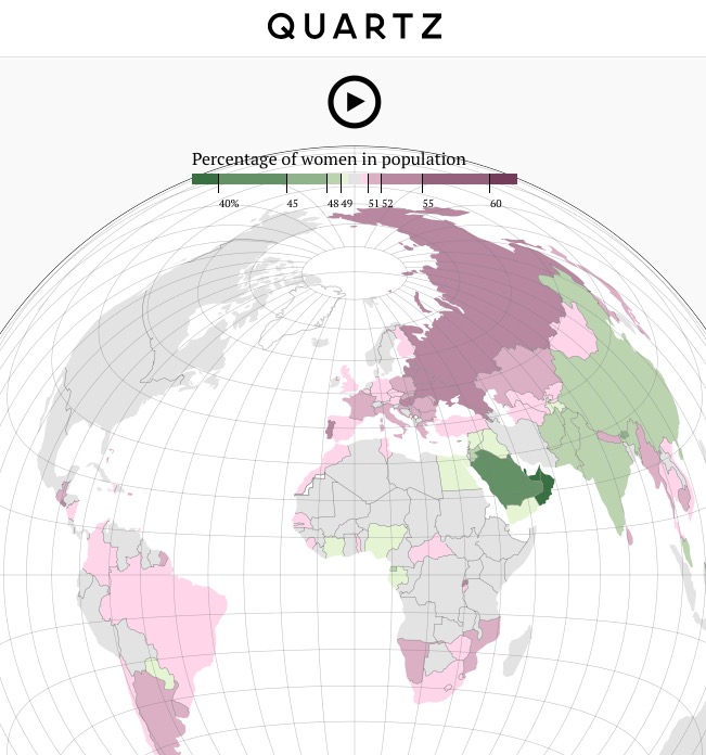
The map I have decided to deconstruct is “A story of drinkers, genocide and unborn girls,” an interactive map/infographic published on Quartz highlighting the sex imbalance in different countries. This map was published online in 2016, and attempts to show the various proportions of sexes across nations with historical reasons why some nations were highly imbalanced while others were not.
Decisions had to be made about the classification of the data, and what range was considered ‘gender parity.’ A range of 0.5% was decided on as parity, with ranges of pink representing countries with more women, and green representing countries with more men. The way that the data was classified is not clear, but the colour grade is clear. Because small deviance from gender parity is quite serious in terms of social stability, the classification choice is effective in showing the range of values. No clear bias is shown in the representation of the data. According to Harley (1989), the way information is selected and classified is a demonstration of power, and the way that it is represented is a reproduction of power. The manipulation of data as represented in this map is not too significant.
The decision to use the Lambert azimuthal equal-area projection is interesting as it severely distorts the angles of the map with no clear reason, putting New Zealand in the bottom with its shape severely distorted. An audience that is not too familiar with different map projections may find Australia’s position and shape unfamiliar as well. Further, the quality of the data is questionable. For example, many nations in the past did not have a strong capacity to conduct censuses, and other nations (such as the Soviet Union) have have major territorial and boundary changes. Because the World Bank is a well respected organization, the data seems trustworthy, but it may not necessarily be. The World Bank cites the United Nations as the source for their population estimates, using interpolation to determine values between the five-year intervals the United Nations gives. Both the World Bank and the United Nations, while respected global institutions, are a reflection of international structures of power that are normalized. Given the availability of data on a global scale, this seems to be the only way I can think of to show the different sex ratios globally.
There are specific choices that have been made in the representation of the map that have political ramifications. The exclusion of Kosovo from Serbia, the inclusion of Western Sahara in Morocco, the omission of Taiwan, and the boundaries drawn in disputed territories (such as the Kashmir region) are examples of representation that have ideological implications. These boundaries and labels put on the map are established due to power structures and established political regimes. Nations do not simply ‘exist’ – they must be internationally recognized to a certain extent. The choice to show Kosovo but not, for example, Taiwan or Abkhazia certainly shows (even implicitly) a ideological underpinning. As Harley (1989) notes, the idea that Western maps are value-free is one that is not true. Because borders and boundaries are not a ‘natural’ thing, the differences in gender ratios within nations are obscured. The article cites various events that have caused gender imbalances within nations, but smaller-scale imbalances within nations that can be caused by political, social, and economic inequalities are obscured.
Because of the various limitations with the representation of data, there are few suggestions I can think of to improve the map. I would use a more recognizable projection to make it more accessible to a general population. On top of that, I would make it clearer why certain areas were included and omitted, because the data given was unclear. For example, the data on Serbia did not make it clear if Kosovan data was included or not. There was also a mistake in the representation of the Koreas – with South Korea being labeled as “North Korea” and North Korea being labeled as “Korea.” Overall, this map was well produced with few explicit biases.
Map URL
Works Cited
Harley, 1989 “Deconstructing the Map,” Cartographica, 6/1: 1-20