Simple overlay of layers
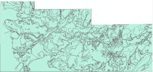
The first step in this process was to obtain the surficial geology polygon from the GSC depicted Figure 1. Next we clipped the city boundary to our geology polygon in order to focus on our area of study as demonstrated in Figure 2. Through the symbology option we were able to divide the categories into the three main groups of rocks found in the Lower Mainland. Through the usage of dark/light green we were able to highlight the stable (ie: safe) areas and pink/red unstable (ie: dangerous) areas, this is shown in Figure 3.


After creating our three preliminary maps, we added the safety hubs as point features. In order to make sure we included all of the safety hubs we checked the ones listed on the City of Vancouver website and then proceeded to manually add the ones that were missing. We then manually selected safety hubs which were lying directly on the unsafe areas as well as the ones in the near proximity of said area as depicted in Figure 4. The safety hubs in potential danger are represented as blue asterisks while the safety hubs in immediate danger are depicted as yellow asterisks, the road network was included for reference. By analyzing the maps created, we are able to verify that there are in fact safety hubs that lie within and near zones of danger. After this initial study we can confidently ascertain that there are at some safety hubs that need to be relocated in order to ensure the safety of the community.
GeologyMap_hubsdanger – (For a detailed, high definition image of Figure 4, please click on this hyperlink)
Population Density
In order to take into consideration the population density we obtained the Dissemination Area (DA) and Census Tract (CT) data from Statistics Canada. By dissecting this data were able to look at how exactly the population is distributed in the city. Additionally, this allowed us to better understand which neighbourhoods need new safety hubs as well as to where we should suggest the relocation of already existing ones. Figure 5 depicts the city of Vancouver arranged by DA’s while Figure 6 divides them by CT’s. Under the option ‘Symbology’ we chose ‘Quantities’ and opted to show the “Population Values”, without normalization,
CTpoprep DApoprep – (For a detailed, high definition image of Figure 5 & 6, please click on this hyperlink)


we did this in order to show the truest numbers available to us. We then chose a graduated colour scheme so that we could show the distribution of the population. In the case of the DA map Figure 5, we decided to use “Natural Breaks” because it appears to give a more realistic representation of the DA values. Additionally, DA’s are smaller in terms of area and population numbers when compared to CT’s, this explains why “Equal Breaks” have several empty classes. On the other hand, we were able to use “Equal Breaks” for our CT map due to the fact that they’re larger in area and population numbers. This way, we were able to break these numbers into five equal classes as seen in Figure 6. Both of these figures also include schools as point features due to their proximity to already established safety hubs and more importantly for their seismically sound infrastructure, we feel that these facilities should be proposed as new safety hubs. By studying the population distribution of the city of Vancouver through both CT and DA data we can further verify that one hub per neighbourhood may not be enough to provide support for everyone in need if a large scale magnitude earthquake were to occur.
Network Analysis
Map 1
The next step we took was to create a network analysis in order to produce our first map.
- In ArcCatalog, we first created a new feature dataset, then created a new network dataset, where we included the DMTI roads (this road data is the best to be using for network analysis). We then built the network we planned to use for this part of the project.
- In ArcMap, we opened the Network Analysis wizard in the Table of Contents, added the CT data polygon and converted it into a point feature, more specifically centroids for the analysis. A spatial join between the polygon and the centroid point features was made so that population values could be used in later analysis.
- We then loaded the community centres layer (existing safety hubs). The network analysis gives us the junctions of the roads and the road edges layers, which we then excluded from our analysis because we just needed the road network.
- Next, we opened the network analyst to the network analyst wizard toolbox and selected “Location-Allocation” tool.
- Input ‘Safety Hubs’ into ‘Facilities’
- Input ‘CT Join’ into ‘Demand Points’
- In “Location-Allocation Properties” → advanced settings
- Problem type: Maximize Attendance
- Facilities to choose: 27
- Impedance cutoff: 6500 (this was value was calculated by taking the lowest value of the ‘green’ CT legend values to the highest value of the ‘brown’ CT legend values to get a reasonable number. The city of Vancouver does not specify how many people each existing hub is supposed to be able to support in the event of a disaster).
- Produce map as shown in the results.
We then set forth to creating our second map. This part of the analysis considers the worst-case scenario, where the 7 hubs in dangerous areas are identified and removed from the analysis.
Map 2
- Remove the disaster hubs that are in danger (these were outlined in Figure 1 showing the geology and the safety hubs of the city).
- Hubs in Danger (in yellow) include: False Creek, Killarney, Roundhouse, Trout Lake and Creekside.
- Hubs in potential danger (in blue) include: Hastings and West Point Grey.
- These 7 hubs were removed by editing these features and deleting them from the data table, therefore excluding them from our analysis.
- Then, we reopened the “Location-Allocation Properties” window, keeping our inputs the same, but changing the advanced settings to the following values:
- Input ‘Safety Hubs’ into ‘Facilities’
- Input ‘CT Join’ into ‘Demand Points’
- In “Location-Allocation Properties” → advanced settings
- Problem type: Maximize Attendance
- Facilities to choose: 20
- Impedance cutoff: 6500.
- Re-run Network Analysis with the new 20 hubs instead of the original 27
- Produce map.
Our final step was to create our third map in which we looked at schools as potential new locations because of the Seismic Upgrade Program they went through.
Map 3
- A buffer of 750m was created around the Disaster Hubs to see which schools are closest to the already-existing hub.
- We initially thought about considering the area of the school, attempting to find the biggest ones in terms of area to suggest those as hubs, but unfortunately our schools layer did not have this information, which explains why we considered the idea of having a buffer set up.
- Buffers (750 m) to the left, schools in the entire city to the right.
- We intersected the Schools with the buffers to determine which schools lie within those 750 m in the proximity of the Disaster Hubs.
- This way we were able to select our potential locations for new hubs (once again, assuming that the current ones may not be enough to support the entire population of the neighborhoods and to compensate for the ones in close to/in danger areas).
- We then added this layer onto the map where we set up the Network dataset.
- We then ran a repeat Network Analysis for the Disaster Hubs and Schools (which are our new potential locations) with respect to the population in the centroids.
- “Location-Allocation Properties” window, keeping our inputs the same, but changing the advanced settings to the following values:
- Input ‘Safety Hubs’ into ‘Facilities’
- Input ‘CT Join’ into ‘Demand Points’
- In “Location-Allocation Properties” → advanced settings
- Problem type: Maximize Attendance
- Facilities to choose: 73 (because of addition of 53 schools within the buffers).
- Impedance cutoff: 6500.
- “Location-Allocation Properties” window, keeping our inputs the same, but changing the advanced settings to the following values:
- Produce map


