Linking Assignment – Task 9
Task 9: Network Assignment Using Golden Record Curation Quiz Data
Classmate: Navid Panah
Link: https://blogs.ubc.ca/metprogramnp/2025/03/12/task-9-network-assignment/
I chose Navid’s Task 9 Post for this linking assignment because we had slightly different interpretations of the data. This resulted in my reflection on data interpretation and how easily data and graphical representations of data can be misinterpreted.
One of Palladio’s strengths is the visual representation of connections through lines connecting to nodes and the sizing of the nodes based on their number of connections. Navid makes a direct reference to the size of the participant nodes in his Task 9 post:
“I at first thought they would all be the same size for every participant as we each chose ten curated songs, but then I saw smaller nodes from participants which inferred the songs they selected were less popular and Palladio seems to generate data from secondary nodes as well not only primary connections.”
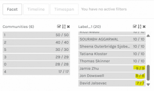
I can see how that conclusion was reached; however, when you look closely at the actual data, you can see that three of the respondents selected less than ten tracks, which I believe caused the size discrepancy.

Noticing that slight difference in interpretation of the data led to my reflection on data generation, interpretation, and usage.
Data can easily be misinterpreted or interpreted in different ways by different people.
Technology has made collecting information and data much easier while simultaneously creating tools, like Palladio, to help humans make sense of the mass amounts of data that would otherwise be impossible. However, humans are still required to interpret the data on some level and are responsible for decisions based on that data (or the systems they decide to put in place to make those decisions). Data is more prevalent and accessible than ever before, which is a beneficial tool in making decisions. Still, this small instance shows how easy it is to misinterpret data. Depending on how data is used, it can have significant implications for individuals or communities. While data represented in graphs or other visual forms makes for quick and accessible interpretation, it also increases the opportunity for error. The number of tracks selected was evident when I looked at the actual data by choosing the facet dimension that contained the respondents.
Designing data collection devices that account for every human reaction or response is impossible.
Humans are messy. We perform in unpredictable ways. Even though the instructions indicated to select ten tracks, 15% of respondents did not, and without an “other’ category or space for an explanation, it is difficult to determine why they didn’t. How significant these outliers or “novel responders” are, differs in every data set and it can be challenging to assess the impact on the overall picture that the data is representing. Of course, there are ways developers and data analysts account for this, such as omitting outliers, creating “other” options in surveys, etc.
Navid highlights how additional information, such as the participants’ backgrounds, would help to better understand the choices made and the connections between the participants. He also notes how effective Palladio is at showing connections, but further information is needed to understand those connections. I think this information would also decrease the likelihood of data misinterpretation.