Census data is important; this is an understatement. It allows us to see the trend in the population, plan ahead of time. It basically allows us to predict the future. Vancouver housing prices are rising; with the huge influx of people coming into the city, it is evidence that the housing market is only getting to rise! But exactly how much did it rise? In this lab we will investigate the best way to present maps and how much the housing market have changed in 2011 and 2016.
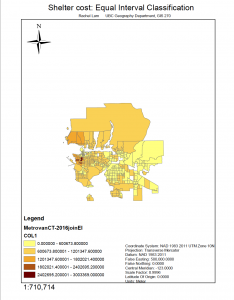
The map below displayed the difference in housing process between 2011 and 2016. In 2016 it is clear that housing process have risen and became a lot less affordable compared to just 5 years prior.
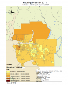
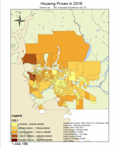
These maps illustrates the different map to segregate the different location by housing prices.

Things I learnt:
- Difference between CT and DA.
- How to joint data to present them on the same layer
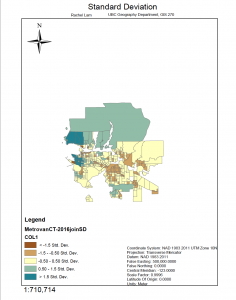
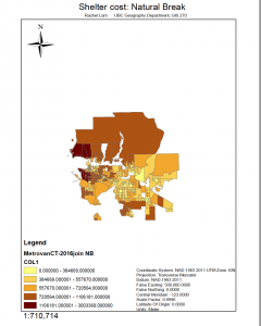
- Difference of the different “break” and how it affects presentation and the reader’s perception
- When to use median and average and why we use each for different occasion.
- Do not skip steps because steps are there for a purpose.
- How to find and use data on census from government website.
- The importance of saving things in the right place, and desktop is not a good place to pile all the data because all the data get mixed up. I am convinced that I could not see the content of the document from the tiny window/picture on the desktop.
Difficulties I encountered:
- Downloads the wrong data and got lost in finding the data from the government website
- When I download the data, they are not saved in the same file, for some data I could find but for others I didn’t know where I saved it
- Because I skipped through the step, I ended up not doing the part where I am supposed to clip the Vancouver area out of the Canadian map, making my computer lag and crash- I ended up redoing it twice.