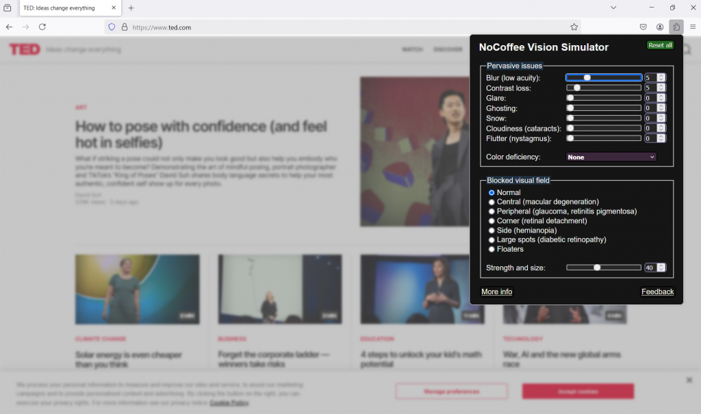
I used the NoCoffee extension on my Firefox browser for the first time, and it was an eye-opening experience. I find the term “eye-opening” somewhat ironic, as the extension actually allowed me to experience accessibility challenges faced by individuals with visual impairments. However, I also find it appropriate, as it helped me realize how critical it is to design learning experiences through the lens of accessibility.
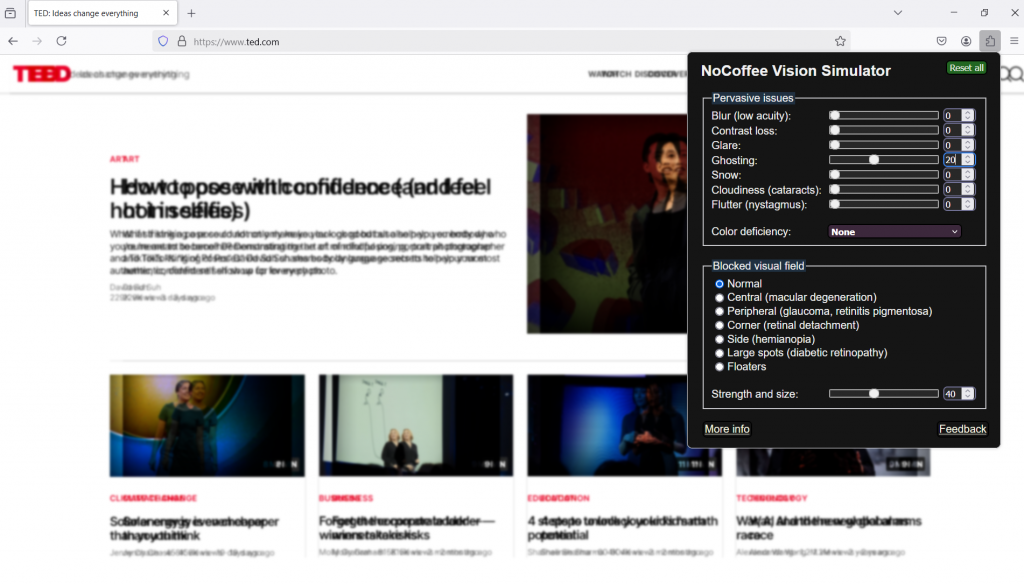
The TED Talks website—my reliable and preferred online video resource—was chosen for this exploration. By adjusting the levels of different visual impairments, I was able to see the content in ways that some learners see it. While video thumbnails remain helpful for navigating the site, reading and understanding text proved challenging. In particular, the descriptions of each video, presented in a smaller font size, were especially difficult to read.
The ghosting effect made it much more challenging to recognize and comprehend text. While images were still helpful for navigation, the colours and figures within them became harder to distinguish. This issue could be greatly improved by incorporating a hover-over voice-over feature. Instead of reading all text from top the bottom, as most screen readers to, it would be more helpful if only the text within the hover-over section were read aloud. This would allow leaders to perceive content more easily and efficiently.
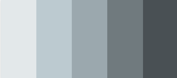
Another important insight relates to the use of colour. Personally, I like to use the monotone colour scheme to create a consistent and modern look. However, I realize that differentiating between similar tones can be challenging for some learners. To ensure inclusivity in learning content design, it would be more effective to use high contrast colours.
Resources
NoCoffee Extension (for Firefox browser)