Task #7 Mode Bending

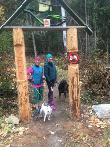
These are my trails. 

I found this task difficult to start because we had already created a visual and a text to go with the bag which left me wondering what next?  So, here I have tried to capture the essence and meaning of my bag – a sanity saver and a way to decompress and relax.  It may be hard for some to relate to but it is what I do; as my friend says “I don’t understand people who do not run.”
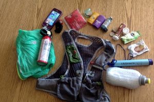
And this is my bag

I have chosen to use iMovie as I am not quite savvy in its use yet and wanted to play with it and learn more. Today I discovered how to control the volume and multilayer sounds.  This allowed me to create a chaotic, noisy setting from which to escape. Our school holds about 500 students in a building designed for 300, hence the portables.  A big thank you to my colleague and fellow port dweller, Justin Nillson for his brilliant quote. The smell of mildew is overpowering and we are often locked out by the custodial staff who forget we exist. And yet, we are remembered when there are a multitude of meetings. We are also undergoing a restructuring. I really love my job but this year more than ever, I have need to take to the trails for a quick escape. 

While this task is not strictly oral one could close their eyes and simply listen. In addition to the audio-visual, I have used sound effects, dialogue and music to create the effects ranging from chaos and noise to peace. There was, however, one wee blip of excitement in the calm trail when a bear was encountered. While the photo of bear tracks did not result in a bear encounter, the dialogue is based on a true story. I actually met a mother bear and twins on the trails. She treed them and turn toward my friend and I and the dialogue is basically what I said, “backup, backup, it’s okay bear, it’s okay.” No bear spray was deployed.  Usually a bear bell will warn animals and sightings are rare. My only wish is that I could have shared the scents, there is something unsettling about the smell of a bear or moose close by but the freshness of the forest is wonderful. And yes, that really is the sound of a LifeStraw slurping up water. Actual sounds and photos that I have taken myself were used in the making of the video.  I turned the cellphone on and drove down the highway (that is my car stereo in the background.  The crowd sounds were a sound clip however, due to COVID-19 restrictions on crowds. 

In addition to the modes already mentioned, spatial and architectural design of the space is evident in the video. From the majestic spires of rock gates and turns  to the signage of  reveals a unique voice of trail builders. “What the Huck” and Angry Beaver” are my favourites. Angry beaver really did bite my butt at least 4 times this past winter. 

“ . . . there is something irreducibly unique about every person’s voice” (76)

Trail builder’s seem to have a very unique and quirky sense of humour and a culture of their own (as do trail runners). Bike parts become part of the signage on Dragon Mountain and the names on the Wonderland network reflect the history of the area: Sluice Box for the mining equipment  and Mucho Oro after a mine in the nearby Barkerville area.  Others like “What the Huck” meander or like“Angry Beaver” are just tough. “Mosster” is a monster of a trail. 

These trails were designed by professional trail builders who are mountain bikers. Theirs is a unique culture that is carving out language in the curves of the trails, the signage and the stacked rocks that signify a gateway or sharp turn. Other trails in my area are old trails along ridges that First People, the Dakelh, used. One such trail,  “Hog’s back” had an excellent view of the river and of any advancing enemies or strangers; as well as food caches. 

According to the New London Group (1996) “The redesigned is founded on hIstorically and culturally received patterns of meaning . . . At the same time it is the unique product of human agency” (p. 76). These trails are just that. 

On multiliteracies and multimodal text in the classroom: I have considered text as being not just writing for sometime now. My students read text, view audio-visual as well as audio books and create using text, audio, audio-visual and mix- media. Some of the best projects I have seen have been created when freedom of choice in representation is given. 

Students who “do” and “create” or redesign rather than memorize and copy actually learn. “Designing transforms knowledge in producing new constructions and representation of reality” (The New London Group, 1996, p. 76). 

Bonus feature: More of the Dragon Mountain Trail – There is another photo of a deconstructed bike redesigned into a signpost that I wanted to share.

Thank you to my Friends Justin, Veronica & Michelle (& pups Russell & Baxter too) for appearing in video or photo images.


References:

Applegate, C. (2012). The One and Only Ivan.  Harper Collins. p.3

The New London Group.  (1996). A pedagogy of multiliteracies: Designing social futures.   Harvard Educational Review 66(1), 60-92.


Linking Assignment #3: Task #5 Twine story 

Chain, Link, Metal, Tether, Chain, Chain

For Linking Assignment Task #3 I am linking to Katlyn Paslawski’s Twine Task. I have chosen Katlyn’s Twine because it is such a stark contrast to my own in so many ways.

Katlyn’s site: https://blogs.ubc.ca/paslawski540/2020/06/10/twine-the-digestive-system-game/

My site: https://blogs.ubc.ca/rebeccahydamacka/2020/06/10/task-5-twine-a-dark-and-stormy-twine/

A quick side by side comparison:


First, focusing on the content, my twine is more rudimentary, relying solely on the default bright hyperlink text against the black background to tell a choose your own adventure mystery/horror story. Conversely, Katlyn’s background is crisp white,  much like a traditional textbook giving it a clean professional quality. She has also included a soundtrack in the background which adds an air of mystery but doesn’t overshadow the game which I consider well chosen. The inclusion of well-placed graphics adds to the visual appeal, creating a multimodal learning experience for the viewer. I am thankful that Kaylyn has included a link to Hammond’s videos on how to embed sound and images in Twine 2, and I want to play with this more now.After viewing the Digestive System Game, I was left wishing I had included sounds and images; however, another point at which our Twine’s diverge is their purposes which has resulted in different end results.

Despite both Twines being created for student audiences, they are built for different purposes. Katlyn’s Twine is a game to support learning in Science and is content driven being all about the digestive system. It has almost a quiz review feel with its gentle non-threatening manner or it could be used as a student’s self assessment for learning. Despite the hyperlinks, it has more of a linear book feel to it as it progresses from beginning to end of digestion (to do otherwise might result in regurgitation or acid reflux). My twine, however, circles or can circle around endlessly.

As I read about how Katlyn had thought the process of building would be quick, an hour maybe, but took much longer, I felt a connection as I shared a similar experience. While she spent time exploring further how to add to her twine, I spent time creating the most convoluted links and twists within my own twine which also took a lot of time but I became very invested in the storyline. In terms of finished products, I think the content and purpose really came into play in the design of our twines.

My own Twine was built for a grade 8 English class to create a sense of fun and play as well as demonstrate a non-linear, iterative and/or circular storytelling as we ask students to construct different these formats in the creation of text. Hypertext is the perfect medium to use to write as we think, associatively (Bolter. 2001. Ch. 3, 2001). I also had specific images in mind as I created my twine which I could have included  but a) I wasn’t certain how and b) I wanted to give the viewer some autonomy. But by not including images, the reader is invited to visualize the scene, and imagine the descriptive detail in their minds. This is one space that the reader actually controls in my twine.

This is yet another similarity in our Twines: both my story and Katlyn’s game give only an illusion of choice. I am in agreement with Bolter that when the reader is allowed to “choose links [it] only gives the illusion of control (Ch. 3, p. 42). If one does not make the desired choice (of the designer), either the game is over or the player is redirected to try again. This very gentle, in Katlyn’s Twine, or not so gentle or sarcastic in mine, redirections reminds me that player control is an illusion as we are in control not the player.

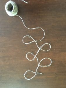
Finally, when considering our blog spaces and the task, I was struck by the fact that we both seemed to feel the need to include map of our Twines. This points to the value we place in images and to the process of the twine.  Katlyn may value images more than I as her text is not nearly as lengthy in her description as mine. This difference struck me as an affordance for someone with a strong visual literacy. The addition of the links to how to embed sound and images was also a great touch. As to the website, I found that it was very easy to navigate and to comment on the blog. This is in part because of the clean space with a white background and minimal background clutter. I do not operate well with distractions making it well designed for someone like me. Also, because I was familiar with the format, a menu at the top and the placement of the comment section, I had the necessary literacies to access it.

Bolter, J.D. (2001).  Writing Space: Computers, hypertext, and the remediation of print . Mahway, NJ: Lawrence Erlbaum Associates. pp. 27-44.

Task # 6 :( An emoji story :)

Title:

Plot:

Emoji story analysis:

Using the conventional emoji keyboard has led me to discover there is not emoji for meerkat or wildebeest which meant I was not going to be able to retell The Lion King, the last movie I had watched, so it was on to the last novel read. This was going to be a challenge because although the title was simple, the story itself proved to be more difficult. 

In order to guess this book title, you might need to be familiar with the book, if you are it should be easy to decipher. The plot might be as difficult to puzzle out as it was to write.  And so I began with the title and wrote in ideas or concepts and groupings of words or ideas rather than in syllables which are only bites of sound meaning little. 

The difficulties in my writing in emojis began with the plot of this story being circular rather than a linear plot line.  Many books that I have read lately seem to actually tend to do this more complex plot line. A colleague (English department head) recently told me that First Nation stories often have a circular path and yes linear, circular and iterative are indeed in the English Arts Curriculum. The story begins at the end, then flashes back to an earlier time in the character’s line in order to explain the final scene. There is also a point where the plot flashes back yet again, twice actually.  

Bolter claims that “[s]ince its invention, printing has placed the word effectively in control of the image” (48).  In the case of emojis, they are incontrol as they become the words.  Word choice is governed by the availability of emojis. I worried that I should not announce the gender of a character using a pink or blue shirt.  I soon discovered that babies did not come in all colours and races which although not central to my plot would have helped.  I tried to create groupings or “families” of character to make them more identifiable. Also missing were some occupations that I wanted as well as at least one  medical procedure. And where was the pregnant emoji?  Seriously? I was looking for that as well and was wondering how we petition for meerkats, wildebeests and pregnant people. 

What was omitted also was interesting: no punctuation, spelling or grammar to worry about, although, I did section ideas into sort of sentences or lines as well as adding spaces between lines to create some semblance of paragraphs between ideas and spans of time. It was easier to create the pauses using a lack of text or by using spaces than it was with the earlier voice to text task. It would have been interesting to simply draw or move the emojis around in different arrangements but the document demanded a line after line arrangement following the conventions of English language. My emoji story retelling still has the constraints of the conservative arrangement of a book that Bolter (2001) describes. 

Where do emojis fit into text? Kress describes written words and spoken to be a representation or “vague description” whereas an image is a more accurate representation. Bolter (2001) also makes an interesting point in that “ekphrasis sets out to rival visual art in words, to demonstrate that words can describe vivid scenes without re­course to pictures” . . . yet . . .  “in digital media and even in print, we get a reverse ekphrasis in which images are given the task of explaining words (Ch 4. P. 56). Writing in emojis is a space that exists in this tension, in a sort of “no man’s land” which is neither image nor word. The emoji are a representation of words and become symbols of words which are what words are.  Both are removed from the actual event and need to be interpreted by the reader. 

This writing experience was definitely a challenge. Emojis were designed to add emotion to text especially in shorter pieces of writing, such as in tweets, messages and chats, to avoid misunderstandings that could arise (Bolter, Ch. 4). It is so hard to tell sometimes if someone ‘s message is being terse or sarcastic or just plain nasty or maybe they are just in a hurry. We rely on more than just written words to convey meaning. This is all great but emojis are designed for these short bursts of text instead of having to rely on lengthy explanations, whereas a novel has the time it takes to set a stage or scene(s) and use multitudes of descriptive language to create meaning.  I have a text in my class library, YOLO Juliet and even it is not written in full emojis but more a rebus style with the odd emoji thrown in as well as being translated into a more modern slang version.  According to Bolter: “Digital media claim to achieve greater immediacy and authenticity by integrating images (and sound) with prose.” (2001, Ch.4, 47). Notice that Bolter says “with”? Emojis are images but to rely totally on them does not create a full story or even plot; they paint a simple picture of emotions and objects but only of those that are available. 


References:

Kress (2005), Gains and losses: New forms of texts, knowledge, and learning. Computers and Composition, Vol. 2(1), 5-22. 

Bolter, J. D. (2001). Chapter 4. Writing space: Computers, hypertext, and the remediation of print (2nd ed.). Mahwah, N.J: Lawrence Erlbaum Associates. doi:10.4324/9781410600110

Shakespeare, W. & Wright, B.( 2015). YOLO Juliet.  Random House.


Task #5 A dark and stormy twine . . .

It was a dark and stormy night . . .

Please note: no animals were injured in the making of this story . . . (but maybe a few humans)

This amazing story is available through this shareable link from google drive which will allow you to first see the html language which is quite lengthy and impressive. Once you download it and open the file, you are ready to read!

https://drive.google.com/file/d/1_C2kJD3qghZ74fMNh4QGw4kqmBIEcYI4/view?usp=sharing

or you can unzip this file: It was a dark and stormy night (1) (1).html

The creation of this Twine story and a few thoughts:

The mapping of the Twine fascinated me as it showed all of the links between the passages. The connections of links are more obvious in the building of the story than they are in the reading.  It was even possible to link back to previous passages and have the reader re-live passages or scenes. I was fascinated with the building process and got a little over enthusiastic perhaps. It may be annoying to some; but not to my students who read choose your own adventure stories over and over again to see different outcomes.  I am reminded of how text has changed from words in books written in a linear fashion or a “complete or closed verbal structure” (Bolter, 2001, p.77) to a more circular rendition through the use of hyperlinks.

This reminds me of my English departments reporting comment bank which states: Student “can construct and create by choosing particular formats (linear, circular, and iterative) in the creation of story/text.” In the past we may have thought of a story or text being anything other than linear but to me that seems “unnatural.”  “The supporters of hypertext may even argue that hypertext reflects the nature of the human mind itself— that because we think associatively, not linearly, hypertext allows us to write as we think” (Ch. 3. 2001, p. 43).  Ted Nelson was one who thought “hypertext was natural to the mind” (Bolter, 2001, 42).  I know that my mind certainly works in circles of association -sometimes I even speak this way; words need to weave and twine around each other. Yes, the pun is intended as the Twine does just that as it circles back and steps sideways and forward.

There has been criticism that hyperlinks do not truly reflect all association. Bolter (2001) mentions supporters of books such as   Birkerts (1994) and Slouka (1995), claim that “as authors prescribe links, they deny the reader the choice of making her own associations . . . [by] letting them “choose links only gives the illusion of control (Ch. 3, p. 42). Indeed my own Twine appears to give choices to the reader and yet I force the reader to make a choice or manoeuvre them to circle back to the choice I want them to take. Sometimes, I did not even give a choice; choice is an illusion in this case.  Editors of encyclopedias decide what to include and what to exclude in both print and on the world wide web (Bolter, 2001, Ch. 5, p. 90).  Do you wonder what I have left out of my story?  There was much more but I will save that for a sequel – I really have enjoyed this experience that much.

The product itself, The Dark and stormy night twine, is rough but as I have said, I was much more mesmerized by the process. It was like a puzzle putting all the pieces together and to tie the ending up . . . well, sort of tie it up. I have included some of the twine statistics which I found quite by accident.  There were a total of 30 passages and 41 links which translates to quite a lot of circling back in for the reader, maybe until they got it right.  again, I emphasis the control that the reader thinks they have but actually do not.

I wondered if the process and being so focused on it was the reason for the grammatical errors which I would not have made if I had written the story in a linear fashion on paper. That would have forced my mind to focus on the mundane side of grammar rather than the creative. I had thought to edit them further but decided not to as a statement to the power of the technology. I know wonder if this might be why my own students seem to forget capitals, punctuation and spelling. maybe they are really focused on the creation. Or is punctuation changing – I had no idea that a ‘.’ or full stop was rude in a message, tweet of chat (Zaltman).

In addition to correcting grammar and spelling*, I might have also taken more time to get the formatting of each passage perfected. Again, I was more interested in the story than its appearance . . . except for the lovely dark background.  I did discover how to edit the formatting but chose not to as I think it suits the dark theme of the story.  I do not think Twine 2 is easy to download sound effects and graphics to (this according to the site) but the story is meant to be read in a dark, deadly quiet space.

The narrator “voice”was modelled after the Twine example of “The temple of No” with a cheeky humorous tone but with a bit cleaner language as I would like to share my Twine with my grade 8/9 classes. The narrator(s), maybe I was arguing with myself, I envisioned arguing throughout the story but this may have been hard to maintain. By using a second person perspective, and “you” in the story even more engagement is created along with the illusion of control. I think it is something students would appreciate and maybe even like to try. Last Halloween, we read a choose your own adventure in class using a google slide show with linked slides which was a big hit and later we participated in a BBC refugee simulation (a bit more serious) but the interactiveness of the activity was highly engaging for the students. To be able to create and understand linking and the opportunity to control it adds yet another layer to this educational process.

*some grammatical and spelling errors have now been corrected after sharing with a small group ( 2 students and 1 educator) for feedback. There were more errors than I had first thought. DIY and feedback are valuable.


References:

Zaltman, H. 102. New Rules: The Allusionist. podcast. with guest McCulloch, G.  http://theallusionist.org/new-rules

Bolter, J.D. (2001). Chapter 3: Hypertext and the Remediation of Text.  Writing Space: Computers, hypertext, and the remediation of print . Mahway, NJ: Lawrence Erlbaum Associates. pp. 27-44.

Bolter, J.D. (2001). Chapter 5:. The Electronic Book.  Writing Space: Computers, hypertext, and the remediation of print . Mahway, NJ: Lawrence Erlbaum Associates. pp.77-98.


Linking Assignment #2: Task #4 Tanya’s Potato Printing and Mechanized Text

For my Linking Assignment #2 I have chosen to link to Tanya Weder’s Task #4 https://texttech.weebly.com/weekly-tasks

For ease of locating, here is my task #4 link: https://blogs.ubc.ca/rebeccahydamacka/2020/06/04/task-4-potato-printing/

I chose this link because I was struck by how similar our planning, thought process and conclusions were and yet despite having many similar elements, our websites are actually quite different.

Tanya’s experience was similar to mine as the planning process of the task seemed to be of significance for both of us. She selected a word that held meaning for her, “Teach” defining who she is or what she does.  My own word also reflects my teaching experience by defining my identity as a Raven House teacher. We both placed an importance on the appearance of our fonts, considering the historical significance of Gutenberg’s Bible and typeface. Fonts are where we diverged: she wished to display a more modern version to reflect change in teaching and also used the laddered T to indicate meaning.  As I reflected on the monks’ writing and Gutenberg’s Bible’s Blackletter, I also thought of American Gothic writer Edgar Allan Poe and his poem “The Raven,”  and decided to try a version of Gothic lettering. Our time spent on the project was also similar with results that as she so eloquently put “still missing the consistency that machinery could give but there is more life and humanity in it’s imperfections.” To this statement, I wholeheartedly agree; there seems to be more value in the handcrafted lettering. 

Tanya’s webspace, however,  is different from my own. It is a Weebly space which confused me initially as accessing from the course’s student webspace, looks different. There is not a complete list of tasks and blogs that usually appears under each individual’s name. Instead the access point appears as only one word, “tasks,” which redirects the viewer to a Weebly. Focussing on the weekly task I had not realized it was a Weebly site initially. The site appears very similar to my own WordPress which uses Booklite as a theme. Similar to my own site, Tanya’s blog presents items in chronological order with the most recent one at the top. Also at the top is of Tanya’s menu are the same words or links as mine own site with the exception of a “Contact” link on her site. Because I had co-created an earlier course’s Weebly for a project, I had wanted to create the same type of appearance in the menu at the top.  With these similarities, my brain connected the two sites. 

Because I had made this connection, it was all the more confusing when Tanya’s site did not navigate the same. What was different and confusing on her site was that to comment, I needed to go to the top of the post rather than the bottom and click on a link. I missed this at first which may be not only the location but also the lighter coloured and smaller font. The link took me to a form to fill out identifying information in addition to commenting and to ask approval to comment. Because it is different, adding another layer of complexity, it took more time and effort.  As frustrating as it was to navigate, not realizing why, it is a worthwhile experience to learn to navigate multiple blog platforms. 

The site itself has a clean minimalist appearance with a boldface type of the task which draws attention and a white background.   The photos display well on a white background. For someone who is more visual, the blog post is excellent. However, for someone with less than good eyesight it might be difficult to read the smaller, lighter font. I have played with my own font and background colours but have yet to settle on a satisfactory one as it seems to depend on graphics and effect I am looking for. One constraint of the course design was the preference to use WordPress. With this platform, I have yet to find the variety of fonts that I would prefer. I had found a font in google docs, Almendra, which I would have liked to use or something similar, to create a Gothic font appearance.  I have also found that my video file type was incompatible with uploading which necessitates uploading to YouTube first. I had wanted to experiment with my blog content. It has definitely been an exercise in exploration. What has been pleasantly surprising, is the way the course itself explores and allows a hands on, authentic experience that evolves with the text technologies despite being an online course.

Task #4 Potato Printing


Potato Printing: An exercise in humility

I chose this task because I had, as a child, done potato print stars with angular straight cuts; it should be easy.

Here is a quick preview of the process:


A detailed look at the process of potato printing:

First, there was planning to do including a day ruminating over word choice. A 5 letter word. Should it be one that could be recycled over and over toPotato make the maximum number of smaller words such as “twine” . . .twin. . . win. . . in . .. net . .. wine.    Or should it be a word of significance? The first book Gutenberg printed, after all, was the Bible so the word should be IMPORTANT. Thus a word go significance to me was selected, Raven, which reminded me of Edgar Allan Poe’s The Raven and my Raven house team at the Middle School where I work.

Might I soon be saying “nevermore” in frustration? Perhaps.

Benson & Carey. The Elements of Lettering.

Font selection: A suitable font for “Raven” was needed but not just any font. I consider fonts to be of particular importance as they can visually communicate an era, a style, an emotion or idea.  Gutenberg’s Bible, the first printed text, was done in Blackletter, also known as Gothic or Textura which appeared similar to the handwriting of medieval monks (The Printed 00:37:50) with its “strong vertical strokes and vertical appearance”(Cloud). Appearing remarkably similar to the monk’s writing helped to promote acceptance of Gutenberg’s work (The Printed 00:37:50). Further, Edgar Allan Poe’s genre of writing is described as American Gothic and so a modified Gothic style seemed appropriate for my Raven. I have done both the Blackletter and the Southern Gothic font in the past, using a calligraphy pen; however, I soon learned this would be a far more difficult task on a potato.

Next, there was the procurement of potatoes. Unfortunately my potatoes had sprouted and were planted in the garden the day previous so off to the store to purchase new potatoes. I selected russets which proved to be far too juicy and I wonder if the new white potatoes would be better as I thought of Gutenberg selecting the best metals to use for his moveable type press. (Harris, 00:36:54)


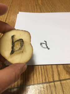
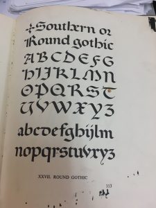
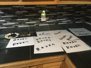
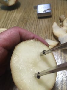
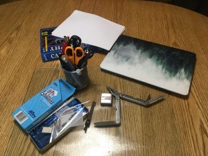
Tools: Gathered in anticipation were a Leather-man (not used), a steak knife (used extensively, a chef’s knife, a tape measure, a geometry set divider, a pen (which proved to be useless), a felt marker (nearly as useless as a pen), and some references (paper based and online) to check fonts.


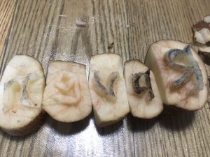
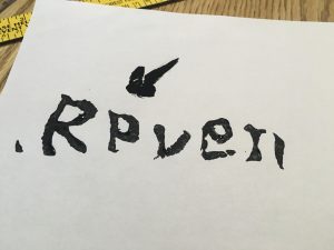
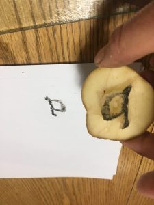
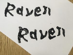
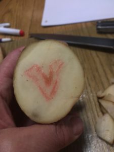
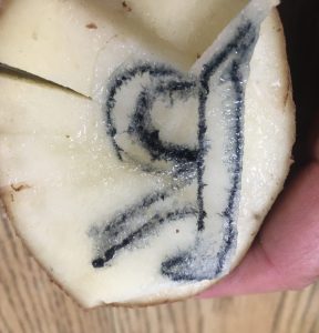
Finally, at 7:02 pm the  actual carving process began. Individual letters were in mirror image  so they would appear oriented  correctly.  This I checked several times. I chose to carve in order of the spelling of the word; I am not sure why but suspect I was following the English convention of writing from left to right. The potato was halved and the letter “R” was carved in uppercase after several attempts with each on making a smaller and smaller potato “halve.”  This is when the decision to make a simple version of the font occurred. The potatoes were incredibly juicy making it messy as well as difficult to see to see the letters and whether too much had been trimmed off. Next time, I would try a dye on the surface to create more contrast. (Yes, I am excited to try this again!) 

The  letter “a” took only a couple attempts and was not the most challenging letter despite the interior cut that needed to be made. The letter “v’ was one of the harder letters because for some reason I could not get the right angle between each side making the letter too wide. I ended up cutting it off and starting again.  The style of the letters also dictate that there be some curves even to the seemingly angular letter “v.

Interrupted by my spouse, I  envy the medieval monks in scriptoriums where “silence is mandatory” (Harris,  00:06:36). 


Even more troublesome letter was the “e” which was strangely was the most angular of all letters and should have been the easiest. The letter “n” was too large at first attempt and needed to be downsized which was done without incident.

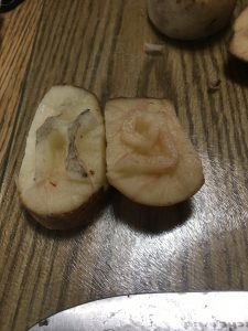
Throughout the process, the divider was used to measure the height of the letters; I preferred the speed and ease over the tape measure that was initially used. Uniformity of font size would improve the finished look of the word. Again, I am reminded of the medieval people marvelling over Gutenberg’s uniformity of text (Harris) which drove me to attempt to perfect the uniformity of my letters. I chose not to trace them, thinking that would be “cheating” and instead carved freehand which made uniformity of size more challenging.

I then trimmed the sides of each letter so they would nest closer and flat beside each other as well as the bottoms so that I could line them up on a straight edge. Next time I will attempt to use a long skewer to join the potato pieces much like a typeset tray.

Ready to Print! Maybe . . .

The printing process stalled when I realized that my paint had been packed in one of 30 or more boxes in the process of renovations (never again during a course). A frantic search resulted in some lovely black acrylic and one stubby paint brush, both selected because they were all that was available but they worked well!  Success . . .almost. The first printing resulted in the  letter “a” appearing backwards which was puzzling. I was sure I carved it in reverse. I had even tested it on another potato half.   

Then came the realization that it was upside down; the style of the “a” made it possible to appear like a
backwards “a.”

Crisis averted, the black paint was applied and potato print blocks lined up ready to be placed ” carefully because they tended to slide and smear easily.  I discovered the letter “n” was not quite flat or level and needed to be rocked slightly to leave a full imprint. As I did this I thought of the monk’s letters, “crisp and  straight upon the page” (Harris, 00:10:18).


9:04  “Raven” was completed! 


Reflections:

I was quite pleased with the way the letters waved almost birdlike in their shape and the rough fill of the paint, all of which seems to suit the Raven of Edgar Allan Poe’s poem. And of course the “found” black seems like fate – perfect. Was I able to get the two words to match exactly? No, but that  uniqueness is reminiscent of the monk’s almost, but not quite perfect lettering. Potato printing seems to bridge the world of hand written manuscripts and the “mechanization” of the printing press, being not quite part of either world. Potato printing  is labour intensive initially but one can rapidly print once the printing blocks are completed.

At several points in the process I had even wished I had chosen to write a 500 word manuscript instead, envying the monks hunched over their writing but I soon became addicted to printing with my potato blocks trying different angles on the paper and curving letter arrangements. It became soothing as I derived pleasure from this simple act of printing. The almost 2 hour process of carving resulted in the ability to quickly print many more and I had extras to give to my colleagues and fellow Ravens the next day. An evening well spent! 

And then I decided to try Animoto to create a dynamic video of the process which need to be uploaded to YouTube which all took almost as long as the potato printing. It will go faster the next time . . . potatoes and new technologies!


References:

Benson & Carey. (1950). The Elements of Lettering. Toronto: McGraw-Hill.

Cloud, G. (July 12 2016). The Jenson Bible joins the Gutenbergs Bible’s page turning.  The Ransom Center. University of Texas. https://www.hrc.utexas.edu/ retrieved June 3, 2020.

Harris, B. “The Printed Book: Opening the Floodgates of Knowledge” How it Began: A History of the Modern World. podcast.


Spam prevention powered by Akismet