
For Linking Assignment Task #3 I am linking to Katlyn Paslawski’s Twine Task. I have chosen Katlyn’s Twine because it is such a stark contrast to my own in so many ways.
Katlyn’s site: https://blogs.ubc.ca/paslawski540/2020/06/10/twine-the-digestive-system-game/
My site: https://blogs.ubc.ca/rebeccahydamacka/2020/06/10/task-5-twine-a-dark-and-stormy-twine/
A quick side by side comparison:
First, focusing on the content, my twine is more rudimentary, relying solely on the default bright hyperlink text against the black background to tell a choose your own adventure mystery/horror story. Conversely, Katlyn’s background is crisp white, much like a traditional textbook giving it a clean professional quality. She has also included a soundtrack in the background which adds an air of mystery but doesn’t overshadow the game which I consider well chosen. The inclusion of well-placed graphics adds to the visual appeal, creating a multimodal learning experience for the viewer. I am thankful that Kaylyn has included a link to Hammond’s videos on how to embed sound and images in Twine 2, and I want to play with this more now.After viewing the Digestive System Game, I was left wishing I had included sounds and images; however, another point at which our Twine’s diverge is their purposes which has resulted in different end results.
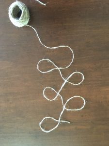
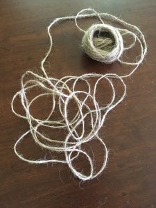
Despite both Twines being created for student audiences, they are built for different purposes. Katlyn’s Twine is a game to support learning in Science and is content driven being all about the digestive system. It has almost a quiz review feel with its gentle non-threatening manner or it could be used as a student’s self assessment for learning. Despite the hyperlinks, it has more of a linear book feel to it as it progresses from beginning to end of digestion (to do otherwise might result in regurgitation or acid reflux). My twine, however, circles or can circle around endlessly.
As I read about how Katlyn had thought the process of building would be quick, an hour maybe, but took much longer, I felt a connection as I shared a similar experience. While she spent time exploring further how to add to her twine, I spent time creating the most convoluted links and twists within my own twine which also took a lot of time but I became very invested in the storyline. In terms of finished products, I think the content and purpose really came into play in the design of our twines.
My own Twine was built for a grade 8 English class to create a sense of fun and play as well as demonstrate a non-linear, iterative and/or circular storytelling as we ask students to construct different these formats in the creation of text. Hypertext is the perfect medium to use to write as we think, associatively (Bolter. 2001. Ch. 3, 2001). I also had specific images in mind as I created my twine which I could have included but a) I wasn’t certain how and b) I wanted to give the viewer some autonomy. But by not including images, the reader is invited to visualize the scene, and imagine the descriptive detail in their minds. This is one space that the reader actually controls in my twine.
This is yet another similarity in our Twines: both my story and Katlyn’s game give only an illusion of choice. I am in agreement with Bolter that when the reader is allowed to “choose links [it] only gives the illusion of control (Ch. 3, p. 42). If one does not make the desired choice (of the designer), either the game is over or the player is redirected to try again. This very gentle, in Katlyn’s Twine, or not so gentle or sarcastic in mine, redirections reminds me that player control is an illusion as we are in control not the player.
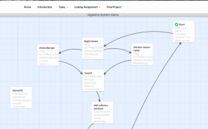 Finally, when considering our blog spaces and the task, I was struck by the fact that we both seemed to feel the need to include map of our Twines. This points to the value we place in images and to the process of the twine. Katlyn may value images more than I as her text is not nearly as lengthy in her description as mine. This difference struck me as an affordance for someone with a strong visual literacy. The addition of the links to how to embed sound and images was also a great touch. As to the website, I found that it was very easy to navigate and to comment on the blog. This is in part because of the clean space with a white background and minimal background clutter. I do not operate well with distractions making it well designed for someone like me. Also, because I was familiar with the format, a menu at the top and the placement of the comment section, I had the necessary literacies to access it.
Bolter, J.D. (2001). Writing Space: Computers, hypertext, and the remediation of print . Mahway, NJ: Lawrence Erlbaum Associates. pp. 27-44.