Potato Printing: An exercise in humility
I chose this task because I had, as a child, done potato print stars with angular straight cuts; it should be easy.
Here is a quick preview of the process:
A detailed look at the process of potato printing:
 First, there was planning to do including a day ruminating over word choice. A 5 letter word. Should it be one that could be recycled over and over toPotato make the maximum number of smaller words such as “twine” . . .twin. . . win. . . in . .. net . .. wine. Or should it be a word of significance? The first book Gutenberg printed, after all, was the Bible so the word should be IMPORTANT. Thus a word go significance to me was selected, Raven, which reminded me of Edgar Allan Poe’s The Raven and my Raven house team at the Middle School where I work.
Might I soon be saying “nevermore” in frustration? Perhaps.
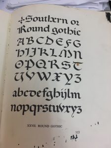
Benson & Carey. The Elements of Lettering.
Font selection: A suitable font for “Raven” was needed but not just any font. I consider fonts to be of particular importance as they can visually communicate an era, a style, an emotion or idea. Gutenberg’s Bible, the first printed text, was done in Blackletter, also known as Gothic or Textura which appeared similar to the handwriting of medieval monks (The Printed 00:37:50) with its “strong vertical strokes and vertical appearance”(Cloud). Appearing remarkably similar to the monk’s writing helped to promote acceptance of Gutenberg’s work (The Printed 00:37:50). Further, Edgar Allan Poe’s genre of writing is described as American Gothic and so a modified Gothic style seemed appropriate for my Raven. I have done both the Blackletter and the Southern Gothic font in the past, using a calligraphy pen; however, I soon learned this would be a far more difficult task on a potato.
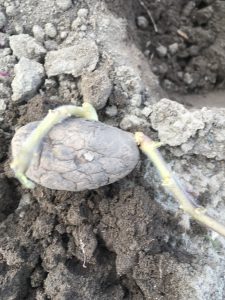
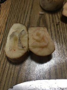
Next, there was the procurement of potatoes. Unfortunately my potatoes had sprouted and were planted in the garden the day previous so off to the store to purchase new potatoes. I selected russets which proved to be far too juicy and I wonder if the new white potatoes would be better as I thought of Gutenberg selecting the best metals to use for his moveable type press. (Harris, 00:36:54)
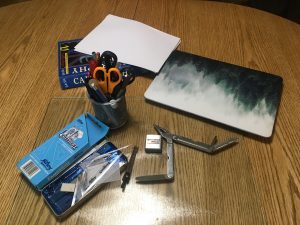 Tools: Gathered in anticipation were a Leather-man (not used), a steak knife (used extensively, a chef’s knife, a tape measure, a geometry set divider, a pen (which proved to be useless), a felt marker (nearly as useless as a pen), and some references (paper based and online) to check fonts.
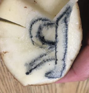 Finally, at 7:02 pm the actual carving process began. Individual letters were in mirror image so they would appear oriented correctly. This I checked several times. I chose to carve in order of the spelling of the word; I am not sure why but suspect I was following the English convention of writing from left to right. The potato was halved and the letter “R” was carved in uppercase after several attempts with each on making a smaller and smaller potato “halve.” This is when the decision to make a simple version of the font occurred. The potatoes were incredibly juicy making it messy as well as difficult to see to see the letters and whether too much had been trimmed off. Next time, I would try a dye on the surface to create more contrast. (Yes, I am excited to try this again!)
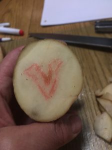
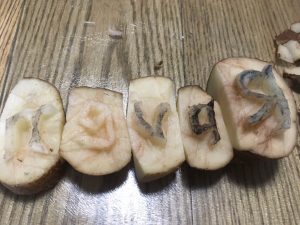
The letter “a” took only a couple attempts and was not the most challenging letter despite the interior cut that needed to be made. The letter “v’ was one of the harder letters because for some reason I could not get the right angle between each side making the letter too wide. I ended up cutting it off and starting again. The style of the letters also dictate that there be some curves even to the seemingly angular letter “v.”
Interrupted by my spouse, I envy the medieval monks in scriptoriums where “silence is mandatory” (Harris, 00:06:36).
Even more troublesome letter was the “e” which was strangely was the most angular of all letters and should have been the easiest. The letter “n” was too large at first attempt and needed to be downsized which was done without incident.
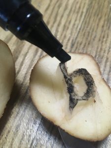
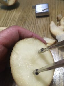 Throughout the process, the divider was used to measure the height of the letters; I preferred the speed and ease over the tape measure that was initially used. Uniformity of font size would improve the finished look of the word. Again, I am reminded of the medieval people marvelling over Gutenberg’s uniformity of text (Harris) which drove me to attempt to perfect the uniformity of my letters. I chose not to trace them, thinking that would be “cheating” and instead carved freehand which made uniformity of size more challenging.
I then trimmed the sides of each letter so they would nest closer and flat beside each other as well as the bottoms so that I could line them up on a straight edge. Next time I will attempt to use a long skewer to join the potato pieces much like a typeset tray.
Ready to Print! Maybe . . .
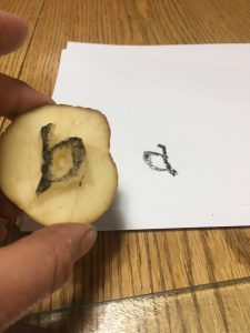
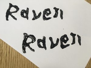
The printing process stalled when I realized that my paint had been packed in one of 30 or more boxes in the process of renovations (never again during a course). A frantic search resulted in some lovely black acrylic and one stubby paint brush, both selected because they were all that was available but they worked well! Success . . .almost. The first printing resulted in the letter “a” appearing backwards which was puzzling. I was sure I carved it in reverse. I had even tested it on another potato half.
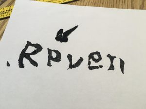
Then came the realization that it was upside down; the style of the “a” made it possible to appear like a
backwards “a.”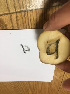
Crisis averted, the black paint was applied and potato print blocks lined up ready to be placed ” carefully because they tended to slide and smear easily. I discovered the letter “n” was not quite flat or level and needed to be rocked slightly to leave a full imprint. As I did this I thought of the monk’s letters, “crisp and straight upon the page” (Harris, 00:10:18).
9:04 “Raven” was completed!
Reflections:
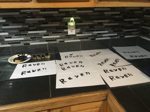
I was quite pleased with the way the letters waved almost birdlike in their shape and the rough fill of the paint, all of which seems to suit the Raven of Edgar Allan Poe’s poem. And of course the “found” black seems like fate – perfect. Was I able to get the two words to match exactly? No, but that uniqueness is reminiscent of the monk’s almost, but not quite perfect lettering. Potato printing seems to bridge the world of hand written manuscripts and the “mechanization” of the printing press, being not quite part of either world. Potato printing is labour intensive initially but one can rapidly print once the printing blocks are completed.
At several points in the process I had even wished I had chosen to write a 500 word manuscript instead, envying the monks hunched over their writing but I soon became addicted to printing with my potato blocks trying different angles on the paper and curving letter arrangements. It became soothing as I derived pleasure from this simple act of printing. The almost 2 hour process of carving resulted in the ability to quickly print many more and I had extras to give to my colleagues and fellow Ravens the next day. An evening well spent!
And then I decided to try Animoto to create a dynamic video of the process which need to be uploaded to YouTube which all took almost as long as the potato printing. It will go faster the next time . . . potatoes and new technologies!
References:
Benson & Carey. (1950). The Elements of Lettering. Toronto: McGraw-Hill.
Cloud, G. (July 12 2016). The Jenson Bible joins the Gutenbergs Bible’s page turning. The Ransom Center. University of Texas. https://www.hrc.utexas.edu/ retrieved June 3, 2020.
Harris, B. “The Printed Book: Opening the Floodgates of Knowledge” How it Began: A History of the Modern World. podcast.
Wow Rebecca! I really enjoyed that post. What an animated and connected take on the readings, podcasts and process. The typeface you choose worked so well to to capture the essence of the raven, a mysterious bird that both represents loss and insight. Also the print reminds me of stories I have heard and read from First Nations Authors, about the Raven as a trickster.
Hi Emily!
I really did enjoy this task. It seemed to be so dense with meaning. Thank you for reminding me of Raven the Trickster! There is a whole level of meaning within the animal spirit world which fascinates me. I was drawn strongly to the visual aspects of the font to represent the essence of Raven – Thank you for confirming that I realized some success with this.