My final link is to Shaun Holma’s Speculative Futures narratives: .https://blogs.ubc.ca/shaunholma/2020/07/26/task-12/
My task link can be found here: https://blogs.ubc.ca/rebeccahydamacka/2020/07/31/task-12-speculative-futures/
The task:
Shaun’s assignment seems so different from my own and yet it resonated with me. He created his narrative using video form while mine is primarily in text. But then, I discovered much of his video was screens of image and text; I needed to stop the video several times to read closely. It relies heavily on text . . . and maybe mood music. Yes, definitely music. I really think we need to take more time to consider of the affordance of music and its power. For me, this where I really felt a connection – music is its own language, capable of conveying so much.
I found Shaun’s two narratives believable and achievable, as I can really visualize these technologies in place. Maybe it is the video? What he has created has an almost Utopian vibe while I had created a post-apocalyptic future as I am not so sure that we are not headed towards a disastrous future brought on by human conflict, greed and climate change. Just call me pessimistic, I guess. Shaun’s take on the future is also mainly positive. In defence of my dystopian Speculative futures 12 Task, after the apocalypse, I did create a scene of domesticity and relative calm.
Shauns’s first narrative seemed at odds with his soothing sounds despite the high stress of an emergency room scenario. There are no sounds of pain, looks of anguish or frenzy that we come to associate ER emergency and drama. This is so removed from our other media and personal experiences.
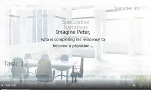
From Shaun Holma’s task 12.
The music track is so relaxing. I am left wondering if the future is to be ‘sanitized: in tidy white. I did, however, connect with Shaun’s ideas. Immersive training simulations are a great idea and being used in the present in some areas and maybe in a more limited scope.
I can also relate to the pedagogy of Shaun’s Speculative Future and feel deeply connected to the ideals. In the grade 12 aspiring firefighter scenario, I see a projected future of project-based or problem based learning as well as the “assessment for learning” model that is in current use today. And while a “personalized learning track” is what we aspire to today, I really do feel we need the assistance of technology to be successful providing the level of personalization that we desire. Otherwise this task is overwhelming.
However, I wonder where a more human element or connection existed in this future. It seems people are “sanitized out of the scene. The research proposal using VR rather than humans was interesting. I have a friend who was a trades instructor at my local college. He complained about how they wanted to teach welding using iPads. He does not believe it is the way to go as it needs to be “hands on.” I wonder if the “human element” of acceptance in the field will be the biggest challenge.
My own post situated humans, as did Shaun, in the scenarios but mine continued not in an artificial world but a “real” one. Dialogue, including humour, were added as I situated the humans in a ridiculous and “off the wall” protest. In addition, I included more of a human element and sense of family or community rather than immersive disembodied AI existence. Despite my ideas being a little hard to imagine, some of the fictional ideas of the past have come to fruition. Consider the “ear shells” of Ray Bradbury’s Fahrenheit 451; are they not like today’s airpods? The “snakes” that pump stomachs, maybe not, but it seems commonplace to resurrect the near dead with naloxone as drug overdoses seem to be more commonplace. Point being, I feel like Shaun was being very realistic while my task really went Sci-Fi fictional with implants for knowledge. I situated my own narrative within a story, a fiction and used a twine game as a prologue to my story as well as weaving non-fiction video and research to clarify ideas within my story.
Despite the differences between our task, Shaun’s task really did resonate with me as I could connect to the ideas, and the immersive educational pedagogy. He has proposed some very useful ideas. And of course, I could live in the song that he has included. I am left wondering if the words held a specific meaning or if it was simply the guitar or a favorite song?
Authoring:
Task Post Affordances: The post with video have a professional quality to it. The laid back music track is effective in convincing the viewer of this “okay” future, as it convinces the listener that the future is stress free and relaxing. I want to live in this video! The neutral tones of the scenes with minimal colours add to the calm, serene future.
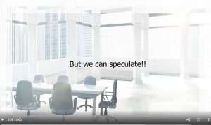
From Shaun Holma’s task 12.
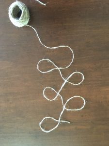
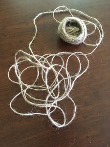
It is almost sanitized and perfect. There is no mess, no spilled coffee or dog hair – can it be real? Do people really exist like this? And then it seems the polished product of Shaun’s video is represented by this reoccurring image. Conversely, my “desk” and Spec futures is more messy and chaotic- perhaps each is reflective of the future we envision?)
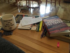
My space . . . and this is on a good day.
Shaun’s video used visuals, text and music but tends to privilege the reader. I wondered why a voice over was not added – if it was intentional? Or not. A visually impaired reader or slower reader (due to literacy level or maybe even the music slowing them down) might benefit from a voice over.
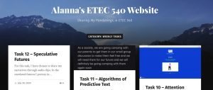
The Blog: The blog is easy to navigate being a UBC WordPress platform as at this point, familiarity has been thoroughly embedded. The Theme, Suits by Dreamweaver, however, is not one that I was as familiar with and it seems to appear different than I expected. At first glance, in previews especially, it reminds me of a business magazine that is trying to be a blog or a blog trying to appeal to an audience familiar with print magazines. Not exactly my preference or style but I did find it quite appealing the way Shaun has personalized it with image. have also noticed that images are used in abundance and to good effect in his blog.
There are also clear directions on the welcome page to go to the menu at the top. Nice touch!
But there seems to be some broken links under the menu tabs of some of the “assignments.” At least 2 show this message:
![]()
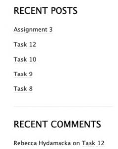
There are, however, directions to go to the blog which takes one to a space to access tasks. The side menu with “Recent Posts” is another feature that makes access easier. I wasn’t sure I liked this look. In fact, way back in May, when I was initially choosing my own theme, I did not liked the look thinking it cluttered the page but it does make access much easier, an important feature. it does make access much easier, an important feature.
In fact, I now find myself wanting to explore the site and blogs further. And with that, this link is complete . . . time to explore! (And listen to that track again 😉

 Same title? Same Story?

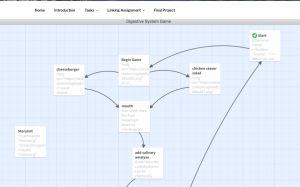 Finally, when considering our blog spaces and the task, I was struck by the fact that we both seemed to feel the need to include map of our Twines. This points to the value we place in images and to the process of the twine. Katlyn may value images more than I as her text is not nearly as lengthy in her description as mine. This difference struck me as an affordance for someone with a strong visual literacy. The addition of the links to how to embed sound and images was also a great touch. As to the website, I found that it was very easy to navigate and to comment on the blog. This is in part because of the clean space with a white background and minimal background clutter. I do not operate well with distractions making it well designed for someone like me. Also, because I was familiar with the format, a menu at the top and the placement of the comment section, I had the necessary literacies to access it.