Kernel Density:
Before any statistical analyses were done I wanted to create a kernel density surface to neatly visualize where crime hot spots are. Initially, I planned to use this raster surface for the OLS regression. However, after converting it to points (15 minutes) and attempting to join them to the census blocks I realized it was going to take too much time. After an hour of waiting the join was not even an eighth of the way done. The surface itself is an interesting visual aid on its own.
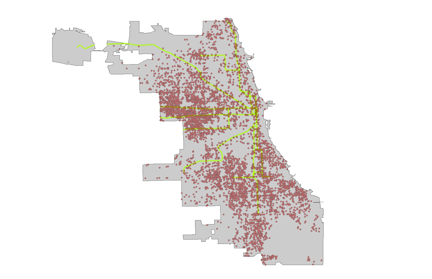
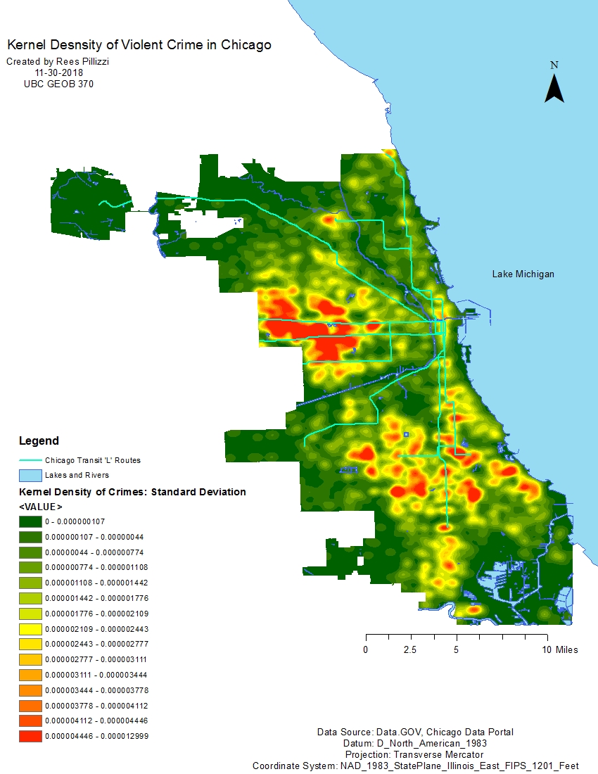
Figure 1 simply shows the crime point data and CTA ‘L’ train routes. Figure 2 is a map of the kernel density surface which was classified using 1/4 standard deviation to better represent the data. There are two main areas of crimes in Chicago. One on the west side and the other the long-discussed south side. The south side includes neighbourhoods such as Englewood and West Englewood notorious for gang violence. Examining the ‘L’ routes reveals an interesting pattern. The two lines running due south terminate in red areas dense with crime. Hot spots seem to parallel the lines as you follow them north towards their source.
Crime vs. Income OLS:

Figure 3 shows the relationship between crime and income. Natural breaks with 18 classes were chosen for display purposes as it better represented the data. Areas in grey show no data (or no relationship) because those census blocks did not contain any points of crime. Crimes still exist in these areas, but of the eight I chose to focus on for this analysis none have occurred in those areas. The legend represents the standard residual of the data. A low (green) residual shows there are lower amounts of crime than expected in those areas based on income. A high (red) residual shows there are higher than expected levels of crime based on income. This could be due to the fact these are poor areas that see extreme levels of crime that even exceed the model’s predictions. The R-squared value is used to determine the reliability of the output. This OLS produced an R-squared of 0.0978. This is a small value indicating less than 1% of the model is reliable for this relationship.


Examining figure 4 we see the OLS output chart displaying statistical data from the analysis. The probability values are both 0.0. These values are statistically significant and show there is no chance the relationship between the variables is due to random chance. Furthermore, figure 5 is the output chart from the Moran’s I test for this OLS regression. The Moran’s Index value of 0.3116 is a positive value demonstrating clustering of similar values within the data. The z-score value of 48.52 shows there is a less than 1% likelihood the cluster pattern is of random chance. These values show the data is spatially autocorrelated. Therefore, I reject the null hypothesis. Given the results of the Moran’s I test, I state the values are spatially autocorrelated and there is a relationship between crime and income in Chicago. Keep in mind the low R-squared value. There is a relationship but the model is quite unreliable in demonstrating so.
Crime vs. Employment OLS:
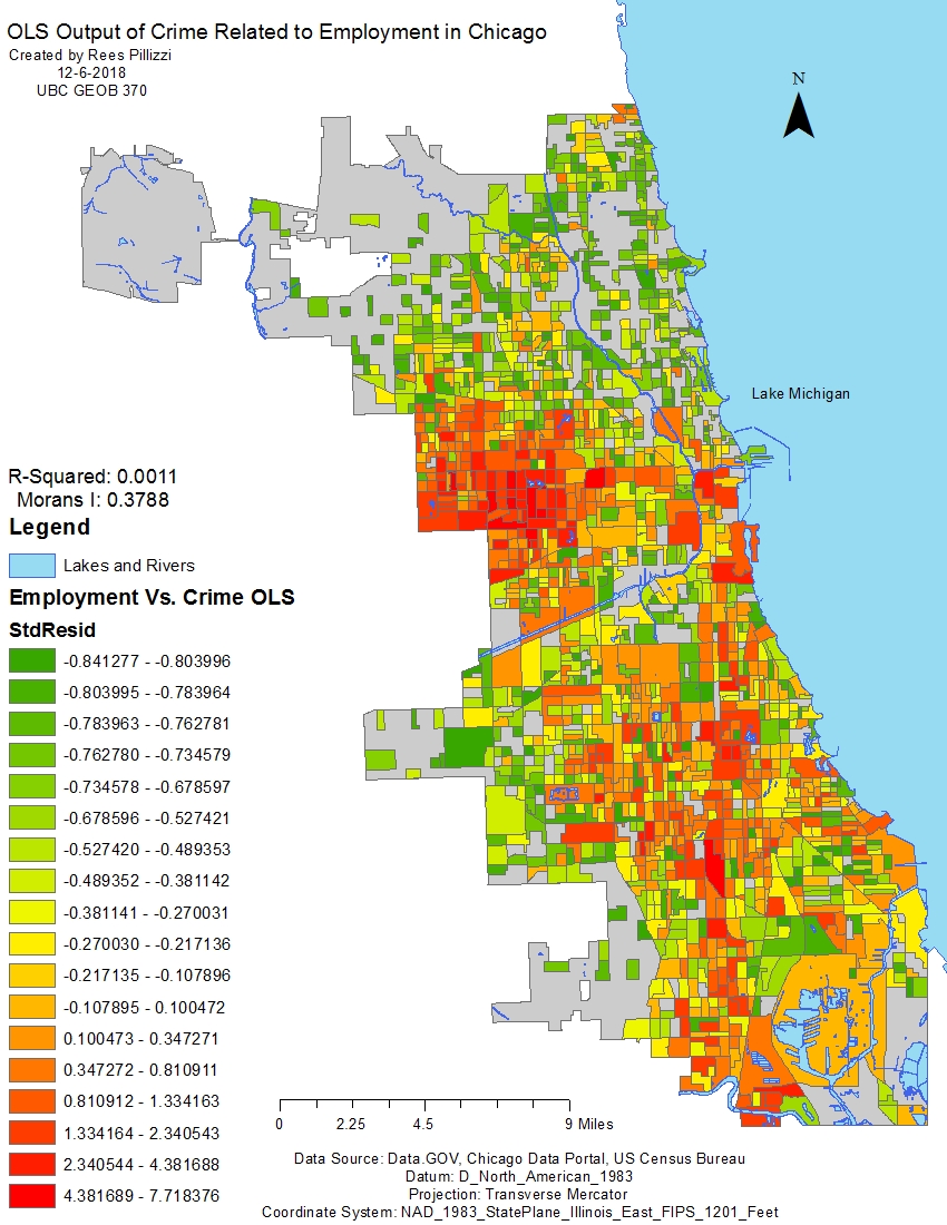
Figure 6 shows the relationship between crime and employment in Chicago. Compared to the relationship between crime and income, there appear to be more areas with high residual values. A low (green) residual shows there are lower amounts of crime than expected in those areas based on employment. A high (red) residual shows there are higher than expected levels of crime based on employment. This regression yielded a very small R-squared value of 0.0011. So small we should not believe this map is reliable.

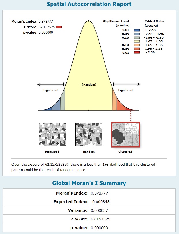
Figure 7 is the output report file for this OLS regression. The probability values are 0.0 and 0.19. Only the value corresponding to the intercept is statistically significant. The value of 0.19 means there is close to a 20% chance this relationship is due to random chance. Examining the Moran’s I test output shows a Moran’s Index value of 0.3787 and a z-score value of 62.15. The index value means there is a positive relationship between the variables. It is also slightly larger than the same variable in the income Moran’s test meaning the data is even more clustered. The z-score value is also higher than in the previous test, meaning there is strong spatial autocorrelation and a small chance the pattern is random. Less than 1% in fact. That said, given the 20% probability this model is due to chance and the very low R-squared value, I err on the side of caution and state there is no strong relationship between crime and employment in Chicago. The data is spatially autocorrelated, but given the unreliability of the model I believe many of the values to be of random chance.
Crime vs. Income & Employment OLS:
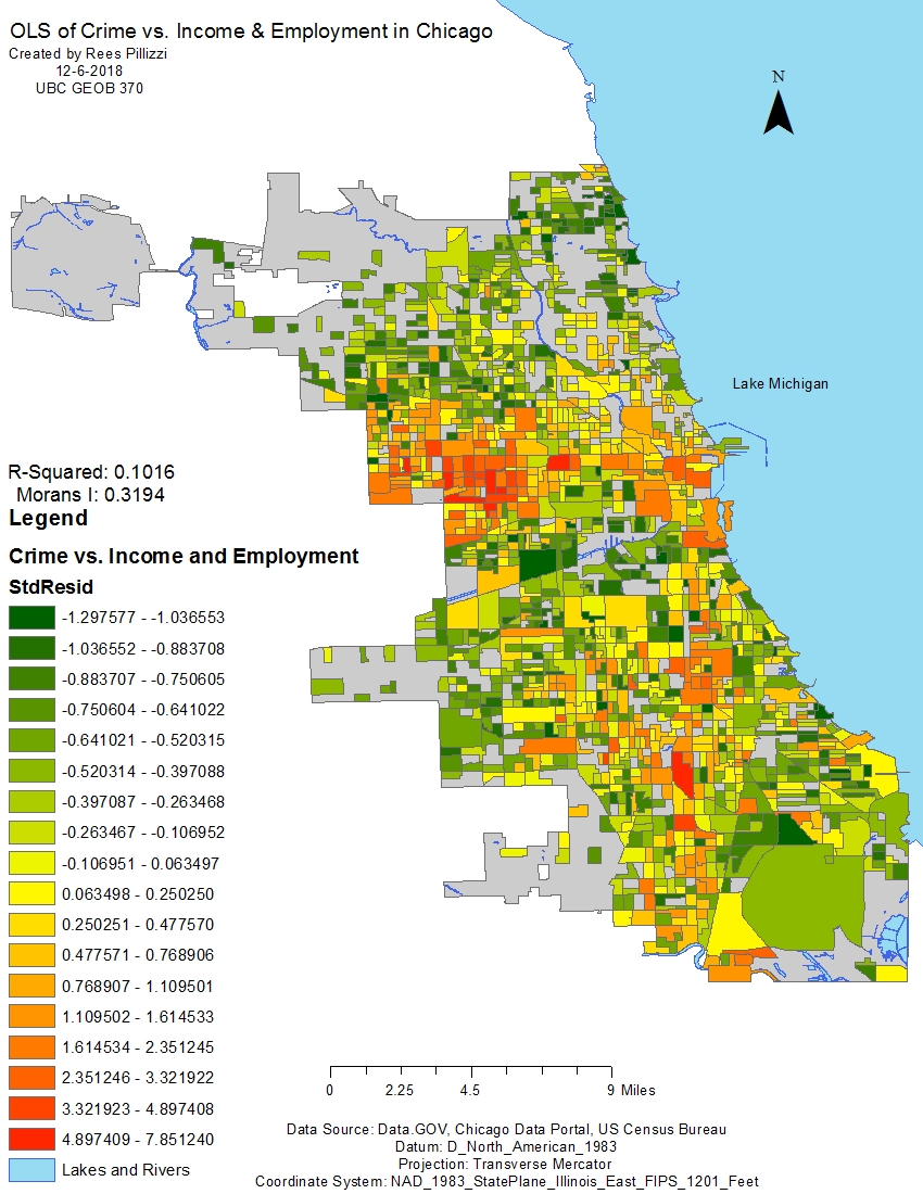
Figure 9 displays a map of the OLS regression output for both income and employment related to crime. The map appears greener i.e. there are more areas with low residuals. This means given the relationship between both explanatory variables there are lower amounts of crime in those areas than predicted. The worst areas continue to be red indicating a high residual value exceeding the model’s predictions. The analysis also yielded a higher R-squared value than the others at 0.1016. This is the most reliable model thus far.

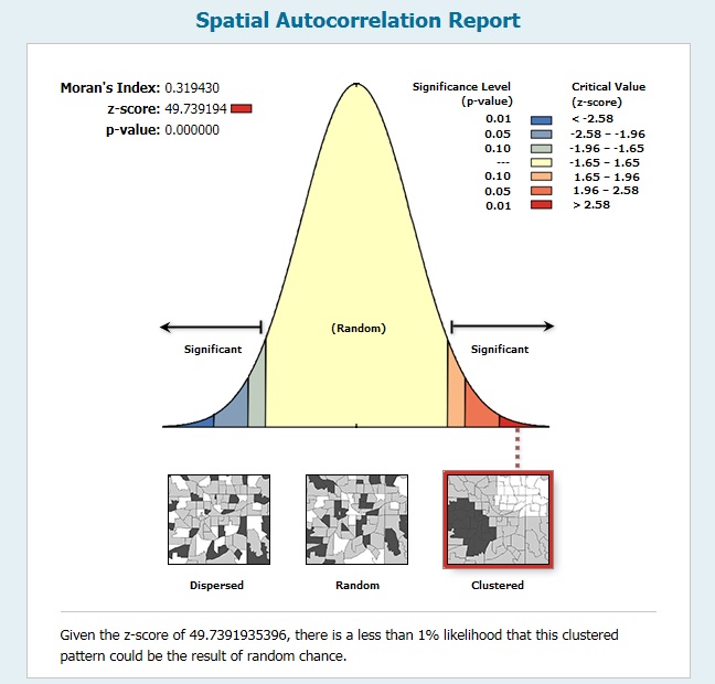
Figure 10 displays the output report from the OLS regression. The probability values are 0.0, 0.0, and 0.013 and are all statistically significant meaning there is a very small chance this relationship could happen randomly. Examining figure 11 we see the results of the Moran’s I test. The Moran’s Index is 0.3194 and the z-score value is 49.73. Another positive index value means there is a positive relationship between the data clusters. The map shows a spread of clustering values high, low, and in between. The z-score value indicates there is a strong clustering of data and a less than 1% probability it being due to randomness. Given the improved reliability of the model and the positive Moran’s I test I state there is a correlation between crime, income, and employment. The presence of both low income and low employment influence crime in Chicago.
Geographically Weighted Regression:
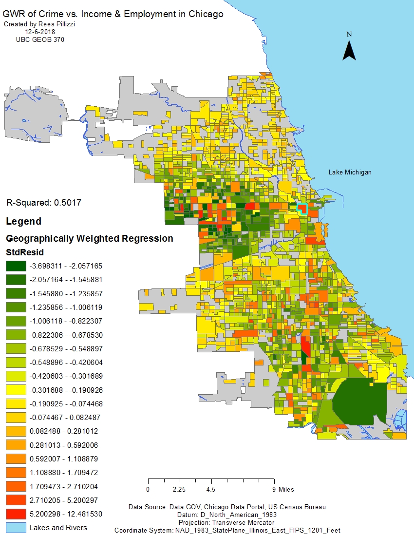
Figure 12 is a map displaying the output of a geographically weighted regression (GWR) done between crime, income, and employment variables. When compared to the OLS regression for the same variables, this map appears yellow indicating more areas of moderately low residual. Residual values such as these show there is slightly less crime than predicted by the model. One can gather these areas are of moderate income and employment but have the potential for high crime rates. They are green because given the relationship between crime and the explanatory variables there is even less crime than predicted given the poor economic status of the areas. The block highlighted in blue is a wealthy area. Given the wealth, there is more crime than expected and therefore has a high residual denoted by the red colouring. This map is the most reliable than any other done in this analyses indicated by the R-squared of 0.5. The GWR shows there is a strong relationship between crime, income, and employment in Chicago.
Discussion:
The three OLS regression analyses displayed different degrees of accuracy and spatial autocorrelation. Crime vs. employment proved to be the weakest individual relationship and is not considered a cause of violent crime in Chicago. There was a relationship between income and crime. The probability of the relationship being of chance was 0. Given the low R-squared value the accuracy of the model is in question. The third regression including both explanatory variables was the most reliable OLS with an R-squared of 0.1 and had very low probability variables indicating the model is not due to chance. The relationship between crime, income, and employment demonstrated the most probability that crime is in fact influenced by these variables. The geographically weighted regression was the most accurate model in this analysis with an R-squared value of 0.5. This not only confirmed the relationship within the OLS regression of all variables, but also showed many areas have a high probability of violent crime. Given the selection of crime types used in this analysis, these areas were underpredicted. Meaning, there is less crime than predicted by the model. Therefore, areas of low income and low employment see the most violent crime. There is a spatial relationship present. I believe these variables to be the cause of increased crime in Chicago.