This task involved analyzing a network based on each class member’s song choices for Task #8: Golden Record Curation using Palladio, a data visualization tool (Stanford, n.d.).
Analysis
Given that I have very limited experience with network visualization, let alone Palladio, the video tutorials by Systems Innovation (2015) were a useful primer to become more accustomed with graph theory and network terms like ‘edges’, ‘verticies’ and ‘nodes’.
Upon importing the data set into Palladio, the initial display of information was a bit chaotic and unclear. By manually pulling out the student-named nodes to the periphery and the track nodes in the centre, I was able to start making better sense of the visualization. However, I still found it a challenge to distinguish which nodes had a “high degree of connectivity” (Systems Innovation, 2015).
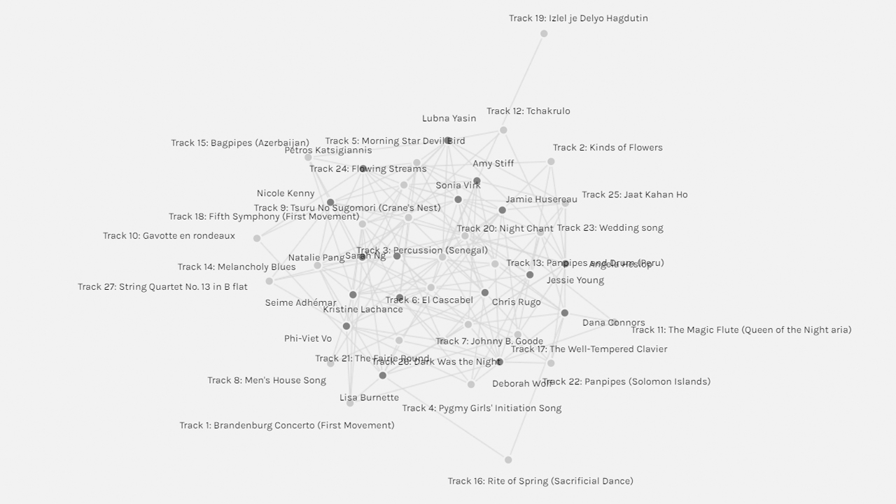
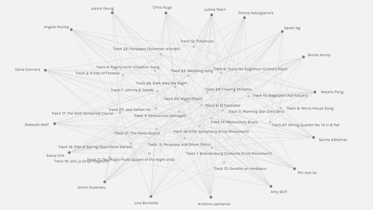
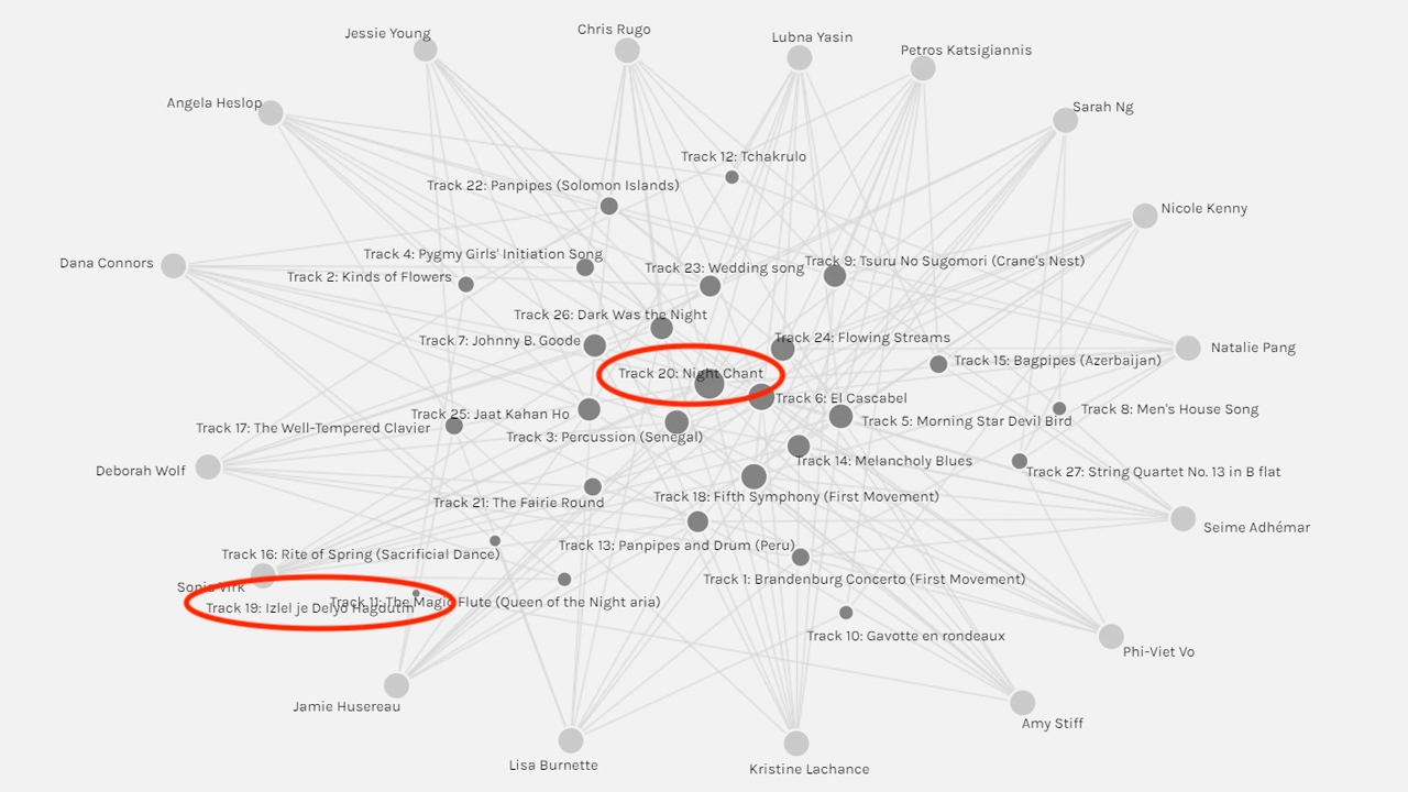
I turned to this video by Raynor Digital Scholarship Lab (2018), which helped me better understand the functions within Palladio, and in particular, how to customize the size of nodes based on the number of edges. In doing so, I could see that track #20 (Night Chant) had the highest degree of connections, and that track #11 (Izlel je Delyo Hagdutin) had the lowest degree of connections.
The facet filters labelled ‘modularity_class’ listed 5 groupings, each of which further reduced the scope of the data set. I found myself in ‘group #1’ along with two other peers. I once again manipulated the data and re-sized the nodes to better interpret the network.
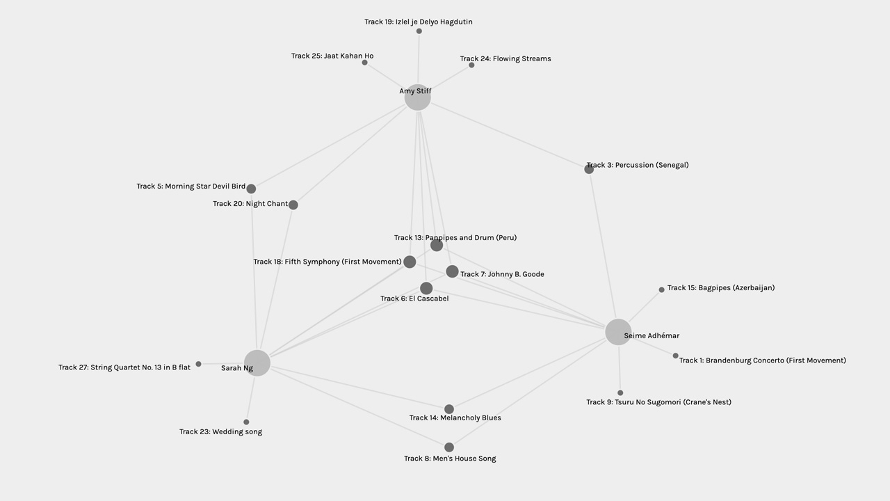
Based on this smaller network, I’ve made the following observations:
• The three of us shared 2 tracks: Night Chant and Dark Was the Night.
• Kristine and I shared 4 tracks
• Deborah and I shared 2 tracks
• Deborah and Kristine shared 1 track
• I selected 2 distinct tracks
• Deborah selected 5 distinct tracks
• Kristine selected 3 distinct tracks
Reflection
Is the visualization able to capture the reasons behind the choices?
Based on the network visualization alone, there isn’t enough information available to draw any strong conclusions about the reasoning of each of our song choices and the commonalities between them. While we can quantitatively assess the degree of connectivity between songs and class members, one can only make assumptions about the reasons for these connections. One would need to refer to the source material to further contextualize any observations based on the visualization. A more accurate visualization might involve an expaded data set that includes coded information on the selection criteria, which would require analysis of the source material.
Upon examining the blog posts of my peers within this group, it doesn’t seem that we have much in common based on our curation criteria. My own criteria was centred around equity and inclusion (Rugo, 2023), while my peers based their curation on human evolution (Wolf, 2023) and subjective musical preferences (Lachance, 2023). As such, if one were to make assumptions from this data set without examining the source material, they would likely draw false conclusions.
Reflect on the political implications of such groupings considering what data is missing, assumed, or misinterpreted?
Given the lack of data points related to selection criteria, we can only draw assumptions or generalizations from this network- which is, of course, not conducive to critical analysis. Furthermore, the formation of group categories is based on limited information – which can be problematic when viewed in the larger context of algorithmic bias and content prioritization systems on the internet, such as PageRank (Code.org, 2017, 03:02).
In her book on algorithmic oppression, Noble (2018) addresses how online content prioritization algorithms can perpetuate and exploit racist and misogynistic ideologies by design. According to Noble (2018), unvetted data prioritization results can the exclude and further suppress equity-deserving groups, while prioritizing results that reflect privileged identities. As such, the political implications of drawing assumptions based on missing, assumed or misinterpreted data (whether intentional or not) can actually be quite detrimental to the work of equity and inclusion. As someone working within the domain of academic libraries and instructional design, I recognize my role in advocating for critical digital literacies and awareness of the biases that influence and inform the systems that we work with on a daily basis, including data sets and search tools.
References
Code.org. (2017, June 13). The Internet: How search works. [Video]. YouTube. https://youtu.be/LVV_93mBfSU
Lachance, K. (2023, March 5). Task 8: Golden Record curation. ETEC 540 – Text Technologies. https://blogs.ubc.ca/kristinelachance/2023/03/05/task-8-golden-record-curation/
Noble, S. U. (2018). Algorithms of oppression: How search engines reinforce racism. New York University Press.
Raynor Digital Scholarship Lab (2018, April 18). Palladio 3-Data visualization. [Video]. YouTube. https://youtu.be/m-OVVAm0utE
Rugo, C. (2023, March 5). Task 8: Golden Record curation. Chris Rugo’s ETEC 540 Blog. https://blogs.ubc.ca/rgch540/2023/03/05/task-8-golden-record-curation/
Stanford. (n.d.). Palladio. http://hdlab.stanford.edu/palladio/
Systems Innovation. (2015, April 18). Graph theory overview. [Video]. YouTube. https://youtu.be/82zlRaRUsaY
Wolf, D. (2023, March 5). Task 8 – The Golden Record. ETEC540 65A: Text Technologies. https://blogs.ubc.ca/dwolfetec54065a/2023/03/05/task-8-the-golden-record/
Hi Chris, here is a link to my Linking Assignment for your Task 9.
https://blogs.ubc.ca/kristinelachance/2023/03/16/linking-assignment-for-task-9/