The network map created by everyone’s Golden Record Curation unearthed a fascinating result.
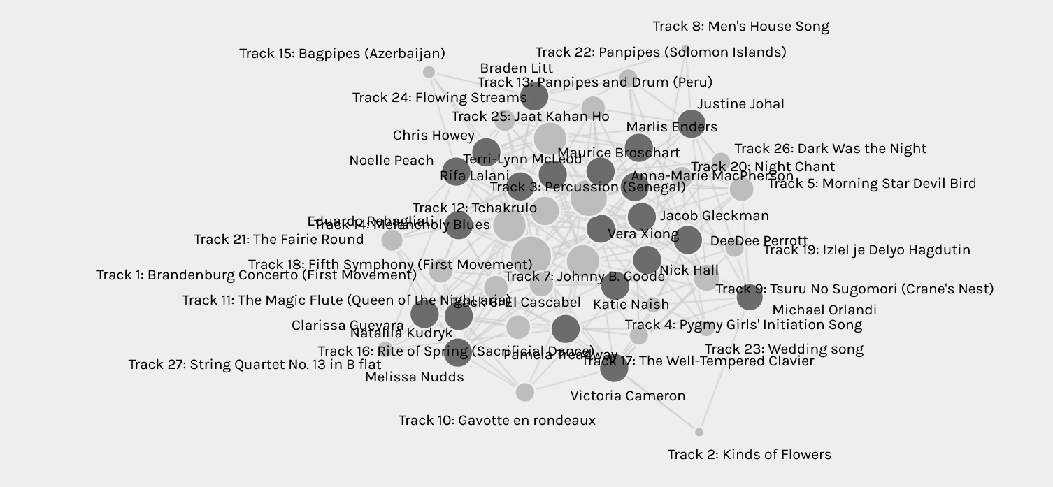
The Pallidio graph used data to display the most and least connections. Beethoven’s Fifth Symphony appears to be the most popular choice with the most connections. The songs Jaat Kahan Ho, Percussion, Johnny B.Goode, and Melancholy Blues were equally popular choices.
There were new networks to be discovered between the musical tracks, curators and groupings which made the data overwhelming to sift through.
I sorted through each of the ten tracks I had chosen to see which classmates my choices frequently matched with and cross-checked their curation posts to learn the reasons for their track selection. Here I discovered that the music was selected for different reasons from mine. Some chose to cover songs based on geography and diversity, while others based their selections on personal preference, emotional impact, cultural significance, mathematical reasoning and so on. The qualitative data paints a richer picture behind each curation.
I was grouped in “Community 1”, with Noelle, Braden and Chris.
Despite choosing similar songs, our rationales for songs varied. The fact that our different approaches yielded identical song selections highlights the risk in categorizing and interpreting data.
The network created in Palladio only illustrates the relationship between final choices. It does not capture the motives, reasons or biases for our curation and so, requires context for further explanation. Similarly, any “null” choices also require more detail. Thus, all data needs to be viewed and treated with nuance.