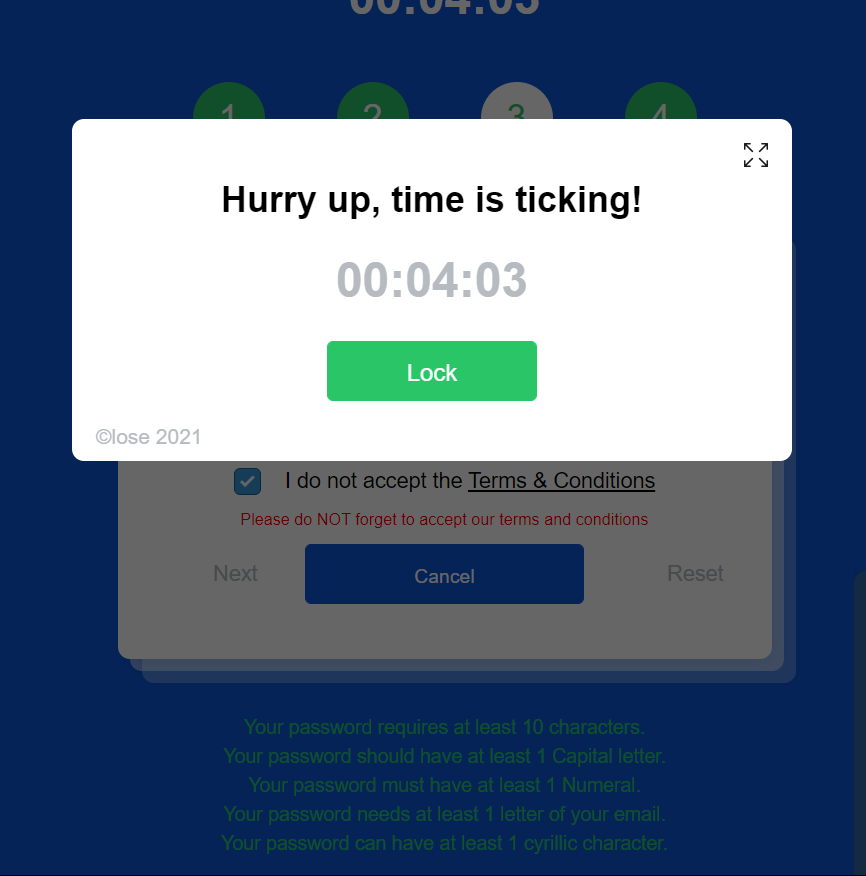
This was the most frustrating task I experienced. After countless attempts I gave up playing User Inyerface.

The front page of the web game sets the player up for the hindrances with the inclusion of several unusual details – a large shape for “NO” in the center that serves no purpose, misdirected use of underline, highlight and capital letters, and no indication of where to actually click.
The next page gets exponentially worse. This page is the start of the game. There appears to be a simple sign-up page where I unfortunately spent too much time deliberating on which email to use, in case my information was being saved or directed elsewhere. There are only 3 text boxes that need to be filled out and a terms and conditions button to be checked off, though the sign up is anything but simple. To enter any information, you have to remove the existing text from the text-fields, which is not an ideal scenario when crunched for time. Neither is having to select the email domain from a drop-down menu, which for some reason includes .jpg, a file format.
The rules for password characters are absurd, requesting to include Cyrillic characters. However, these rules display in green, whether or not you match the criteria. Still, even with the same password that I saved and copy-pasted in my numerous attempts, I often received a “your password is not unsafe” message in red, unable to move ahead. The checkbox uses a negative-statement and opens up a terms and condition pop up that is exceedingly slow to scroll down and click “accept” from. The floating “help” button on the right is not helpful at all, changing text typed in there into senseless jibber. I was naive to assume the bot would provide a hint to move forward but it truly feels like I was trolled!
In one of my attempts I was able proceed past this page into the second step only to accidentally refresh my window and end up back in the endless pit of step one.
The GIF below summarizes my feelings towards this game.
Overall, the game succeeds in highlighting how web and interaction designers exploit interfaces to seizure our attention. We expect interfaces to be intuitive, convenient and effortless. Our behaviours, instincts and priorities can be strategically manipulated to direct users towards information that websites wish for them to see, most notably advertisements.
Maurice Broschart
November 19, 2021 — 10:41 am
Hello Rifa,
You mention in your post that this activity was frustrating, but, did you find it funny. I was laughing during the whole process at the absurdity of it all.
Was the screenshot that you provided the last step you were able to get to? For me, I was stuck on a “select images” to prove that you are not a bot. It was set up in a way that you could not progress any further since there were tick boxes missing.
I wanted to ask you about the “HELP” function and its flaws that you experienced as I made comments about it as well. Are there situations in “real life” where you found a help chat box to be successful? I will never forget this past year as I used the chat to connect with bots and sometimes humans, for both Westjet and Whirlpool (for Covid and defective products). Needless to say, neither experience was successful. At what point did it become normal to connect with companies though typing and through out-sourced people?
Rifa
November 21, 2021 — 6:17 pm
Hi Maurice,
I found it comical at first but after a couple of attempts I didn’t know whether to laugh or to cry because I was frustrated and couldn’t get through all the steps. Good observation about chat bots in real life! Those aren’t that helpful at all with the canned generic responses they offer, often not matching or completely ignoring the questions being asked. I too have dealt with both WestJet and Whirpool this year (what are the chances?!) for similar reasons as yourself and did get the run around from live chat and then customer service over the phone. Perhaps this task hit too close to home!
DEREKDOHERTY
November 29, 2021 — 2:48 pm
Love the gif Rifa…exactly how I felt too.