I was excited for this task as the last time I had done a potato print was in elementary school and I figured this would be a fun project. While still a fun project, I’d say more that stamping would be a more accurate term to what I had attempted as a child. The activity was a very engaging way to think about Bolter’s (2001, p. 15) observation that all aspects of writing involve a degree of mechanization.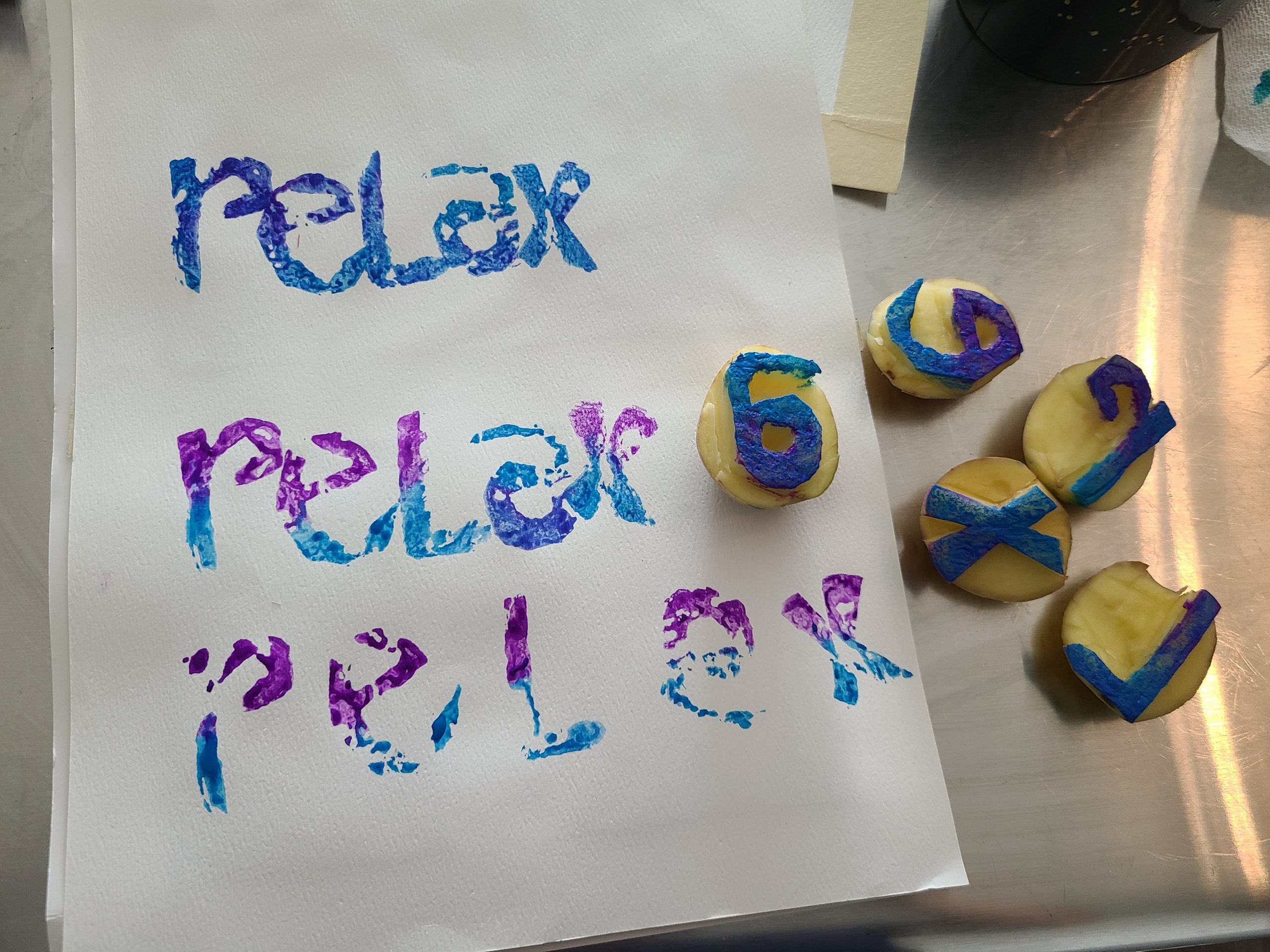
I chose the word “relax” because that is always a pleasant reminder.
Since the letters would need to be carved out as mirror images, I printed out a stencil of letters that were flipped so I could easily trace and etch them on the potato. I’m assuming this saved me plenty of time and effort than it would have taken me to free hand the letters. It also ensured some form of uniformity because I did not measure the height or width of my letters during slicing.
The letters r, a and e were more challenging and demanded more time than ‘x’ and ‘l’ which were easier due to the straight lines needed for carving. I did wonder why I hadn’t been thoughtful over my choice of font or opted for capital letters. The style of the font was “curvy” and took a couple of attempts. Letters ‘a’ and ‘e’ were particularly difficult due to the hollow spaces within them, that I now know are called “counters” in typography.
I wanted to be creative with my print, so I painted the letters half in purple and half in blue. I revived old gouache paints but the purple colour refused to cooperate for my next attempt, resulting in me having to paint it over with blue. Both prints had white gaps and not were not an even solid colour, likely because potatoes have a porous texture and I had not exerted enough force to stamp. The first print also resulted in the letter “a” appearing upside down because I had simply placed it down like the other letters where discerning orientation of the potato was either easier or not so important.
The whole process took me about an hour. Albeit therapeutic, I couldn’t be more grateful for the mechanization of writing! As Clement (1997) had noted, “to print, one must have a type” (p. 15). In addition, every facet of the text and print had to be considered for organizational design, layout, composition, preparation of a writing surface, ink and so on. I can appreciate the patience and skill of those involved in printmaking – it is certainly a skilled art form. However, technology has now advanced into word processing and texting that we do not have to worry about a labour-intensive process in order to fix mistakes, or deliberate on what to communicate.
References
Bolter, Jay David. (2001). Writing space: Computers, hypertext, and the remediation of print [2nd edition]. Mahwah, NJ: Lawrence Erlbaum.
Clement, Richard W. (1997). “Medieval and Renaissance book production (Links to an external site.)“. Library Faculty & Staff Publications. Paper 10. https://digitalcommons.usu.edu/lib_pubs/10
Innis, Harold. (2007) Empire and Communications. Toronto: Dundurn Press