
 A few weeks ago a friend of mine posted an image of this website on his facebook wall. If you follow the link (or read the title of this blog) you’ll quickly realize it’s a map of the internet. If you are at all like me, your first reaction might be “You can’t map the internet, silly! It has no geo-phyiscal presence!” But if, like me, you realize this is an overly simplistic interpretation of the concept of ‘map’, you’ll explore this website further and discover that it’s actually quite neat!
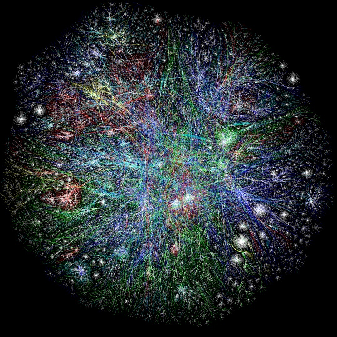
The map is a “bi-dimensional presentation of links between websites”. The more traffic a site has the larger the representation of that site is. Users switching between sites form links and the stronger the links, the closer the sites. The sites are also colour coded based on the country in which they are based.
Beyond being visually attractive and generally cool to look at, the Internet Map is also a useful tool for examining how people use the internet.
For instance, a closer examination of the second largest blob on the map reveals facebook as the second most trafficked site. (I guess I should note this map was created in2011 and, as far as I can tell is still based on those statistics). Ominously close, however, is the giant blob representing Google.
This blog by Mark Wilson, sheds some light on what this close spatial proximity means. Basically, the close proximity of these two blob monsters indicates that a large portion users are visiting both sites. This means that google and facebook are, in a sense, competing for the same customers. This is not really surprising news. I think most people would expect the two biggest websites to have many users in common.
What is surprising is the distance between facebook and other social media sites. While Youtube and Twitter are relatively close to the facebook blob, wikipedia is further away and popular blogging sites blogspot and wordpress are very distant (wordpress is in the virtual Oort cloud of this internet solar system). This seems suggest that users of these blogging sites tend not to use facebook, twitter and the like nearly as much as other internet users. Those who use wordpress appear to not use the rest of the internet at all.
I’m not sure I completely grasp everything offered by this map. Further exploration may reveal new insights. What is clear is that the internet is dominated by relatively few sitesand a good portion of these are social networking related. I would like to find a similar map from 5 and 10 years ago to see what the landscape looked like before facebook and the other giants really established themselves.
That is really cool. I wonder how it will change over time.
Me too. It appears that the site is a ‘one off’ static model. I wonder if there is a updated version of this kind of thing somewhere out there. It would be really interesting to visually track the progression of the internet in real time.